
Key Details
Commercial use for one business is included. The brand may not be resold or redistributed.
You’ll receive the complete brand kit as editable source files, including a mini visual brand guideline (PDF).
This brand kit can be adapted within a defined scope. Up to 2 revision rounds are included after the initial setup.
Once the purchase is confirmed, delivery usually takes 7–14 business days, depending on the requested adjustments.
breadfordesign, BreadForDesign
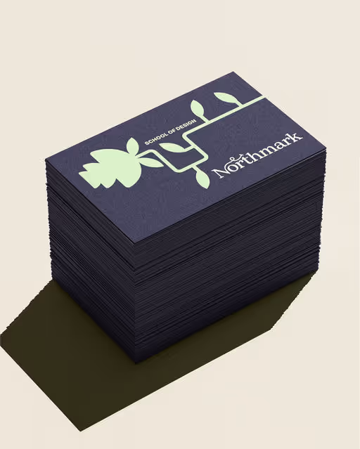
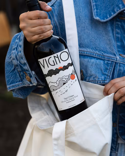
Bread for Design bakes distinct visual identities through strategy, packaging, and digital experiences. Every detail is intentional — design that solves business challenges and el
Profil on Braaands™Frequently Asked Questions
The core visual concept and structure of the brand remain unchanged.
These changes adapt the brand to your business without redesigning it from scratch.
If everything matches, you’ll receive a checkout link from Braaands™ to confirm the purchase.
The full amount is secured until the brand is finalized.
At checkout, you’ll also have the option to add additional packages such as business cards or packaging design.
Payment only happens once everything is confirmed.
Resale or redistribution is not permitted.
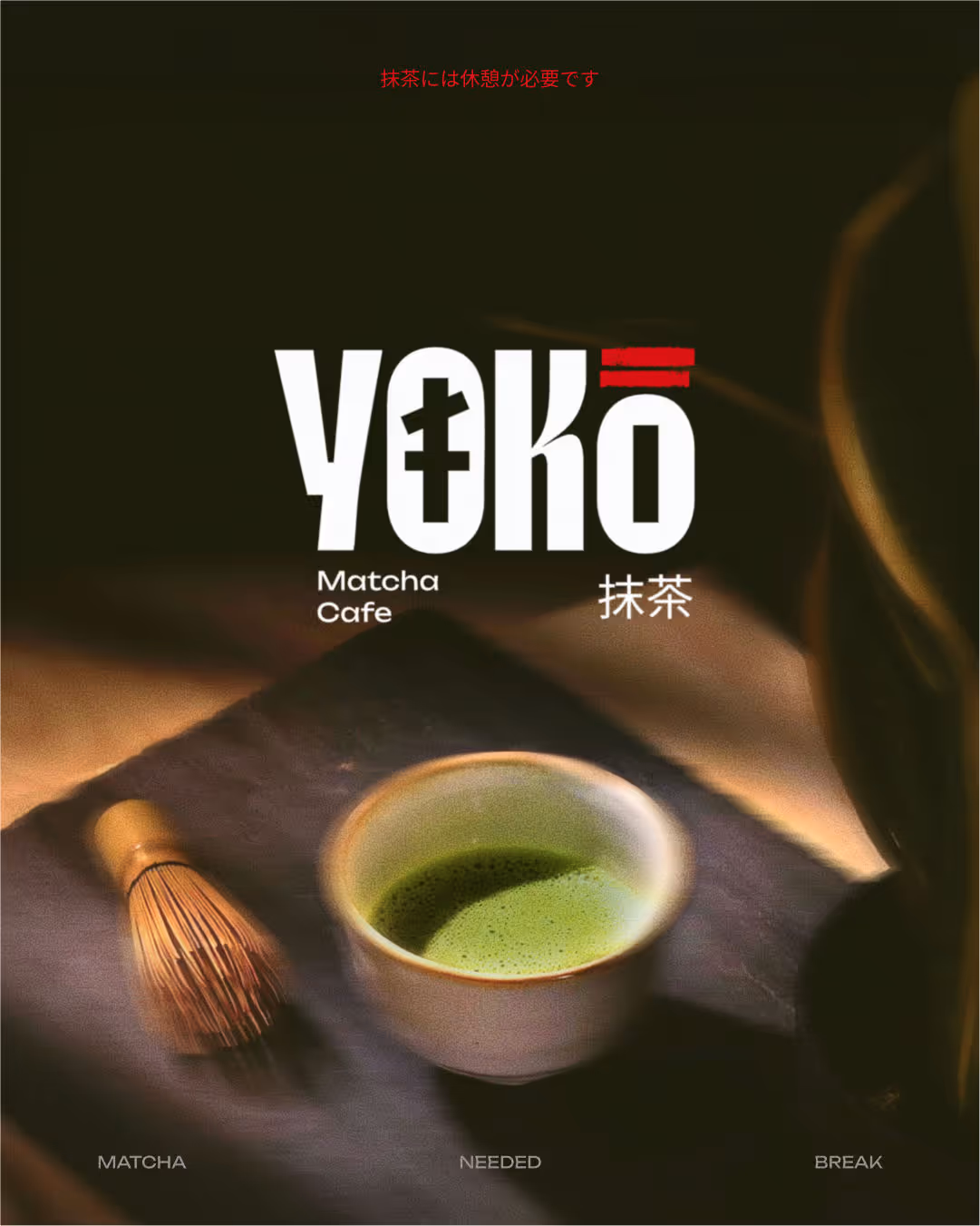
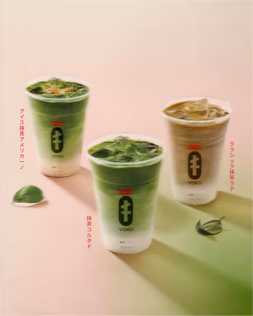
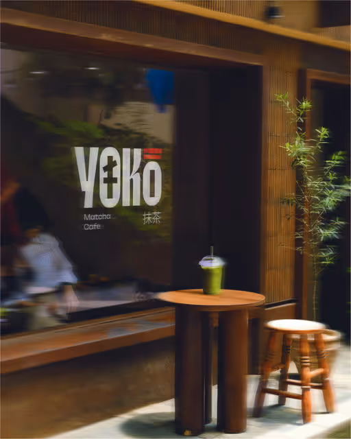
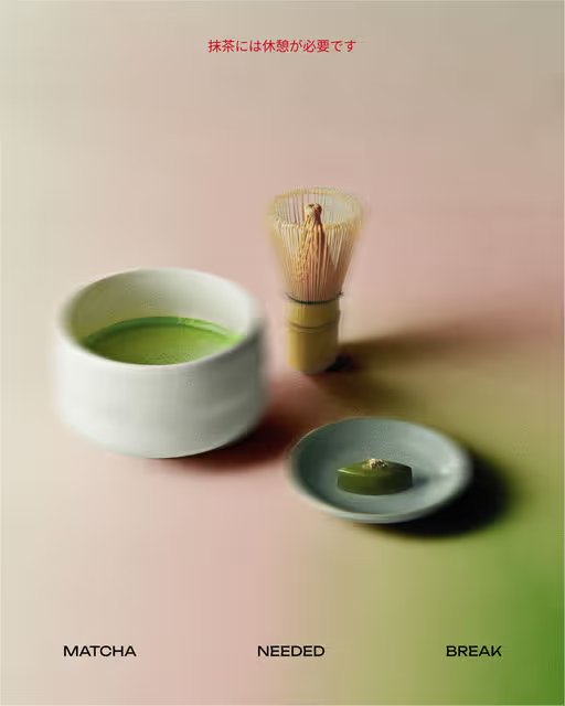
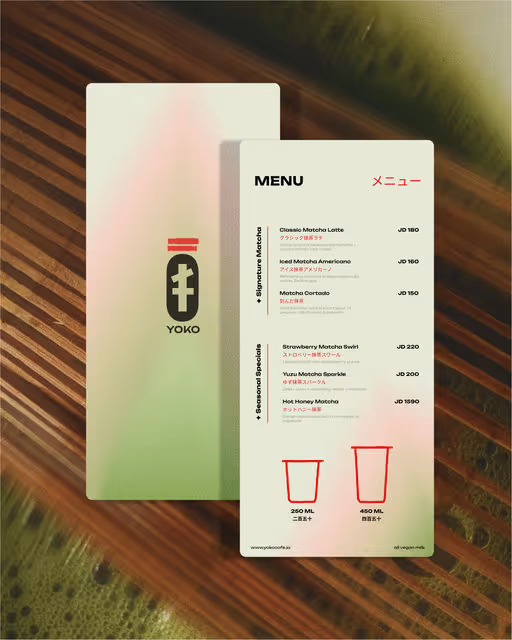
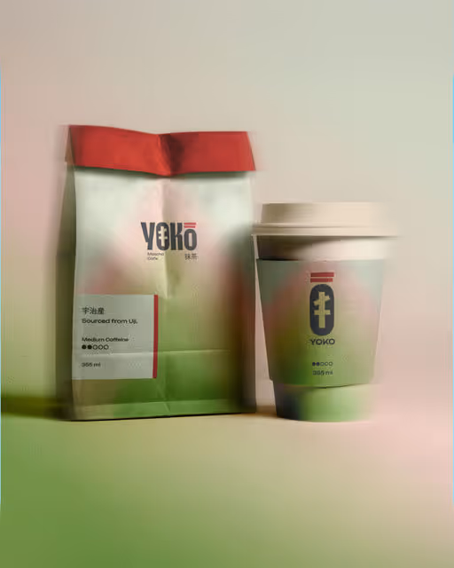
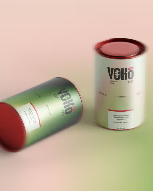
Matcha Branding
Yoko: A matcha needed break🍵 For Yoko, a modern matcha café, we set out to build more than just a brand. We crafted a pause button in the middle of a fast paced world. Rooted in the spiritual calm of Japanese culture, Yoko blends traditional design elements like the bold symbolism of torii gates ⛩️, the softness of sakura pinks, and the grounded calm of matcha greens. The result is a brand that feels equal parts ritual and refresh. The core idea is simple “A matcha needed break.” This became the narrative thread across the brand, from tone to textures, packaging to space design. Yoko is not just a café. It is a peace offering in a cup. Every touchpoint, from the menu to the merchandise, invites customers to slow down, sip up, and reconnect even if just for a moment. So tell us, do you want a matcha break?