Best Brand Designs and winner of the Brand of the Day Awards
Brand of the day
Thank you! Your submission has been received!
Oops! Something went wrong while submitting the form.
Showing 0 results out of 0 Brands of the Day.

Bold and joyful body care brand concept. A colorful identity with playful typography, vibrant packaging and studio visuals created with AI. A modern campaign celebrating confident skin and feel-good self care.
Body Care Branding
April 3, 2026
Beauty & Skincare
Retail
Packaging Design
Label Design
Poster & Print
Merchandise
).avif)

Cinnapop turns gingerbread into a statement. Sweet but unapologetic, nostalgic but modern — made for those who celebrate quietly, strangely, and in their own way. (collab with @zoevermander)
Gingerbread Branding
April 2, 2026
Food & Beverage
Fashion & Apparel
Packaging Design
Poster & Print
Merchandise
Label Design
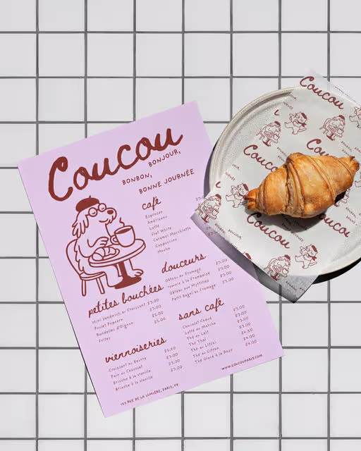

Coucou is a patisserie that serves fresh french pastries. their mission is to create treats that feel warm and sweet. From flaky croissants to colourful macarons, everything is made to bring a smile perfect for a coffee break or a gift.
Patisserie Branding
April 1, 2026
Food & Beverage
Retail
Poster & Print
Packaging Design
Label Design
Business Cards


Scope of work: Branding & Packaging
A Mineral water brand made of plant extract shaped by cold climate and pristine landscapes
Mineral Water Branding
March 31, 2026
Food & Beverage
Retail
Packaging Design
Label Design
Merchandise

Bella is a transformative Australian brand redefining the pasta sauce category by merging authentic Italian traditions with contemporary culinary trends. It’s designed for the modern-day gourmet who values quality, sustainability, and convenience. In a market dominated by uninspired options, Bella rises as the choice for those craving authenticity, vibrant flavors, and eco-conscious packaging.
Sauce Branding
March 30, 2026
Food & Beverage
Retail
Packaging Design
Label Design
Merchandise
Poster & Print


Identity | Packaging design
Lumea
The name Lumea draws from the idea of light and glow, without being literal. Soft and balanced, it sets the tone for a brand that feels warm, modern, and composed. The logo is intentionally minimal. Set in lowercase typography with generous spacing, it communicates confidence without excess. There are no decorative elements - only clean forms designed to feel contemporary yet enduring.
The brand identity is built around repetition, rhythm, and structure. Linear patterns and stripe variations form a visual system inspired by the steady burn of candlelight. These elements create consistency while allowing variation across products. Color is used with restraint - muted reds, violets, and teals provide distinction without breaking the brand’s quiet tone.
The packaging design reflects the same philosophy. Tall, slim boxes echo the proportions of the dinner candles inside. The layout prioritizes white space, allowing the product to feel light and refined. Fine line illustrations suggest the form and pattern of the candles without relying on photography, reinforcing a sense of calm and intentional design.
Candles Branding
March 29, 2026
Home & Lifestyle
Retail
Packaging Design
Label Design
Poster & Print
Merchandise

Parley is a high-class biscuit salon. In a world full of bakeries, patisseries, and dessert cafés, Parley makes biscuits the star of the show, treating them like works of art - inviting people to slow down and appreciate life’s smaller pleasures.
Biscuit Salon Branding
March 28, 2026
Food & Beverage
Retail
Label Design
Packaging Design
Poster & Print
Merchandise
An 80s inspired milkshake bar with bold retro vibes and extra creamy shakes
Milkshake Bar Branding
March 27, 2026
Food & Beverage
Hospitality
Poster & Print
Label Design
Merchandise
Packaging Design

An experimental branding project exploring restaurant identity through the lens of 90s underground print culture. The BANG Ramen system uses limited high contrast color, aggressive typography, and layered graphic composition to create a fictional but fully realized brand world. Designed to exist across physical objects, signage, and printed ephemera, the work emphasizes tactile detail, macro graphic texture, and cohesive visual storytelling.
Restaurant Branding
March 26, 2026
No items found.
No items found.

La Musé is a heritage atelier based in France, founded on the belief that fashion is both memory and muse. Rooted in artisanal craftsmanship and poetic femininity, the brand blends old-world refinement with modern restraint. Each piece is thoughtfully constructed, honoring traditional techniques while embracing a contemporary silhouette.
The logo reflects this philosophy. The hand-drawn portrait at its center evokes a timeless muse. Its imperfect, expressive lines give the mark an intimate, workshop-made quality, reinforcing the brand's commitment to artistry and authenticity.
The fully custom logotype, fluid and organic, contrasts the delicacy of the illustration with confident movement.
Together, the logo mark and wordmark create a signature that feels personal, archival, and distinctly crafted — much like the garments themselves.
Atelier Branding
March 25, 2026
Fashion & Apparel
Label Design
Packaging Design
Business Cards
Merchandise
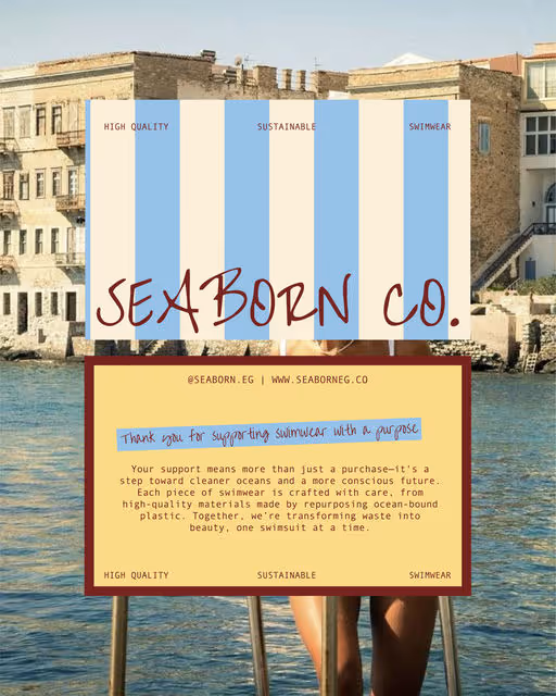

Seaborn Co. is a conceptual sustainable swimwear brand focused on ocean conservation, transforming ocean plastic into chic, eco-friendly suits with natural palettes and minimalist designs, using symbols like the nautilus for circularity, emphasizing luxury without excess and a purpose-driven identity.
Swimwear Branding
March 24, 2026
Fashion & Apparel
Home & Lifestyle
Poster & Print
Packaging Design
Merchandise
Label Design
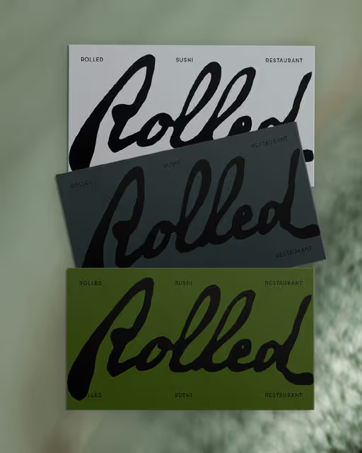

Rolled is a sushi restaurant concept inspired by quaint Japanese fishing villages atmosphere. Each roll captures a journey of heritage, creativity, and adventure, all wrapped in a traditional, harmonious atmosphere.
Sushi Restaurant Branding
March 23, 2026
Food & Beverage
Hospitality
Business Cards
Packaging Design
Label Design
Poster & Print


A London Tea House. A quiet escape in the heart of the city, where time slows down with every steep. It’s less about sipping tea and more about creating pause.Brief by @designerbriefs
Keywords: Elegant, serene, timeless, calm
Tea House Branding
March 22, 2026
Food & Beverage
Home & Lifestyle
Packaging Design
Merchandise
Poster & Print
Business Cards

Miyako is a Japanese green tea brand reimagined—not just a drink, but an experience. A moment of joy, a playful ritual, a sip that feels like a little celebration. Rooted in tradition yet infused with a modern, effortless charm, Miyako transforms tea into something both soothing and exciting.
Green Tea Branding
March 21, 2026
Food & Beverage
Home & Lifestyle
Packaging Design
Label Design
Merchandise
Poster & Print


Nayma is a warm and friendly cake brand that focuses on homemade flavors and simple joy. Its visual style uses soft colors, clean shapes, and a gentle look that reflects comfort and sweetness. The brand aims to feel welcoming, kind, full of love—just like the cakes it creates. Nayma brings a small moment of happiness to anyone who enjoys something sweet and made with care.
Cake Branding
March 20, 2026
Food & Beverage
Retail
Packaging Design
Merchandise
Poster & Print
Label Design

Bare Earth is a fictional natural body care brand inspired by forest extracts and raw materials.
This project explores minimalist branding and packaging through a calm, earthy and modern visual identity.
Body Care Branding
March 19, 2026
Beauty & Skincare
Home & Lifestyle
Packaging Design
Label Design
Merchandise
Poster & Print
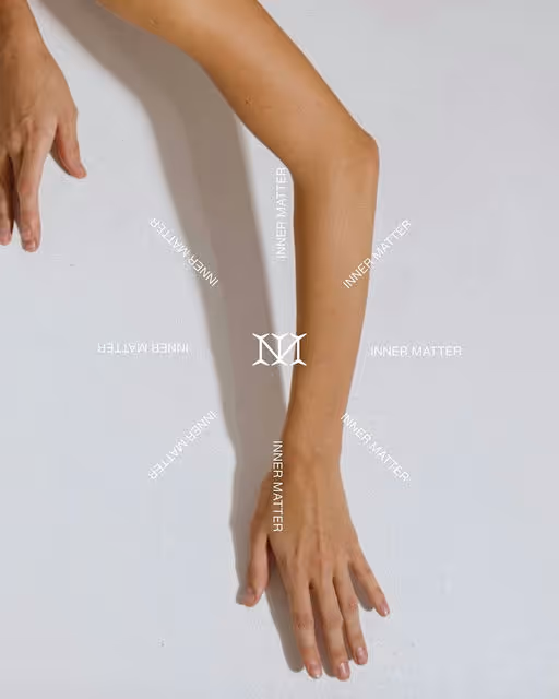
A quiet return to what truly matters.
Inner Matter — where stillness takes form.
Retreat Branding
March 18, 2026
Wellness & Health
Home & Lifestyle
Poster & Print
Packaging Design
Merchandise
Label Design
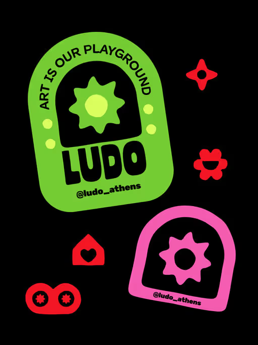
A bold brand identity for an art space in Athens, Greece offering workshops for adults and kids.
Art Space Branding
March 17, 2026
No items found.
No items found.

Crumb & Brew is a modern coffee spot centered on warm drinks, soft cookies, and the joy of slowing down. The bold, flowing logomark reflects community and rising steam, while bubbly visuals echo fresh coffee foam to create a cozy feel.
Café Branding
March 16, 2026
Food & Beverage
Hospitality
Packaging Design
Merchandise
Poster & Print
Business Cards
Modern porridge brand concept focused on warmth, simplicity and everyday rituals. Identity design, packaging system and AI-directed visuals created to explore a soft, honest and contemporary food branding universe.
Porridge Branding
March 15, 2026
Food & Beverage
Retail
Packaging Design
Label Design
Poster & Print
Merchandise

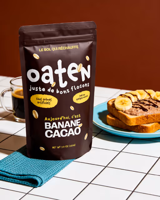
Oaten; A modern porridge brand made for slow mornings and busy ones alike.
Soft tones, confident typography, and a playful mascot come together to create a visual language that feels modern yet grounded.
—
Designed in collaboration with @designedbymitte
Porridge Branding
March 14, 2026
Food & Beverage
Retail
Business Cards
Packaging Design
Label Design
Merchandise

MooHaus is a handmade gelateria based in São Paulo. Our goal was to create a fun, fluid and cool brand! We adopted a totally organic identity, representing Moo's artisanal side, from the conception of its ice creams made carefully with natural ingredients, to the establishment of emotional connection and experience that we want to transmit through all the visual and verbal part.
Gelateria Branding
March 13, 2026
Food & Beverage
Retail
Packaging Design
Merchandise
Poster & Print
Business Cards


Oaten is a modern porridge brand focused on nutritious everyday breakfasts.
Porridge Branding
March 12, 2026
Food & Beverage
Packaging Design
Merchandise
Label Design
Poster & Print


Nonna Beve is an Italian restaurant concept inspired by the client’s grandmother and the feeling of growing up around her table. The identity translates warmth, generosity, and togetherness into a playful yet elegant visual world. Inspired by old Italian illustrations and aperitivo culture, the brand is centered around the grandmother as both the name and the mascot — a symbol of joy, hosting, and unapologetic living. Designed to feel welcoming, lively, and familiar, Nonna Beve invites people to eat well, drink well, and stay a little longer.
Italian Restaurant Branding
March 11, 2026
Food & Beverage
Hospitality
Business Cards
Label Design
Packaging Design
Poster & Print

AirAlbania is a travel agency created for everyone who loves to explore the world. Many people dream of visiting new places, and this agency aims to make that journey easier and more inspiring. The name comes from Albania’s national stadium, a symbol of pride and unity. Its logo is a minimalistic, geometric version of the Albanian eagle; representing freedom, strength, and the spirit of adventure.
Travel Agency Branding
March 10, 2026
Hospitality
Poster & Print
Social Media Kit
Business Cards
Stationery
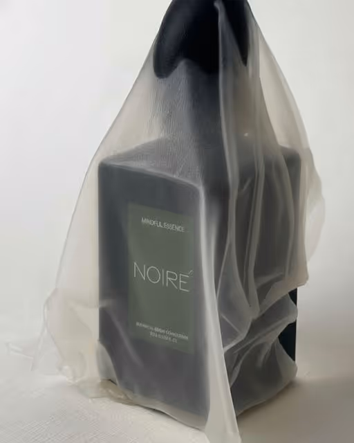
NOIRÉ is a study in quiet luxury — a language built on stillness, balance, and intent. It is a world where refinement takes the place of noise, and where the most meaningful expressions are the ones delivered in silence. NOIRÉ speaks softly yet with unmistakable precision; nothing is excessive, and nothing is left to chance. Every detail carries a purpose, and every decision reflects a deeper discipline.
At its core lies the pursuit of distilled simplicity, a process through which color, form, and texture are reduced to their purest, most essential essence. Within this reduction, honesty emerges: the grain of paper revealing its natural life, the weight of silence grounding the senses, the quiet rhythm formed when light and shadow meet. These elements are not embellishments; they are truths, revealed without alteration.
NOIRÉ is not about appearance, but presence. It is not created to impress at first glance, but to endure through time. It does not ask for attention; it lingers subtly, breathing with a calm, unwavering confidence. Each surface, each pause, each restrained gesture becomes a testament to clarity and control, a reflection of an inner stillness that defines its character.
This world is shaped by restraint — a reminder that true sophistication is not found in excess, but in precision. Restraint sharpens perception, allowing the smallest nuance to hold significance. Here, beauty is not loud; it is intentional, deliberate, and quietly powerful.
NOIRÉ exists for those who find meaning in the quiet, who understand the elegance of understatement, and who seek identity in permanence rather than spectacle. It is an invitation to slow down, to perceive the subtle layers beneath the surface, and to discover a form of luxury defined not by what is added, but by what is allowed to remain.
Luxury Branding
March 9, 2026
Fashion & Apparel
Packaging Design
Poster & Print
Merchandise
Stationery
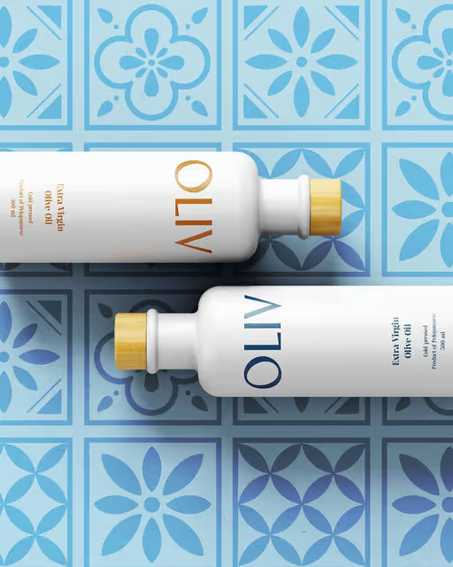
Cool Tones, Earthy Tones
Oliv is a modern olive oil brand blending tradition and design for conscious, style-driven home cooks worldwide. It is for young food lovers who value premium taste, minimal branding, and stylish kitchen essentials.
Olive Oil Branding
March 8, 2026
Food & Beverage
Home & Lifestyle
Label Design
Packaging Design
Merchandise
Poster & Print
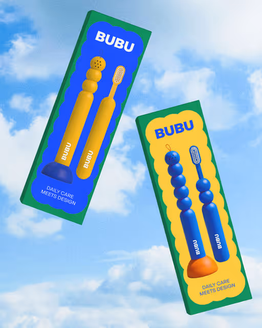
BUBU is a toothbrush designed to live out in the open, inspired by the shape of a candle. I realized how sad it is that toothbrushes always sit out in the open, screaming “bathroom tool”. I wanted to design something playful, something you could actually love seeing on your shelf. A simple holder and a small cap. Take the brush, pop off the cap, brush your teeth, put it back, and suddenly it’s gone. Invisible. Turns into bathroom decor without trying.
Toothbrush Branding
March 7, 2026
Beauty & Skincare
Home & Lifestyle
Packaging Design
Poster & Print
Merchandise
Label Design