Best Brand Designs and winner of the Brand of the Day Awards
Brand of the day
Thank you! Your submission has been received!
Oops! Something went wrong while submitting the form.
Showing 0 results out of 0 Brands of the Day.
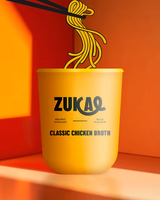

Bold Colors, Warm Tones
ZUKAE Instant Noodles pairs bold flavours with bold design. Illustration, 3D mockups, and a touch of realism combine with energetic photography and packaging to create a playful, multi-layered, visually striking brand.
Instant Food Branding
October 17, 2025
Food & Beverage
Packaging Design
Poster & Print
Label Design
Merchandise
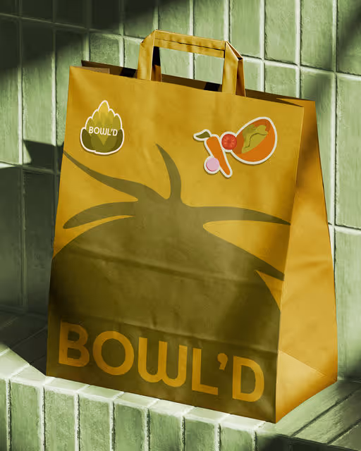

Earthy Tones, Pastel
Bowl'd is a modern salad bar that makes healthy food much more enjoyable!
Healthy Food Branding
October 16, 2025
Food & Beverage
Wellness & Health
Packaging Design
Poster & Print
Merchandise
Label Design


Earthy Tones, Dark Mode
Dear Lilith offers a bewitching range of make-up products designed to evoke the mysterious & alluring. Their cosmetics allow customers to explore their dark & enchanting side by creating looks that are perfect for any spooky or scary occasion.
make-up Branding
October 15, 2025
Beauty & Skincare
Label Design
Packaging Design
Merchandise
Poster & Print
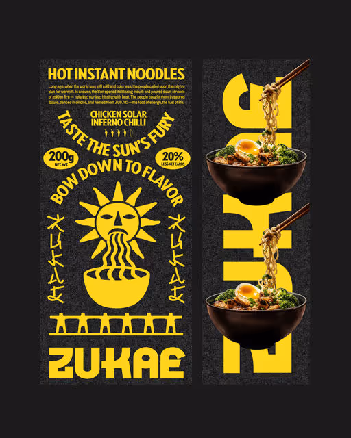

Bold Colors, Dark Mode
Long ago, when the world was still cold and colorless, the people called upon the mighty Sun for warmth. In answer, the Sun opened its blazing mouth and poured down strands of golden fire — twisting, curling, hissing with heat. The people caught them in sacred bowls, danced in circles, and named them ZUKAE — the food of energy, the fuel of life.
Instant Food Branding
October 14, 2025
Food & Beverage
Packaging Design
Poster & Print
Merchandise
Label Design
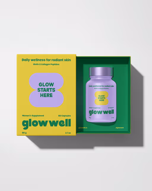
Bold Colors, Cool Tones
Glowwell is a women's wellness supplement designed to support pure, radiant skin for health conscious women who embrace self-care as part of their daily routine.
Supplement Branding
October 13, 2025
Wellness & Health
Beauty & Skincare
Packaging Design
Pastel, Warm Tones
MNCH is a modern sandwich spot redefining plant-based fast food. With a GOAT mascot, bold pink palette, and hand-drawn quirks, it makes veggie sandwiches feel cooler, quirkier, and the Greatest Of All Time.
Sandwich Branding
October 12, 2025
Food & Beverage
Merchandise
Packaging Design
Poster & Print
Business Cards

Earthy Tones, Warm Tones
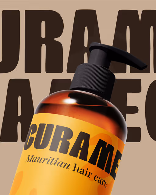
Introducing Curame, a Mauritian hair care brand offering serums, moisturising balms and leave-in treatments designed to nourish and protect dry or brittle hair.
The logo features a female silhouette whose hair merges with a Ghaf tree — a species of tree found in desert regions, capable of surviving extreme heat with very little water.
A powerful nod to women who want to take care of their hair despite dry and sensitive scalps.
Beauty & Health Branding
October 11, 2025
Beauty & Skincare
Packaging Design
Label Design
Poster & Print
Business Cards

Earthy Tones, Minimal / Monochrome
Still: a zero-waste beauty brand designed to bring calm, clarity, and conscious care into your routine. 🧴✨
We said “pause to cosmetic waste” and leaned into nature’s quiet honesty choosing recycled butter paper and frosted glass to reflect transparency and tranquility.
Our beauty kit is intentionally simple: a reusable glass container, refillable cream capsules, and a nozzle for ease. From moisturizers to toners and sunscreens all your essentials, minus the waste.
Sustainable. Refillable. Beautifully Still.
Skincare Branding
October 10, 2025
Beauty & Skincare
Packaging Design
Earthy Tones, Dark Mode
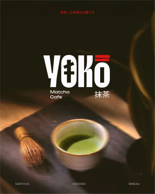
Yoko: A matcha needed break🍵
For Yoko, a modern matcha café, we set out to build more than just a brand. We crafted a pause button in the middle of a fast paced world.
Rooted in the spiritual calm of Japanese culture, Yoko blends traditional design elements like the bold symbolism of torii gates ⛩️, the softness of sakura pinks, and the grounded calm of matcha greens. The result is a brand that feels equal parts ritual and refresh.
The core idea is simple “A matcha needed break.” This became the narrative thread across the brand, from tone to textures, packaging to space design.
Yoko is not just a café. It is a peace offering in a cup. Every touchpoint, from the menu to the merchandise, invites customers to slow down, sip up, and reconnect even if just for a moment.
So tell us, do you want a matcha break?
Matcha Branding
October 9, 2025
Food & Beverage
Home & Lifestyle
Packaging Design
Poster & Print
Merchandise
Stationery

Earthy Tones, Minimal / Monochrome
Hey Yallah is a women-run, multi concept and community driven space serving specialty coffee and good vibes ☕🌿
For this project I designed a custom logotype that’s bold and geometric, with rounded edges that keep it friendly. The palette is inspired by the desert, built from warm earthy tones that feel grounded and natural. To top it off, the brand is brought to life with a cute little camel mascot. A tad clumsy but always with the best intentions, bringing coffee wherever it goes.
Together it creates a brand that feels confident, welcoming and just a touch cheeky.
Concept Store Branding
October 8, 2025
Food & Beverage
Merchandise
Poster & Print
Business Cards

Bold Colors, Warm Tones
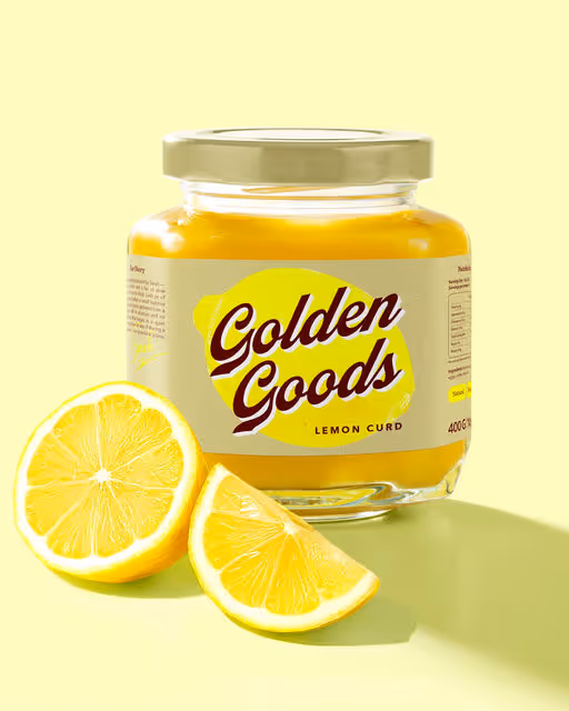
Golden Goods is a homemade lemon curd brand, born in a sunlit English kitchen of the 70s. Crafted in small batches, with wholesome ingredients and a generous spoonful of love.
The identity is inspired by English kitchen aesthetics and vintage pantry labels.
It feels retro, but with a modern twist — bringing the brand’s roots into today’s world.
The letter G in the logo hints at lemon curves, leaves, and the smooth flow of curd. The color palette — bright yellow, deep burgundy, and soft vanilla — sets a warm, appetizing mood and highlights the curd’s golden color. A vintage-style logo adds character, while textured illustrations give a homemade, personal feel. The packaging was created to let the product shine — using bold contrasts and cozy tones to make the curd stand out.
Every detail was crafted to capture a sunny moment — from the first glance to the last spoonful.
Food & Beverage Branding
October 7, 2025
Food & Beverage
Retail
Label Design
Packaging Design
Poster & Print
Business Cards


Earthy Tones, Warm Tones
Plant-based pops packed with nutty goodness – creamy, dreamy, and 100% guilt-free!
Food & Beverage Branding
October 6, 2025
Food & Beverage
Packaging Design
Cool Tones, Minimal / Monochrome
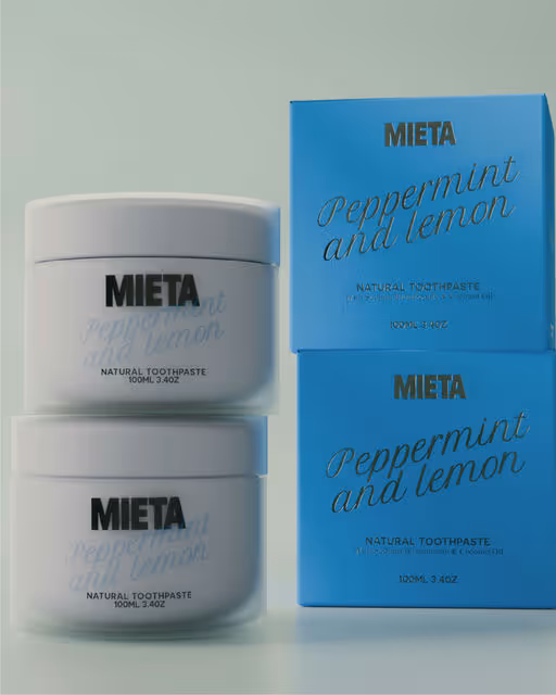
Mieta is a natural toothpaste brand transforming a simple daily ritual into an elevated experience.
Premium refillable packaging aims to elevate the everyday ritual of oral care, resulting in a brand that feels at home in any modern bathroom.
Toothpaste Branding
October 5, 2025
Beauty & Skincare
Packaging Design
Merchandise
Poster & Print
Cool Tones, Earthy Tones
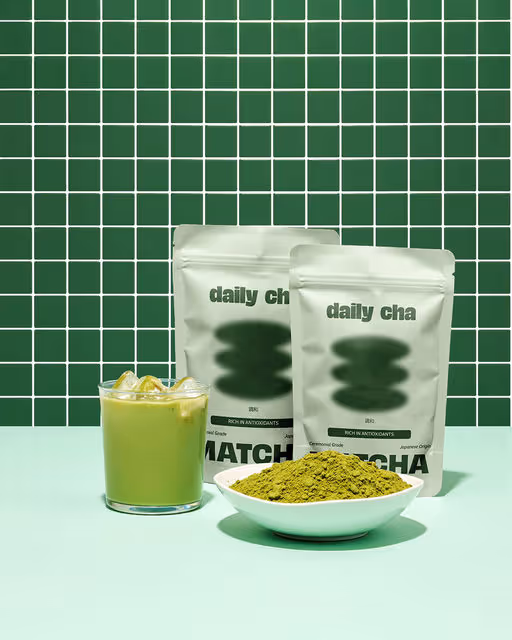
Daily Cha is a matcha café that serves authentic Japanese green tea made with ceremonial grade matcha. They focus on quality and simple preparation, whether you enjoy it as a traditional whisked tea or a smooth latte.
Matcha Branding
October 4, 2025
Food & Beverage
Packaging Design
Website Design

Dark Mode, Minimal / Monochrome
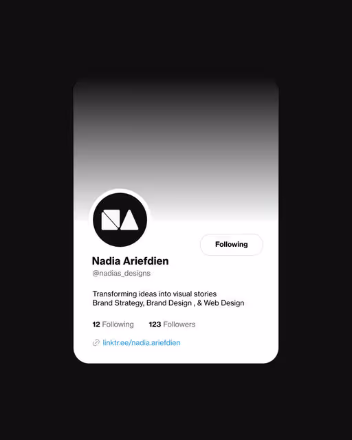
For my personal brand, I created a cohesive visual identity, website, social media designs, and print stationery designs (business cards, letterheads, contracts, etc.). My aim was to create a professional visual style that is characterized by a minimalist aesthetic, classic sans-serif typefaces, and a simple monochrome color palette. My goal for this project was to create a visual style that represents the unique blend of creativity and meticulous attention to detail that characterizes my work.
Agency Brand Identity
October 3, 2025
Retail
Business Cards
Label Design
Packaging Design
Stationery
Pastel, Minimal / Monochrome
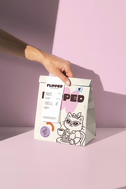
FLIPPED 🥞- the modern pancake house
Flipped is the kind of café that makes you want to slow down. The smell of fresh coffee, pancakes flipping on the griddle, that comforting clink of cups — it’s breakfast all day and good mood guaranteed.
Pancake Branding
October 2, 2025
Food & Beverage
Packaging Design
Poster & Print
Merchandise
Business Cards

Bold Colors, Neon / Vibrant
Baya Baya is an açaí bowl brand serving tropical, fresh, post-gym fuel vibes 🥣💜. Instead of type-first, we went symbolic: a bowl with milk spilling—playful, bold, and instantly memorable. Wrapped in cobalt blue + orange, it’s all things fresh, zesty, and yum. And the tagline? “Baya self a bowl of happiness” 🥄—pun absolutely intended 😉.
Açaí Bowl Branding
October 1, 2025
Food & Beverage
Merchandise
Packaging Design
Poster & Print
Label Design

Pastel, Bold Colors
The Wellsomnia project is a startup aiming to support mental wellness and growth of young women. The brand offers journals, workbooks and trackers that help them become more self-aware, find a way to regulate emotions and energy levels.
The concept of identity is based on the idea of finding an internal balance. The variety of forms of the visual concept symbolize the uniqueness of each person and resemble the letters of the brand name. The semicircle highlights the search for balance of emotions and sensations, which is common to all seekers of wellness.
The logomark is an abstract embodiment of the first letter of the brand name "W" and reflects the very essence of its mission — to help a person in their self-discovery and achieving internal balance. The lower part of the sign balances and supports the semicircle, which symbolizes the swings of emotions and inner energy.
The softness of the graphics creates a feeling of friendliness and comfort, that helps to be open to self-discovery. In their turn, bright contrasts and playfulness of identity awaken curiosity. The Wellsomnia brand gives energy and comfort to take small steps towards inner balance every day.
Elevate your wellness with Wellsomnia.
Beauty & Health Branding
September 30, 2025
Wellness & Health
Interface Design
Poster & Print
Packaging Design
Merchandise
Cool Tones, Minimal / Monochrome
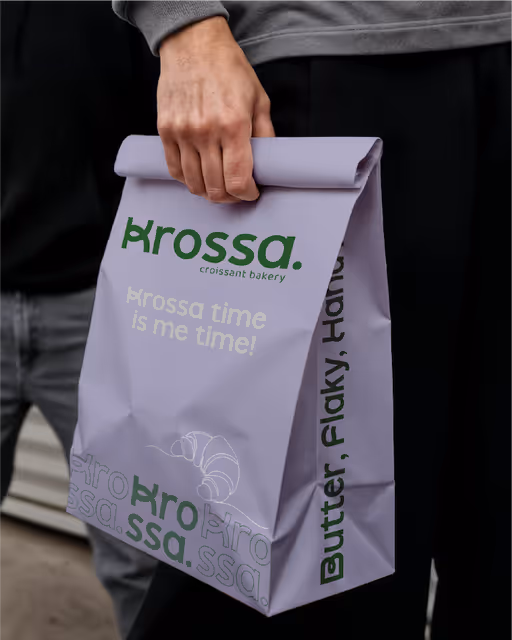
Say hello to Krossa — where every layer tells a story. Buttery, flaky, and freshly branded.✨🥐 Branding done with extra love (and zero crumbs).
Bakery Branding
September 29, 2025
Food & Beverage
Packaging Design
Poster & Print
Business Cards


Bold Colors, Dark Mode
Born in the back alleys of rebellion, Bunzo's Burgers are proudly messy, unapologetically greasy, and dangerously delicious. We embrace the chaos. We pile it high, melt it messy, and make every burger an edible riot.
Burger Branding
September 28, 2025
Food & Beverage
Packaging Design
Merchandise
Poster & Print
Label Design
Pastel, Minimal / Monochrome
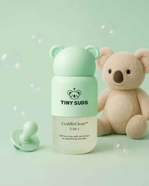
Tiny Suds is a design-led baby care brand that blends playful character with premium simplicity. Through strategic identity, packaging, and tone of voice, it reframes baby skincare as cosy, elevated, and emotionally resonant.
Beauty & Health Brand Identity
September 27, 2025
Beauty & Skincare
Packaging Design
Label Design
Poster & Print
Merchandise

Cool Tones, Pastel
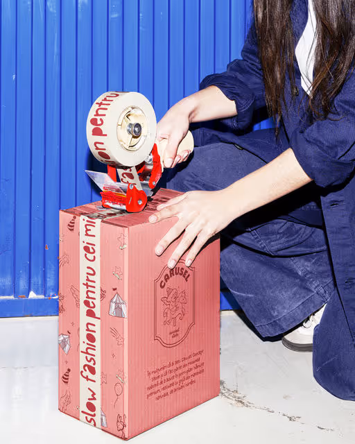
CARUSEL Concept Store is a premium kids’ boutique offering sustainable, Romanian-made clothing and accessories. Inspired by the magic of childhood, it blends playful design with natural fabrics, creating joyful, timeless pieces parents can trust.
Kids Boutique Branding
September 26, 2025
Fashion & Apparel
Packaging Design
Poster & Print
Merchandise
Label Design

Earthy Tones, Minimal / Monochrome
Sunwhip was created to give the sun kissed glow, without any sun damage. Bonus points - looks great on the skincare shelf too.
Sunscreen Branding
September 25, 2025
Beauty & Skincare
Packaging Design
Merchandise
Poster & Print
Website Design
Cool Tones, Dark Mode
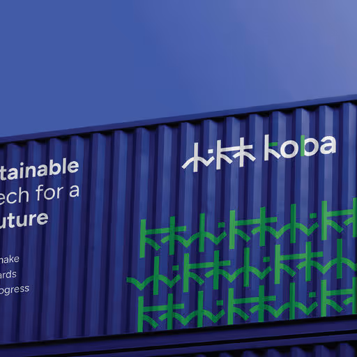
KōBA (KOBA Textile), a concept brand by @sold_designstudio, pioneers eco-sustainable fabric technology, drawing inspiration from Kyoto’s majestic forests & mountains. It blends Japan’s reverence for nature with global manufacturing needs, delivering innovative woven solutions & world-class craftsmanship while championing eco-responsibility.
Technology Branding
September 24, 2025
Fashion & Apparel
Poster & Print
Packaging Design
Merchandise
Business Cards
Earthy Tones, Warm Tones
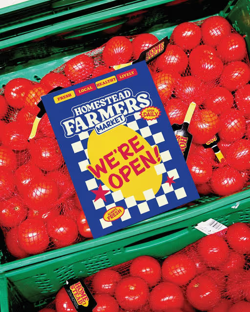
Homestead Farmers Market brings back the good ol' farmstand spirit — local, lively, and full of heart. Homestead celebrates fresh produce, homemade goods, and the simple pleasures of farm life. It's a place where baskets overflow, neighbors gathers, and the farm feels like home.
Farmers Market Branding
September 23, 2025
Food & Beverage
Label Design
Packaging Design
Poster & Print
Merchandise
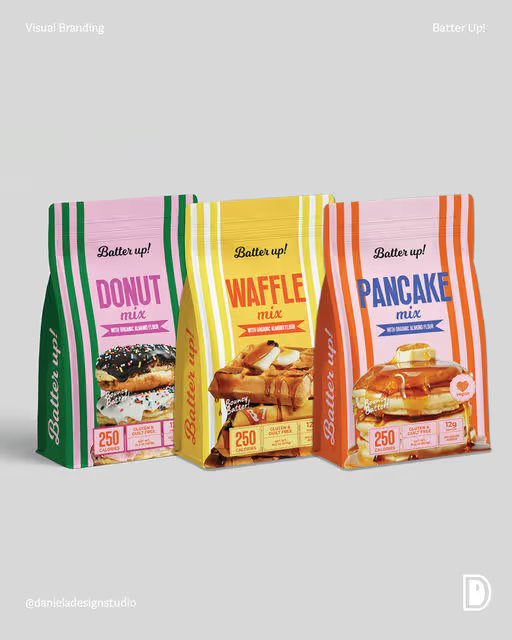
Bold Colors, Warm Tones
Stacks, squares, or circles? 🥞🧇🍩 We designed the Batter Up! trio to make breakfast feel like a game —each with playful vibes that pop off the shelf.
Breakfast Branding
September 22, 2025
Food & Beverage
Packaging Design


Dark Mode, Minimal / Monochrome
Sando is a Japanese-American sandwich shop blending rich cultural flavors with modern minimalist visuals. The main inspiration for this creative direction was Japanese precision and minimal architecture.
Sandwich Shop Branding
September 21, 2025
Food & Beverage
Packaging Design
Poster & Print
Merchandise
Label Design
Dark Mode, Warm Tones
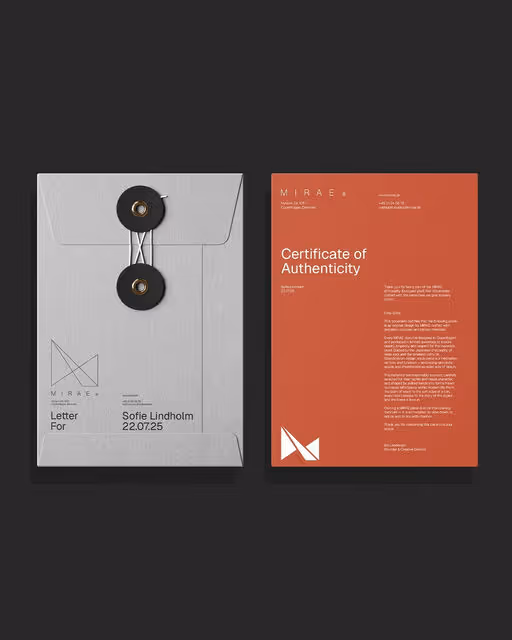
Mirae is a Danish design studio crafting the interiors of tomorrow. Rooted in the rich traditions of European craftsmanship, we blend clean, functional Scandinavian design with the refined minimalism of Japanese aesthetics.
Interior Branding
September 20, 2025
Home & Lifestyle
Business Cards
Packaging Design
Poster & Print
Stationery