Key Details
Commercial use for one business is included. The brand may not be resold or redistributed.
You’ll receive the complete brand kit as editable source files, including a mini visual brand guideline (PDF).
This brand kit can be adapted within a defined scope. Up to 2 revision rounds are included after the initial setup.
Once the purchase is confirmed, delivery usually takes 7–14 business days, depending on the requested adjustments.

Abubakr.design
WBDS Silver Student Award Winner 2025/26 | Graphic Design BA Hons Student | Freelance Brand Identity & Packaging Designer | Professional Gold ODA 2025 Q1 x2 Winner | London, UK 📍
Profil on Braaands™Frequently Asked Questions
The core visual concept and structure of the brand remain unchanged.
These changes adapt the brand to your business without redesigning it from scratch.
If everything matches, you’ll receive a checkout link from Braaands™ to confirm the purchase.
The full amount is secured until the brand is finalized.
At checkout, you’ll also have the option to add additional packages such as business cards or packaging design.
Payment only happens once everything is confirmed.
Resale or redistribution is not permitted.
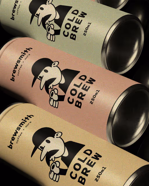
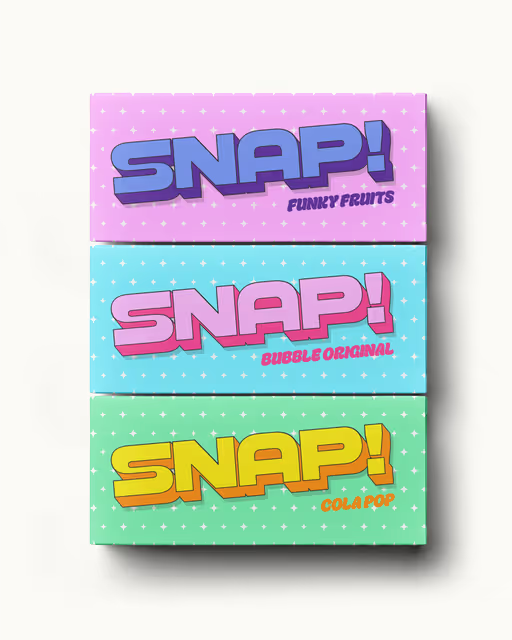
Sweets
Snap is a new Swiss chocolate brand that offers delicious and playful chocolate treats for kids. Their goal is to create positive associations for chocolate with children, making it an adventure for the senses. They also want to build strong brand loyalty. For my design of the brand, I decided to create an identity tied around the word 'adventure' from the brief. I avoided using lots of chocolate brown colors and instead used more forest orange and green colors, linking towards the ideas of kids having fun adventures in the forest, kinda like when we used to go camping as kids. I created a logomark with a lightning shape formed in the logotype to symbolise the idea of 'creating a spark for adventure with chocolate. Finally, with areas such as the brand touchpoints, I not only focused on exploring consistency of the visual identity, but I also explored unique ways to build brand loyalty. Two ways I achieved this were through packaging and app design. For the packaging, I created a section that included a special offer for amusement parks like Chessington (like how Kellogg cereal boxes do it), as a fun way for kids to 'unlock their next adventure'. and finally for the app design, I create a playfully-styled rewards program where kids could scan every time they buy the product, and once they buy enough, they can win rewards such as free chocolate, special discounts and more!