Brand Identity Showcase
Nominees
Thank you! Your submission has been received!
Oops! Something went wrong while submitting the form.
Showing you 0 of 0 Nominees

Brand for Sale
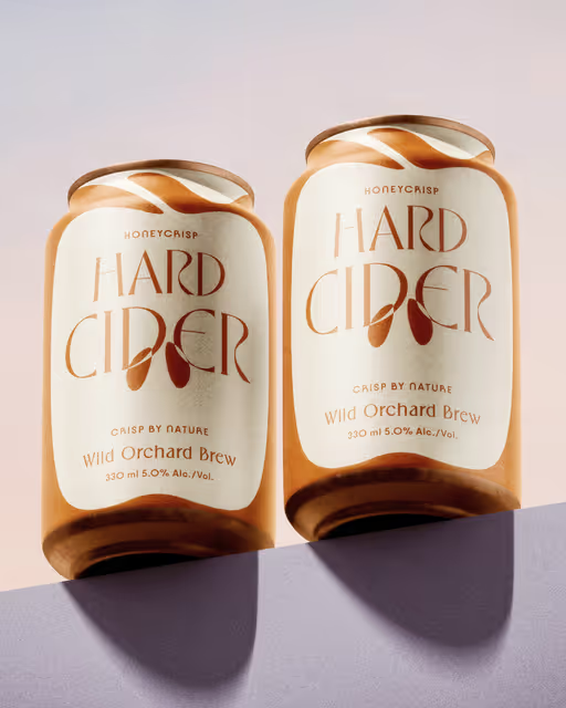
Wild Orchard Brew celebrates everything we love about cider. Crisp apples, easy moments, and a little touch of nature in every can.
Cider Branding
Earthy Tones, Minimal / Monochrome
Packaging Design
Label Design
Merchandise
Poster & Print
Food & Beverage


Brand for Sale
Dear Lilith offers a bewitching range of make-up products designed to evoke the mysterious & alluring. Their cosmetics allow customers to explore their dark & enchanting side by creating looks that are perfect for any spooky or scary occasion.
make-up Branding
Earthy Tones, Dark Mode
Label Design
Packaging Design
Merchandise
Poster & Print
Beauty & Skincare
Brand for Sale
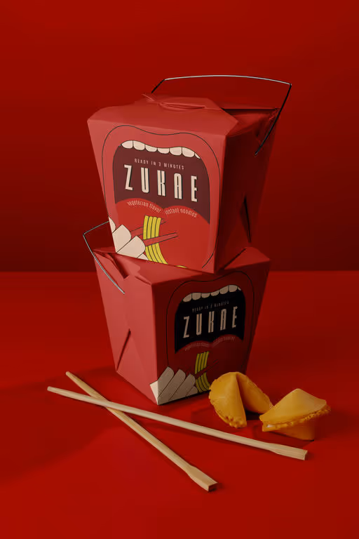
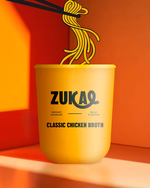
Zukae is the instant noodle brand made for quick breaks and unstoppable cravings. Our mascot is the mouth—because while every tongue has its own taste, Zukae is the one flavor that satisfies them all.
Instant Food Branding
Bold Colors, Warm Tones
Packaging Design
Merchandise
Poster & Print
Business Cards
Food & Beverage

Brand for Sale
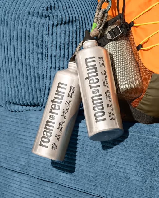
Roam & Return is a purpose-driven outdoor gear and apparel brand for eco-conscious explorers.
This brief honors U.S. national parks, which face growing threats, from privatization and drilling to budget cuts and intensifying wildfires, driven by weakened protections and increased resource extraction.
Outdoor Gear Branding
Bold Colors, Cool Tones
Merchandise
Label Design
Packaging Design
Poster & Print
Fashion & Apparel

Brand for Sale
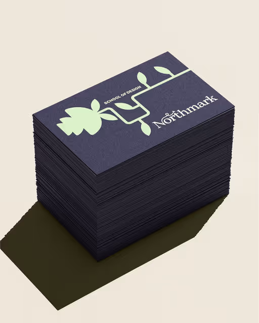
Brand identity concept for Northmark School of Design based in Manchester. My aim was to blend timeless craft with contemporary vision.
At the core, the logo balances classic elegance with a forward-thinking spirit.
The illustration style: botanical meets machine, an organic “robot-plant” form that embodies how creativity truly thrives and evolves in the urban landscape.
From the primary logo and 'N' monogram to the posters and custom merch featuring the signature illustrations, every element is crafted to stand out and spark curiosity.
School Branding
Earthy Tones, Cool Tones
Business Cards
Poster & Print
Merchandise
Stationery
Fashion & Apparel

Brand for Sale
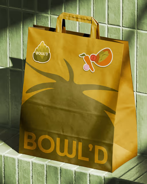
Bowl'd is a modern salad bar that makes healthy food much more enjoyable!
Healthy Food Branding
Earthy Tones, Pastel
Packaging Design
Poster & Print
Merchandise
Label Design
Food & Beverage
Wellness & Health

Brand for Sale
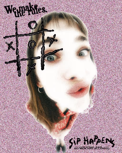
Sip Happens is a cocktail bar for free, unapologetic women. It’s the place where life’s little chaos meets big laughs, stronger drinks and best friends.
It’s moody, sarcastic, and fun — a space that feels like you own it.
And ofc, no men are allowed. Unless they’re serving the f drinks.
The logo is made by me in Procreate. I wanted to convey the idea of texting when you are drunk, you can’t see the letters properly. That’s why the logo is not straight.
Also, the letters are made to look like liquid.
The colours and the overall mood are punkish style but with a feminine touch.
Cocktail Bar Branding
Bold Colors, Warm Tones
Poster & Print
Merchandise
Packaging Design
Label Design
Hospitality
Events & Festivals

Brand for Sale
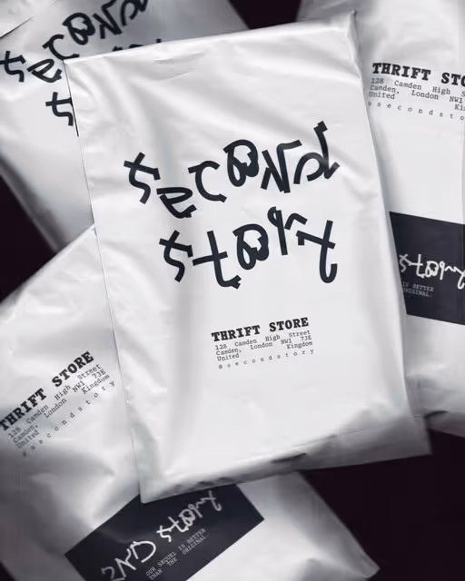
Second Story reimagines thrift as an editorial experience — bold, surreal, and playful. Clothes are staged like delicacies, paired with witty lines like “Our sequel is better than the original.” Fashion gets a sequel, and sustainability gets style.
Second Hand Fashion Branding
Dark Mode, Warm Tones
Merchandise
Packaging Design
Poster & Print
Business Cards
Fashion & Apparel
Brand for Sale
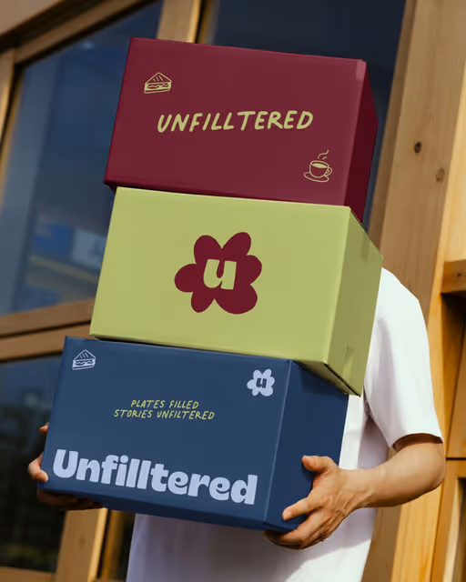
Unfilltered café is all about warm vibes, witty charm, and effortlessly premium feels. It's designed to be the neighborhood spot where real conversations meet bold flavors.
Coffee Shop Branding
Bold Colors, Cool Tones
Packaging Design
Merchandise
Poster & Print
Business Cards
Food & Beverage
Brand for Sale
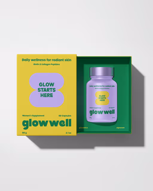
Glowwell is a women's wellness supplement designed to support pure, radiant skin for health conscious women who embrace self-care as part of their daily routine.
Supplement Branding
Bold Colors, Cool Tones
Packaging Design
Wellness & Health
Beauty & Skincare

Brand for Sale
Yiru is an e-commerce premium matcha brand built around authenticity, quality, and emotional connection.
Matcha Branding
Earthy Tones, Warm Tones
Poster & Print
Packaging Design
Label Design
Business Cards
Food & Beverage
Retail
Brand for Sale
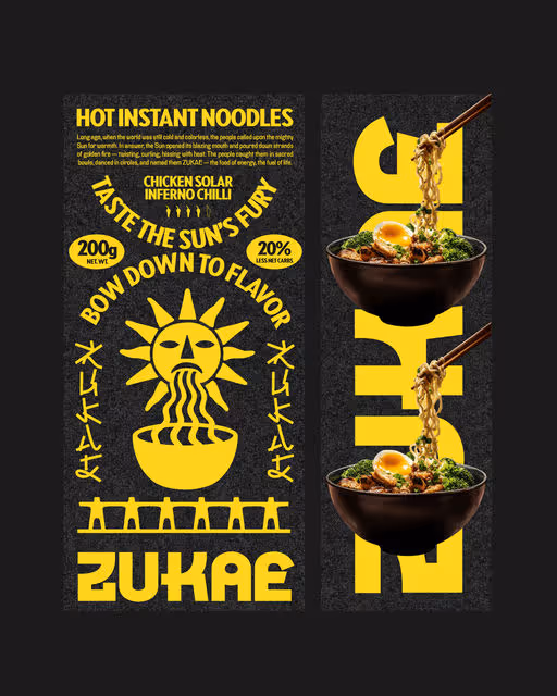
Long ago, when the world was still cold and colorless, the people called upon the mighty Sun for warmth. In answer, the Sun opened its blazing mouth and poured down strands of golden fire — twisting, curling, hissing with heat. The people caught them in sacred bowls, danced in circles, and named them ZUKAE — the food of energy, the fuel of life.
Instant Food Branding
Bold Colors, Dark Mode
Packaging Design
Poster & Print
Merchandise
Label Design
Food & Beverage
Brand for Sale
Zukae is an instant noodle brand made for late nights, quick breaks, and cravings. It’s food that fits your pace, hot, salty, and always delicious.
Instant Food Branding
Bold Colors, Warm Tones
Packaging Design
Poster & Print
Merchandise
Business Cards
Food & Beverage
Brand for Sale
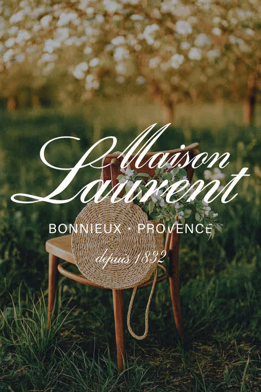
Maison Laurent is a boutique countryside retreat in Provence. The brand was crafted to evoke timeless elegance, warmth, and intention, aligning with values of slow living and refined simplicity.
Boutique Branding
Earthy Tones, Minimal / Monochrome
Business Cards
Merchandise
Poster & Print
Hospitality

Brand for Sale
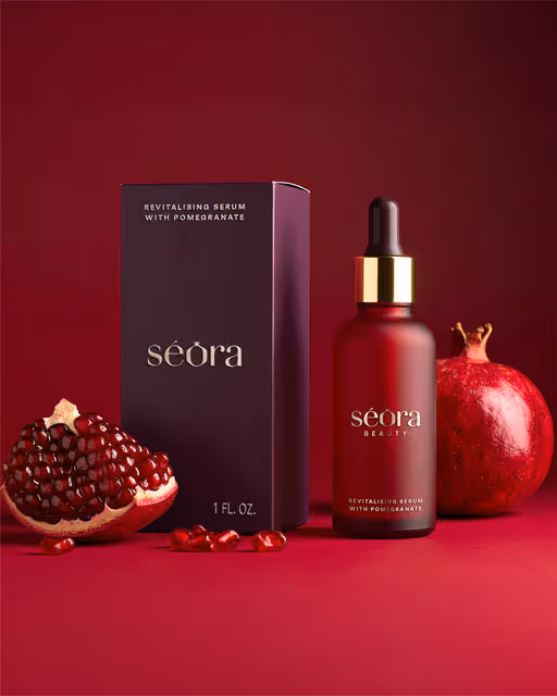
Séora Beauty is a luxury brand inspired by the pomegranate, where deep crimson tones, sculptural typography, and handcrafted elegance blend with sensual storytelling to create a bold, refined, and memorable beauty experience.
Skincare Branding
Bold Colors, Warm Tones
Packaging Design
Poster & Print
Merchandise
Label Design
Beauty & Skincare
Brand for Sale
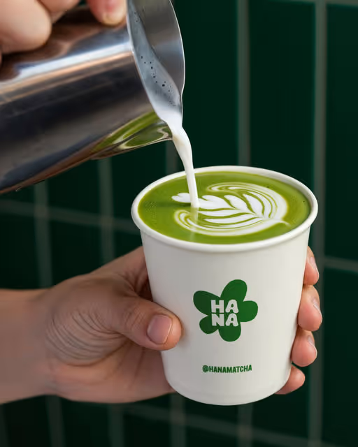
Hana is a premium and playful matcha bar bringing you the finest Japanese matcha in fun, modern ways 🍃
Matcha Branding
Earthy Tones, Pastel
Merchandise
Packaging Design
Business Cards
Poster & Print
Food & Beverage
Hospitality

Brand for Sale
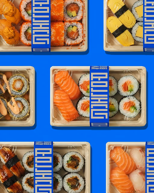
Rolling Nori is a contemporary sushi-to-go brand. Our bold blue identity blends tradition with a modern edge. It’s not just sushi — it’s sushi designed for today’s fast-paced lifestyle: vibrant, convenient, and unapologetically recognizable.
Sushi Branding
Bold Colors, Cool Tones
Packaging Design
Poster & Print
Business Cards
Label Design
Food & Beverage
Brand for Sale
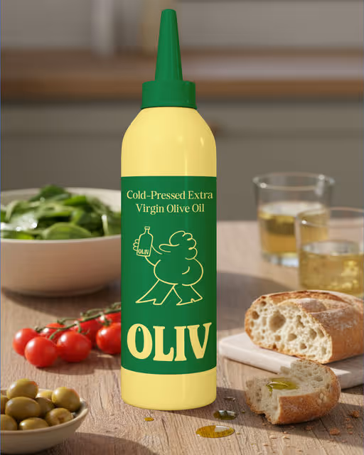
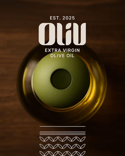
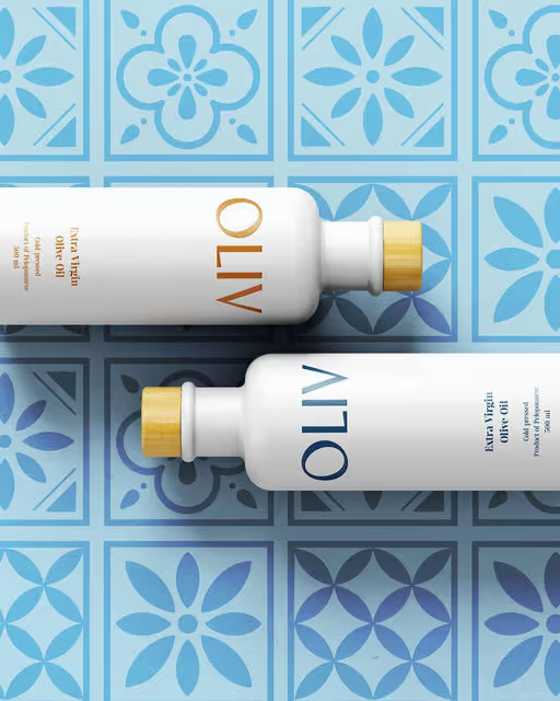
Oliv is a sleek olive oil brand bringing minimal design, Mediterranean roots, and modern lifestyle appeal into everyday kitchens.
Olive Oil Branding
Earthy Tones, Bold Colors
Packaging Design
Label Design
Poster & Print
Merchandise
Food & Beverage
Home & Lifestyle
Brand for Sale
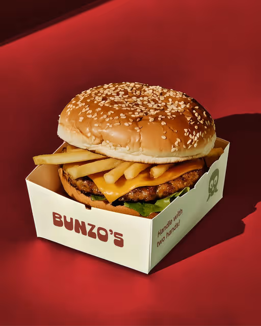
Bunzo’s is a burger joint that keeps it real, big buns, juicy patties, and just the right amount of attitude.
Burger Branding
Bold Colors, Warm Tones
Packaging Design
Poster & Print
Merchandise
Business Cards
Food & Beverage
Brand for Sale
Oliv is a redefined olive oil brand for the modern kitchen. Minimal packaging, a logo inspired by the olive pit, and thoughtful design make every meal feel elevated, turning cooking into a stylish, everyday experience.
Olive Oil Branding
Earthy Tones, Minimal / Monochrome
Packaging Design
Label Design
Poster & Print
Business Cards
Food & Beverage

Brand for Sale
Nalu, a modern yoga and pilates brand, uses a calming yet energising palette and a signature orb gradient to represent core strength, flow, and balance, paired with a clean logo suite across apparel, packaging, and digital.
Yoga Branding
Earthy Tones, Warm Tones
Merchandise
Packaging Design
Label Design
Poster & Print
Fashion & Apparel
Brand for Sale
MNCH is a modern sandwich spot redefining plant-based fast food. With a GOAT mascot, bold pink palette, and hand-drawn quirks, it makes veggie sandwiches feel cooler, quirkier, and the Greatest Of All Time.
Sandwich Branding
Pastel, Warm Tones
Merchandise
Packaging Design
Poster & Print
Business Cards
Food & Beverage
Brand for Sale
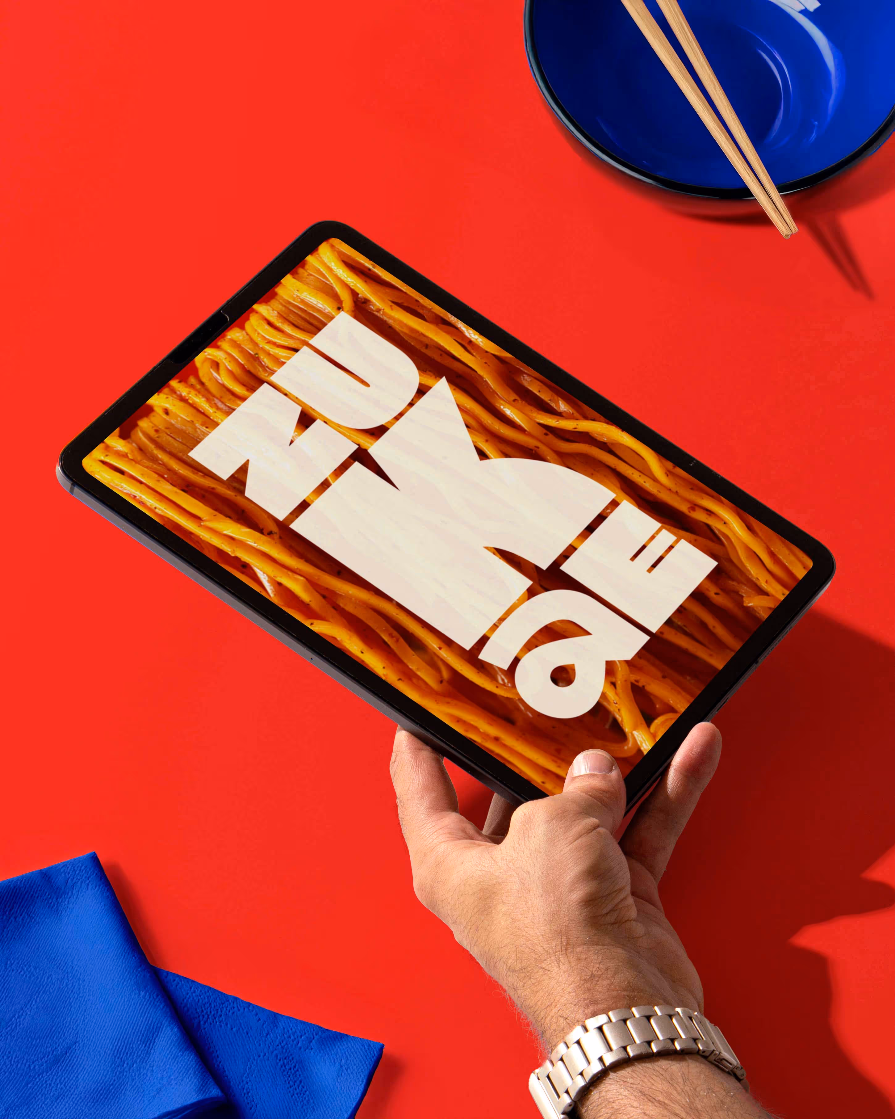
ZUKAE Instant Noodles pairs bold flavours with bold design. Illustration, 3D mockups, and a touch of realism combine with energetic photography and packaging to create a playful, multi-layered, visually striking brand.
Instant Food Branding
Bold Colors, Warm Tones
Packaging Design
Poster & Print
Label Design
Merchandise
Food & Beverage
Brand for Sale
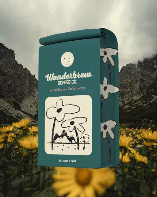
Crafting the Wanderbrew Coffee Co. brand was about bringing a passion for great coffee and adventure to life. It tells a visual story of authentic journeys, connecting artisan quality with a genuine, inviting feel.
Coffee Branding
Earthy Tones, Cool Tones
Label Design
Packaging Design
Merchandise
Poster & Print
Food & Beverage

Brand for Sale
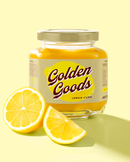
Golden Goods is a homemade lemon curd brand, born in a sunlit English kitchen of the 70s. Crafted in small batches, with wholesome ingredients and a generous spoonful of love.
The identity is inspired by English kitchen aesthetics and vintage pantry labels.
It feels retro, but with a modern twist — bringing the brand’s roots into today’s world.
The letter G in the logo hints at lemon curves, leaves, and the smooth flow of curd. The color palette — bright yellow, deep burgundy, and soft vanilla — sets a warm, appetizing mood and highlights the curd’s golden color. A vintage-style logo adds character, while textured illustrations give a homemade, personal feel. The packaging was created to let the product shine — using bold contrasts and cozy tones to make the curd stand out.
Every detail was crafted to capture a sunny moment — from the first glance to the last spoonful.
Food & Beverage Branding
Bold Colors, Warm Tones
Label Design
Packaging Design
Poster & Print
Business Cards
Food & Beverage
Retail


Brand for Sale
Plant-based pops packed with nutty goodness – creamy, dreamy, and 100% guilt-free!
Food & Beverage Branding
Earthy Tones, Warm Tones
Packaging Design
Food & Beverage

Brand for Sale
The Wellsomnia project is a startup aiming to support mental wellness and growth of young women. The brand offers journals, workbooks and trackers that help them become more self-aware, find a way to regulate emotions and energy levels.
The concept of identity is based on the idea of finding an internal balance. The variety of forms of the visual concept symbolize the uniqueness of each person and resemble the letters of the brand name. The semicircle highlights the search for balance of emotions and sensations, which is common to all seekers of wellness.
The logomark is an abstract embodiment of the first letter of the brand name "W" and reflects the very essence of its mission — to help a person in their self-discovery and achieving internal balance. The lower part of the sign balances and supports the semicircle, which symbolizes the swings of emotions and inner energy.
The softness of the graphics creates a feeling of friendliness and comfort, that helps to be open to self-discovery. In their turn, bright contrasts and playfulness of identity awaken curiosity. The Wellsomnia brand gives energy and comfort to take small steps towards inner balance every day.
Elevate your wellness with Wellsomnia.
Beauty & Health Branding
Pastel, Bold Colors
Interface Design
Poster & Print
Packaging Design
Merchandise
Wellness & Health

Brand for Sale
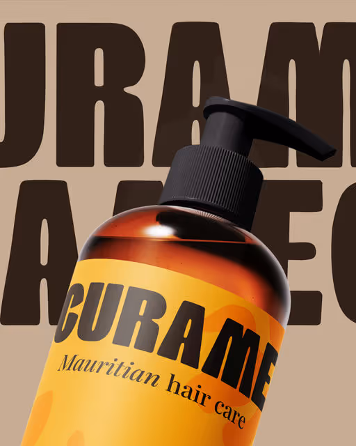
Introducing Curame, a Mauritian hair care brand offering serums, moisturising balms and leave-in treatments designed to nourish and protect dry or brittle hair.
The logo features a female silhouette whose hair merges with a Ghaf tree — a species of tree found in desert regions, capable of surviving extreme heat with very little water.
A powerful nod to women who want to take care of their hair despite dry and sensitive scalps.
Beauty & Health Branding
Earthy Tones, Warm Tones
Packaging Design
Label Design
Poster & Print
Business Cards
Beauty & Skincare

Brand for Sale
this is the logo design for Romaya Law, a Vancouver-Canada based law firm.
They help people with family issues, real estate, businesses, immigration, and planning for the future. I wanted the identity to feel trustworthy, clear, and strong.
After many ideas—from symbols of justice to bold twists—this monogram captures Romaya Law’s character: Modern, Sophisticated & Professional.
Business Branding
Dark Mode, Minimal / Monochrome
Business Cards
Poster & Print
Stationery
Packaging Design
Real Estate

Brand for Sale
Hey Yallah is a women-run, multi concept and community driven space serving specialty coffee and good vibes ☕🌿
For this project I designed a custom logotype that’s bold and geometric, with rounded edges that keep it friendly. The palette is inspired by the desert, built from warm earthy tones that feel grounded and natural. To top it off, the brand is brought to life with a cute little camel mascot. A tad clumsy but always with the best intentions, bringing coffee wherever it goes.
Together it creates a brand that feels confident, welcoming and just a touch cheeky.
Concept Store Branding
Earthy Tones, Minimal / Monochrome
Merchandise
Poster & Print
Business Cards
Food & Beverage
Brand for Sale
Oliv is a modern olive oil brand blending tradition and design for conscious, style-driven home cooks worldwide. It is for young food lovers who value premium taste, minimal branding, and stylish kitchen essentials.
Olive Oil Branding
Cool Tones, Earthy Tones
Label Design
Packaging Design
Merchandise
Poster & Print
Food & Beverage
Home & Lifestyle
Brand for Sale
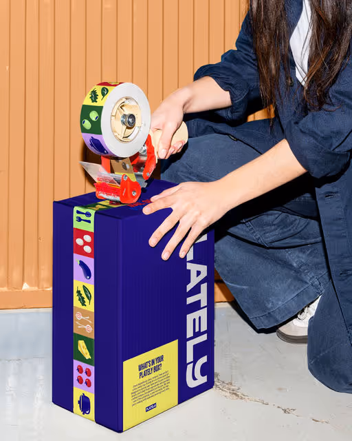
Plately is a meal kit subscription service that brings fresh ingredients and easy recipes straight to your door. More than just ingredients, they deliver the whole experience. Plately’s mission is simple: to make food ordering effortless and to turn cooking into something light, fun, and enjoyable. Everyday meals become a playful activity, not a routine.
The brand identity is built around the cooking process itself. Just as different ingredients combine to create a dish, Plately’s visual blocks come together in multiple ways. One ingredient can lead to many meals, and the same principle works for the brand’s flexible, modular design system.
A clear grid provides structure, while bold illustrations and vibrant colors add energy and joy, just like following a recipe and enjoying the process. Each illustration keeps the brand recognizable and memorable, seamlessly adapting across packaging, marketing, and digital touchpoints.
Make Your Dinner Click.
Food & Beverage Branding
Bold Colors, Cool Tones
Packaging Design
Label Design
Poster & Print
Merchandise
Food & Beverage

Brand for Sale
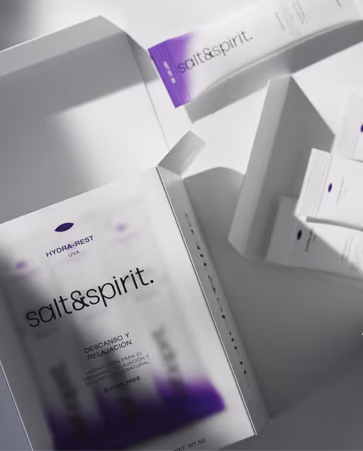
Salt&spirit is more than electrolytes, it’s hydration with spirit. Designed with a bold yet minimal identity, the brand reflects purity, functionality, and modern wellness. A fresh, confident, and intentional ritual for body, mind, and spirit.
Beauty & Health Branding
Minimal / Monochrome, Bold Colors
Packaging Design
Label Design
Merchandise
Poster & Print
Wellness & Health
Brand for Sale
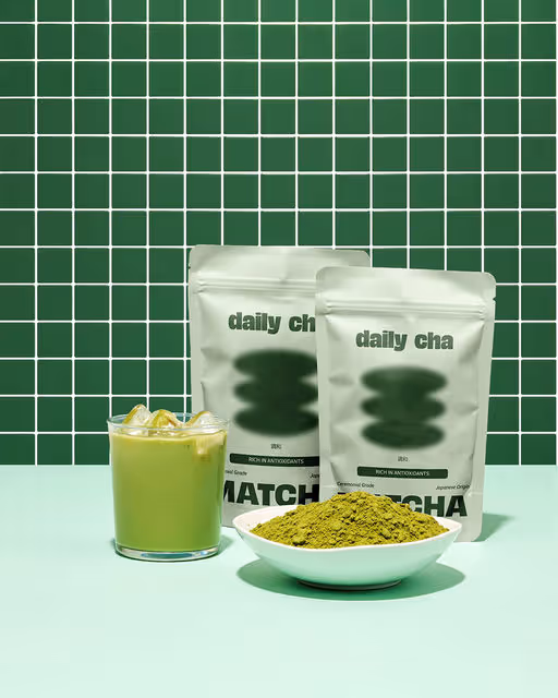
Daily Cha is a matcha café that serves authentic Japanese green tea made with ceremonial grade matcha. They focus on quality and simple preparation, whether you enjoy it as a traditional whisked tea or a smooth latte.
Matcha Branding
Cool Tones, Earthy Tones
Packaging Design
Website Design
Food & Beverage
Brand for Sale
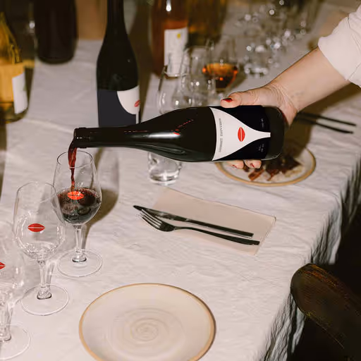
Red Whisper was born from the idea that the strongest voices are often the quietest. A whisper carries subtle power — and that became the core of the concept. The identity combines bold red with minimalist forms, balancing energy and elegance. Pictograms inspired by female silhouettes and social space create a visual language that feels both intimate and powerful.
The wines at our house may come in bottles that look familiar, but each one carries a story . Our wine bar has always been a space created by women, for women, where every flavor is approachable and every detail feels personal. No matter your taste—whether bold and strong, light and playful, or something in between—there’s a bottle here that reflects you.
Step inside, and you’ll find more than just wine: you’ll find connection, conversation, and a community that toasts to women everywhere.of strength, elegance, and individuality—just like the women we celebrate. Every pour is thoughtfully chosen to highlight the richness, diversity, and character that make each woman’s journey unique.
Wine Branding
Bold Colors, Dark Mode
Label Design
Merchandise
Packaging Design
Poster & Print
Food & Beverage
Hospitality

Brand for Sale
American diner nostalgia, but make it bold and modern🔥🍔
Meet Bunzo’s, celebrating big buns, juicy patties and cheeky branding.
Burger Restaurant Branding
Bold Colors, Warm Tones
Packaging Design
Poster & Print
Merchandise
Label Design
Food & Beverage