Brand Identity Showcase
Nominees
Thank you! Your submission has been received!
Oops! Something went wrong while submitting the form.
Showing you 0 of 0 Nominees

Brand for Sale
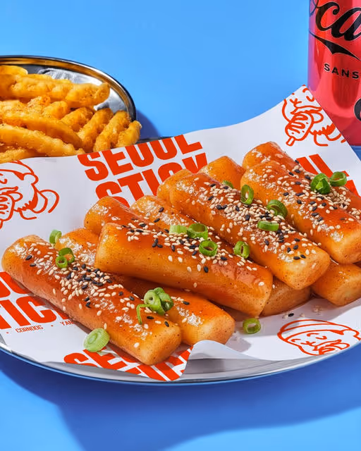
Seoul Stick is a bold Korean street-food corn dogs brand born in Queens, NY. It is a love letter to Seoul's bustling food alleys and New York's restless street corners. Seoul Stick delivers fast, fiery, and unapologetically indulgent street eats. It is a visual declaration of culture clash.
Street Food Branding
Bold Colors, Warm Tones
Packaging Design
Merchandise
Poster & Print
Label Design
Food & Beverage

Brand for Sale
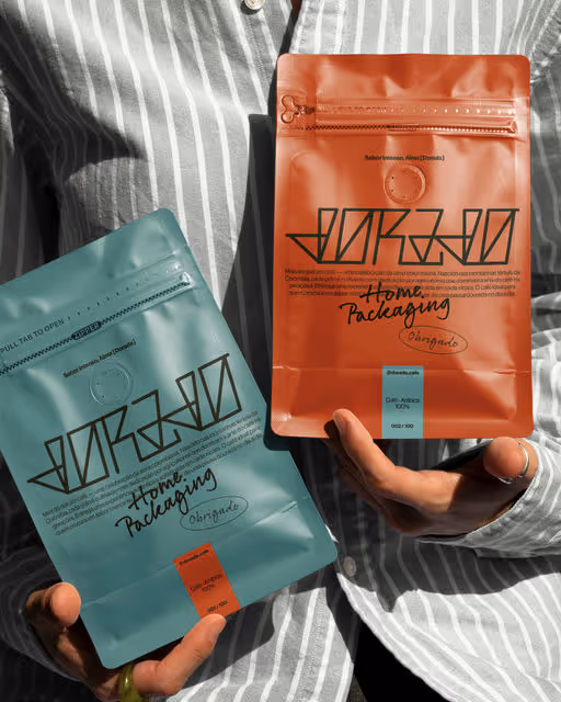
Dorado, which means “golden,” offers high-quality Colombian coffee with a rich flavor, sourced from the best coffee-growing regions in Colombia.
This branding project was inspired by the essence of Colombian tradition—the warmth of its people, the richness of its land, and the golden heritage behind every bean.
Coffee Branding
Cool Tones, Earthy Tones
Packaging Design
Merchandise
Poster & Print
Social Media Kit
Food & Beverage

Brand for Sale
Muld is a refined, sensory-driven brand that transforms the age-old tradition of mulled wine into a contemporary ritual of warmth and reflection. Its design, rich and tactile, evokes craftsmanship, depth, and seasonal nostalgia. Muld aims to communicate a story of nature's rhythm and quiet indulgence. Muld isn't just a beverage; its an experience — grounded, poetic, and timeless, inviting you to slow down and savor the season.
Beverage Branding
Earthy Tones, Minimal / Monochrome
Merchandise
Poster & Print
Packaging Design
Label Design
Food & Beverage

Brand for Sale
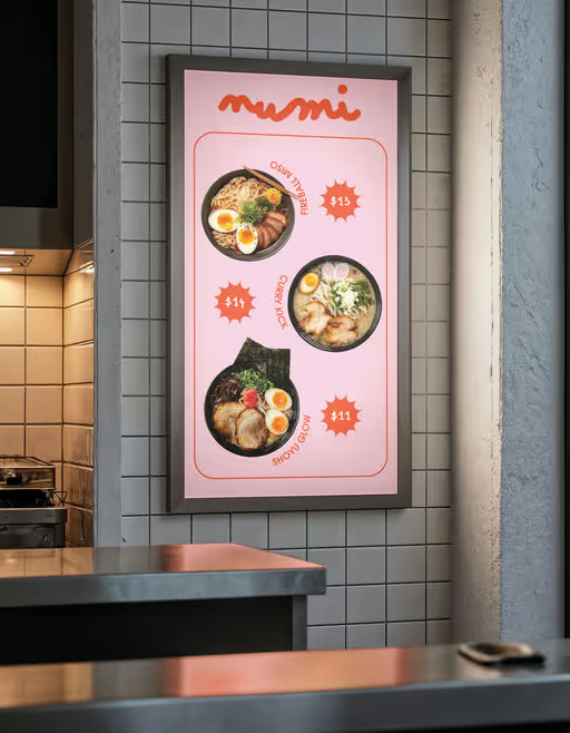
Numi isn’t just a ramen shop — it’s an experience wrapped in color, cuteness, and creative chaos. From steaming bowls of comfort to walls splashed with playful art, every detail is designed to make you smile. Step inside our pink-orange world where ramen meets imagination, and every corner is a photo waiting to happen. Come hungry, leave full — not just with ramen, but with memories (and a camera roll) bursting with joy!
Ramen Branding
Warm Tones, Minimal / Monochrome
Poster & Print
Label Design
Packaging Design
Merchandise
Food & Beverage
Events & Festivals
Brand for Sale
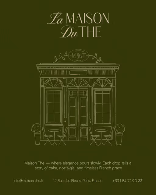
Maison The is more than a tea house — it is a quiet ode to French grace, where time slows and beauty lingers in every detail. Inspired by Parisian salons and the delicate art of afternoon tea, each blend reflects a symphony of flowers, herbs, and emotions. From the soft clink of porcelain cups to the scent of rose and chamomile drifting through the air, Maison Thé invites you to step into a world where conversation, fragrance, and elegance intertwine.
It is the gentle charm of France captured in a cup — a blend of nostalgia, poetry, and timeless design, made for those who find romance in stillness and refinement in simplicity.
Tea House Branding
Earthy Tones, Dark Mode
Packaging Design
Poster & Print
Business Cards
Label Design
Food & Beverage

Brand for Sale
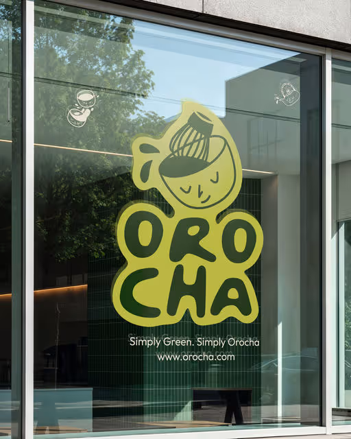
A clean, character-filled identity for Orocha, blending minimalism with the vibrant energy of matcha 🍵.
Every detail reflects the brand’s natural, feel-good vibe.
Matcha Branding
Earthy Tones, Minimal / Monochrome
Packaging Design
Merchandise
Business Cards
Poster & Print
Food & Beverage
Brand for Sale
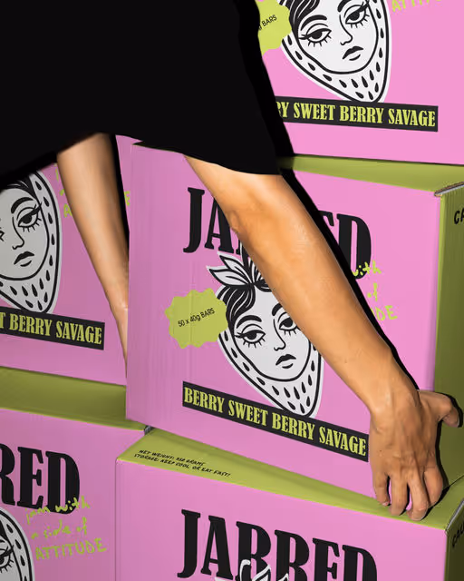
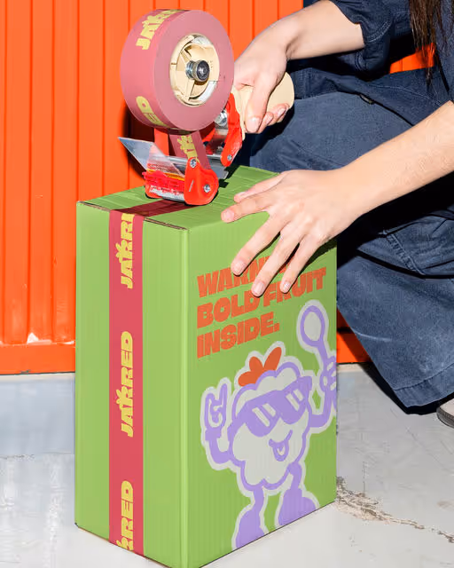
Jam but make it SAVAGE
For this brand , I cooked up a brand identity for jams that refuse to be your “grandmas basic”. Enter JARRED-bold, unapologetic, and dripping with attitude. From sticky spoons to savage spreads, this brand doesn’t whisper “sweet” it shouts flavour with FIRE
BECAUSE EVERY TOAST DESERVES BETTER
Jam Branding
Bold Colors, Warm Tones
Packaging Design
Label Design
Poster & Print
Merchandise
Food & Beverage
Brand for Sale
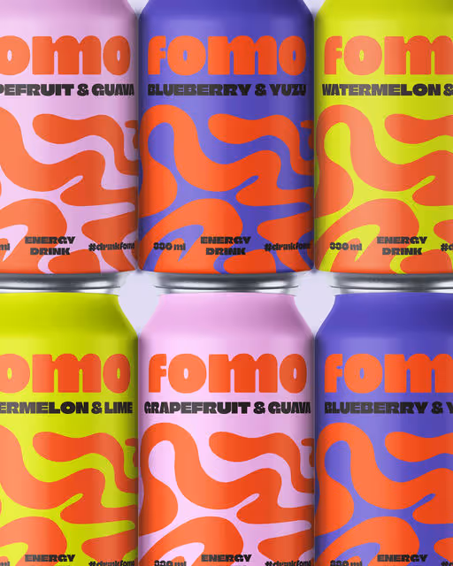
FOMO is a party-fueled beverage brand giving instant energy and style to festivals and social scenes.
Beverage Branding
Bold Colors, Neon / Vibrant
Packaging Design
Poster & Print
Merchandise
Social Media Kit
Food & Beverage
Events & Festivals

Brand for Sale
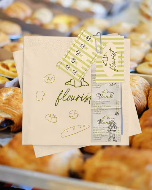
Flourist is an artisan bakery that treats baking as an art form. At Flourist, flour isn’t just an ingredient; it’s the beginning of creation. Inspired by artistry and craft, they bake with intention, shaping each piece into something worth savouring with your eyes first and your taste second.
Bakery Branding
Earthy Tones, Minimal / Monochrome
Business Cards
Label Design
Packaging Design
Poster & Print
Food & Beverage

Brand for Sale
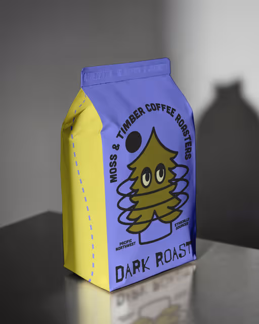
A character-driven identity for Moss & Timber Coffee Roasters, combining warmth, whimsy, and forest charm. The design celebrates ethical sourcing and nature through bold color and clean geometry.
Coffee Branding
Cool Tones, Earthy Tones
Packaging Design
Label Design
Merchandise
Poster & Print
Food & Beverage


Brand for Sale
SOAK is a self-care brand inspired by calm, clarity, and clean design.
RELAXING, CLEANSING, and HYDRATING — three lines designed to bring softness and balance to the everyday.
Beauty & Health Branding
Earthy Tones, Minimal / Monochrome
Packaging Design
Label Design
Beauty & Skincare
Brand for Sale
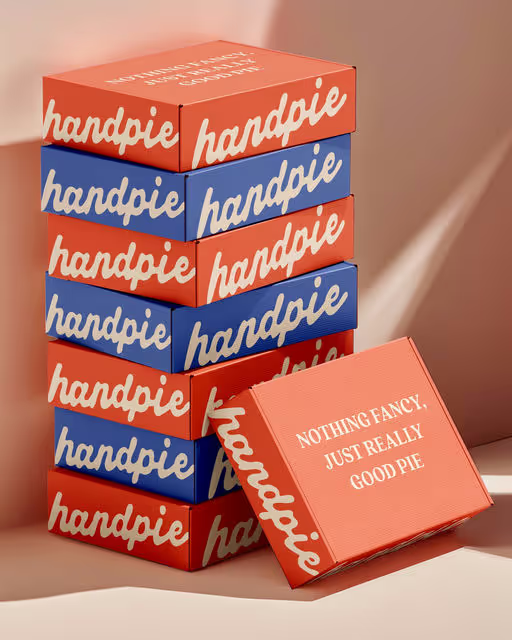
Handpie is a small-batch bakery offering handcrafted pies, made from seasonal, locally sourced ingredients and baked fresh in limited quantities each day.
Bakery Branding
Bold Colors, Warm Tones
Packaging Design
Poster & Print
Merchandise
Social Media Kit
Food & Beverage

Brand for Sale
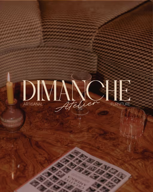
Dimanche Atelier, is an artisanal furniture design brand, defined by bold patterns and classic forms.
The branding reflects typography with sculptural forms and rhythmic patterns inspired by craftsmanship. Each element of the identity was designed to mirror the brand’s essence: timeless yet daring, elegant yet approachable.
Furniture Branding
Earthy Tones, Bold Colors
Business Cards
Label Design
Packaging Design
Poster & Print
Home & Lifestyle


Brand for Sale
Rude Kid is a brunch & coffee concept inspired by authenticity, curiosity, and that playful honesty we often lose as adults. A minimal, urban brand that stays effortlessly real.
Brunch & Coffee Branding
Bold Colors, Warm Tones
Merchandise
Packaging Design
Poster & Print
Food & Beverage

Brand for Sale
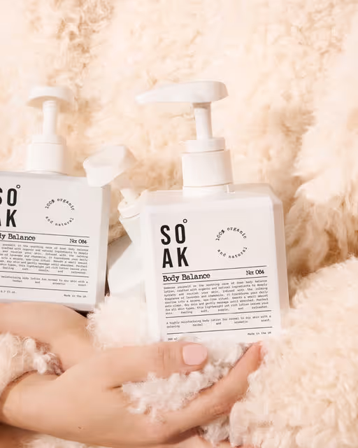
Introducing SOAK, a UK-made, gender-neutral body care brand that celebrates the art of ritual and restoration. Created in collaboration with @brandsbypaola SOAK was designed to reflect the balance between nature and self: self-care for all.
We chose a soft, muted palette to evoke peace and calm, paired with a bold sans-serif logo for a modern edge. The typewriter-style font in the body text brings an organic, grounded feel which is a nod to the brand’s natural ingredients and thoughtful simplicity.
Every detail, from the product textures to the photography direction, was crafted to highlight the essence of SOAK: purity, mindfulness, and connection through everyday rituals.
We were so excited to do this collaboration together, was such a joy we both share a similar appreciation for clean, intentional design but brought our own unique strengths to the process. The result feels like a true blend of our creative worlds - calm yet confident, natural yet elevated. We hope you can see both of our influences woven through every detail.
Body Care Branding
Earthy Tones, Minimal / Monochrome
Packaging Design
Poster & Print
Label Design
Beauty & Skincare
Wellness & Health

Brand for Sale
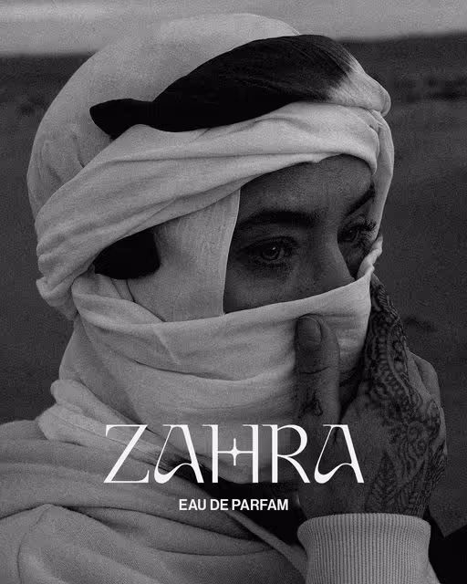
ZAHRA is a modern Moroccan perfume house that brings regional scent traditions into elegant wearable keepsakes. Each fragrance is composed of Moroccan botanicals and selected materials, presented in bottles with hand finished brass detail and crowned by an ambergris inspired cap.
Perfume Branding
Dark Mode, Warm Tones
Packaging Design
Poster & Print
Label Design
Beauty & Skincare

Brand for Sale
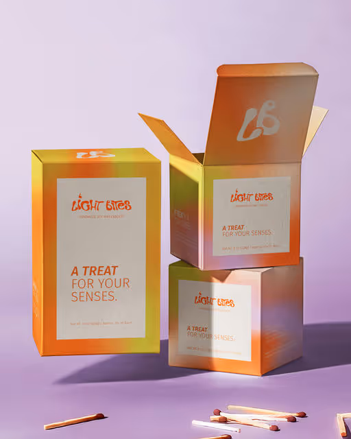
Light Bites is a playful candle brand inspired by food and drink favorites – cupcakes, lattes, cocktails, and more. The goal was to design a brand identity and packaging system that felt cozy, aesthetic, and irresistibly fun, while staying premium enough to compete in the home fragrance market.
Candles Branding
Warm Tones, Earthy Tones
Packaging Design
Label Design
Poster & Print
Social Media Kit
Home & Lifestyle
Brand for Sale
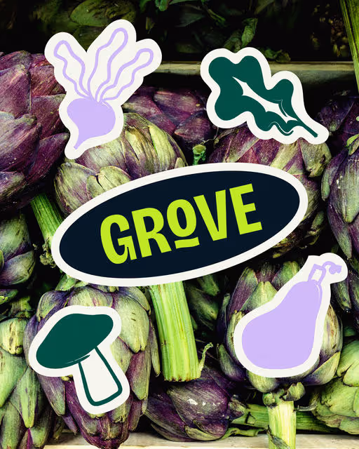
Meet Grove — a modern grocer for the design-minded. Think small-batch sauces, seasonal fruit, handmade pasta and local favourites all gathered under one thoughtfully curated roof.
Grocer Branding
Bold Colors, Earthy Tones
Label Design
Packaging Design
Poster & Print
Food & Beverage

Brand for Sale
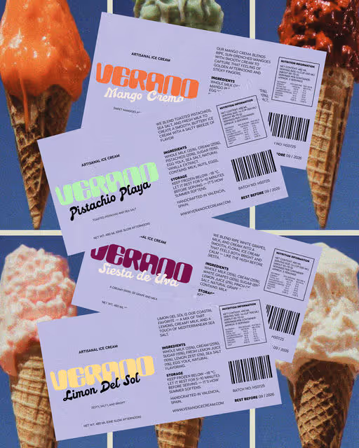
Verano is an artisanal ice cream brand inspired by the slow rhythm of Spanish summers — tactile, nostalgic, and effortlessly cool. A celebration of warmth, sun-soaked colors, and melting moments that turn every scoop into a slow afternoon.
Ice Cream Branding
Cool Tones, Pastel
Poster & Print
Merchandise
Label Design
Website Design
Food & Beverage
Brand for Sale
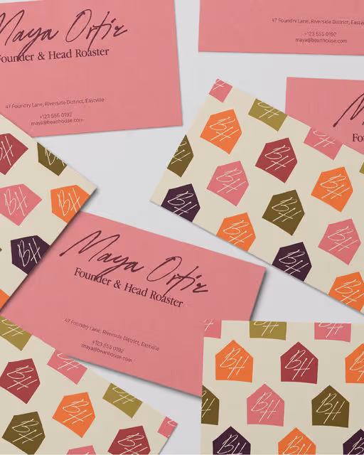
Bean House is a neighbourhood coffee shop that transforms into a vibey espresso bar at night. The project was to design a brand identity that balances this duality – welcoming regulars during the day, then shifting into a vibrant social space at night – through a system that feels warm, energetic, and story-driven.
Coffee Shop Branding
Earthy Tones, Warm Tones
Business Cards
Packaging Design
Stationery
Social Media Kit
Food & Beverage
Hospitality
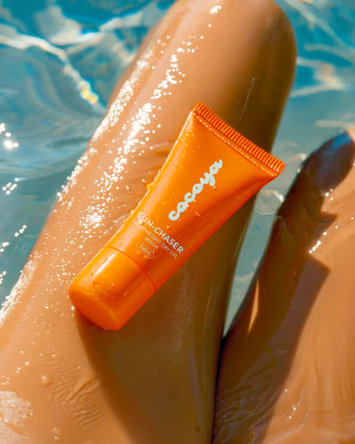
Cocoya is a sun body care brand designed for modern sun lovers. Featuring bold visuals, clean type, and radiant storytelling, Cocoya brings skincare into the spotlight. Featured in Packaging on Behance.
Sun Screen Branding
Bold Colors, Warm Tones
Packaging Design
Label Design
Business Cards
Merchandise
Beauty & Skincare
Brand for Sale
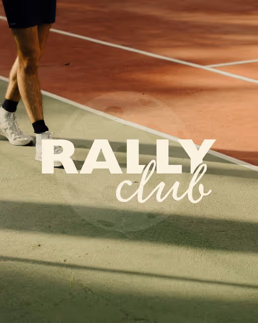
Rally Club is a modern pickleball brand selling paddles, apparel, and accessories that make the game as stylish and social as it is fun. The challenge was to build a bold identity that goes beyond equipment – capturing the energy of community, playfulness, and modern lifestyle.
Pickleball Branding
Earthy Tones, Bold Colors
Merchandise
Poster & Print
Label Design
Social Media Kit
Fashion & Apparel
Brand for Sale
Jarred – a jam with attitude. It's bold, fruity, and cheeky in all the right ways. Think sticky spoons, toast at midnight, and flavours so good they demand centre stage. This isn't your grandma's gingham-lidded jar. Jarred flips the script on jam with a modern, design-conscious edge – playful enough to grab attention, but polished enough to earn a permanent spot on the shelf.
Jam Branding
Bold Colors, Warm Tones
Packaging Design
Merchandise
Poster & Print
Label Design
Food & Beverage


Brand for Sale
WHISK is a complete brand identity for a premium pet food line, designed to balance energy and trust.
Using a rare triadic color palette and rounded typography, the brand feels both joyful and sophisticated.
The visual system is modular and adaptable across packaging and digital touchpoints, expressing genuine warmth and modern simplicity.
Pet Food Branding
Cool Tones, Earthy Tones
Packaging Design
Merchandise
Poster & Print
Business Cards
Food & Beverage
Brand for Sale
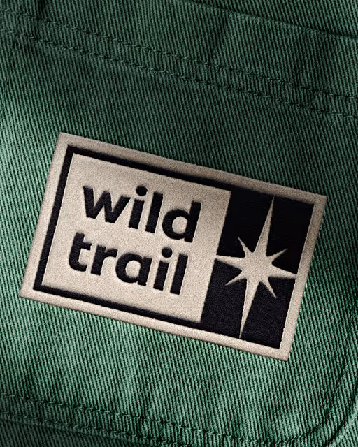
Wild Trail is a Scottish camping resort tucked deep in the Highlands, offering off-grid stays, guided treks, and quiet solitude under open skies. The challenge was to craft a brand identity that feels elemental and authentic – one that honours the land while resonating with modern travellers seeking escape and reconnection.
Camping Resort Branding
Earthy Tones, Minimal / Monochrome
Poster & Print
Merchandise
Business Cards
Stationery
Hospitality


Brand for Sale
KAMI is a modern hair care brand built on the principle of uncomplicated rituals. Their concept includes high-quality, design-led products that combine precision, purity, and strength with a focus on essentials — shampoos & conditioners, treatments, styling products, and fragrance for hair — designed to simplify routines without sacrificing performance.
Hair Care Branding
Earthy Tones, Minimal / Monochrome
Poster & Print
Packaging Design
Merchandise
Business Cards
Beauty & Skincare

Brand for Sale
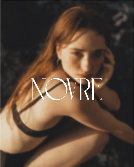
NOVRA is a contemporary women’s lingerie brand that blends understated sensuality with timeless elegance. Designed for the modern woman, every piece celebrates confidence, comfort, and individuality, offering a perfect balance between delicate detailing and effortless wearability.
Women Lingerie Branding
Dark Mode, Minimal / Monochrome
Business Cards
Poster & Print
Packaging Design
Fashion & Apparel
Brand for Sale
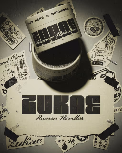
A visual study in fast culture and typographic rhythm. ZUKAE explores Y2K nostalgia through layered textures, bold type systems, and raw composition. The result is a brand that feels immediate, imperfect, and alive.
Ramen Branding
Dark Mode, Minimal / Monochrome
Packaging Design
Label Design
Poster & Print
Merchandise
Food & Beverage

Brand for Sale
A visual identity born from modern nostalgia — where calm seaside energy meets warm, tactile aesthetics.
Soft sun, slow hours, and cocktails that taste like a golden afternoon.
Designed as a gentle escape — a place that feels both yesterday and right now.
Cocktail Bar Branding
Earthy Tones, Cool Tones
Poster & Print
Packaging Design
Merchandise
Stationery
Hospitality

Brand for Sale
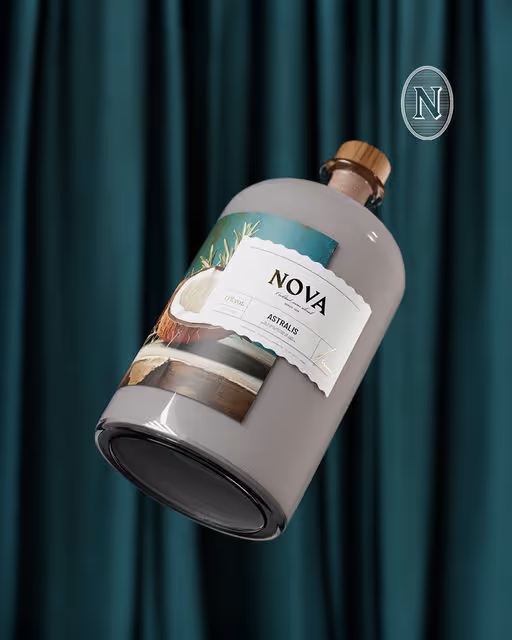
NOVA is a mocktail brand redefining the non-alcoholic experience.
Its mission is to make every occasion, from celebrations to quiet nights in, feel exciting, modern, and inclusive, without compromise on taste or style.
NOVA celebrates the balance between celebration and mindfulness, blending modern aesthetics with confident simplicity.
Mocktail Branding
Cool Tones, Dark Mode
Label Design
Packaging Design
Merchandise
Poster & Print
Food & Beverage

Brand for Sale
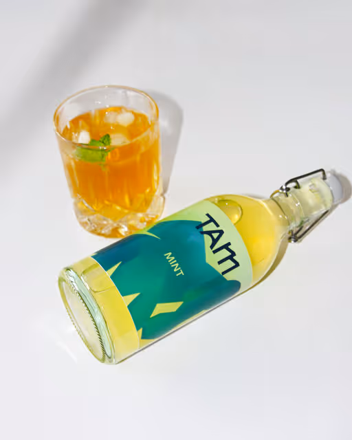
TAM channels the bold spirit of microbreweries into small-batch, alcohol-free ginger beer. Its vibrant identity draws from ginger's organic, shifting forms, with gradients and textured silhouettes that evoke fermentation and fizz. Each flavor —Original, Spiced, Lemon, and Mint— has its own color palette, reflecting its unique personality while maintaining a cohesive brand family. The geometric-yet-organic wordmark balances structure with warmth, embodying the handcrafted, energetic essence of the drink. TAM isn't just a beverage; it's a celebration of difference, energy, and flavor!
Beverage Branding
Bold Colors, Warm Tones
Label Design
Packaging Design
Merchandise
Poster & Print
Food & Beverage

Brand for Sale
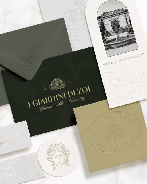
I Giardini di Zoe is a cultural and hospitality destination that combines the elegance of Italian Renaissance gardens with refined accommodation and dining.
Created by an Italian owner for his granddaughter, Zoe, the project reflects a personal story rooted in heritage and care. What began as a private gesture of devotion has grown into an experience that welcomes visitors from around the world.
Restaurant Branding
Earthy Tones, Minimal / Monochrome
Business Cards
Label Design
Packaging Design
Poster & Print
Events & Festivals
Hospitality


Brand for Sale
Petali reimagines botanical soda through bold colour, refined typography, and sensorial imagery. A fusion of nature and design, it captures the vitality of petals in a modern, elevated beverage experience.
Beverage Branding
Bold Colors, Warm Tones
Packaging Design
Label Design
Poster & Print
Merchandise
Food & Beverage
Brand for Sale
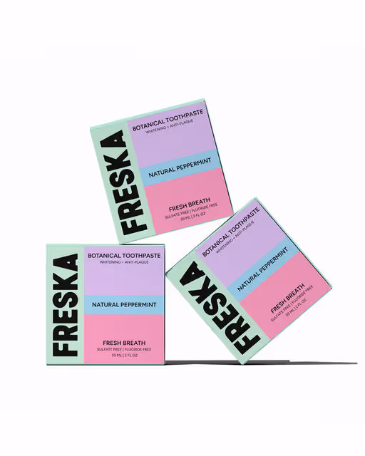
Freska, a modern, design-forward toothpaste brand that redefines your daily ritual. More than just toothpaste, Freska transforms an ordinary routine into a moment of style, freshness, and confidence.
Toothpaste Branding
Pastel, Minimal / Monochrome
Packaging Design
Beauty & Skincare
Brand for Sale
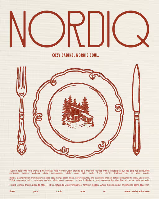
The Nordiq Cabins branding blends Scandinavian simplicity with cozy warmth. A bold wordmark pairs with a cabin stamp for versatility, while harsh light photography, nostalgic still-lifes, and crafted collateral create a modern yet timeless visual identity.
Cabins Branding
Bold Colors, Warm Tones
Poster & Print
Packaging Design
Business Cards
Label Design
Home & Lifestyle

Brand for Sale
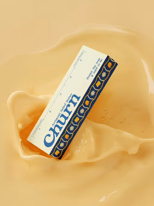
Churn is an artisanal butter brand that celebrates nostalgia and tradition. Made in small batches with fresh cream, it delivers purity, care, and a nostalgic taste for today's table. The goal was to create the brand identity and packaging designs that reflects the nostalgic craft of butter-making while positioning Churn as a premium yet approachable choice.
Butter Branding
Earthy Tones, Cool Tones
Label Design
Packaging Design
Poster & Print
Merchandise
Food & Beverage