Brand Identity Showcase
Nominees
Thank you! Your submission has been received!
Oops! Something went wrong while submitting the form.
Showing you 0 of 0 Nominees

Brand for Sale
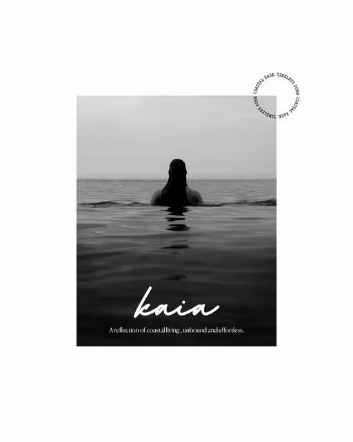
A coastal-inspired lifestyle and swimwear brand that captures the essence of sun, sea, and stillness through modern editorial design.
Swimwear Branding
Dark Mode, Minimal / Monochrome
Business Cards
Poster & Print
Fashion & Apparel
Brand for Sale
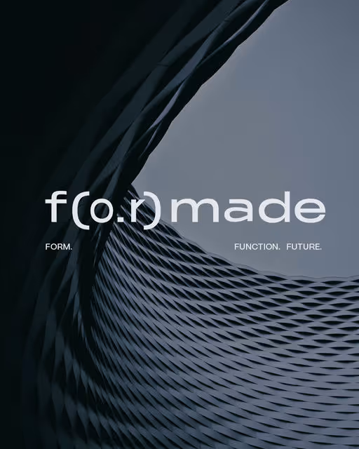
Formade is an architectural studio exploring the dialogue between geometry and emotion where design meets intention.
Architect Studio Branding
Cool Tones, Dark Mode
Merchandise
Packaging Design
Poster & Print
Website Design
Home & Lifestyle

Brand for Sale
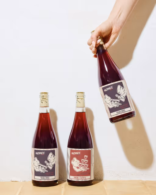
Visual identity and packaging for NOMOS—a brand of natural wines with feet on the ground and glasses in the air.
Where the visual language breathes freedom and the logo, almost handwritten, reflects its artisanal origins.
Wine Branding
Earthy Tones, Minimal / Monochrome
Packaging Design
Merchandise
Poster & Print
Stationery
Food & Beverage

Brand for Sale
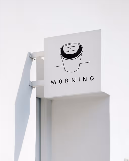
Branding and packaging design for Morning coffee shop. The branding includes illustrations that show the awakening of modern people through suffering and attachment to their phones. The illustrations are sloppily done, showing that everything is imperfect in the morning.
Coffee Shop Branding
Minimal / Monochrome, Dark Mode
Label Design
Packaging Design
Poster & Print
Merchandise
Food & Beverage

Brand for Sale
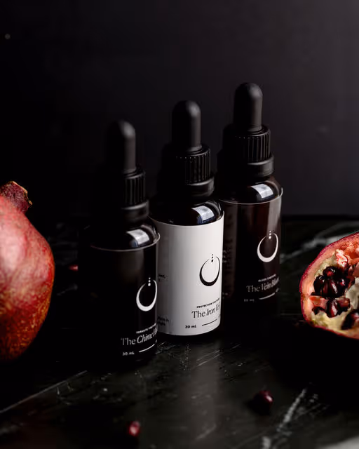
Designing a powerful, raw, and authentic brand inspiring individuals to take control of their health.
Beauty & Health Branding
Dark Mode, Earthy Tones
Packaging Design
Website Design
Poster & Print
Stationery
Wellness & Health


Brand for Sale
Lumora is a premium canned cocktail brand inspired by Italian mixology. The design reflects the essence of an espresso martini, bold, refined, and timeless. With its black and white palette and diamond details, Lumora brings a touch of elegance to every sip.
Cocktail Branding
Minimal / Monochrome, Earthy Tones
Packaging Design
Merchandise
Poster & Print
Business Cards
Food & Beverage

Brand for Sale
MNCH is a bold, plant-based sandwich brand built on clean black-and-white design with playful pops of color. Script fonts mimic ketchup and mustard drips, while stickers add fresh energy to every bite.
Sandwich Branding
Bold Colors, Warm Tones
Packaging Design
Label Design
Merchandise
Poster & Print
Food & Beverage
Brand for Sale
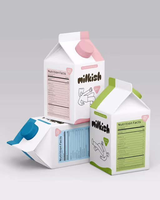
A Plant-based milk brand. 🥛
Milk Branding
Pastel, Cool Tones
Packaging Design
Poster & Print
Merchandise
Stationery
Food & Beverage


Brand for Sale
Client: Conceptual
Industry: Food & Beverage
Scope: Brand Identity, Packaging, Product Mockups
Project Goal: To develop a full brand identity for Tropina, a coconut water brand rooted in simplicity, refreshment, and island inspiration. The objective was to create a minimal, modern visual system that would reflect the purity of the product while standing out on shelves and digital platforms.
Food & Beverage Branding
Earthy Tones, Minimal / Monochrome
Packaging Design
Label Design
Poster & Print
Merchandise
Food & Beverage
Retail

Brand for Sale
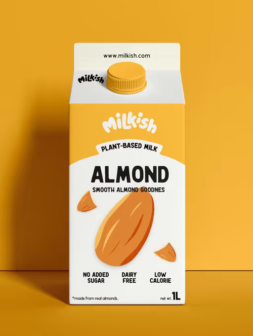
Milkish is a plant-based milk brand that’s kinda like milk, just better. Milkish is made with simple ingredients and a playful look.
The wordmark is friendly, refreshing, and modern. With colors like yellow, it feels more refreshing and enjoyable, just like the brand vibe.
brief by @designerbriefs
Milk Branding
Warm Tones, Dark Mode
Packaging Design
Merchandise
Poster & Print
Social Media Kit
Food & Beverage
Brand for Sale
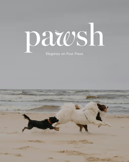
A luxury pet care and accessories brand that blends playfulness with elevated design. Redefining sophistication for four-legged lives.
Pet Branding
Earthy Tones, Pastel
Poster & Print
Merchandise
Packaging Design
Business Cards
Beauty & Skincare
Retail

Brand for Sale
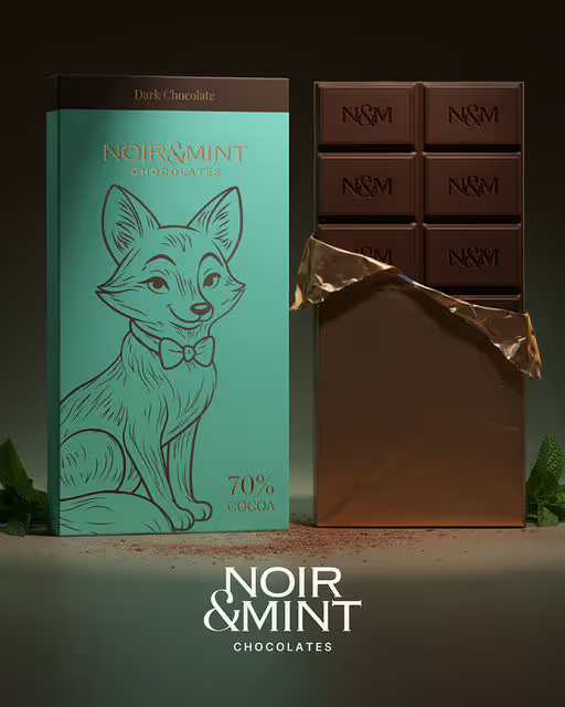
Noir & Mint blends indulgence with freshness, a luxury chocolate brand that’s timeless yet playfully modern. Refined, witty, and full of contrast, it celebrates balance through elegant design, bold simplicity, and a charming fox mascot.
Chocolate Branding
Cool Tones, Dark Mode
Packaging Design
Merchandise
Poster & Print
Label Design
Food & Beverage
Brand for Sale
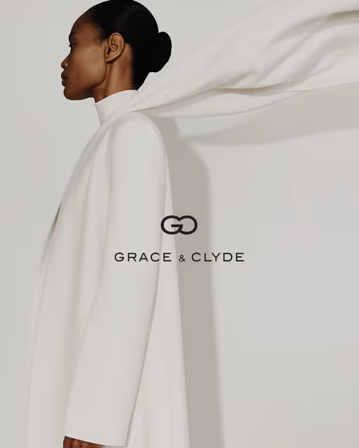
Grace & Clyde is a refined, quietly luxurious fashion brand designed for the modern professional who values timeless elegance, intentional living, and sustainable craftsmanship. This new brand identity captures the balance of sophistication and approachability, pairing neutral palettes with editorial precision. With its debut at Paris Fashion Week 2026, Grace & Clyde steps confidently into the global arena, showcasing a collection that redefines accessible luxury and proves that true style transcends trends.
Fashion Branding
Dark Mode, Minimal / Monochrome
Merchandise
Packaging Design
Label Design
Poster & Print
Fashion & Apparel
Brand for Sale
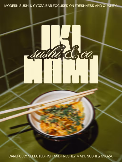
A modern sushi and gyoza bar offering fresh, flavorful Japanese bites in a stylish and welcoming atmosphere.
Japanese Food Branding
Earthy Tones, Dark Mode
Business Cards
Packaging Design
Poster & Print
Merchandise
Food & Beverage
Hospitality
Brand for Sale
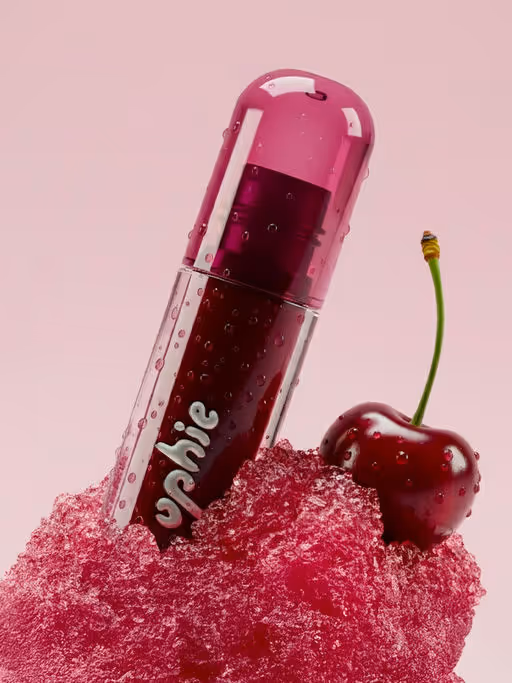
A fun lip oil brand that nourishes and adds a glossy shine.
Make-up Branding
Bold Colors
Packaging Design
Poster & Print
Beauty & Skincare
Brand for Sale
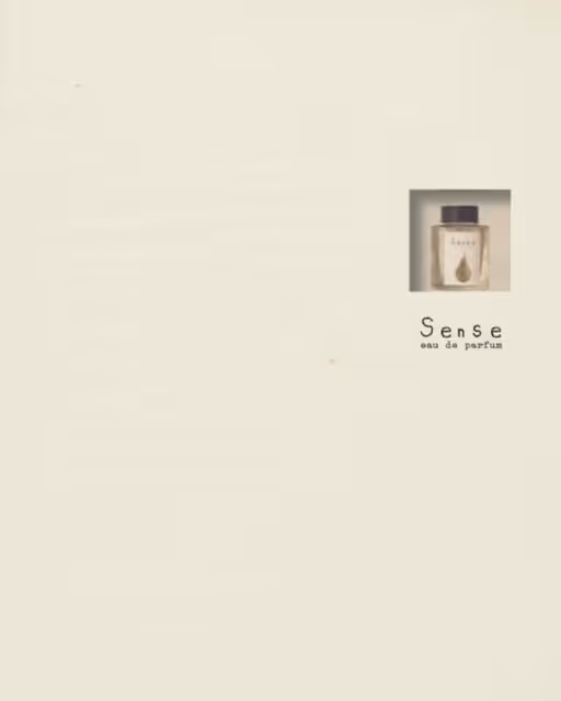
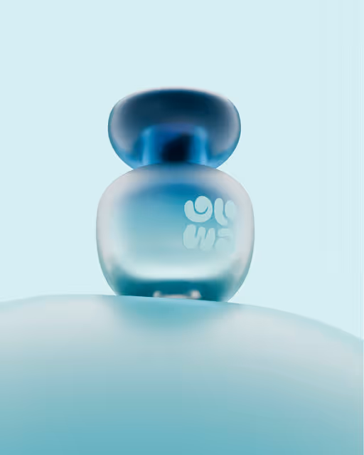
Sense is a perfumery that keeps every moment alive. The sense of living, of existing with all being and of feeling every surface, experiencing every human emotion.
I chose the font — HazesSprayPaint — that reminded me of simplicity. It felt childish, raw, and unpolished, like the handwriting of a child.
A child knows how to feel life — they’re curious to touch and discover everything around them.
And Sense is about allowing yourself to be guided by feeling.
The packaging is minimalist: you only see the logo and a material that feels 3D to the touch — textured, tactile.
You only get a sneak peek of the perfume. You truly discover it when you smell it.
The entire concept uses earthy tones and textures — simple, minimal, yet luxurious.
The brand is a luxury one, inspired by the aromas of autumn, clean natural materials, and the nostalgic scent of childhood pears.
It’s all about emphasizing feeling — letting yourself be carried away by the experience.
Perfume Branding
Earthy Tones, Minimal / Monochrome
No items found.
Beauty & Skincare

Brand for Sale
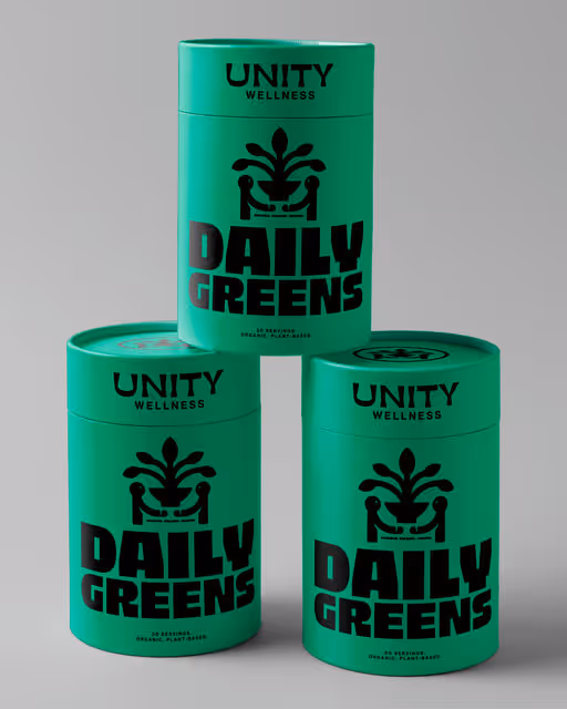
The brand uses strategically this electric green color everywhere. It screams health, energy and nature. The logo: those two figures supporting a plant instantly show the brand's message of "Unity" and "Balance". By using bold fonts and clean, minimal packaging, the design quickly tells you this is a straightforward, dependable product that fits easily into your daily routine.
Beauty & Health Branding
Cool Tones, Earthy Tones
Packaging Design
Merchandise
Poster & Print
Label Design
Wellness & Health

A cool coffee spot to savor your coffee or matcha in cozy, relaxed vibes.
Coffee Shop Branding
Earthy Tones, Warm Tones
Label Design
Packaging Design
Poster & Print
Merchandise
Food & Beverage
Hospitality
Brand for Sale
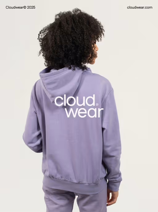
I’m excited to share Cloudwear — a soft, quiet, and serene fashion label built around one simple intention: clothing that feels light, effortless, and peacefully comfortable.
Cloudwear creates its own line of clothing with a feather-light feel — the kind of comfort that doesn’t weigh on you. Pieces that feel easy to wear, easy to move in, and easy to live your day with.
The brand identity follows this same calm feeling.
Minimal, quiet, and peaceful — with washed dawn-inspired colors that instantly relax the mood. The typography is soft and slightly expressive to bring in that gentle, effortless vibe Cloudwear stands for. Nothing loud, nothing showy — just a visual feeling of ease.
Fashion Branding
Cool Tones, Minimal / Monochrome
Merchandise
Poster & Print
Label Design
Packaging Design
Fashion & Apparel


Brand for Sale
ZESTERA is a mindful energy brand that redefines what it means to feel awake. Its identity captures the balance between clarity and calm — bright enough to lift your focus, gentle enough to steady your mind. Inspired by the rhythm of natural energy, ZESTERA’s design language flows through modular geometric patterns, vibrant yet grounded color palettes. By translating the flow of light, air, and balance into a visual form, ZESTERA invites people to refresh their minds, find focus, and move through the day with clarity and ease.
Beverage Branding
Cool Tones, Warm Tones
No items found.
Wellness & Health

Brand for Sale
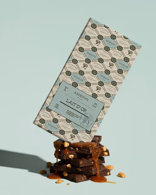
Ardenne is a small-batch Belgian chocolate brand rooted in craftsmanship, stillness, and the quiet beauty of indulgence done slowly. Every bar tells a story of artisanal care and natural refinement. Ardenne isn't loud or ostentatious; it's a refined, heritage-driven brand that embodies elegance, authenticity, and calm indulgence.
Chocolate Branding
Earthy Tones, Cool Tones
Packaging Design
Merchandise
Poster & Print
Business Cards
Food & Beverage

Brand for Sale
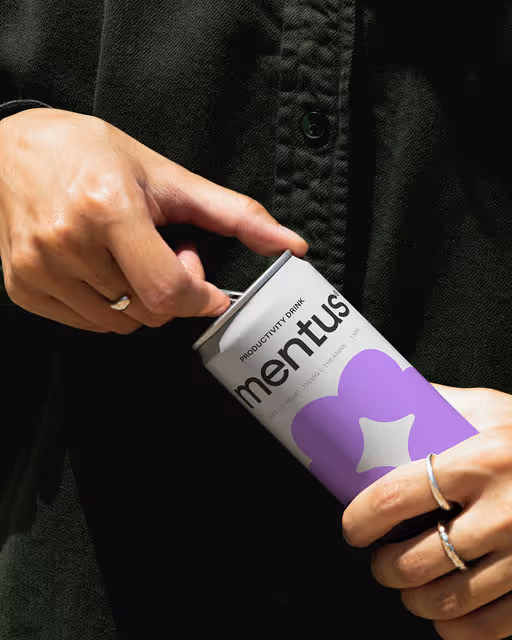
The brand identity for Mentus, a revolutionary drink crafted to enhance mental performance for students and young professionals. Designed to boost focus, memory, and creativity, Mentus embodies the essence of peak cognitive function. Every detail was carefully considered to create a brand that is both aspirational and approachable. Mentus stands as a trusted ally for those striving to excel and achieve their best.
Beverage Branding
Cool Tones, Minimal / Monochrome
Packaging Design
Merchandise
Poster & Print
Social Media Kit
Food & Beverage
Wellness & Health
Brand for Sale
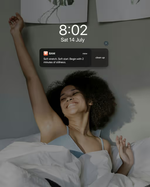
A slow-living lifestyle brand built around calm mornings, minimal design, and quiet energy — celebrating the art of beginning again.
Lifestyle Branding
Dark Mode, Bold Colors
Poster & Print
Social Media Kit
Website Design
Merchandise
Home & Lifestyle

Brand for Sale
Skincare that travels with you. GLOWA® redefines beauty as something wearable, fun, and effortlessly portable, created for the fast-paced, style-conscious Gen Z generation. For GLOWA®, we created a brand and packaging system that captures the essence of wearable beauty, fun, flexible, and portable. Designed to connect with Gen Z’s lifestyle, where skincare meets daily practicality
Skincare Branding
Cool Tones, Minimal / Monochrome
Packaging Design
Merchandise
Poster & Print
Stationery
Beauty & Skincare

Brand for Sale
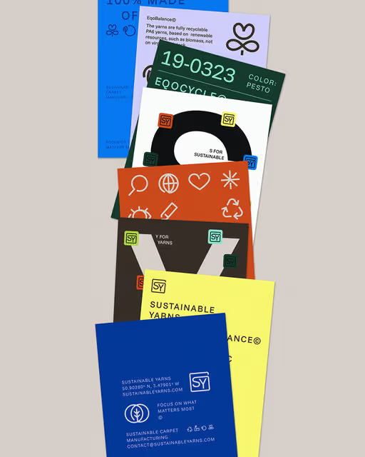
Sustainable Yarns is a forward-thinking supplier of eco-conscious carpet yarns, set out to bring transparency to sustainable materials in the retail space. Their visual identity is utilitarian yet vibrant—built on precision, data, and honesty, with bold layouts, color-coded information, and icons inspired by textile care symbols. Its slogan, “Focus on what matters most,” became a visual idea: two circles converging to reveal a leaf at their center, a mark of clarity and purpose that anchors the brand. Their design system translates seamlessly across packaging, swatches, and everyday tools, making sustainability visible, practical, and woven into every detail.
Carpet Branding
Earthy Tones, Dark Mode
Business Cards
Label Design
Packaging Design
Poster & Print
Retail

Brand for Sale
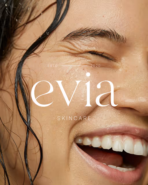
Evia is a skincare brand that combines science and simplicity, offering accessible solutions for everyone. With transparent and effective formulas, the products are designed to strengthen and balance the skin, without the complexity.
Skincare Branding
Earthy Tones, Minimal / Monochrome
Packaging Design
Poster & Print
Social Media Kit
Merchandise
Beauty & Skincare
Brand for Sale
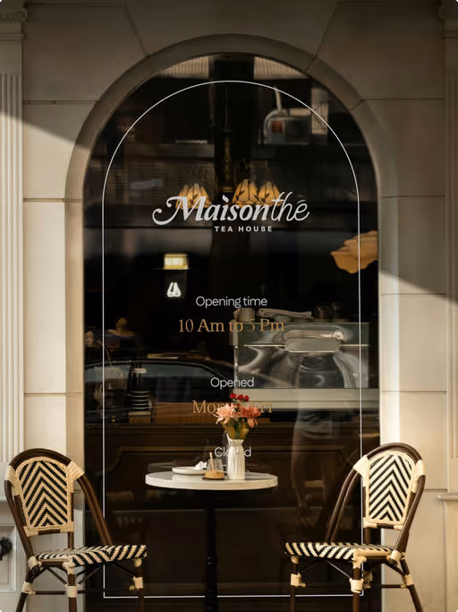
Maison Thé is a place for people who want to exhale their all-day stress and treat themselves to a gentle, comforting time.
Brief by : @designerbriefs
Tea House Branding
Earthy Tones, Minimal / Monochrome
Label Design
Packaging Design
Poster & Print
Merchandise
Wellness & Health

Brand for Sale
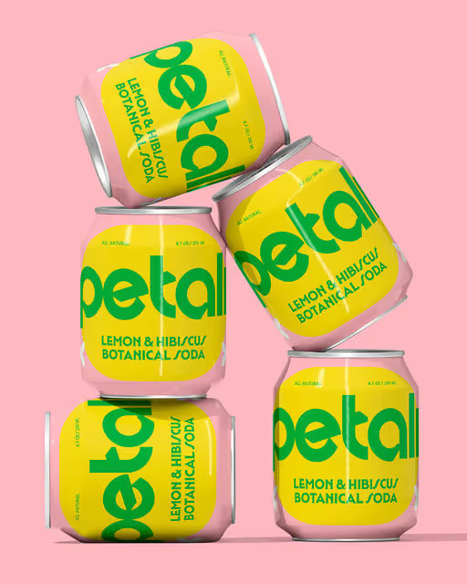
Refreshment in full bloom. Petali is a modern botanical soda. Made with delicate floral notes and pure, natural ingredients, each sip is a celebration of freshness and sophistication.
Beverage Branding
Bold Colors, Pastel
Packaging Design
Merchandise
Poster & Print
Business Cards
Food & Beverage

Brand for Sale
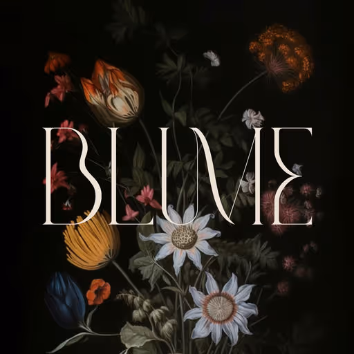
Rooted in the beauty of growth and transformation, Blume is a brand that embodies grace, femininity, and quiet strength. Inspired by nature’s delicate yet resilient forms, the visual identity blends soft, flowing elements with refined typography and a gentle color palette. Every detail is designed to evoke a sense of calm, confidence, and effortless elegance, making Blume a reflection of beauty that blooms from within.
Beauty & Wellness Branding
Dark Mode, Earthy Tones
Packaging Design
Poster & Print
Label Design
Merchandise
Beauty & Skincare
Brand for Sale
Dwello helps young adults find clean, modern studios in the city that finally feel like home. Designed for early independence, our youthful, urban listings make moving simple, stylish, and worry-free.
Real Estate Branding
Minimal / Monochrome
Business Cards
Merchandise
Website Design
Stationery
Real Estate

Brand for Sale
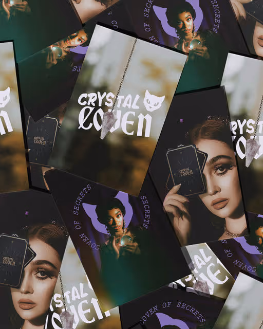
Founded by soul-seekers and tarot enthusiasts, the shop was created as a sacred space where intuition meets ancient wisdom. Crystal Coven curates a unique collection of tarot decks, crystals, and spiritual items, all carefully selected for their ability to guide, heal, and inspire.
Mystic Branding
Dark Mode, Cool Tones
Poster & Print
Packaging Design
Merchandise
Stationery
Wellness & Health

Brand for Sale
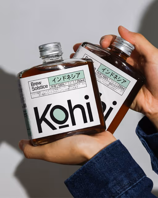
Kohi the brand identity balances Japanese simplicity with modern coffee culture — clean typography, minimal labels, and structured packaging reflect a sense of order and craft. The square bottles and bold wordmark give Kohi a distinctive shelf presence, while subtle Japanese characters nod to its inspiration.
Coffee Branding
Minimal / Monochrome, Cool Tones
Packaging Design
Label Design
Poster & Print
Merchandise
Food & Beverage
Brand for Sale
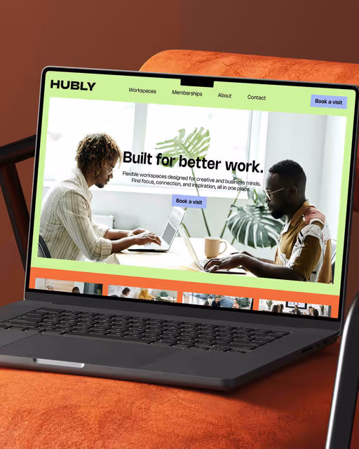
Hubly is a professional co-working brand providing flexible workspaces and inspiring environments for creative and business minds.
Workspace Branding
Bold Colors, Warm Tones
Poster & Print
Website Design
Merchandise
Stationery
Home & Lifestyle
Brand for Sale
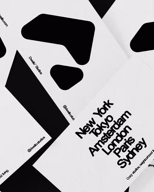
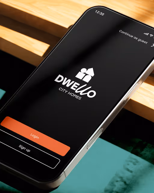
Dwello is a modern, human brand for city living, built from simple shapes and a warm, handwritten wordmark. A flexible visual system balancing structure and soul, bringing urban sophistication and approachable energy to every touchpoint.
Real Estate Branding
Dark Mode, Warm Tones
Interface Design
Website Design
Poster & Print
Business Cards
Real Estate

Brand for Sale
At Mama’s, comfort is always on the menu. A warm, welcoming brand that serves up care, flavour, and that unmistakable “Mama takes care of you” vibe. The bold and caring character of Mama brings the brand to life.
Restaurant Branding
Bold Colors, Warm Tones
Packaging Design
Poster & Print
Merchandise
Label Design
Food & Beverage

Brand for Sale
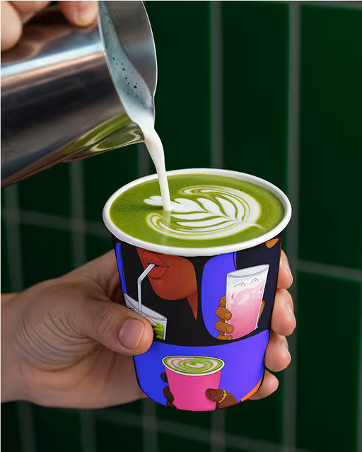
The world doesn’t need another matcha brand, it needs one that feels like art.
Meet Juno Matcha - a brand that explores color, calm, and ritual through bold visuals and unapologetic design.
From vivid illustrations to flavor fusions, every detail celebrates the creative side of matcha. 🍵💜
Where color meets calm - experience art in every sip.
Matcha Branding
Bold Colors, Dark Mode
Packaging Design
Merchandise
Poster & Print
Label Design
Food & Beverage