Brand Identity Showcase
Nominees
Thank you! Your submission has been received!
Oops! Something went wrong while submitting the form.
Showing you 0 of 0 Nominees

Brand for Sale
Amber’s Studio is a warm, craft-inspired brand built around slow moments and handmade comfort. The identity uses soft tones, natural shapes, and subtle textures to reflect a studio that feels personal, inviting, and thoughtfully created.
Interior Branding
Poster & Print
Merchandise
Packaging Design
Stationery
Home & Lifestyle
Brand for Sale
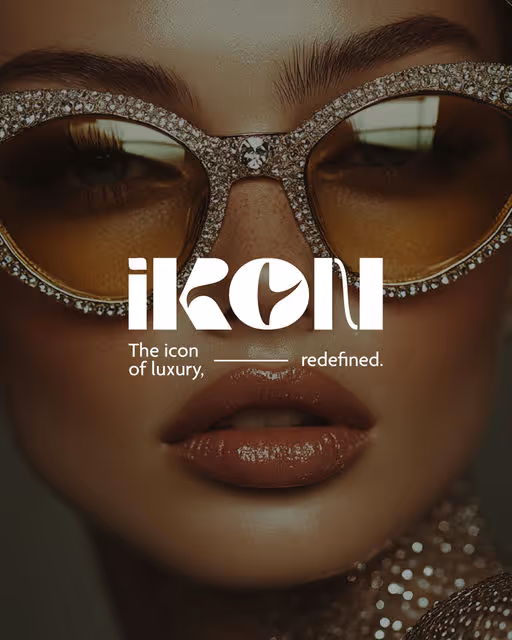
Identité visuelle haut de gamme pour IKON : un univers graphique puissant, minimaliste et sculptural, pensé pour incarner l’exclusivité, la précision et l’aura iconique d’une marque de luxe moderne.
Luxury Branding
No items found.
Fashion & Apparel

Brand for Sale
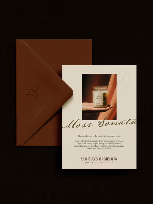
Sundays in Sienna is a handcrafted candle brand inspired by the warmth and softness of unhurried hours. Rooted in slow living and sensory calm, the brand celebrates the beauty of quiet rituals. Each candle is poured in small batches using natural materials, warm hues, and fragrances shaped by memory, atmosphere, and emotion.
Candles Branding
Packaging Design
Poster & Print
Stationery
Merchandise
Home & Lifestyle

Brand for Sale
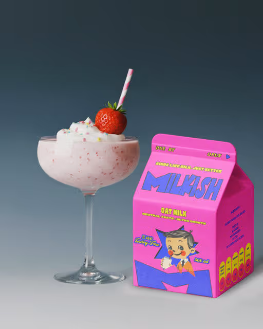
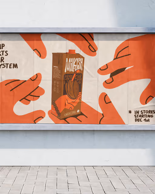
Milkish is a plant-based milk brand that’s like milk… just better.
It’s creamy, wholesome, and made with simple, clean ingredients — all wrapped in a fun, playful visual identity that makes healthy feel exciting.
Whichever flavor you pick, Milkish brings the joy back into dairy-free.
Milk Branding
Packaging Design
Poster & Print
Merchandise
Food & Beverage


Brand for Sale
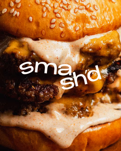
SMASH’D is a modern street-burger concept serving perfectly smashed patties with a raw, urban edge and simplicity.
Burger Branding
Packaging Design
Poster & Print
Merchandise
Label Design
Food & Beverage

Brand for Sale
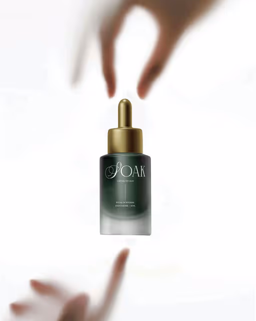
A self-care brand shaped by stillness, intention, and design.
SOAK brings calm to the everyday. Rooted in simplicity and mindfulness, it turns the bath into a space for reflection and renewal—where design meets ritual, and purity meets indulgence.
Beauty & Wellness Branding
Packaging Design
Poster & Print
Merchandise
Label Design
Beauty & Skincare

Brand for Sale
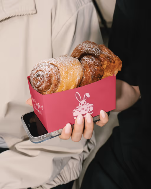
Say hello to one of my sweetest projects yet! The Perfect Dough came to me with a crystal-clear vision:
“We want something adorable, vibrant, and full of personality.”
And honestly… I couldn’t wait to dive in. 💗🍞🎀
From designing their playful bunny-on-cake mascot to building a complete logo suite, packaging, social templates, and a cohesive brand aura — every detail was crafted to feel warm, fun, and irresistibly charming.
The goal wasn’t just to design a logo.
It was to shape an experience that feels joyful, memorable, and as indulgent as their eggless bakes.
Seeing the whole identity come together across boxes, bags, cups, and socials has been chef’s kiss perfection.
Bakery Branding
Merchandise
Packaging Design
Poster & Print
Label Design
Food & Beverage
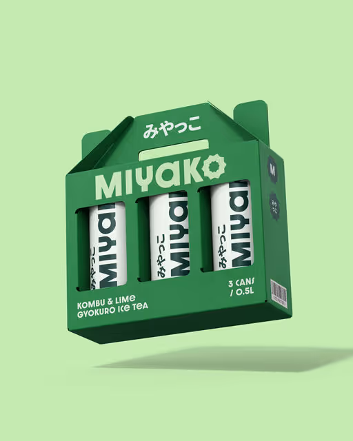

Miyako is a refreshing, cold green iced tea beverage, far from your typical iced tea. It is available in four strong umami flavors, and it’s specifically crafted for contemporary, health-conscious consumers. The packaging signals quality, health, and modern taste, and it feels premium, but still accessible.
Beverage Branding
Packaging Design
Poster & Print
Merchandise
Business Cards
Food & Beverage
Brand for Sale
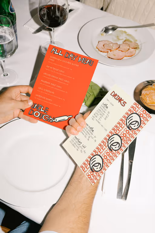
Uncle Dough, “what if a sourdough bakery didn’t look like every other earth-tone, muted, “farm-to-table” spot on the planet?”
Yeah… I asked myself the same thing.
so I made Uncle Dough loud.
Uncle Dough is a bakery built on honesty and neighborhood warmth, so I pushed the identity toward something that feels handmade, bold, and full of character: reds inspired by oven heat, soft blues from morning light, and scribbly handwritten textures that mimic the way bakers track notes.
sourdough is loud. It crackles, hisses, pops, grows, deflates, fights back!! I wanted the identity to feel alive , bold lines, messy charm, that handwritten energy that mirrors the unpredictability of a ferment.
It’s sourdough with personality, not perfection🥖🍞🥯
the goal? A sourdough brand that doesn’t whisper “organic,” but shouts “I’ve got crust and character.”
Bakery Branding
Poster & Print
Packaging Design
Merchandise
Label Design
Food & Beverage


Brand for Sale
Noma offers Japanese furniture shaped by the balance between space and structure. These are pieces that don’t compete with a room, they compare it with a sense of form and honest materials, all inspired by Japanese interiors.
The visual identity of Noma is shaped by a modern interpretation of Japanese design. A considered logotype mirrors the brand’s emphasis on balance, form, and structural clarity. Soft, calming tones complete the palette, creating an environment that feels both serene and welcoming.
Furniture Branding
Poster & Print
Label Design
Packaging Design
Stationery
Home & Lifestyle


Brand for Sale
Milkish blends creamy plant-based goodness with a design-forward attitude. Playful characters, soft colors, and bold typography create packaging that connects instantly with Gen Z’s eye for aesthetic brands. Light, smooth, and always ready to go, it’s milk-ish in the best possible way.
Milk Branding
Packaging Design
Poster & Print
Merchandise
Food & Beverage


Brand for Sale
Project Type: Concept Brand Identity Design Challenge. About: Urban. Bold. Rebellious. A kombucha that throws the peace signs out the window and embraces the raw energy of fermentation. For the cool kid in the health aisle, featuring graffiti-inspired visuals, a green tea leaf-monster icon, and punchy typography.
Kombucha Branding
Label Design
Packaging Design
Poster & Print
Merchandise
Food & Beverage
Brand for Sale
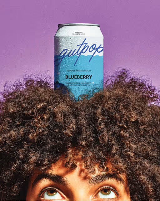
Gutpop is soda but better. Better for your gut, with good and natural ingredients. Each can is packed with living probiotic cultures, light bubbles, and some bold flavor. A simple way to fuel your gut and brighten your mood.
Beverage Branding
Packaging Design
Poster & Print
Label Design
Merchandise
Food & Beverage

Brand for Sale
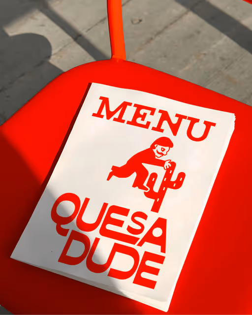
A bold brand identity for a Mexican restaurant, driven by a quirky mascot.
Restaurant Branding
Poster & Print
Packaging Design
Merchandise
Business Cards
Food & Beverage


Brand for Sale
Azuroscape is a boutique hotel brand inspired by Fort Kochi’s coastal charm and Portuguese heritage. Blending premium design with hand-drawn details, the identity combines azulejo-inspired patterns, a custom script logo, and coastal colors to create a refined, personal escape.
Hotel Branding
Business Cards
Packaging Design
Poster & Print
Merchandise
Hospitality
Home & Lifestyle
Brand for Sale
This almond milk brand and packaging design was entirely hand-drawn. Every little detail! That was something I've been wanting to do for a while. I thought this vegan milk brief would be the perfect opportunity, because the wabi sabi, drawn style matches the natural, sustainable vibe that environmentally conscious consumers are drawn to.
On top of that, I went with a warm, retro colour palette & minimalistic illustrations for an even more laid-back energy.
Milk Branding
Packaging Design
Poster & Print
Label Design
Food & Beverage
Retail
Brand for Sale
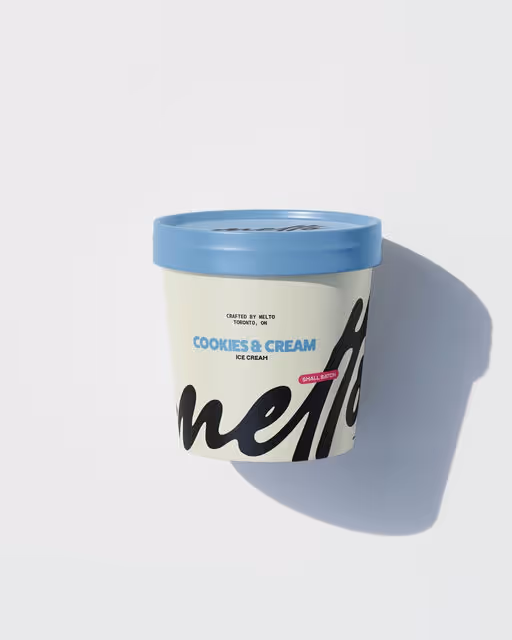
Melto—your freezer’s new favourite ice cream. Crafted in Toronto, ON. Cold, creamy & uncomplicated. For the ones who just want good ice cream.
This identity is minimal, letting texture, tone, and type tell the story. Like the product itself, Melto is simple—but irresistible.
Ice Cream Branding
Packaging Design
Merchandise
Poster & Print
Food & Beverage
Brand for Sale
Brand design for Uncle Dough - a conceptual bakery 🍞🥯🧇
Uncle Dough is a bakery fueled by passion for the craft. It takes a new and modern approach that stands out and doesn't take itself too seriously. Just like Uncle Dough himself.
Bakery Branding
yellow
Business Cards
Stationery
Packaging Design
Merchandise
Food & Beverage
Retail

Brand for Sale
Brand design for whisk - a conceptual gourmet pet treat brand 🐶
The logo and illustrations for this project were fully hand-drawn in Procreate. Like with my last concept, I started with a single illustration, in this case the Airedale Terrier, and built the whole brand around it. I am still experimenting with this slightly rough, hand-drawn style and I am honestly having a ton of fun with it. It helps concepts feel fun and down to earth, natural and a little imperfect in the best way.
Pet Branding
blue
Packaging Design
Poster & Print
Label Design
Business Cards
Food & Beverage
Retail
Brand for Sale
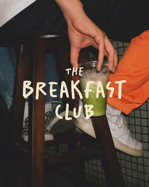
The Breakfast Club delivers everything you want for your breakfast every Sunday. From your own jam to fresh croissants to soft eggs. The company needs a logo and packaging for delivery, something playful, cheerful, that will delight everyone upon delivery.
Breakfast Club Branding
Poster & Print
Packaging Design
Merchandise
Label Design
Food & Beverage
Retail


Brand for Sale
Snook is a bakery where bread has its own character, and the main hero is a bold, charismatic mascot — a mischievous bird thief. It steals fresh loaves right from under your nose, turning ordinary pastries into a playful story full of charm.
Bakery Branding
black, white
Merchandise
Poster & Print
Stationery
Food & Beverage

Brand for Sale
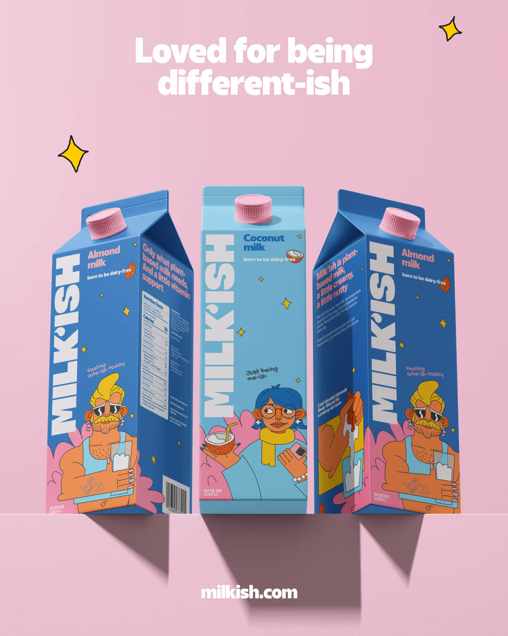
Loved for being different-ish.
Brand doesn’t try to be “real milk”, they simply taste good in our own way. Honest ingredients, gentle flavor, and a soft, friendly mood in every sip.
Made for people who are just real, just themselves, just wonderfully different-ish.
Milk Branding
blue, bold, pink
Packaging Design
Poster & Print
Website Design
Stationery
Food & Beverage

Brand for Sale
AirAlbania is a travel agency created for everyone who loves to explore the world. Many people dream of visiting new places, and this agency aims to make that journey easier and more inspiring. The name comes from Albania’s national stadium, a symbol of pride and unity. Its logo is a minimalistic, geometric version of the Albanian eagle; representing freedom, strength, and the spirit of adventure.
Travel Agency Branding
Poster & Print
Social Media Kit
Business Cards
Stationery
Hospitality

Brand for Sale
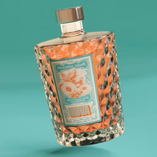
Nova is a mocktail brand that invites you to celebrate without compromise. This brand redefines the festive experience with a full sensory universe.
Inspired by the glamour of 1920s Gatsby soirées, Nova combines complexity and sophistication: a uniquely patterned glass bottle, a retro-futuristic label, and a bold yet elegant color palette. The identity plays with Art Deco codes in a contemporary twist—balancing geometry and luxury.
From branding to packaging design, the project aims to create an unforgettable experience: bold, timeless, and elegant. Whether on the shelf or in the hand, Nova is made to be as beautiful as it is delicious.
Creative Direction, Branding, and 3D by Camille Piot
Mocktail Branding
Packaging Design
Poster & Print
Merchandise
Label Design
Food & Beverage
Retail
Brand for Sale
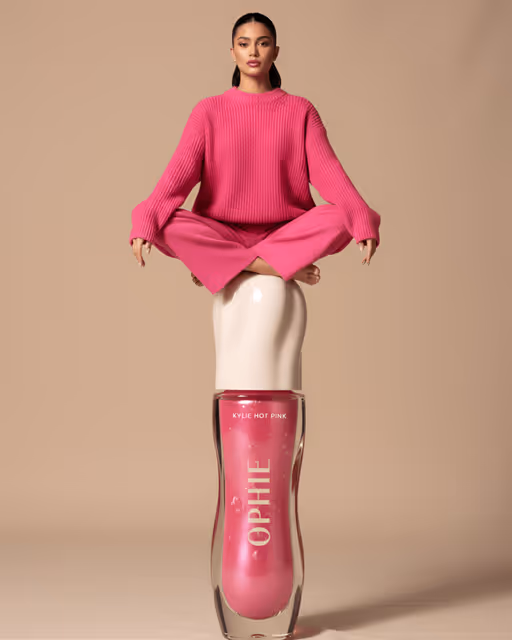
OPHIE is a pop-inspired lip oil beauty brand blending high-gloss glamour with playful femininity. Tapping directly into the language of desire and celebrity influence, to build this brand identity I use a distinctly pop vernacular and audacious marketing.
Beauty Branding
Packaging Design
Poster & Print
Merchandise
Social Media Kit
Beauty & Skincare

Brand for Sale
Smash’d - Bold burgers. Messy hands. Happy mouth.
Smash’d was born from the idea that the best moments are the ones that leave a little sauce on your hands. It is a brand that celebrates the raw and unfiltered joy of eating, bold, flavorful and unapologetically messy.
Inspired by the spirit of the classic smash burger, the identity was built around contrast: bold typography, rich textures and nostalgic imagery that capture the sensory pleasure of every bite.
Every detail, from the logo to the tone of voice, was designed to feel spontaneous yet intentional. The goal was to create a brand that feels alive, vibrant and full of personality.
Smash’d does not just serve burgers. It serves attitude, a visual and emotional experience that is as indulgent and satisfying as the product itself.
Burger Branding
Packaging Design
Poster & Print
Merchandise
Social Media Kit
Food & Beverage

Brand for Sale
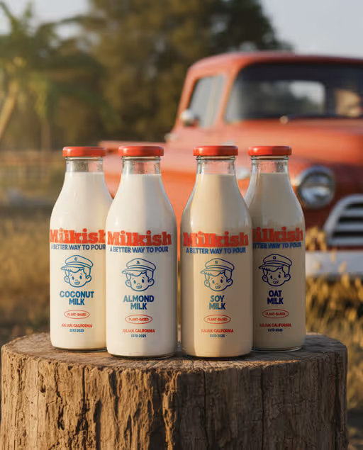
Milkish is plant-based milk with roots and personality. Born in Julian, California, it brings back the charm of milk routes and porch deliveries with simple ingredients and honest flavor.
At the heart of it is the Milkboy. Friendly, familiar, a little nostalgic. He carries the trust of the milkman era into a cleaner and kinder way of making milk. His face across bottles, boxes, and patches reminds you what Milkish stands for. Goodness made simple.
Milkish blends retro Americana with modern simplicity. A farm-fresh personality that feels inviting and honest.
It is made for real moments. Coffee at dawn. Smoothies after a run. Pancake mornings. Late-night cereal. Gentle on your body. Easy on the planet. Ready for every home.
Milkish is a better way to pour because it is milk that minds its manners.
Slogan:
A Better Way to Pour.
Mission:
To make simple, feel-good milk alternatives that are gentle on people and the planet.
Milk Branding
Packaging Design
Label Design
Poster & Print
Merchandise
Food & Beverage
Home & Lifestyle


Brand for Sale
MELT crafts small-batch premium caramel and toffee sauces designed to bring warmth, richness, and a touch of indulgence to every moment. Each jar captures the essence of slow-made comfort - smooth, flavorful, and irresistibly rich — transforming even the simplest dessert into something extraordinary.
Richness, comfort, and flavor — all melted into one.
Sauce Branding
Packaging Design
Label Design
Poster & Print
Merchandise
Food & Beverage


Brand for Sale
SONAK Cold Brew series, the design pairs a grounded single-tone label with loud, expressive typography. A balance of clean structure and playful energy in one bottle.
Beverage Branding
Label Design
Food & Beverage

Brand for Sale
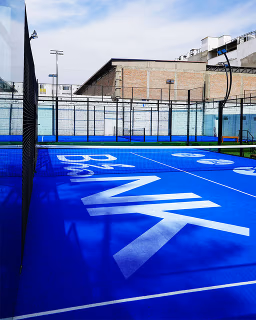
An urban paddle club born from Berlin’s raw energy. BLNK turns play into expression and skill into identity. Minimal design meets bold attitude; concrete, sound, and light shape the experience. Built for those who move with purpose, think in rhythm, and play by their own rules.
Padel Club Branding
Merchandise
Poster & Print
Business Cards
Stationery
Sports

Brand for Sale
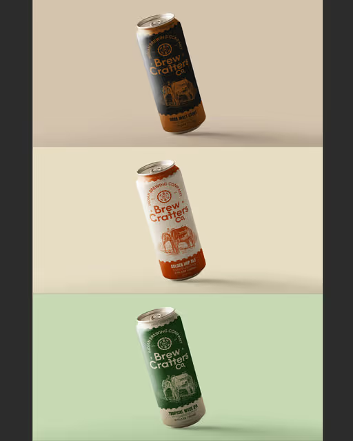
Brew Crafters Co. is a conceptual craft beer brand that blends the rich tapestry of Indian heritage with the artistry of modern brewing. Rooted in tradition yet forward-looking, the brand embodies the spirit of resilience, community, and craftsmanship. Each beer is a celebration, not just of flavor, but of the stories, people, and experiences it brings together. Brew Crafters Co. seeks to honor the past while pushing the boundaries of modern brewing, delivering small-batch brews that are as meaningful as they are flavorful.
Branding
Label Design
Packaging Design
Poster & Print
Merchandise
Food & Beverage

Brand for Sale
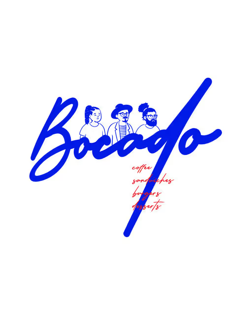
Bocado is more than just a cafe. It’s the heart of hangout for youngster looking to unwind, connect, and make memories. Bold, fun, and memorable identity that teases the energy of a great hangout place. The goal was to create a visual atmosphere where youngsters could recognize themselves and connect.
Coffee Shop Branding
No items found.
Food & Beverage
Hospitality

Brand for Sale
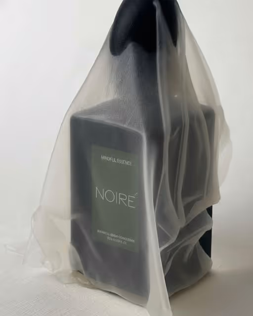
NOIRÉ is a study in quiet luxury — a language built on stillness, balance, and intent. It is a world where refinement takes the place of noise, and where the most meaningful expressions are the ones delivered in silence. NOIRÉ speaks softly yet with unmistakable precision; nothing is excessive, and nothing is left to chance. Every detail carries a purpose, and every decision reflects a deeper discipline.
At its core lies the pursuit of distilled simplicity, a process through which color, form, and texture are reduced to their purest, most essential essence. Within this reduction, honesty emerges: the grain of paper revealing its natural life, the weight of silence grounding the senses, the quiet rhythm formed when light and shadow meet. These elements are not embellishments; they are truths, revealed without alteration.
NOIRÉ is not about appearance, but presence. It is not created to impress at first glance, but to endure through time. It does not ask for attention; it lingers subtly, breathing with a calm, unwavering confidence. Each surface, each pause, each restrained gesture becomes a testament to clarity and control, a reflection of an inner stillness that defines its character.
This world is shaped by restraint — a reminder that true sophistication is not found in excess, but in precision. Restraint sharpens perception, allowing the smallest nuance to hold significance. Here, beauty is not loud; it is intentional, deliberate, and quietly powerful.
NOIRÉ exists for those who find meaning in the quiet, who understand the elegance of understatement, and who seek identity in permanence rather than spectacle. It is an invitation to slow down, to perceive the subtle layers beneath the surface, and to discover a form of luxury defined not by what is added, but by what is allowed to remain.
Luxury Branding
Packaging Design
Poster & Print
Merchandise
Stationery
Fashion & Apparel

Brand for Sale
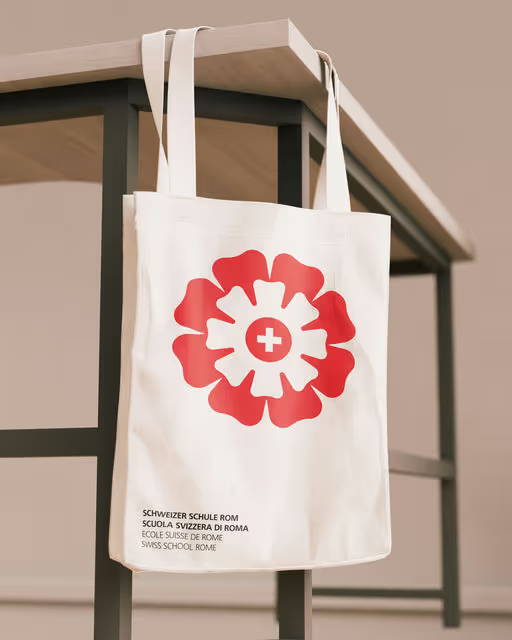
The new visual identity for the Swiss School Rome features a logo inspired by the floral wrought-iron motif of the Liberty-style entrance gate and the architectural details of the historic building.
It symbolizes harmony, community, and blossoming—an homage to the growth of the students and the School’s educational values.
Designer: Lucilla Dosa
Creative coordination: Antonia Marmo
School Branding
Business Cards
Merchandise
Poster & Print
Stationery
Home & Lifestyle


Brand for Sale
A modern matcha brand celebrating calm energy and daily ritual through minimal design and grounded green aesthetics.
Matcha Branding
Earthy Tones, Pastel
Packaging Design
Poster & Print
Merchandise
Stationery
Food & Beverage
Wellness & Health
Brand for Sale
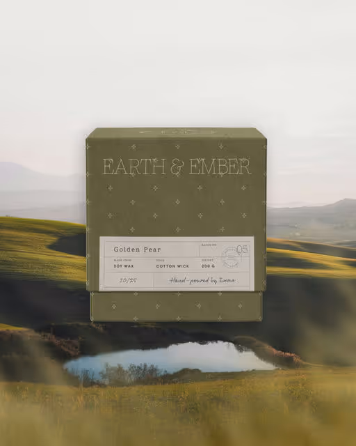
Earth & Ember is a handcrafted candle brand inspired by slow living and simple rituals. Made in small batches from natural materials, each piece carries quiet character. The identity feels warm, textured, and reminiscent of a calm countryside home.
Candles Branding
Earthy Tones, Minimal / Monochrome
Packaging Design
Merchandise
Poster & Print
Label Design
Home & Lifestyle