Brand Identity Showcase
Nominees
Thank you! Your submission has been received!
Oops! Something went wrong while submitting the form.
Showing you 0 of 0 Nominees
Brand for Sale
Crybaby is a bold hot sauce brand with dramatic color pops, spicy attitude and playful emotional twist. The branding mixes heat, humor and clean design to make every bottle feel fierce, modern and instantly recognizable at a glance.
Sauce Branding
No items found.
No items found.
Brand for Sale
Catalyst is a modern wine bar offering an extensive selection of wines, including three signature house wines, complemented by a curated range of tapas. The atmosphere is relaxed and contemporary, reflected through soft, minimal branding that feels both warm and refined.
The rabbit serves as the brand’s emblem, capturing Catalyst’s friendly, unpretentious spirit. It symbolizes celebration and playfulness, adding an unexpected twist to the wine world, just like Catalyst’s surprisingly impressive in-house wines ;)
Wine Bar Branding
No items found.
No items found.
Brand for Sale
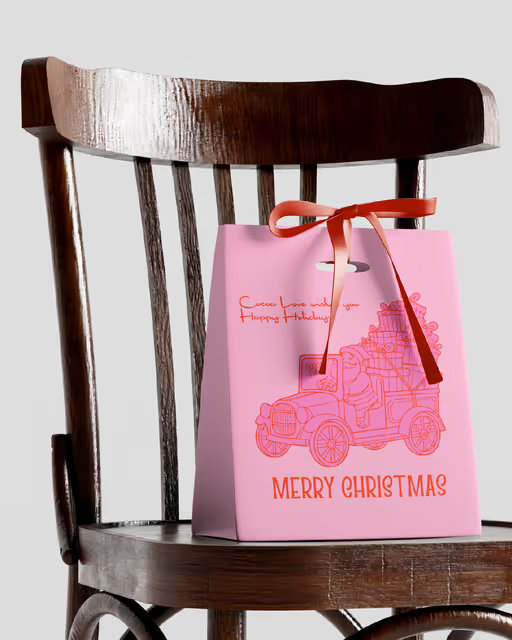
I grew up believing Christmas didn’t begin on December 1st, it began the moment the city decided to dress itself up. When I lived in London, the lights would go up months before, and suddenly the streets felt like a countdown. You could literally feel the switch flip, when the decorations went from quietly waiting to officially glowing.
And every year, I was that person who waited for the exact time the lights would turn on, because the first flicker always felt like magic.
This year feels different, new city, new rhythms, new version of “home.” But this brief brought all of that nostalgia back in the most unexpected way.
Cocoa Love became my chance to design a world that feels like that first light switch moment:
indulgent, handcrafted, slightly chaotic, zero-logic, maximum joy.
A universe where nutcrackers form questionable pyramids, reindeer have too much personality, and Santa somehow fits in every mug.
It reminded me that design is storytelling, not just visuals, but feelings you can hold.
Food & Beverage Branding
No items found.
No items found.
Brand for Sale
Ophie is a lip oil brand designed for your everyday routine. It's made for the clean girl who wants to glow without trying. Design brief by @designerbriefs
Beauty Branding
Packaging Design
Label Design
Poster & Print
Merchandise
Beauty & Skincare
Brand for Sale
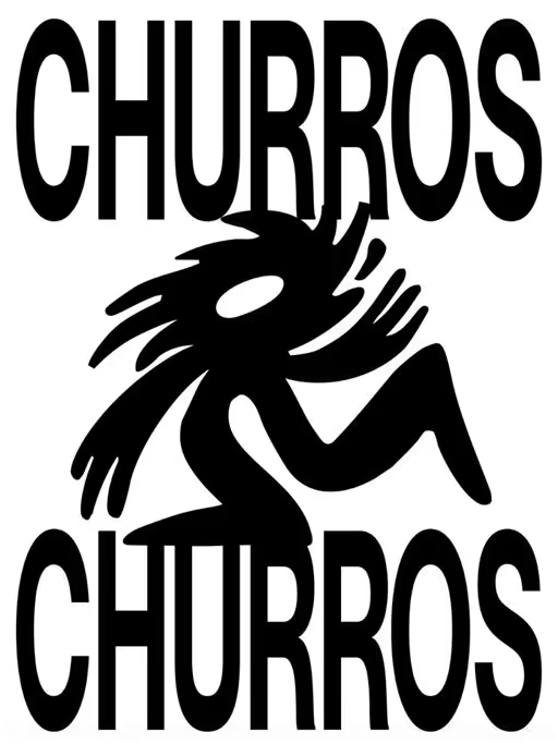
CHURROS CHURROS shows how bold hospitality branding can transform a traditional churro shop into a stand-out, character-driven brand 💥
Two young founders from Talavera de la Reina wanted to push the classic idea of a churrería further. From that starting point, we created a fresh, contemporary visual identity for a young, urban audience: powerful type choices, a chocolate-splashed mascot, spontaneous illustrations, super-colorful art direction, and take-away–ready churro packaging designed to shine both in real life and on social media.
More than just a nice look, it’s a brand that’s recognizable, direct, and memorable — a modern churrería that reimagines tradition to connect with how we experience food today.
Typography: Neue Montreal Ultra Squeezed by off-type.com
Branding & Art Direction: pixelarte.com
Hospitality Branding
No items found.
No items found.
Brand for Sale
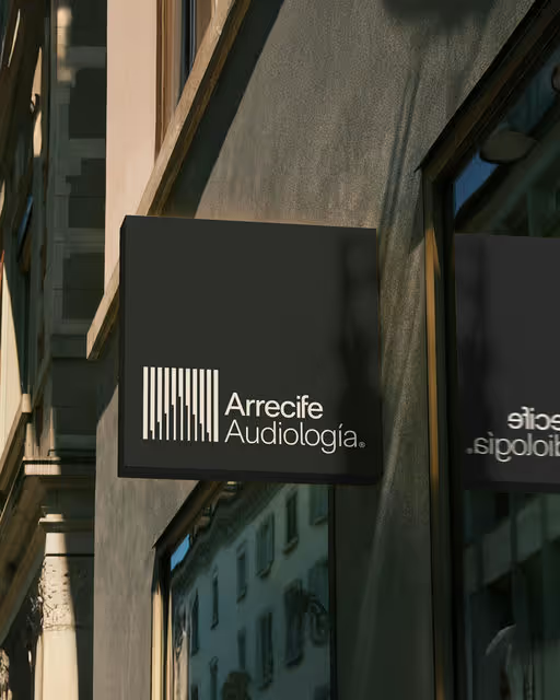
For Arrecife Audiología, we designed a visual identity that celebrates sound as connection and emotion, not loss. Through authentic imagery, messaging, and a cohesive brand universe, we created a warm, human-centered identity that builds trust and enriches life.
Design by pixelarte.com
Typography by cotypefoundry.com
Healthcare Branding
No items found.
No items found.
Brand for Sale
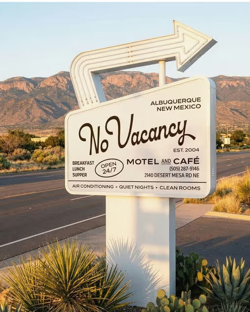
No Vacancy is a modern and chic roadside motel for design-conscious travelers. Inspired by classic Americana and desert stays, it mixes mid-century charm with a touch of luxury. It's the perfect spot for spontaneous road trips.
Motel Branding
No items found.
No items found.
Brand for Sale
A fictional motel and café located in Albuquerque, New Mexico, created as a full brand identity exploration. This project imagines a warm, nostalgic roadside stay shaped by desert landscapes, soft pastels, retro typography, and classic American motel culture.
The visual direction leans into familiar Southwestern textures, analog ephemera, and vintage-inspired objects: key tags, postcards, apparel, signage, and room details.
The concept also nods to the cultural footprint of Breaking Bad, Better Call Saul, and Pluribus, drawing from their atmosphere, tone, and Albuquerque setting. Certain elements (like Howard’s Jaguar from Better Call Saul) appear as direct Easter eggs for fans.
Motel Branding
No items found.
No items found.
Brand for Sale
OLÉRIQUE Paris is a science-led, softly luxurious skincare maison crafted for the modern individual who values prevention, refinement, and quiet confidence. Rooted in French elegance and Mediterranean warmth, the brand blends dermatological innovation with poetic design to create skincare that fortifies as much as it beautifies. This new identity captures the harmony of clinical precision and lyrical sophistication, expressed through neutral tones, tactile textures, and timeless restraint. As OLÉRIQUE continues to establish its presence in the world of intelligent skincare, it redefines what modern luxury means, where care is elevated, and prevention becomes an art form.
Skincare Branding
Packaging Design
Label Design
Poster & Print
Business Cards
Beauty & Skincare
Brand for Sale
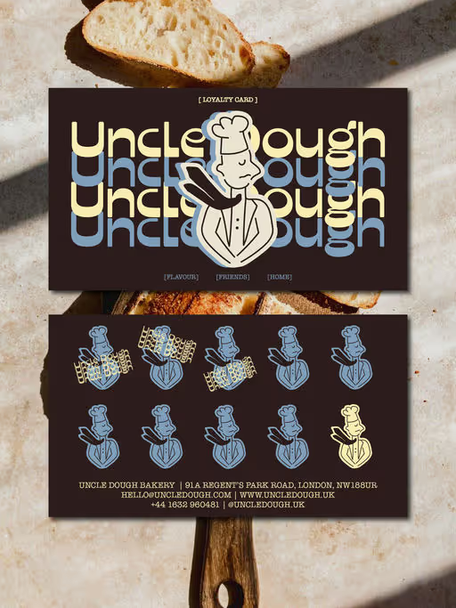
Uncle Dough is a sourdough bakery with heart, crust, and character. It's all about honest bread and long ferments. Design brief by @designerbriefs @brief.mebaby @dirtyline.std
Bakery Branding
Packaging Design
Label Design
Merchandise
Business Cards
Food & Beverage
Brand for Sale
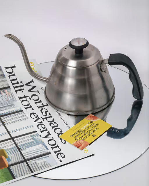
Hubly is a modern co-working space offering flexible workstations, collaborative areas, and a vibrant community-driven environment. Design brief by @briefcorp
Workspace Branding
Business Cards
Poster & Print
Merchandise
Interface Design
Home & Lifestyle
Hospitality
Brand for Sale
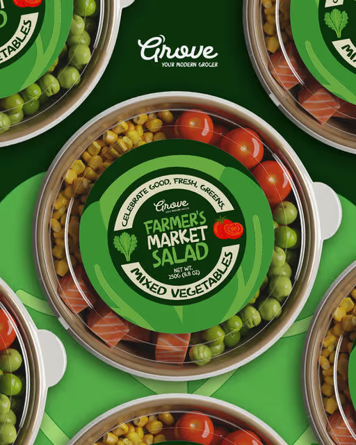
rove is a modern grocer for the design-minded. Think small-batch sauces, seasonal fruit, handmade pasta, and local favourites gathered under one thoughtfully curated roof. This isn't your average corner shop. Grove celebrates good food, good people, and good design. Design brief by @brief.mebaby
Grocer Branding
Packaging Design
Label Design
Poster & Print
Merchandise
Food & Beverage
Retail
Brand for Sale
Mora is an artisanal jam and jelly brand that celebrates fruit at its peak ripeness. Named after the Spanish and Italian word for berry, MORA is rooted in heritage yet styled for the modern pantry. Design brief by @readysetbrief
Jam Branding
Packaging Design
Label Design
Poster & Print
Business Cards
Food & Beverage
Retail
Brand for Sale
CHOCOL was born wild, far from clichés. But who said a fierce jaguar can’t become elegant for a special occasion? CHOCOL Deluxe transforms the iconic dark chocolate brand with dark chocolate truffles, orange filling and premium orange crystals.
Chocolate Branding
Packaging Design
Label Design
Poster & Print
Merchandise
Food & Beverage
Brand for Sale
Uncle Dough is a sourdough bakery with heart, crust, and character. It’s all about honest bread and long ferments.👀
Bakery Branding
Business Cards
Poster & Print
Label Design
Packaging Design
Food & Beverage
Brand for Sale
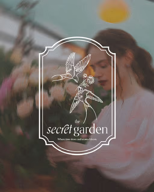
The Secret Garden is a nostalgic, mysterious flower shop crafting story-rich floral arrangements inspired by love letters, wild gardens, and quiet memories. This identity uses delicate typography, muted florals, and botanical icons to capture its romantic charm.
Florist Branding
Business Cards
Merchandise
Packaging Design
Poster & Print
Home & Lifestyle
Retail
Brand for Sale
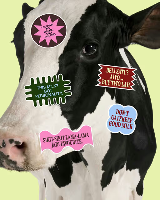
MILKISH puts a cow on plant-based milk to spark cognitive dissonance — turning a familiar symbol into a bridge between comfort, curiosity, and Malaysian everydayness.
Milk Branding
Packaging Design
Poster & Print
Merchandise
Label Design
Food & Beverage
Retail
Brand for Sale
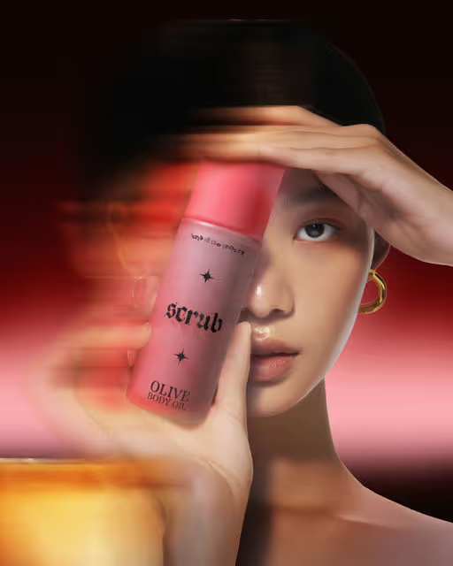
Scrub is a startup selling amazing sugar scrubs containing simple ingredients that are dermatologically tested and hypoallergenic.
Beauty & Wellness Branding
Packaging Design
Poster & Print
Label Design
Merchandise
Beauty & Skincare
Retail
Brand for Sale
About the Brand
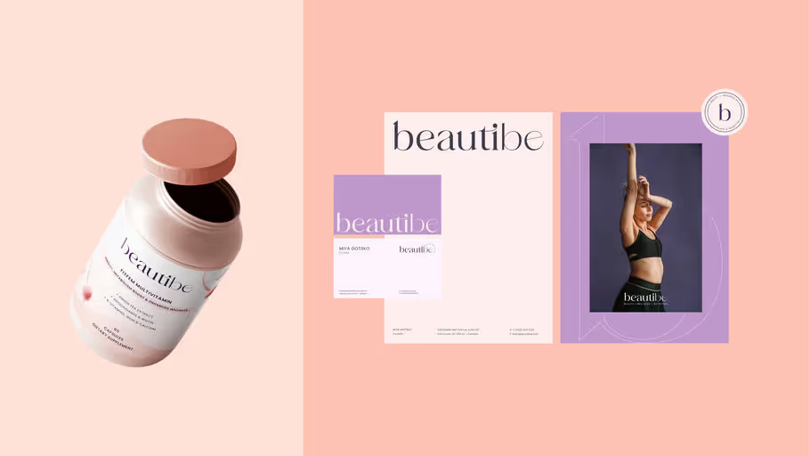
Beautibe is a wellness brand responsible for offering natural supplements for the daily routine, for women who cares about their health and want to live a healthier lifestyle.
The brand has as main values to bring high quality natural products with ethical and sustainable methods for women of all kinds and whp love themselves. With these values in mind, the brand’s visual identity was developed, with the aim of bringing a more holistic, feminine and friendly approach in line with the brand’s current aesthetic and concept.
The Challenge
Project Overview: I developed a brand identity for a nutrition supplement brand targeting women who prioritize beauty and a healthier lifestyle. The aim was to create a visually appealing and cohesive brand that resonates with the target audience's aesthetics and values.
The main challenge was to craft a brand identity that seamlessly integrates the concepts of beauty and health while appealing to a diverse demographic of women. The identity needed to be elegant yet approachable, reflecting the brand’s commitment to quality and well-being. Additionally, the brand's visual language had to stand out in a saturated market of health and beauty products.
To address this challenge, I developed a sophisticated and feminine brand identity using a carefully curated color palette and typography choices.
The Solution
The resulting brand identity successfully encapsulates the essence of beauty and health, appealing to women who value both. The cohesive and visually appealing design has helped the brand differentiate itself in the competitive market, fostering a strong connection with its target audience and driving brand loyalty.
By blending sophisticated colors and elegant typography, the brand identity not only stands out but also conveys a sense of trust and quality, making it a preferred choice for women seeking beauty and wellness supplements.
Beauty & Wellness Branding
Packaging Design
Poster & Print
Business Cards
Stationery
Beauty & Skincare
Wellness & Health
Brand for Sale
Where Every Product Tells A Story.
VIRSARI® is an online shop that showcases a collection of stylish and functional household items. The shop is designed to cater women who are interested in cooking, interior design and lifestyle accessories, offering a wide range of products that are both practical and aesthetically pleasing.
For this one client I was responsible to bring to life their brand identity, by capturing the brand essence to convey the idea of versatility and modern lifestyle according to its target audience.
Deliverables
- Logo Suite
- Color Palette
- Typography System
- Stationary
- Posters
- Packaging
- Brand Guidelines Book
The Challenge
The challenge was to create a distinctive, memorable visual identity for VIRSARI that would cut through a crowded home and lifestyle market, while speaking directly to women interested in cooking, interior design, and lifestyle accessories, the brand needed to feel versatile, modern, and sophisticated across both digital and physical touchpoints, and all of this had to be achieved within a six week timeline.
The Solution
The solution focused on a restrained, flexible system, with a custom logotype in a modern serif using elegant contrasts and ligatures to read as feminine, luxurious, and adaptable, a refined neutral color palette for sophistication and flexibility, and a paired serif + sans-serif typography system for clarity and consistency, delivered as a full suite of assets including logo variations, brand guidelines, stationery, packaging and Amazon listing creative so the brand appears cohesive and scalable across product ranges and channels.
Home Branding
Packaging Design
Label Design
Business Cards
Stationery
Home & Lifestyle
Retail
Brand for Sale
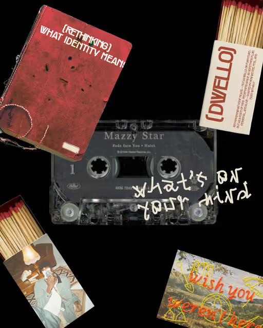
First home isn’t only a place to live; it’s where you learn independence, have a dialogue with yourself, and define what home truly means.
“Rethinking” is more than a word — it’s Dwello’s call to action. The brand invites people to reconsider what home really means: more about feelings than walls, more about meaning than address.
The “(( ))” symbol represents that idea — open, breathing, and deeply personal; a space that holds both freedom and belonging.
Home Branding
Label Design
Poster & Print
Merchandise
Packaging Design
Home & Lifestyle
Brand for Sale
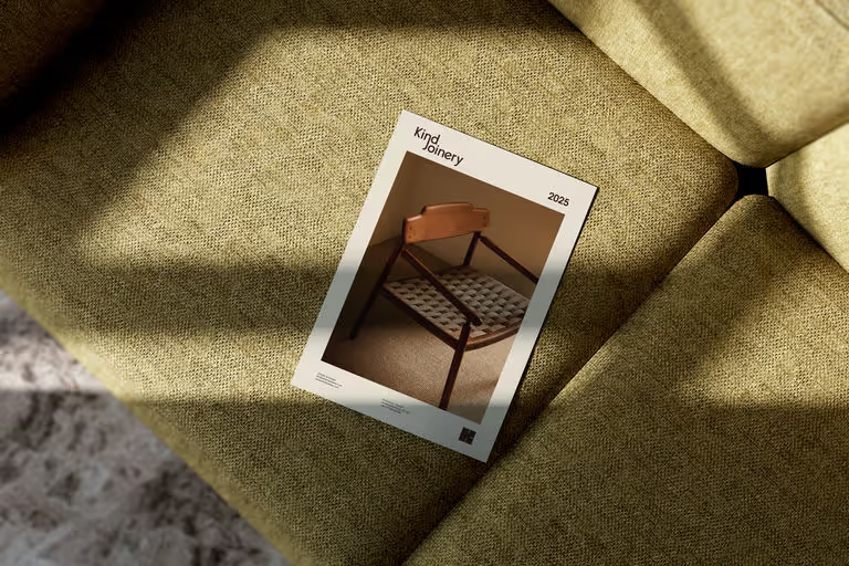
It’s more than a mark — it’s a joint.
Inspired by traditional woodworking slots, this logo for Kind Joinery hides a quiet ‘K’ within its form — a subtle nod to precision, balance, and timeless craft. Just like every dovetail or mortise-and-tenon, the logo embodies the harmony of strength and elegance, where nothing is accidental and every detail serves a purpose. It’s a celebration of craftsmanship passed down through generations, reimagined for today — a symbol that’s as enduring as the work it represents.
Craftsmanship Branding
Poster & Print
Home & Lifestyle
Brand for Sale
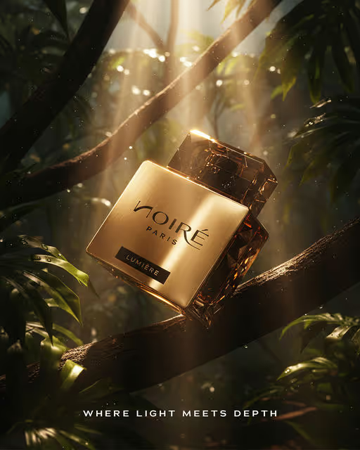
NOIRÉ is a contemporary fragrance brand blending refinement and sensuality. The identity captures “Where light meets depth”, balancing gold and shadow, nature and luxury, to create a cinematic world of confidence, sophistication, and allure.
Fragrance Branding
Packaging Design
Poster & Print
Merchandise
Label Design
Beauty & Skincare
Brand for Sale
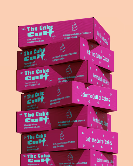
A modern cake subscription brand that rejects the idea that sweets have to be soft, pastel and polite. Instead, it celebrates the weird, the bold, and the beautifully twisted side of dessert culture. Indulgence feels like a ritual. The Cake Cult is a brand identity that feels like a sugar rush, electric, funky and bold. One part punk bakery, one part cult of sweetness. Join the cult of cakes!
Bakery Branding
Packaging Design
Poster & Print
Merchandise
Business Cards
Food & Beverage
Brand for Sale
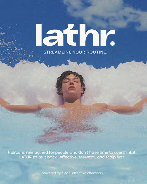
A refined bath and body brand designed around simplicity, scent, and sensory detail. Modern, muted, and minimal at heart.
Beauty & Wellness Branding
Packaging Design
Poster & Print
Merchandise
Social Media Kit
Beauty & Skincare
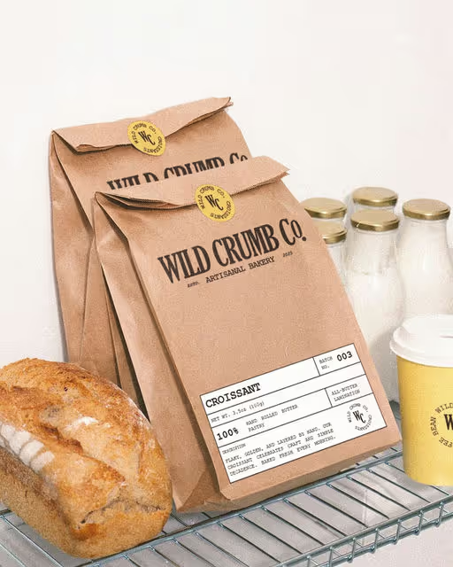
Wild Crumb Co. is an artisanal bakery defined by its devotion to craft, texture, and honest indulgence. Every croissant, loaf, and jar is made by hand and wrapped in thoughtful design. A brand built for those who find beauty in the crumb.
Bakery Branding
Packaging Design
Label Design
Merchandise
Poster & Print
Food & Beverage
Brand for Sale
UNSEEN redefines modern identity through the lens of imperfection. A gritty, anti-design exploration that embraces cracks, texture, and imbalance as the new visual language of authenticity.
Fashion Branding
Merchandise
Poster & Print
Packaging Design
Label Design
Fashion & Apparel
Brand for Sale
A contemporary casino brand built on contrast, where elegance meets adrenaline, chance meets design.
Casino Branding
Packaging Design
Merchandise
Poster & Print
Business Cards
Entertainment
Hospitality
Brand for Sale
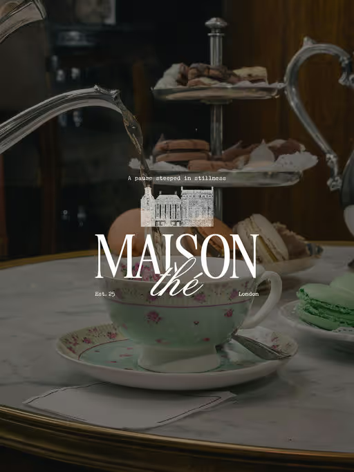
A sophisticated tea atelier combining Parisian sensibility with grounded luxury a visual narrative of warmth, ritual, and refinement.
Tea House Branding
Packaging Design
Poster & Print
Merchandise
Business Cards
Food & Beverage
Brand for Sale
A premium golf club brand inspired by heritage, precision, and quiet luxury. Designed for those who play with intention.
Golf Branding
Merchandise
Poster & Print
Label Design
Packaging Design
Sports
Hospitality
Brand for Sale
A modern florist brand inspired by nature’s quiet poetry where every arrangement feels like a secret waiting to bloom.
Florist Branding
Poster & Print
Packaging Design
Merchandise
Stationery
Beauty & Skincare
Home & Lifestyle
Brand for Sale
Vibes is a design-forward cocktail brand built for the new social era. Fresh, dynamic, and unapologetically expressive.
Cocktail Branding
Packaging Design
Poster & Print
Merchandise
Social Media Kit
Food & Beverage
Brand for Sale
This identity captures the artisanal spirit of Flourist - handcrafted breads, delicate pastries, and a touch of kitchen magic in every creation. A brand made for those who savor with their eyes first and taste second.
Soft textures, elegant layouts, and a crafted aesthetic bring Flourist’s personality to life, making every bite feel intentional and unforgettable.
Because when it comes to baking and branding, artistry always rises. ✨
Bakery Branding
Business Cards
Packaging Design
Poster & Print
Merchandise
Food & Beverage
Brand for Sale
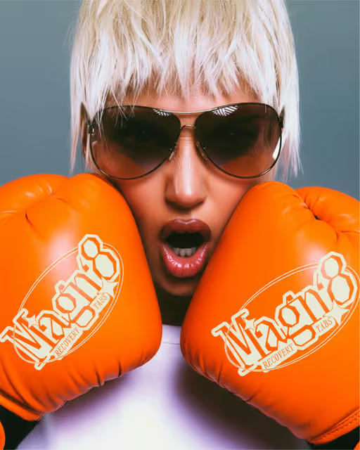
A nod to old-school grit, reimagined for modern recovery.
MAGN8 channels the raw energy of hard training: fueling hydration, muscle repair, and momentum with magnesium precision and the power of proper rest.
Supplement Branding
Packaging Design
Merchandise
Poster & Print
Label Design
Wellness & Health
Brand for Sale
Petali is a botanical soda brand, that is infused with floral notes ✨..
Petali comes in 5 flavours to romance your senses - bringing freshness to your mornings, uplift to your afternoons, calming serenity to your evenings and touch of sensuality to your nights.
Beverage Branding
Packaging Design
Poster & Print
Merchandise
Food & Beverage
Brand for Sale
For UltraWave Studio’s brand identity, we wanted to convey a bold, colorful and creative vision. We aim to craft visual worlds where innovation is the norm and eccentricity is celebrated.
Agency Branding
Merchandise
Poster & Print
Packaging Design
Label Design
Entertainment


