Brand Identity Showcase
Nominees
Thank you! Your submission has been received!
Oops! Something went wrong while submitting the form.
Showing you 0 of 0 Nominees
).avif)

Brand for Sale
Cinnapop turns gingerbread into a statement. Sweet but unapologetic, nostalgic but modern — made for those who celebrate quietly, strangely, and in their own way. (collab with @zoevermander)
Gingerbread Branding
Packaging Design
Poster & Print
Merchandise
Label Design
Food & Beverage
Fashion & Apparel

Brand for Sale
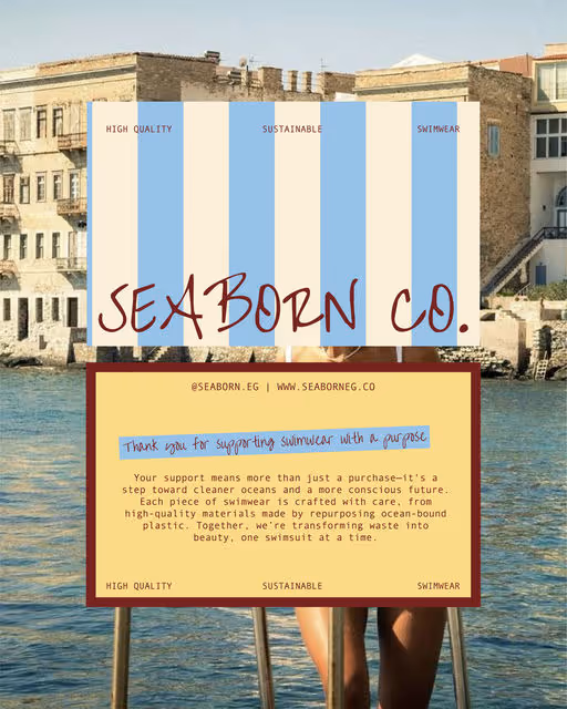
Seaborn Co. is a conceptual sustainable swimwear brand focused on ocean conservation, transforming ocean plastic into chic, eco-friendly suits with natural palettes and minimalist designs, using symbols like the nautilus for circularity, emphasizing luxury without excess and a purpose-driven identity.
Swimwear Branding
Poster & Print
Packaging Design
Merchandise
Label Design
Fashion & Apparel
Home & Lifestyle


Brand for Sale
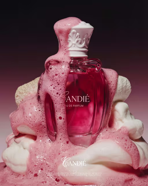
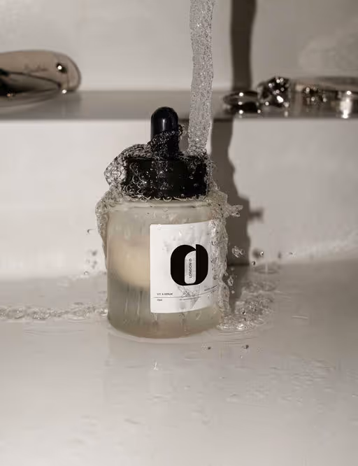
Candié is a sweet inspired perfume with a bold edge, playful, confident scent made to stand out.
Inspired by cherry tones, the rich reds and soft pinks come together to create a look that feels bold, feminine and full of personality. The packaging is designed to create a bold first impression while maintaining simplicity and clarity.
Perfume Branding
Packaging Design
Poster & Print
Merchandise
Business Cards
Beauty & Skincare
Fashion & Apparel

Brand for Sale
A futuristic brand and motion system built for an AI-driven world. The design explores clarity, rhythm, and energy through light, motion, and intelligent form
AI Branding
Poster & Print
Merchandise
Interface Design
Website Design
Tech & AI


Brand for Sale
hibr is a contemporary winter streetwear brand built around the philosophy of "soft moods and cold streets". The visual identity is engineered for everyday wearability, blending textured layers with a sophisticated, minimalist aesthetic.
Streetwear Branding
Label Design
Merchandise
Packaging Design
Poster & Print
Fashion & Apparel

Brand for Sale
Fictional homewear brand focused on comfort and simplicity.
Brand identity, visual direction and mockups exploring soft materials, muted tones and everyday silhouettes.
Concept developed as a creative branding project.
Homewear Branding
Label Design
Packaging Design
Merchandise
Business Cards
Fashion & Apparel
Home & Lifestyle

Brand for Sale
OAKR is a furniture brand concept inspired by retro design and natural materials.
The project explores warm wood, soft curves and timeless forms, imagined to fit contemporary interiors while celebrating craftsmanship and simplicity.
Furniture Branding
Business Cards
Label Design
Packaging Design
Poster & Print
Home & Lifestyle
Retail

Brand for Sale
Uncle Dough is a fictional sourdough bakery project focused on handcrafted bread, warm packaging, and in-store visuals. The concept highlights simplicity, craftsmanship, and a modern yet rustic atmosphere rooted in everyday bakery life.
Bakery Branding
Packaging Design
Label Design
Business Cards
Poster & Print
Food & Beverage
Retail

Brand for Sale
Candié is where sweetness meets sophistication. Playful at heart and elegant by design, the brand turns fragrance into a delicate balance of playfulness and elegance. @dehouse.agency created the full visual universe for Candié, from logo and brand identity to product and packaging design, AI-driven imagery, and Instagram direction. Refined forms, delicate sweetness, and a polished digital presence come together to express a sweet kind of luxury.
Perfume Branding
Packaging Design
Poster & Print
Label Design
Merchandise
Beauty & Skincare
Fashion & Apparel

Brand for Sale
Jubi is a new generation of functional soft drinks created to restore balance, lift mood, and bring energy back to modern life without sugar, stevia, or unnecessary additives.
The brand captures the idea of effortless wellness through a clean and contemporary identity built on clarity, calm, and quiet confidence. Minimal typography, a balanced color system, and refined layouts create space to breathe, reflecting what Jubi stands for: less noise, more intention.
A reminder that feeling good can be simple, smart, and beautifully designed.
by @dehouse.agency
Beverage Branding
Packaging Design
Poster & Print
Label Design
Merchandise
Food & Beverage
Wellness & Health


Brand for Sale
A drink to turn every moment into an expression of joy. The product name was developed based on an African girl named Ebby (The Founder) as she is a joyful and a bubbly girl.
Simplicity, creating a delightful and witty packaging design that effortlessly mirrors the joy of sipping on these three delightful natural juices.
Ebby is portrayed as an playful, bubble – smile shaped character on each label.
Juice Branding
Business Cards
Label Design
Packaging Design
Poster & Print
Food & Beverage
Retail

Brand for Sale
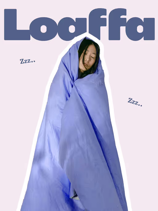
Loaffa makes sleep products that feel calm from the first touch. Everything about the brand is meant to slow things down, from the soft, low-light mood to the quiet colour palette of desaturated blues and gentle pinks. It’s designed to feel restful, familiar, and easy to live with.
Homewear Branding
Poster & Print
Merchandise
Packaging Design
Label Design
Home & Lifestyle
Fashion & Apparel
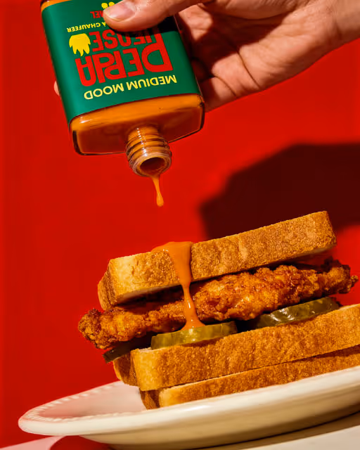
Bold and playful brand identity for a hot sauce concept. Strong typography, vibrant color palette and expressive visuals designed to highlight flavor intensity and personality through packaging, logo and visual direction.
Sauce Branding
Packaging Design
Label Design
Merchandise
Poster & Print
Food & Beverage
Retail


Brand for Sale
Peppa Please habanero hot sauce is spicy, bold, and doesn't take food to seriously. This packaging and branding design concept focuses on Peppa, a body building hot pepper who knows how to pack a punch, and always uses manners.
Sauce Branding
Packaging Design
Label Design
Poster & Print
Merchandise
Food & Beverage
Retail


Brand for Sale
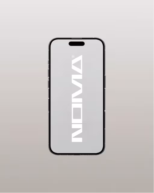
In a small workshop, a few sketches became questions. What if furniture did not announce itself, but instead made room to breathe? What if form followed calm, and materials were chosen for truth not trend? From those questions, noma emerged. noma offers Japanese furniture shaped by the balance between space and structure. These are pieces that don’t compete with a room, they complete it with a sense of form and honest materials, all inspired by Japanese interiors.
Furniture Branding
Merchandise
Poster & Print
Label Design
Packaging Design
Home & Lifestyle
Retail


Brand for Sale
Aperitivo with one click
Fresco for Cantina Felice is a collaboration between two brands created to offer a new way of enjoying wine: an aperitivo with just one click. The project rethinks wine for informal moments through a canned format, designed for convenience and spontaneity. Fresco is available in two options : red wine and white wine, and in two sizes, 33 cl and 50 cl, inspired by classic soft drink cans to fit different occasions. The visual identity is based on a minimalist design approach, where color plays a key role, making the product fresh, modern, and easy to recognize.
Created by @adgrafica_
Aperitivo Branding
Packaging Design
Label Design
Merchandise
Poster & Print
Food & Beverage
Retail

Brand for Sale
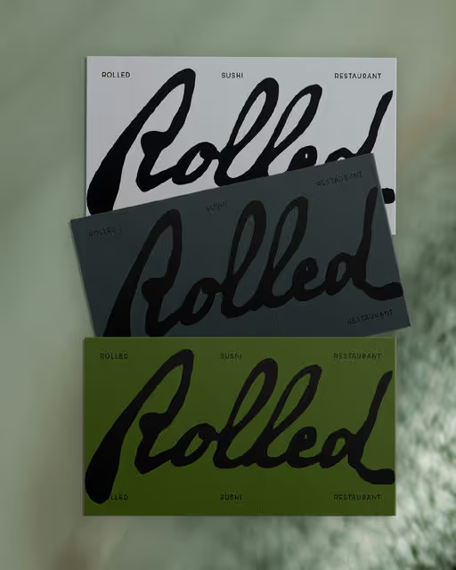
Rolled is a sushi restaurant concept inspired by quaint Japanese fishing villages atmosphere. Each roll captures a journey of heritage, creativity, and adventure, all wrapped in a traditional, harmonious atmosphere.
Sushi Restaurant Branding
Business Cards
Packaging Design
Label Design
Poster & Print
Food & Beverage
Hospitality

Brand for Sale
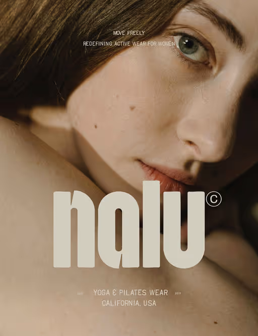
Redefining active wear for women. A yoga and pilates wear brand built around balance and flow. Each piece is made to feel supportive and high-quality.
Keywords: Flow, balance, clean, modern, feminine
Sportswear Branding
No items found.
Fashion & Apparel
Wellness & Health
Brand for Sale
A fashion & beauty brand, London.
Keywords: Clean, bold, modern.
Fashion & Beauty Branding
No items found.
Beauty & Skincare
Fashion & Apparel

Brand for Sale
Clean and calm identity inspired by Japanese furniture and space.
Furniture Branding
No items found.
Home & Lifestyle


Brand for Sale
Steaky is a bold, contemporary grill restaurant redefining the classic steakhouse. We deliver premium, flame-grilled cuts with an elevated casual vibe. Built for food lovers seeking smokey flavors and a modern, approachable atmosphere that feels alive.
Restaurant Branding
No items found.
Food & Beverage
Hospitality

Brand for Sale
FRAGMNT is a poetic brand shaped by memory, emotion, and the quiet beauty of what fades.
Its name and logo, marked by missing letters, reflect the way time erases details yet leaves behind the feeling.
Each creation — a scent, a form, a moment — becomes a vessel for what we can no longer hold, but still remember.
Through simplicity and light, FRAGMNT turns absence into presence, reminding us that even fragments can speak the language of love, warmth, and longing.
Fragrance Branding
Packaging Design
Poster & Print
Business Cards
Label Design
Beauty & Skincare

Brand for Sale
Merlin is a science-backed dog supplement brand built around one simple belief: dogs deserve the same ingredient standards as humans. Every Merlin product is formulated with clinically supported nutrients and made using human-grade, high-quality ingredients to support long-term canine health from the inside out.
Supplement Branding
Packaging Design
Label Design
Poster & Print
Merchandise
Wellness & Health

Brand for Sale
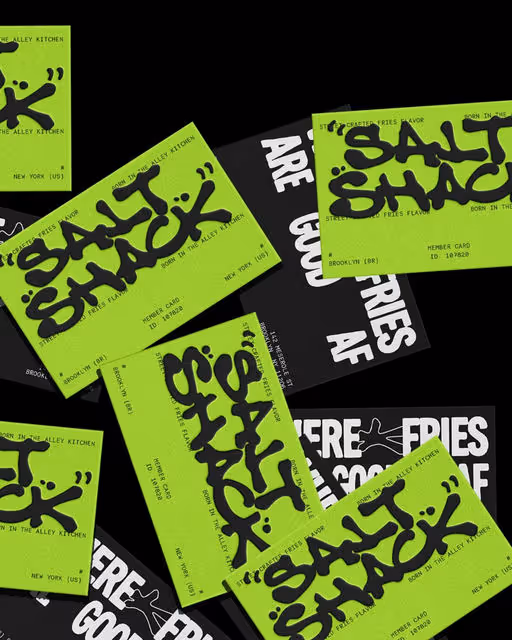
Salt Shack is a bold, elevated loaded fries bar serving hand-cut chips layered with unapologetically luxe toppings. Designed for girl dinners, date nights, and post-club cravings, it’s where indulgence meets attitude. The brand pairs a deep, luxurious red with crisp white accents and a chic, fashion-forward typeface. Salt Shack is striking, confident, and impossible to ignore.
Sometimes boujee, always messy.
Fries Bar Branding
Packaging Design
Label Design
Business Cards
Poster & Print
Food & Beverage
Fashion & Apparel

CLER is a modern dermatological brand built on the principles of inclusivity, transparency, and scientific simplicity. The visual identity centers around the core mission: providing high-performance "Care for All Skin" types, including combination, oily, and dry profiles.
Skincare Branding
No items found.
No items found.
Brand for Sale
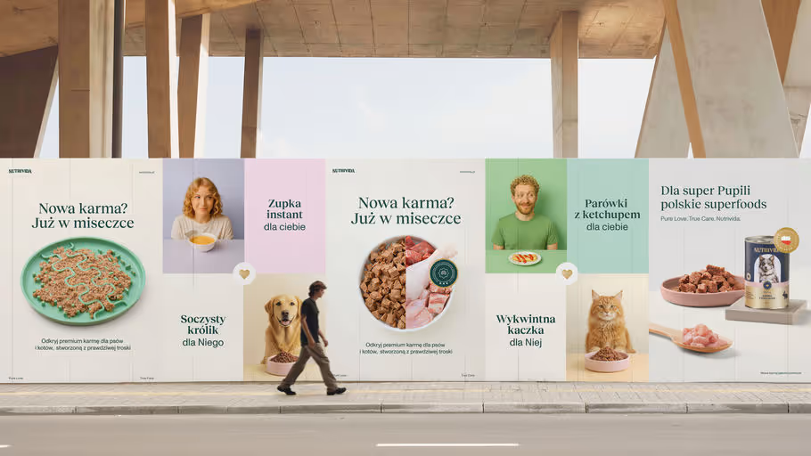
The branding was inspired by classic typographic forms. Serif typefaces, a golden Pantone accent, and a hand-drawn pen illustration gave the design an elegant, timeless character. The pet’s portrait was emphasized with a semi-circular color field, while the label layout followed a traditional, centered composition. To evoke warmth and a sense of closeness, the color palette was softened - warm ecru backgrounds and emotional photography showcasing the bond between humans and their pets. Combined with the tagline “Pure Love, True Care,” it all formed a coherent and harmonious brand identity.
Pet Food Branding
No items found.
No items found.

Brand for Sale
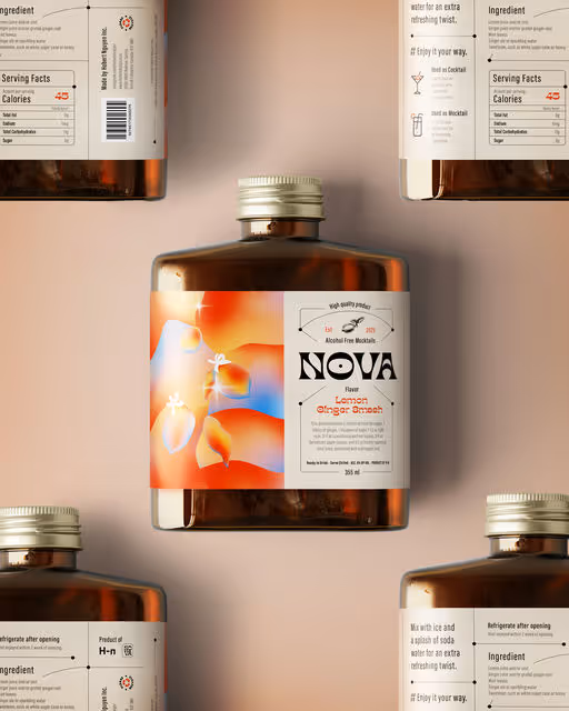
Nova is a bold and modern mocktail brand that transforms the non-alcoholic beverage experience into something exciting and sophisticated. With a focus on delivering refreshing flavors, Nova is perfect for any occasion—whether it’s a lively celebration, a casual hangout, or a quiet night in. The brand combines a sense of fun and elegance, offering an elevated alternative to traditional alcoholic drinks, allowing everyone to enjoy the perfect balance of flavor and style.
Mocktail Branding
Packaging Design
Label Design
Merchandise
Poster & Print
Food & Beverage
Hospitality


Brand for Sale
“Pietro Strizzi” is an Italian-style ice cream shop, defined by witty signature creations and genuine Viennese charm. The name refers to the colloquial Viennese term “Strizzi”—a character known for being a little roguish yet always likeable.
The parlor presents itself as an exceptional ice cream shop with an extravagant graphic identity. On mild summer evenings in 1140 Vienna, ice cream with distinctive character is served here.
Type in use: EK Roumald / @erkin_karamemet
Business Blooming: @pizzatypefaces
Ice Cream Branding
Label Design
Packaging Design
Poster & Print
Merchandise
Food & Beverage
Retail
Brand for Sale
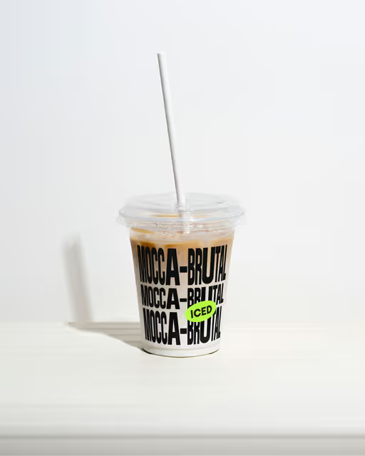
„Mocca Brutal“ is a Viennese coffee with a touch of extravagance. Unlike traditional coffeehouses, „Mocca Brutal“ is located in the heart of Favoriten, in Vienna’s 10th district. It’s not the typical corner you would expect for a coffeehouse of this kind – but that’s what makes it special. Here, traditions are slightly broken, and coffee is celebrated through a fusion of old and new cultures. ☕️
——
Type: -Bandit VF- & –Visual– by @allcapstype
Coffee Shop Branding
Merchandise
Packaging Design
Poster & Print
Label Design
Food & Beverage
Home & Lifestyle

Branding and packaging concept for a gingerbread brand.
A festive visual identity built around bold typography, warm colors and narrative illustrations, designed to create a cohesive and memorable brand experience.
Gingerbread Branding
No items found.
No items found.
Brand for Sale
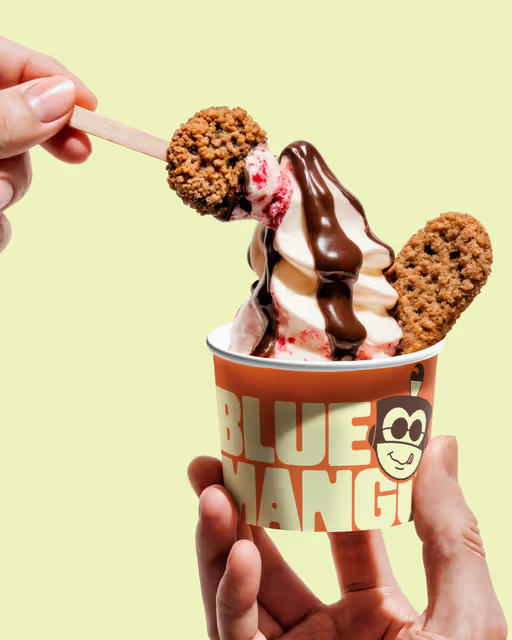
What began as a small froyo concept became a full visual universe. Driven by a mischievous monkey, a legendary blue mango, and a brand attitude that refuses to take dessert too seriously.
Blue Mango blends storytelling with strong graphic structure, resulting in a cheerful, memorable identity made for a new generation of customers in Tyre.
Ice Cream Branding
Packaging Design
Merchandise
Poster & Print
Label Design
Food & Beverage
Retail

Brand for Sale
Salt Shack embraces the raw energy of street culture and grit. Street-crafted fries are loud, fast, messy, and addictive. It echoes the feeling of grabbing fries from a back-alley kitchen where taste matters more than rules.
Fast Food Branding
Merchandise
Packaging Design
Poster & Print
Label Design
Food & Beverage

Brand for Sale
Amaro brings the Italian cocktail spirit wherever you are. Vibrant, refreshing, and made for sunny days.
Cocktail Branding
Packaging Design
Label Design
Merchandise
Poster & Print
Food & Beverage
Hospitality
Brand for Sale
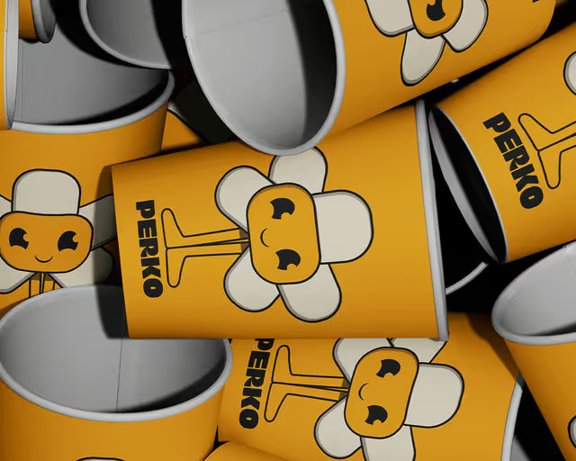
Perko is a lively, modern coffee brand built around the idea that mornings should feel brighter, lighter, and full of positive momentum. Designed for young professionals, creatives, and anyone navigating fast paced urban life, Perko blends bold flavor with an energetic visual identity that’s both fun and approachable.
Perko mascot was created for one simple reason to make you smile and brighten your day. Inspired by the warmth of a fresh cup of coffee, this friendly little character brings the brand to life with playful poses and sunny energy.
The brand centers on a simple belief:
good coffee should lift your mood as much as your energy.
Coffee Branding
Packaging Design
Merchandise
Poster & Print
Business Cards
Food & Beverage
Retail

Brand for Sale
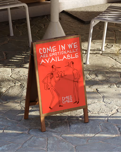
meet chez chez ❤️, the project that let me lean fully into messy sketches, bold reds, and bistro-core chaos in the best way possible.
I wanted this brand to feel like that one neighborhood spot where the tables wobble a little, the wine pours generously, and someone’s dog is always wearing a beret for no reason.
So everything is intentionally hand-drawn, imperfect, human. Nothing stiff. Nothing over-polished. Just a warm, slightly chaotic bistro energy wrapped in vibrant reds and napkin-doodle illustrations.
Bistro Branding
Poster & Print
Stationery
Label Design
Packaging Design
Food & Beverage
Home & Lifestyle


Brand for Sale
Oasis is a modern online plant shop bringing lush, curated greenery directly to your home. It caters to urban dwellers, plant lovers, and design-conscious individuals who value quality, style, and a touch of nature in their everyday life.
The visual identity for Oasis embodies a refined sense of freshness, modernity, and the quiet joy of plant ownership. The system is built on a minimalist design approach - clean layouts, generous breathing space, and contemporary typography - allowing the brand’s natural elements to take centre stage. Complemented by a fresh green palette inspired by lush forest tones, the identity creates an immersive, nature-led experience across all touchpoints.
Plant Branding
No items found.
No items found.