Brand Identity Showcase
Nominees
Thank you! Your submission has been received!
Oops! Something went wrong while submitting the form.
Showing you 0 of 0 Nominees


Brand for Sale
A London Tea House. A quiet escape in the heart of the city, where time slows down with every steep. It’s less about sipping tea and more about creating pause.Brief by @designerbriefs
Keywords: Elegant, serene, timeless, calm
Tea House Branding
Packaging Design
Merchandise
Poster & Print
Business Cards
Food & Beverage
Home & Lifestyle


Brand for Sale
Wildpup is a bold and playful dog food brand inspired by the high energy, carefree nature of dogs. Built around bold colors and graphic elements, the brand feels fun, expressive, and full of personality.
Dog Food Branding
Packaging Design
Poster & Print
Label Design
Merchandise
Food & Beverage

Brand for Sale
Flipped is a modern brunch spot serving comfort classics with a playful twist. It’s all about slow mornings, good food, and the everyday joy of coffee and pancakes.
Brunch Branding
Packaging Design
Merchandise
Poster & Print
Label Design
Food & Beverage
Hospitality

Brand for Sale
Bold and joyful body care brand concept. A colorful identity with playful typography, vibrant packaging and studio visuals created with AI. A modern campaign celebrating confident skin and feel-good self care.
Body Care Branding
Packaging Design
Label Design
Poster & Print
Merchandise
Beauty & Skincare
Retail


Brand for Sale
Crumb & Brew Is a modern coffee spot built around warm drinks, soft cookies, and the simple joy of taking a break
Coffee Shop Branding
Poster & Print
Merchandise
Label Design
Packaging Design
Food & Beverage
Hospitality


Brand for Sale
Crafting Stories Through The Lens.
Aperture Pictures is a film production studio committed to bringing recent history to life through compelling storytelling and precise cinematography. Our mission is to illuminate the intricacies of contemporary history with authenticity and artistic flair, providing audiences with an engaging and enlightening view of the recent past.
Film Studio Branding
Business Cards
Poster & Print
Stationery
Packaging Design
Entertainment
Brand for Sale
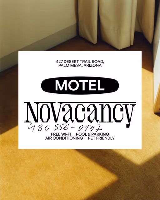
Brand identity for a fancy American Motel
Motel Branding
Business Cards
Label Design
Merchandise
Poster & Print
Hospitality
Home & Lifestyle

Brand for Sale
Luxory Pajamas and bedding fashion project
Homewear Branding
Packaging Design
Label Design
Merchandise
Poster & Print
Fashion & Apparel
Home & Lifestyle

Brand for Sale
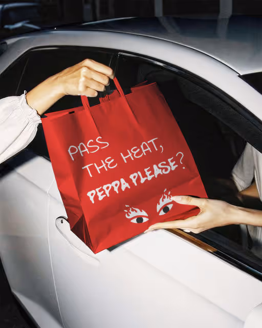
Pleaseeee don’t take us too seriously. Well, maybe a bit. At Peppa Please, we want you to enjoy the spicy authentic chilli flavours that we’ve freshly sourced for you. But don’t expect this to be a smooth ride. No, no, NO. These hot sauces were created to add a kick that you have never felt before. So enjoy, but be prepared to feel the heat.
Sauce Branding
Packaging Design
Poster & Print
Merchandise
Label Design
Food & Beverage
Retail

Brand for Sale
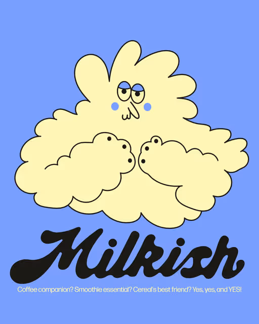
Brand design for Milkish, a plant-based milk. The goal was to make Milkish feel friendly, simple, and honest, moving away from typical, serious plant-milk branding.
Milk Branding
Poster & Print
Merchandise
Packaging Design
Label Design
Food & Beverage
Retail

Brand for Sale
Still is a zero-waste makeup brand designed for conscious consumers who want beauty without the excess. All products are refillable or recyclable, made with clean ingredients.
Make-up Branding
Packaging Design
Poster & Print
Merchandise
Social Media Kit
Beauty & Skincare

Brand for Sale
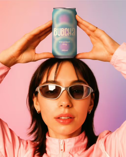
Bubcha is a non-alcoholic vibrant kombucha brand that blends bold flavors with feel-good energy. Crafted for the curious and the conscious, it celebrates balance between fizz and calm, health and indulgence. Every sip is a bubbly boost for your gut and your mood.
Kombucha Branding
Packaging Design
Poster & Print
Merchandise
Label Design
Food & Beverage

A vibrant floral studio in Miami, creating artistic arrangements that celebrate color, texture, and natural beauty.
Florist Branding
Business Cards
Label Design
Packaging Design
Poster & Print
Home & Lifestyle


Brand for Sale
AURUM – Visual Identity for a Luxury Hotel in Provence🐎
A visual identity created for a luxury hotel in Provence where the horse becomes the distinctive symbol, a tribute to the region’s equestrian heritage and timeless elegance.
The horse is illustrated with irregular, hand drawn strokes, expressing authenticity and movement while the cream and green palette evokes natural harmony and refined luxury.
The logo, combining calligraphic and serif typography, is applied across the hotel’s visual system: stationery, menus, room keys and all branded materials.
The name “Aurum”, meaning gold in Latin, embodies the sense of prestige and understated opulence that defines the spirit of this place.
Design by Giulia Lecca
Hotel Branding
Merchandise
Packaging Design
Poster & Print
Stationery
Hospitality
Home & Lifestyle
Brand for Sale
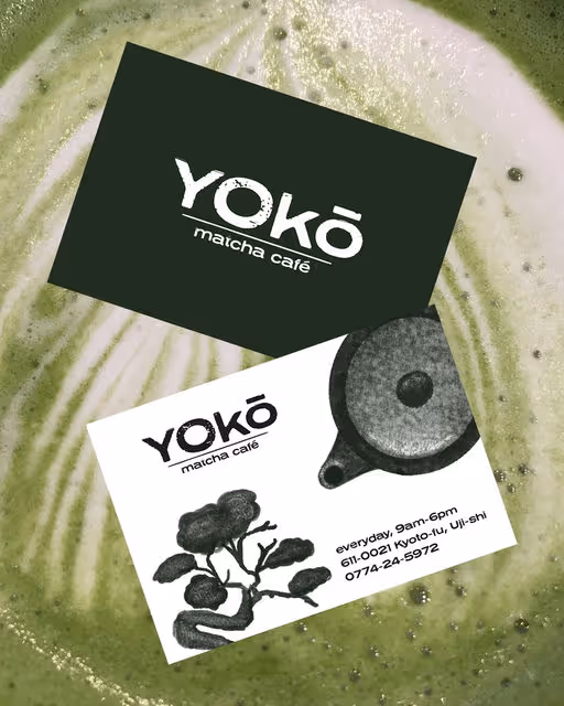
A visual identity created for a Japanese matcha bar that invites slowness and quiet reflection.
Yokō was born from the tension between fast city rhythms and the need to pause. The concept is expressed through a design language that embraces calm, ritual, and the beauty of imperfection.
The illustrations are hand-drawn, inspired by traditional sumi-e ink painting (墨絵 ) and the minimal, poetic forms of Japanese nature.
Textured strokes and organic lines bring a sense of authenticity.
Embracing imperfection, the logo reveals a quiet elegance in its roughness, where every line holds meaning.
Like a matcha prepared slowly, the design invites a quiet moment in a busy world.
Project by Giulia Lecca
Matcha Branding
Packaging Design
Poster & Print
Merchandise
Business Cards
Food & Beverage
Home & Lifestyle

Brand for Sale
MAGN8 offers magnesium tabs for quick recovery. Built for athletes who move hard and rest harder, each tab supports hydration and muscle repair. It's portable, potent, and made for momentum.
Supplements Branding
Packaging Design
Merchandise
Poster & Print
Business Cards
Wellness & Health


Brand for Sale
A boutique coffee brand merging artisanal brewing with modern aesthetics. Crafted for those who treat coffee as ritual, not routine.
Coffee Branding
Merchandise
Packaging Design
Poster & Print
Stationery
Food & Beverage
Retail

Brand for Sale
Brand identity and label design for SILVA.
Brand brief by Creative Boom.
Alcohol free Branding
Packaging Design
Poster & Print
Merchandise
Label Design
Fashion & Apparel
Brand for Sale
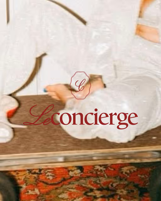
Le Concierge is a lifestyle service brand imagined as a timeless hotel where every detail is curated, every request feels personal, and every service is delivered with the charm of a private concierge. Inspired by the golden era of hospitality, the brand brings back the elegance of handwritten notes, vintage room keys, and quiet luxury. We approached the branding as if Le Concierge were a real concierge service, one that offers everything you need with grace, warmth, and intention. From beauty rituals to fitness programs and private experiences, each offering is named and presented as if part of a storied stay, allowing clients to feel like guests, not customers. At Le Concierge, we don’t just offer services. We take notes.
Concierge Branding
Label Design
Packaging Design
Poster & Print
Merchandise
Home & Lifestyle
Brand for Sale
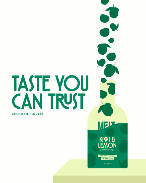
Most products that are labeled ‘better for you’ are filled with artificial sweeteners, preservatives, and synthetic acids. Ingredients that confuse your mind and body.
Melt is made for people who want/need something honest. Making products the simple way, with ingredients you can pronounce. It’s taste you can trust.
Beverage Branding
Packaging Design
Poster & Print
Merchandise
Label Design
Food & Beverage
Wellness & Health


Brand for Sale
The project presents the brand identity for Gill’s Fish Market, a heritage seafood brand located by the piers of Sausalito. Established in 1940 and run by the Gillford family, Gill’s has long been known for its fresh catch, quality seafood, and genuine hospitality - staying true to its motto: “You’re not a customer - you’re family.” As the brand expands with a new food truck, the identity reimagines its legacy through a modern, approachable design that brings the same trusted tradition to the streets. For this project, I carefully designed the visual identity that draws inspiration from the marine lifestyle of California. Each element - from the logo and typography to the colour palette and icon system - was intentionally chosen to evoke the freshness, warmth, and authenticity of the coast.
Market Branding
Packaging Design
Poster & Print
Merchandise
Business Cards
Food & Beverage
Hospitality


Brand for Sale
There’s something so comforting about a cinnamon-roll bakery — the warmth, the sweetness, the nostalgia.
With Jacob Rolls, I wanted to capture that feeling visually: soft purples, gentle swirls, playful illustrations, and a brand world that feels cozy, welcoming, and a little bit whimsical.
From menu design to character doodles, every detail was built to make the brand feel like a place you’d want to linger, indulge, and smile.
A cinnamon-roll bakery with personality? Yes, absolutely. 💜
Bakery Branding
Packaging Design
Merchandise
Poster & Print
Stationery
Food & Beverage
Retail

Brand for Sale
OKERRE is a bold, expressive skincare brand transforming self-care into a sensorial, confidence boosting ritual. Their first product, a premium clay-based face mask, embodies modern artistry, unexpected refinement, and elevated creativity.
Skincare Branding
Packaging Design
Label Design
Merchandise
Poster & Print
Beauty & Skincare

Brand for Sale
This is At home bakery. The owners are June and George. They live in their grandparents house, which they renovated 3 years ago.
June and George are fascinated by hand made, and their recipes are actually from their ancestors. They are the kind of people who wear natural materials and reuse clothes when they are no longer wearable.
These 2 have always wanted a bakery, and since their grandparents are no longer here, they decided it was the right time to keep their recipes alive. And the smell of memories.
Bakery Branding
Packaging Design
Label Design
Poster & Print
Business Cards
Food & Beverage
Home & Lifestyle


Brand for Sale
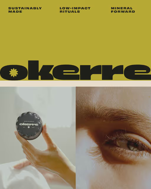
Okerre is a modern, earth-rooted skincare brand inspired by the healing soils of Mexico, blending ancient clay rituals with contemporary skincare science to create grounding, restorative skincare for everyday rituals.
Skincare Branding
Packaging Design
Label Design
Merchandise
Poster & Print
Beauty & Skincare
Wellness & Health
Brand for Sale
THE BRAND
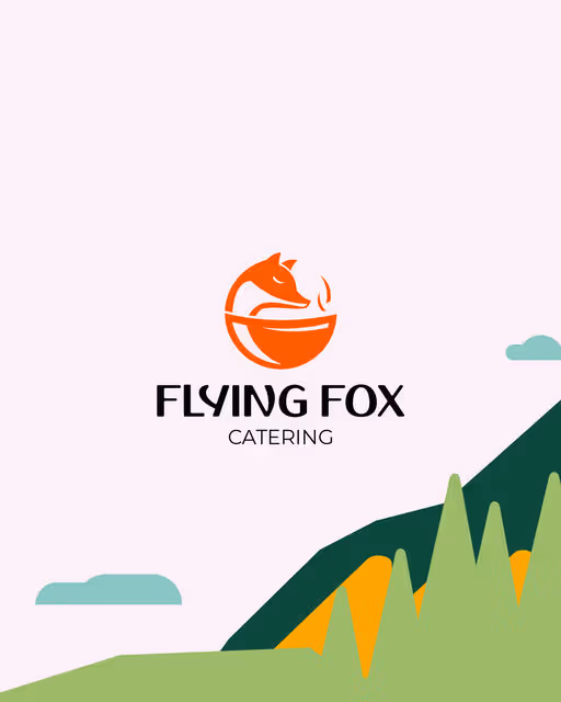
The project is for a food delivery brand created for people who live life at a fast pace but don’t want to compromise on eating well. The brand offers authentic dishes inspired by different cultures, carefully prepared and delivered all day long. A journey through global flavors, designed to fit seamlessly into modern city life.
The logo is inspired by the concept of the zipline, one of the earliest transportation systems used in ancient China, India, and Japan. Later known as the “flying fox” in Australia, New Zealand, and Scotland, it was also used to deliver food to people living in hard-to-reach areas.
This history inspired the symbolic fusion of the fox—representing speed, movement, and cleverness—and the bowl/earth, a symbol of food, sharing, and the world. A mark that reflects our mission: delivering global cuisine in a fast, thoughtful, and authentic way.
Food in motion. Cultures connected. Life in the city.
Food Delivery Branding
Poster & Print
Packaging Design
Business Cards
Merchandise
Food & Beverage
Retail

Brand for Sale
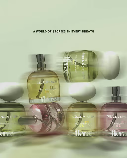
Floræ is a bold 100% natural fragrance line devoted to the purity and vitality of nature. Each scent is meticulously crafted from living plant distillations, capturing the quiet beauty of flowers, herbs, woods, and air as they shift through the seasons. Never synthetic and free from harmful additives, Floræ creates fragrances that feel pure, intentional, and alive.
Here I have only showcased about one of it's signature product, Soft Bloom, inspired by gladiolus flower. It captures the delicate freshness of gladiolus - lightly sweet and quietly radiant. Crafted from living botanicals, this scent unfolds like petals opening at dawn.
Fragrance Branding
Packaging Design
Poster & Print
Label Design
Merchandise
Beauty & Skincare
Wellness & Health
Brand for Sale
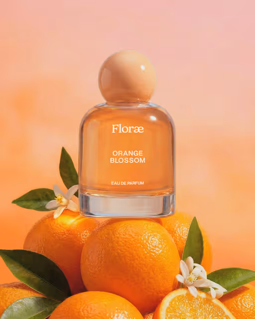
Floræ is a bold, 100% natural fragrance line dedicated to the purity and vitality of nature. Each seasonal scent is meticulously crafted from living plant distillations—never synthetics, never harmful additives. Rooted in real botanicals such as orange blossoms and other seasonal ingredients, Floræ creates earthy, modern fragrances that reflect clean beauty values and responsible formulation. Designed for contemporary beauty and cosmetic brands, Floræ combines botanical expertise, sustainable practices, and refined aesthetics to deliver authentic, nature driven scent experiences.
Fragrance Branding
Packaging Design
Poster & Print
Label Design
Business Cards
Beauty & Skincare
Wellness & Health


Brand for Sale
Cinnapop cookies bring sugar, spice, and everything nice to the holidays. They’re meant to be shared—except tonight. Sorry kids, these cookies are reserved for Santa… and let’s be real, he loves them more than you do.
Cookie Branding
Packaging Design
Poster & Print
Label Design
Merchandise
Food & Beverage
Retail
Brand for Sale
Floræ is a bold 100% natural fragrance line devoted to the purity and vitality of nature. Each seasonal scent is meticulously crafted from living plant distillations; never synthetics, never harmful additives.
Fragrance Branding
Packaging Design
Poster & Print
Label Design
Business Cards
Beauty & Skincare
Wellness & Health

Brand for Sale
The visual language is inspired by mineral rich landscapes, directly linking the brand's products to their origin. A strategic approach to position the brand at the intersection of minimalism and natural authenticity.
Business Branding
Packaging Design
Poster & Print
Label Design
Merchandise
Beauty & Skincare
Home & Lifestyle
Brand for Sale
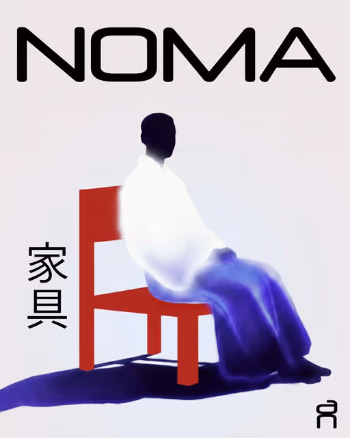
NOMA is a calm, Japanese-inspired furniture brand shaped by balance, space, and quiet structure. The identity blends minimal forms, soft gradients, and thoughtful restraint to create pieces that feel modern, intentional, and effortlessly serene.
Furniture Branding
Poster & Print
Packaging Design
Label Design
Merchandise
Home & Lifestyle

Brand for Sale
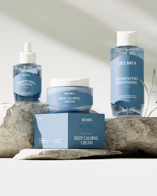
Qelora is a premium skincare brand inspired by the beauty of the tropics.
With natural ingredients such as Aloe Vera, Centella Asiatica, and Cucumber,
Qelora presents a skincare range designed to address the unique needs of
skin in tropical climates.
Creative Director — Ahmad Ilham
Art Director — Miftahul Fauzi
Graphic Designer — Nurfaisal Wiranugraha & Gerrad D Pascalis
3D Designer — Rusbin Toroki
Skincare Branding
Packaging Design
Label Design
Poster & Print
Merchandise
Beauty & Skincare

Brand for Sale
We take our butter seriously, maybe a little too seriously. That’s why we make it ourselves, right here, before it ever touches a cookie.
Because when the butter is richer, the dough is better,
and the cookies come out exactly how they should be:
gooey in the middle, golden on the edges, and worth slowing down for.
Cookie Branding
Packaging Design
Merchandise
Label Design
Poster & Print
Food & Beverage

Brand for Sale
Archive is a luxury bag brand that is about every woman who values the moment.
A bag should hold all the weight, not the women. A good bag has scars that last over time because it is of high quality.
It is that bag that you love and don’t want to change every day. In which you put all the things you need on the run, until it is full.
Luxury Branding
Packaging Design
Merchandise
Label Design
Poster & Print
Fashion & Apparel
Retail

Brand for Sale
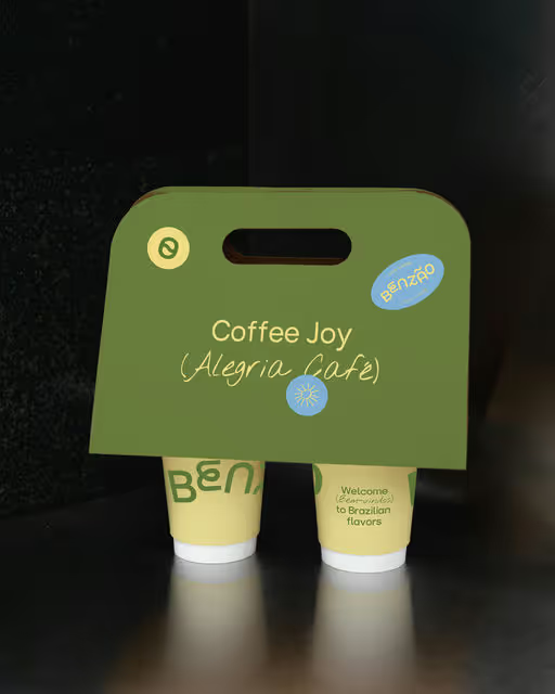
Benzão is a Brazilian café with a cozy spot that celebrates coffee culture alongside traditional Brazilian treats. With focus on warmth and flavor it’s a great place to connect with friends. The word Benzão means 'big blessing,' hence for the identity the inspiration was taken from the natural beauty of Brazil; the sun, beaches, and palms, as symbols of life’s everyday blessings.
Café Branding
Packaging Design
Poster & Print
Label Design
Business Cards
Food & Beverage
Hospitality