Brand Identity Showcase
Nominees
Thank you! Your submission has been received!
Oops! Something went wrong while submitting the form.
Showing you 0 of 0 Nominees


Brand for Sale
FROSTÉ is a café where cold becomes a form of comfort. About freshness, quiet, and a brief pause in the city's rhythm.
FROSTÉ designed as a calm and contemporary brand for cold desserts and coffee. The identity focuses on typography, balance, and a quiet visual language, creating a flexible system that works across packaging, print, and real-life applications.
Café Branding
Packaging Design
Merchandise
Poster & Print
Label Design
Food & Beverage
Hospitality

Brand for Sale
LUNTO is a contemporary pet supplies brand focused on tactile connection, comfort, and everyday movement.
The brand creates thoughtfully designed accessories and resting spaces that blend seamlessly into modern interiors while supporting the natural behavior of pets.
The visual identity is based on the principle of soft geometry in motion.A smooth curved form becomes the foundation of the logo mark, symbolizing comfort, flexibility, and natural posture. Two minimal dots act as a dynamic accent — a visual metaphor for movement, touch, and interaction. By changing their position, the dots introduce motion into the system and create a flexible, living visual language while maintaining a consistent brand character.
Pet Supplies Branding
Packaging Design
Label Design
Merchandise
Poster & Print
Home & Lifestyle
Retail

Brand for Sale
ØYEN is a skincare brand born from silence. It reflects Nordic tranquility, purity, and a sense of inner balance. The project encompasses the full development of strategy, brand identity, and packaging design for a minimalist skincare line. The concept of "The line between calm and care" forms the foundation of the brand's philosophy and is visually expressed through the Ø symbol—a sign of balance, connection, and purity. The identity is built on a combination of clean typography, architectural grids, and tactile materials, conveying the aesthetics of quiet luxury and honest minimalism. Packaging was developed for three core products—Hydrate Serum, Gentle Gel Cleanser, and Purify Clay Mask—united in The Balance Set collection—a daily ritual of care and tranquility. ØYEN is a brand where form and philosophy merge in a single breath.
Skincare Branding
Packaging Design
Label Design
Poster & Print
Business Cards
Beauty & Skincare
Home & Lifestyle


Brand for Sale
No more empty promises in your drink. Born from the simple question “when will my stomach feel alive again?”, Oh Belly is a prebiotic soda brand that combines the best of both worlds: 100% vegan ingredients packed with gut-friendly prebiotics to create a bubbly treat that never sacrifices taste.
Trust your gut with Oh Belly.
Prebiotic Soda Branding
Packaging Design
Label Design
Poster & Print
Merchandise
Food & Beverage
Wellness & Health

Brand identity and visual campaign concept for Oh Belly, a probiotic sparkling soda. A bold, colorful packaging system designed to highlight 3 refreshing flavors through playful gradients and pop product visuals.
Soda Branding
Packaging Design
Label Design
Merchandise
Poster & Print
Food & Beverage
Retail

Brand for Sale
Nana’s is a playful, honest banana brand turning an everyday fruit into a fun, feel-good fruit with personality. It is for health-conscious people who value fresh food, simple choices, and brands with character.
Fresh Food Branding
Packaging Design
Label Design
Merchandise
Poster & Print
Food & Beverage
Wellness & Health


Brand for Sale
Melabody is a self-care design project centered on softness, tactility, and quiet confidence. The visual identity combines clean typography with organic forms and muted tones, while embossed product names add subtle depth to the packaging. Marble caps introduce a natural, sculptural element, reinforcing a sense of material honesty and timeless design.
Skincare Branding
Packaging Design
Poster & Print
Merchandise
Beauty & Skincare
Home & Lifestyle


Brand for Sale
STILL is a conceptual sustainable makeup brand that explores intentional disposability within the beauty industry. Instead of designing packaging to appear permanent or collectible, the project focuses on creating a consciously temporary object with a clear and responsible end of life.
The brand addresses one of the core contradictions of cosmetic packaging: products are inherently short-lived, yet their packaging often outlives their use. STILL responds by designing a minimal packaging structure made from materials chosen specifically for disposal rather than preservation.
By reducing components, avoiding unnecessary layers, and simplifying the overall structure, the packaging minimizes environmental impact while remaining functional and visually restrained. Sustainability is embedded in the material choice and lifecycle logic, not expressed through decorative cues or trend-driven aesthetics.
Within the makeup category, STILL stands apart by challenging the expectation that sustainable packaging must be either refillable or permanent. Instead, it proposes an alternative approach—one where packaging is designed to be used briefly, discarded responsibly, and leave as little trace as possible.
Make-up Branding
Packaging Design
Business Cards
Stationery
Merchandise
Beauty & Skincare
Home & Lifestyle
Brand for Sale
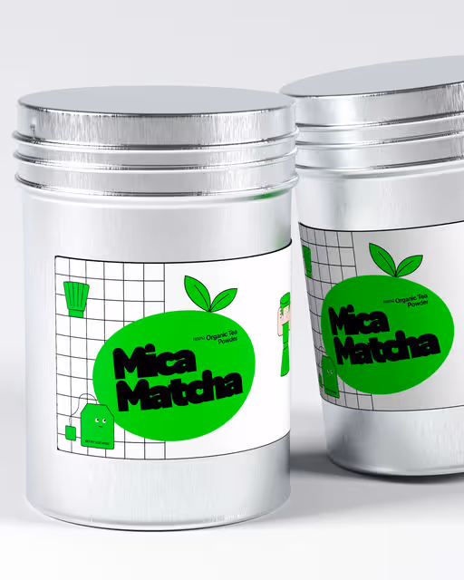
Mica Matcha is a conceptual brand identity and packaging design project created as a visual exploration of how a traditional product like matcha can be reimagined through a modern, minimal, and tech-inspired lens — while staying fun, fresh, and approachable.
The project combines clean typography, bold color contrast, and playful character-style illustrations, enhanced through high-quality 3D product visualization to bring the brand to life in a realistic yet vibrant way.
Matcha Branding
Packaging Design
Label Design
Poster & Print
Merchandise
Beauty & Skincare
Retail
Brand for Sale
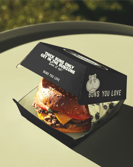
Bunzo’s is a burger brand concept built around its lovable mascot — Bunzo the hippo — who loves buns just as much as the people who eat them. The mascot defines the brand’s personality: friendly, playful, and instantly recognizable.
The visual identity blends fun and comfort food aesthetics — juicy burgers, soft rounded shapes, bold typography, and a character-driven system that brings warmth and appetite appeal. Bunzo isn’t just a logo element; he’s a scalable brand character designed to live across packaging, menus, merchandise, and digital platforms.
The name and tagline “buns you love” highlight the core idea of the brand: great burgers start with great buns — soft, fresh, and irresistible. Bunzo’s communicates in a simple, joyful way, creating an emotional connection through character storytelling and bold visuals.
Bunzo’s is ideal for:
Fast-casual burger concepts
Dark kitchens
Food trucks
Delivery-first brands with strong visual identity
This concept is fully ready for commercial use and easily adaptable to different markets, formats, and scales.
Burger Branding
Packaging Design
Label Design
Poster & Print
Merchandise
Food & Beverage
Retail
Brand for Sale
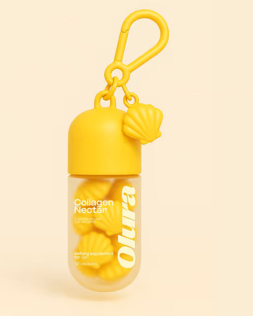
Olura is a modern dietary supplement brand for women, created to support overall well-being through beauty, balance, and vitality. The product line focuses on everyday essentials — Vital Energy, Collagen Nectar, Radiance Glow, and Calm Balance — designed to fit seamlessly into a contemporary wellness lifestyle.
At the heart of the brand is its signature detail: pearl-shaped capsules inspired by seashells. This unique form becomes a powerful visual metaphor — a reminder that true radiance comes from within. The packaging echoes this idea, with capsule-shaped containers and a soft yet confident pastel palette of red, yellow, pink, and turquoise.
Allura’s visual identity is intentionally bold and modern, combining a strong, confident logotype with gentle, feminine colors. The contrast creates a brand that feels both premium and approachable — expressive without being delicate, aesthetic without feeling generic.
The tagline “The Pearl is you” positions the woman herself as the core of the brand. Olura doesn’t promise transformation — it celebrates what’s already there, enhancing natural glow, inner calm, and daily energy.
Olura is ideal for:
Women’s wellness & beauty supplements
DTC and lifestyle-driven brands
Premium yet playful supplement concepts
Markets focused on self-care, balance, and modern femininity
The brand is fully developed as a ready-to-sell concept, easily adaptable across SKUs, markets, and communication platforms.
Supplement Branding
Packaging Design
Merchandise
Poster & Print
Business Cards
Beauty & Skincare
Wellness & Health


Brand for Sale
vial is a conceptual multivitamin packaging system that frames daily supplementation as a quiet, repeatable ritual. Informed by Tetris / Mondrian logic, the modular grid uses repetition and reduction to express health as something accumulated gradually over time.
Supplement Branding
Packaging Design
Label Design
Poster & Print
Beauty & Skincare
Wellness & Health
Brand for Sale
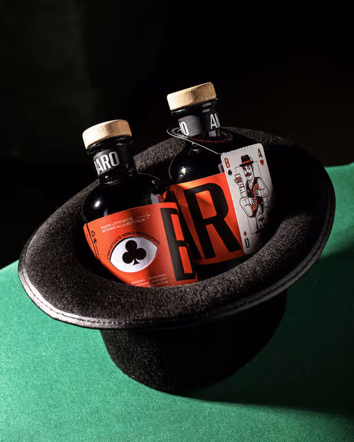
Art direction and brand identity design for Amaro Baro by @diegoserpico
Mr. Baro (“baro” means cardsharp in Italian) is a gentleman from another era, with a sly, knowing gaze – always ready to play the right card to win.
The project features a double label. The top label, with the cardsharp’s eye, wraps around the bottle and “reveals” the card suits as it turns, creating interaction. Each bottle also includes a neck tag with “the cardsharp’s card,” illustrated in the classic poker-card style with a contemporary twist; it detaches and becomes a keepsake gift.
The primary typography is based on @fontpopulista, a project that pays homage to the vinyl adhesive lettering typical of Italian hardware stores, commonly seen on shop windows and signs in the ’80s and ’90s – often slightly misaligned, with a highly recognizable, popular aesthetic.
The packaging is screen-printed, and the boxes – when aligned – can recompose the cardsharp’s face.
Illustration & motion design: @dariogenuardi_illustrations
Photography: @aury.scotto
Motion design: @russovittorio98
Italian amaro Branding
Packaging Design
Label Design
Merchandise
Poster & Print
Food & Beverage
Retail

Brand for Sale
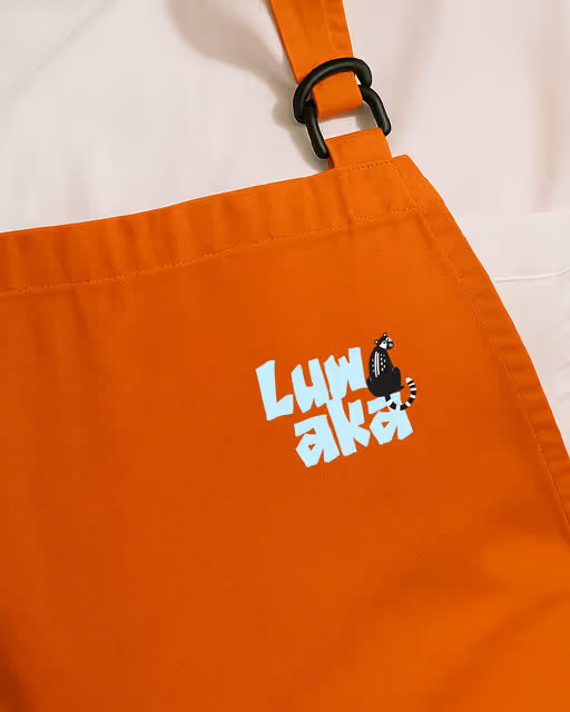
Introducing LUWAKA where wild nature meets refined design.
A brand born from one of the world’s most unique coffee experiences reimagined with a playful, soulful, and modern identity.
From the jungle to your cup, Luwaka captures the spirit of calm mornings, creative energy, and slow living. Brewed for dreamers, crafted for coffee lovers.
This branding project celebrates warmth, texture, and storytelling blending character illustration, typography, and contemporary café culture aesthetics.
Coffee & Bakery Branding
Merchandise
Packaging Design
Label Design
Poster & Print
Food & Beverage
Home & Lifestyle

Brand for Sale
Bare Glow is a makeup brand that behaves like skincare. Thoughtfully made to hydrate, protect, and enhance your natural features, for a glow that feels calm, comfortable, and easy to wear - everyday.
The identity is built around a palette of blue, green, and brown to communicate nature, balance, and health. A combination of clean, modern sans-serif and serif typefaces keeps the brand minimal and contemporary, with glow set in bold to visually reflect the radiance the product delivers. The packaging is intentionally minimal, allowing the product to - and the skin it enhances - to speak for itself.
Make-up Branding
Packaging Design
Label Design
Poster & Print
Business Cards
Beauty & Skincare
Brand for Sale
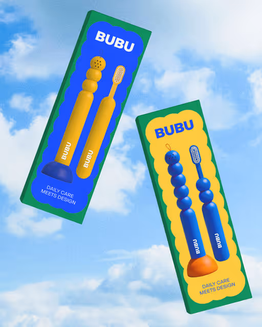
BUBU is a toothbrush designed to live out in the open, inspired by the shape of a candle. I realized how sad it is that toothbrushes always sit out in the open, screaming “bathroom tool”. I wanted to design something playful, something you could actually love seeing on your shelf. A simple holder and a small cap. Take the brush, pop off the cap, brush your teeth, put it back, and suddenly it’s gone. Invisible. Turns into bathroom decor without trying.
Toothbrush Branding
Packaging Design
Poster & Print
Merchandise
Label Design
Beauty & Skincare
Home & Lifestyle

Brand for Sale
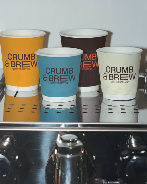
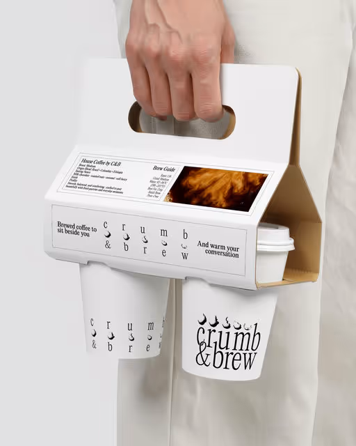
Crumb & Brew draws inspiration from old roasteries. It is about craft over trend, leaning into industrial materials and heritage cues. Crumb & Brew respects the ritual of daily coffee, made for people who show up, everyday.
Coffee Branding
Packaging Design
Label Design
Merchandise
Poster & Print
Food & Beverage
Retail

Brand for Sale
We collaborated with @by.skojie to bring this conceptual project to life for @designerbriefs 🎪 Peppa Please is a pure art-direction experiment, built around storytelling, humour, and controlled chaos. At the centre of the concept is Peppa: a lazy, slightly delusional pig convinced they’re ready to leap through a flaming circus hoop. The result is a brand that doesn’t take itself too seriously, but is executed with intention and restraint. The circus became our narrative framework. Acts, pauses, and after-hours moments informed the flavour hierarchy, while the hexagon-shaped bottle and box reference the geometry of a circus chapiteau. Bold colour contrasts, gritty textures, and tattoo-inspired illustration styles were used to push the brand away from polished perfection and toward something more raw, tactile, and human. The label design balances structure with distortion, combining strong typographic hierarchy with displaced details and print-like imperfections. The result is packaging that feels worn, energetic, and slightly unhinged, like a travelling street circus that’s been on the road a little too long. This project wasn’t about creating a market-ready hot sauce. It was about exploring visual tension, narrative branding, and how far a concept can be pushed while still feeling cohesive. It’s loud. It’s chaotic. It’s probably a bad idea. 🔥🐷
Sauce Branding
Packaging Design
Label Design
Business Cards
Merchandise
Food & Beverage
Retail
Brand for Sale
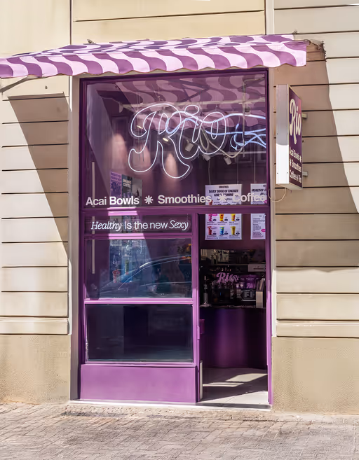
RIO Açaí opened its first location in Prague in October 2024. The launch on Kaprova Street was followed by a major opening event on Národní, marking the beginning of expansion to Ostrava, Brno, London and Dubai.
A wave pattern, loosely inspired by Rio’s iconic Copacabana sidewalks, became one of the key visual elements of the brand. The countertop is shaped as a continuous wave, reflecting the same curves used across packaging, printed materials and small interior details. The main color is açaí purple, expanded into bold gradients that add contrast and movement to the space.
Posters are the highlight of the in-store experience. Each location features large-format prints showcasing key products through a mix of AI-generated backgrounds, editorial-style lighting and polished retouching. They add energy to the space and help tie the brand’s visual world together.
Healthy is the new Sexy
Açaí Bowl Branding
Packaging Design
Poster & Print
Merchandise
Label Design
Food & Beverage
Retail
Brand for Sale
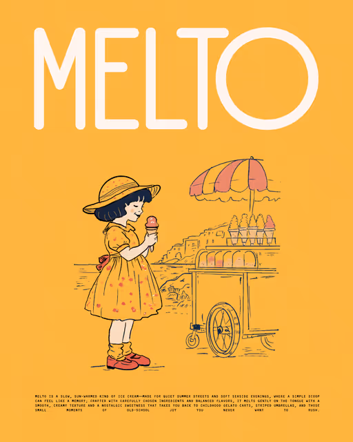
MELTO is a slow, sun-warmed kind of ice cream—made for quiet summer streets and soft seaside evenings, where a simple scoop can feel like a memory; crafted with carefully chosen ingredients and balanced flavors, it melts gently on the tongue with a smooth, creamy texture and a nostalgic sweetness that takes you back to childhood gelato carts, striped umbrellas, and those small moments of old-school joy you never want to rush.
Ice Cream Branding
Packaging Design
Merchandise
Poster & Print
Food & Beverage
Retail

Brand for Sale
Crumb & Brew was a layout experimentation and graphic information exposure project. I wanted to tease the idea that you can play with “unaesthetic” elements and create an impactful layout that works as a graphic representation of the brand.
I wanted it to be modern, minimal, and based on grid layouts. A brand of guidance and transparency; a brand that works for you and with you, that gives you insights into its own creations, that isn’t afraid to expose its product—idealizing the idea of honesty and connection with the customer.
It shows confidence not only in what it sells, but also in what it offers as a café space: a warm and cozy place to rest, dialogue, think, create, and study.
That’s what’s innovative about C&B: not only its product excellence, but also its way of communicating with the customer.
Coffee Shop Branding
Packaging Design
Merchandise
Label Design
Poster & Print
Food & Beverage
Home & Lifestyle

Brand for Sale
Sometimes, the smallest and most invisible things make the biggest impact. YANS is a B2B company that specializes in supplies and disposable items for HoReCa, hospitals, and a wide range of professional industries. As the company expanded into new cities and countries, it approached us to rethink the brand and develop a clear, future-ready strategy.
The Challenge
How do you transform a brand built on objects that are simple, everyday, and often overlooked? How do you express value when your product is something that’s meant to be used once and thrown away?
The Idea
We found the answer in a single, powerful idea: Emptiness. The concept of Emptiness revolves around simplicity, flexibility, and personal choice. Every container begins as a “blank slate” - an empty form full of potential. This emptiness is not a limitation, but a space that adapts seamlessly to any business, product, or scenario.
Supplies Branding
Packaging Design
Merchandise
Poster & Print
Label Design
Hospitality
Retail

Sproutly is a creative learning platform that is built on the idea that creativity, can be learned, practiced, and grown over time. In Sproutly, students learn the step-by-step. Every class is interactive and hands-on, encouraging students to plant their ideas.
Learning Platform Branding
Packaging Design
Poster & Print
Business Cards
Website Design
Home & Lifestyle
Tech & AI


Brand for Sale
Good Pup is a brand of healthy treats for dogs. Its minimalist and clean aesthetic is complemented by vibrant colors and cute dog illustrations, making each product appealing and memorable.
Dog Food Branding
Packaging Design
Merchandise
Label Design
Poster & Print
Food & Beverage
Retail
Brand for Sale
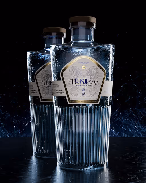
For TEKĪRA, we designed a 3D glass bottle, label, and full branding system inspired by Japanese culture and ritual.
The project draws from ideas of precision, balance, respect for materials, and quiet elegance - values deeply rooted in traditional Japanese aesthetics.
Calm blue tones, minimal forms, and refined details bring together old culture and modern expression, shaping a tequila brand that feels both timeless and fresh.
Through 3D design, illustration, and branding, we explored how tradition can evolve into a modern visual identity.
Tequila Branding
Packaging Design
Label Design
Poster & Print
Merchandise
Food & Beverage
Retail

Brand for Sale
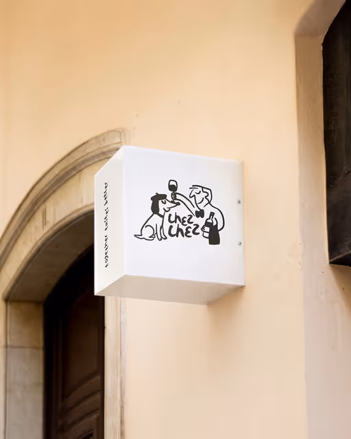
Chez chez is a neighbourhood bistro where the food is unfussy, the wine flows freely, and the dog might just be wearing a beret. Warm, playful and just the right amount of chaotic — a local spot that feels like a second living room, only with better wine. The energy lives somewhere between a Parisian sidewalk and a doodle drawn on a napkin.
Bistro Branding
Label Design
Packaging Design
Poster & Print
Merchandise
Food & Beverage
Hospitality


Brand for Sale
Pizza Branding
hot boxes, greasy fingers. cheese doing that thing.
menus you skim, boxes you read, games you play before the first bite!
that joe: this is the pizza the way you like it.
LOUD. SIMPLE. NO APOLOGIES.
Pizza Branding
Packaging Design
Poster & Print
Label Design
Business Cards
Food & Beverage
Retail

Brand for Sale
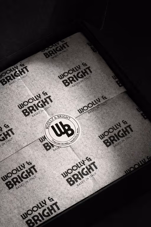
Woolly & Bright is a luxury winter apparel brand dedicated to creating timeless, well-crafted pieces that balance warmth, comfort, and understated elegance. Rooted in quality and thoughtful design, the brand focuses on soft textures, classic silhouettes, and enduring style—offering winter essentials that feel cozy yet refined. Each piece is designed to be worn season after season, celebrating slow fashion and the beauty of lasting craftsmanship.
Apparel Branding
Packaging Design
Label Design
Merchandise
Business Cards
Fashion & Apparel

Brand for Sale
Framed is a photography studio dedicated to the idea that every moment and every story can fit in a frame, letting photography become more than just an image and represent a timeless expression of emotion and perspective.
The goal for this project was to create a modern, but timeless, visual identity that could translate the essence of capturing life's fleeting moments into a strong visual language.
The resulting design blends minimalism and structure, evoking both the precision of capturing a shot and the emotional depth behind each image. The non-existent kerning, as well as the subtle photographic details create a refined sense of geometric balance and harmony that evoques the feeling of "fitting every moment in a frame".
Photography Branding
Business Cards
Stationery
Poster & Print
Label Design
Home & Lifestyle
Retail


Brand for Sale
Eggstasy is a brand built on honesty and simplicity.
No loud packaging, no artificial promises - just naturally clean, quality eggs made for the perfect breakfast or the ideal cocktail foam.
Even something as simple as an egg can be ideal when it’s made with care - from hens raised responsibly, fed clean diets, and treated with real attention.
Egg Branding
Packaging Design
Poster & Print
Label Design
Merchandise
Food & Beverage
Wellness & Health


Brand for Sale
Rooted in bio-innovation and balance, NÜMA (meaning beautiful in the Limbu language) embodies skincare designed to lock in deep moisture, reinforcing your skin’s barrier so it stays hydrated, supple, and calm even through winter’s chill ❄️.
The visual story behind NÜMA’s campaign mockups draw from that same chill ❄️ energy; soft light, icy hues, and textures inspired by calm winter air.
Skincare Branding
Packaging Design
Label Design
Poster & Print
Merchandise
Beauty & Skincare
Home & Lifestyle


Brand for Sale
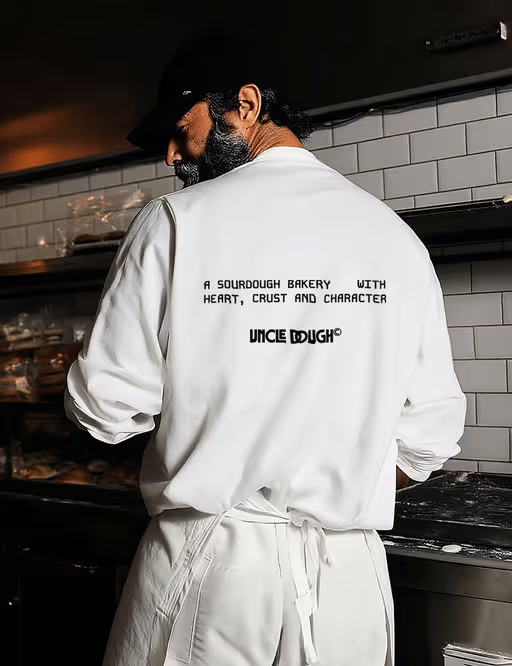
Uncle Dough - King of the Crust, is a bold sourdough bakery that celebrates rustic charm and a warm community spirit. We bake honest sourdough shaped by long ferments and heartfelt flavour. Simple ingredients—made to bring people together, slice by slice.
Bakery Branding
Packaging Design
Business Cards
Label Design
Merchandise
Food & Beverage
Retail

Brand for Sale
Ophie started as a small ritual for dry lips. Made from 100% natural botanicals and ethically sourced oils, our formulas hydrate soothe and restore so your lips look dewy with no fuss.
Lip Oil Branding
Packaging Design
Poster & Print
Merchandise
Beauty & Skincare

Brand for Sale
The new identity for Walor Software Studio is like a clean line of code: structured, modular, and intentionally minimal.
Created by Damian Jaszczyk (Brand You Studio), the system relies on strong typographic rhythm, a clear grid, and functional use of color — all designed to create clarity, not noise.
Every component serves a purpose. The modular layout adapts easily across formats, and the high-contrast palette reinforces hierarchy without distraction.
This is branding that doesn’t just look good — it works harder.
A design system built to support the brand’s logic, scale, and communication.
Software Studio Branding
Interface Design
Website Design
Merchandise
Business Cards
Tech & AI

Brand for Sale
K9pal is a conceptual pet food branding and packaging project focused on minimalism, balance, and a quiet, modern visual identity.
The pet food aisle is rarely quiet. Bright colors, dense claims, and competing mascots often fight for attention, leaving little room for clarity. K9pal takes a different approach. Designed as a premium nutrition brand for modern, conscious dog owners, this conceptual identity leans into restraint, using design to signal trust, transparency, and quality.
At the core of the brand is the idea of Fresh Balance. The system pairs scientific precision with a calm, modern visual language, intentionally stepping away from the visual noise typical of commercial pet food. Inspiration comes from the Dalmatian coat. Its natural contrast and graphic simplicity become a subtle metaphor for balance, purity, and confidence.
The result is a brand that feels considered and contemporary. Rather than relying on excess, K9pal creates shelf presence through contrast, spacing, and a strong point of view, proving that clarity can be just as compelling as color.
Design Approach
The packaging is built on a dominant white canvas, chosen to evoke cleanliness, safety, and transparency. This sense of “radical whiteness” creates breathing room on shelf, allowing the product to stand apart through calm rather than chaos. Bold black typography anchors the system, while playful Dalmatian imagery adds warmth and character without overwhelming the design. A unified design system was developed across multiple SKUs, ensuring consistency while allowing the range to scale seamlessly. Key elements include:
Line Art Illustrations
Custom minimalist outlines introduce a light, friendly personality, referencing the active and joyful lives of dogs while keeping the overall look refined and uncluttered.
Clear Hierarchy
Modern sans-serif typography establishes strong readability and structure across all packaging formats and digital applications, reinforcing the brand’s emphasis on clarity and trust.
Together, these elements create a visual identity that feels confident, intentional, and refreshingly quiet. It is an approach that lets design do the talking.
https://www.behance.net/gallery/240959817/K9pal-Pet-Food-Branding-Packaging
Dog Food Branding
Packaging Design
Label Design
Poster & Print
Business Cards
Food & Beverage
Retail

Brand for Sale
A sourdough bakery with heart, crust, and character. It’s all about honest bread and long ferments. Baked with passion, served with love.
Keywords : Warm, bold, rustic, playful
Bakery Branding
Packaging Design
Label Design
Merchandise
Business Cards
Food & Beverage