


Key Details
Commercial use for one business is included. The brand may not be resold or redistributed.
You’ll receive the complete brand kit as editable source files, including a mini visual brand guideline (PDF).
This brand kit can be adapted within a defined scope. Up to 2 revision rounds are included after the initial setup.
Once the purchase is confirmed, delivery usually takes 7–14 business days, depending on the requested adjustments.

Stavroula Adamopoulou, ADAMSTAV Studio
I specialize in creating distinctive, memorable brand identities and designs that resonate with your target audience and drive meaningful engagement.
Profil on Braaands™Frequently Asked Questions
The core visual concept and structure of the brand remain unchanged.
These changes adapt the brand to your business without redesigning it from scratch.
If everything matches, you’ll receive a checkout link from Braaands™ to confirm the purchase.
The full amount is secured until the brand is finalized.
At checkout, you’ll also have the option to add additional packages such as business cards or packaging design.
Payment only happens once everything is confirmed.
Resale or redistribution is not permitted.
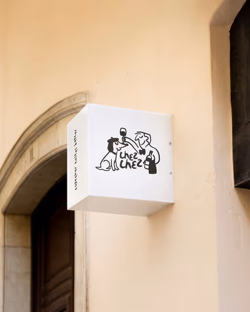
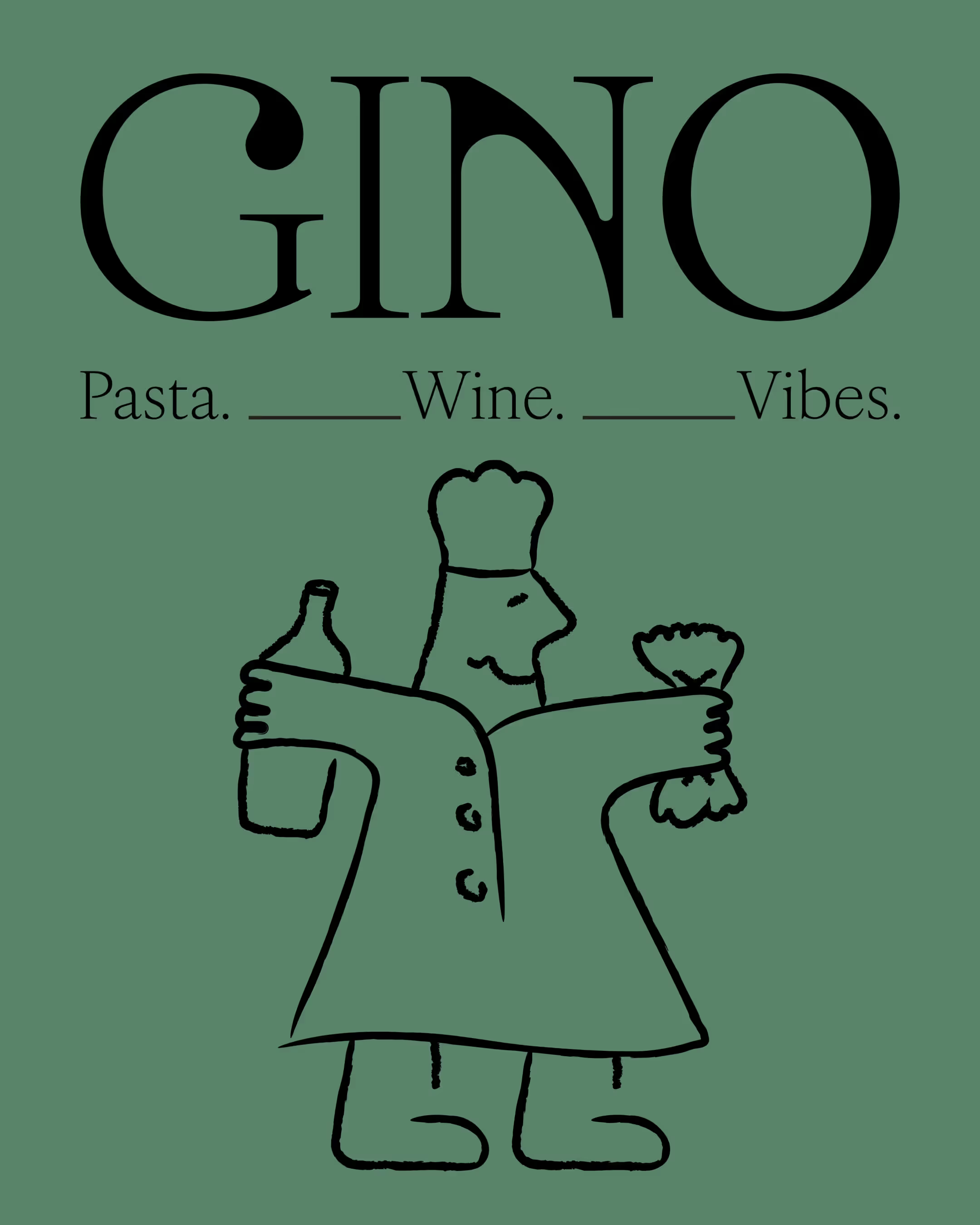
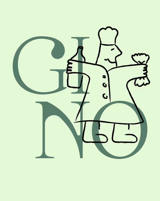
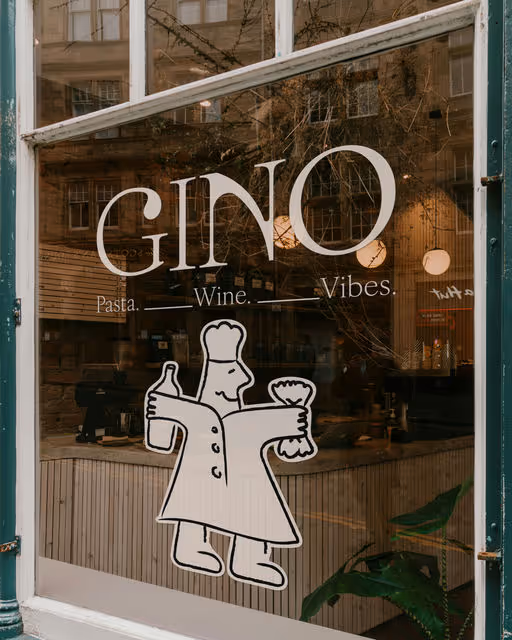
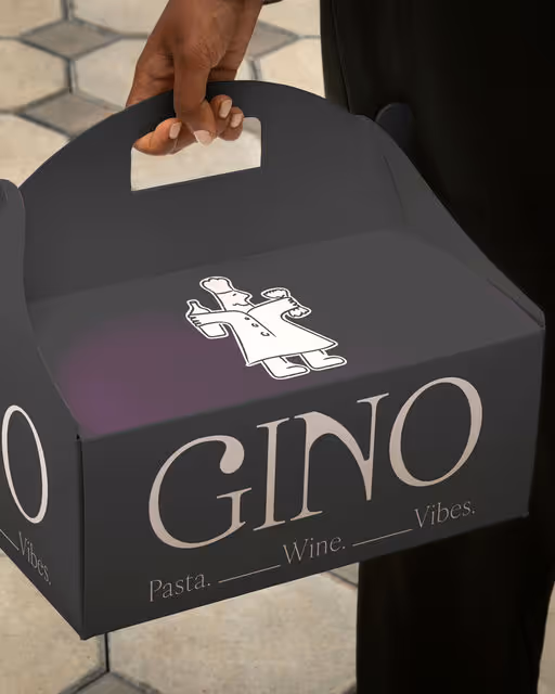
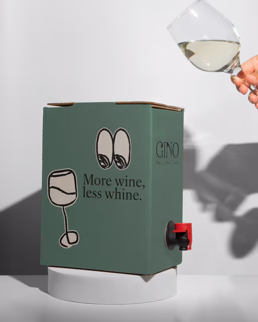
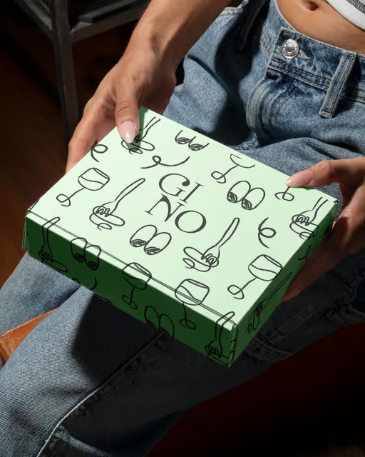
Italian Restaurant Branding
GINO TRATTORIA
For Gino Trattoria, I aimed for a brand identity that feels like a warm, lively Italian restaurant in a modern way. The goal was to mix fun, authentic Italian charm, and a simple, memorable style. The logotype is bold and clean, its contemporary lines subtly incorporate a classic elegance in their curves and weight. The heart and true differentiator of this brand is the custom-illustrated character, "Gino" the chef. The way he playfully holds a bottle of wine and some pasta instantly communicate the core offerings with a warmth that's universally appealing. The hand-drawn, slightly imperfect style feels genuine and invites connection. Gino tells a story without words. He's the host, the provider of good food and drink. This distinctiveness creates an emotional anchor, making Gino Trattoria sticky in the minds of customers.