Food & Beverage · by Viktoria Stanevich
Baek
 Viktoria Stanevich

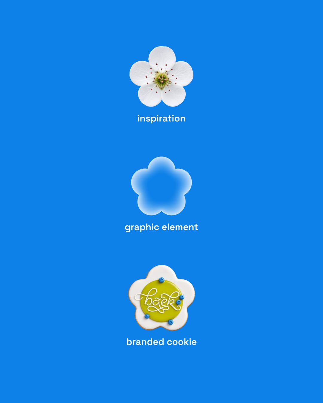
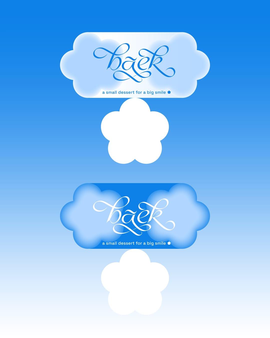
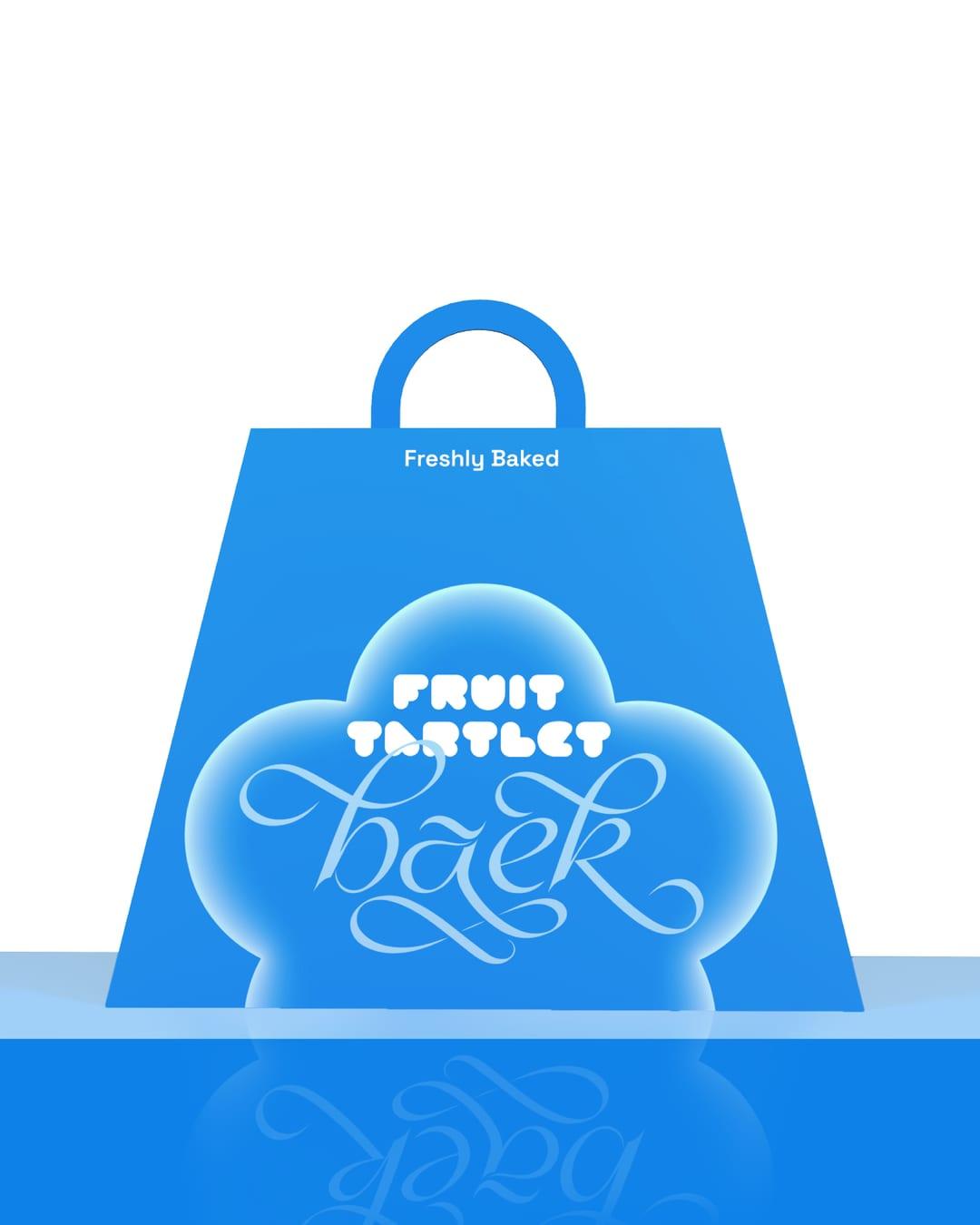
Baek is a new Korean bakery built around a simple idea: turning the meaning of its name into a visual language. “Baek” means “white” in Korean, which became the starting point for an airy palette of whites and blues accents. Rather than relying on familiar Korean visual clichés, I chose to reinterpret simple cultural symbols through a contemporary lens. The identity is built around blur and the cherry blossom. The blossom becomes a recognizable brand element without feeling overly literal, while the blurred visuals add a more atmospheric and modern character to the system. I also extended the identity into the packaging. The sakura-shaped cookies come in custom-shaped boxes that mirror the product itself, making the packaging more playful and recognizable. This turns a simple packaging solution into another touchpoint of the brand.



Color Palette
This brand uses a color palette of 3 colors
Click a color to find brands with similar colors.
Tags
Live score
Scores stay hidden while voting is open, so early votes can't anchor the ones that follow. Check back once the countdown ends.
Votes (2)
| Voter | Design | Strategy | Originality | Story | Overall | |
|---|---|---|---|---|---|---|
 | Estúdio Marciano from Brazil estudiomarciano.keepo.bio | 10 | 9 | 9 | 10 | 9.50 |
 | syeda maham from Pakistan | 10 | 10 | 10 | 10 | 10.00 |