Beauty & Personal Care · by Lanab
Dewdew
 Lanab
Lanab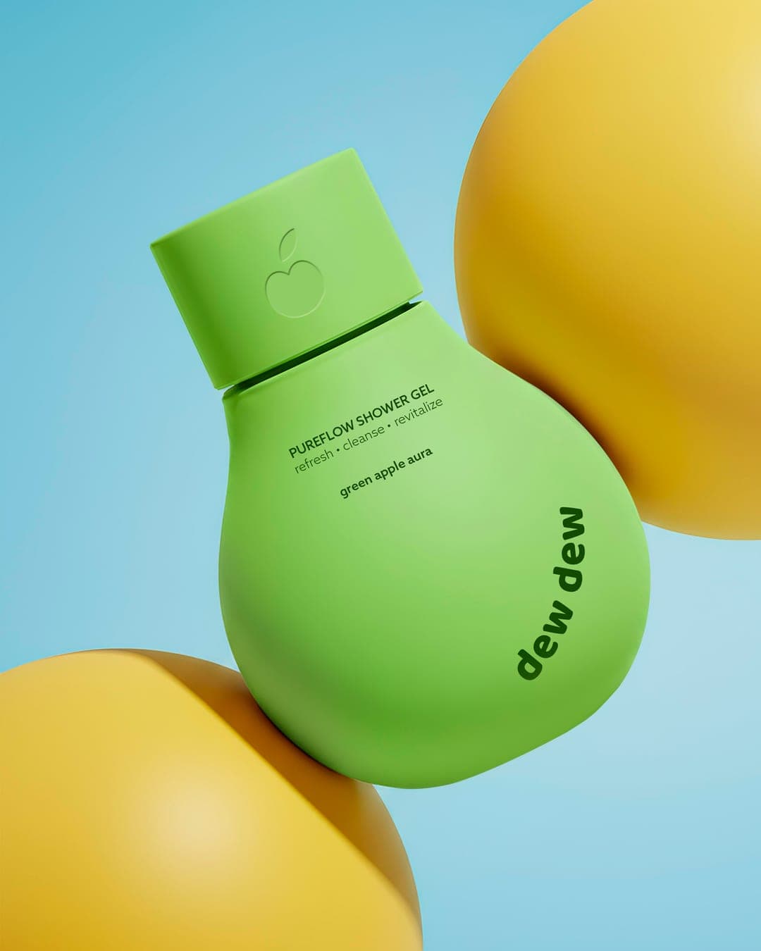
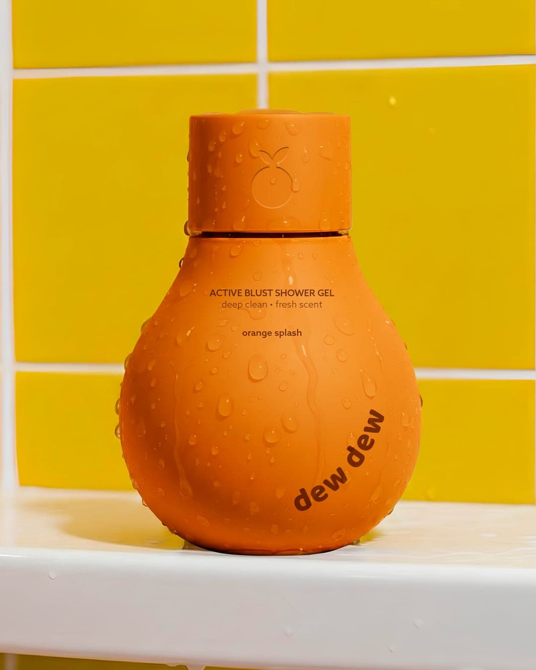
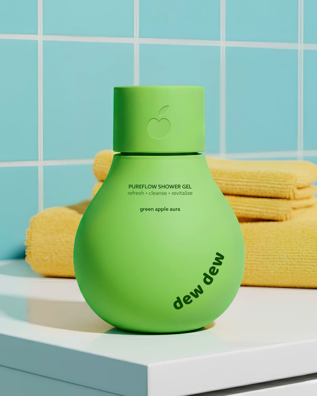
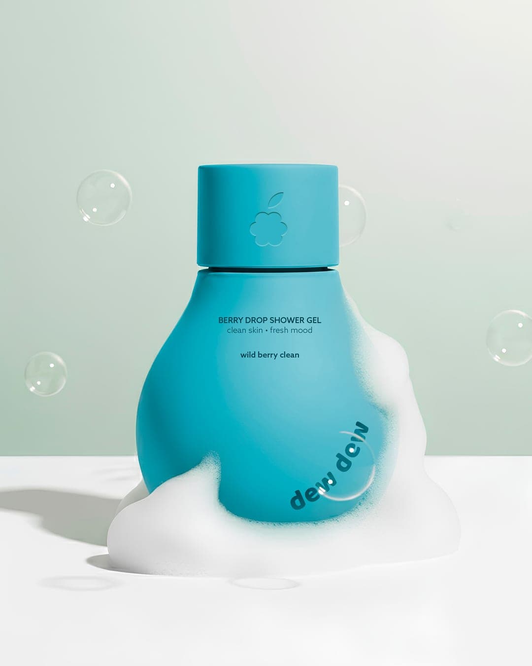
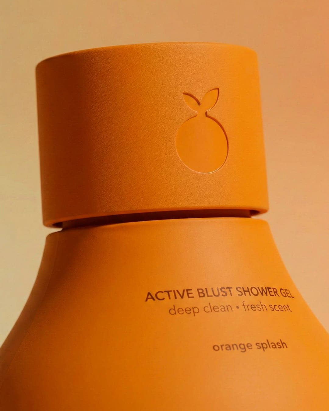
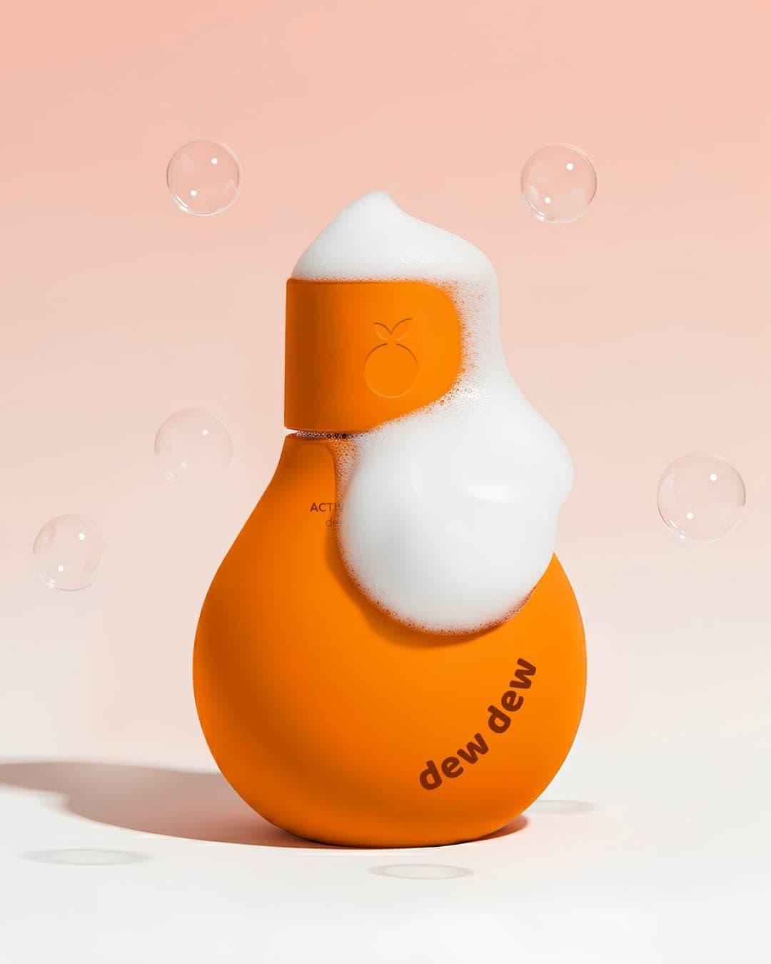
This project explores a vibrant and playful packaging direction for a shower gel line inspired by freshness, fruit energy, and everyday self-care rituals. The goal was to create a design that feels clean, modern, and instantly eye-catching while reflecting different scent personalities through bold color storytelling. The bottle form combines soft, rounded geometry with a minimal design approach to keep the focus on color, texture, and product mood. Each variant features a distinct hue and subtle fruit icon embossing on the cap to visually connect scent, freshness, and identity. The overall aesthetic balances simplicity with personality - a contemporary look designed to stand out on shelves while communicating freshness, cleanliness, and a fun daily skincare experience.

Color Palette
This brand uses a color palette of 1 color
Click a color to find brands with similar colors.
Live score
Scores stay hidden while voting is open, so early votes can't anchor the ones that follow. Check back once the countdown ends.
Votes (0)
No votes yet — be the first.