Entertainment & Media · by Nadia Ariefdien
OpenHaus
 Nadia Ariefdien
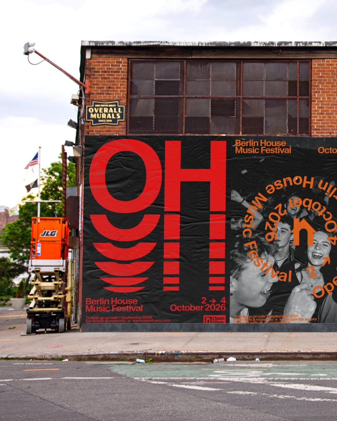
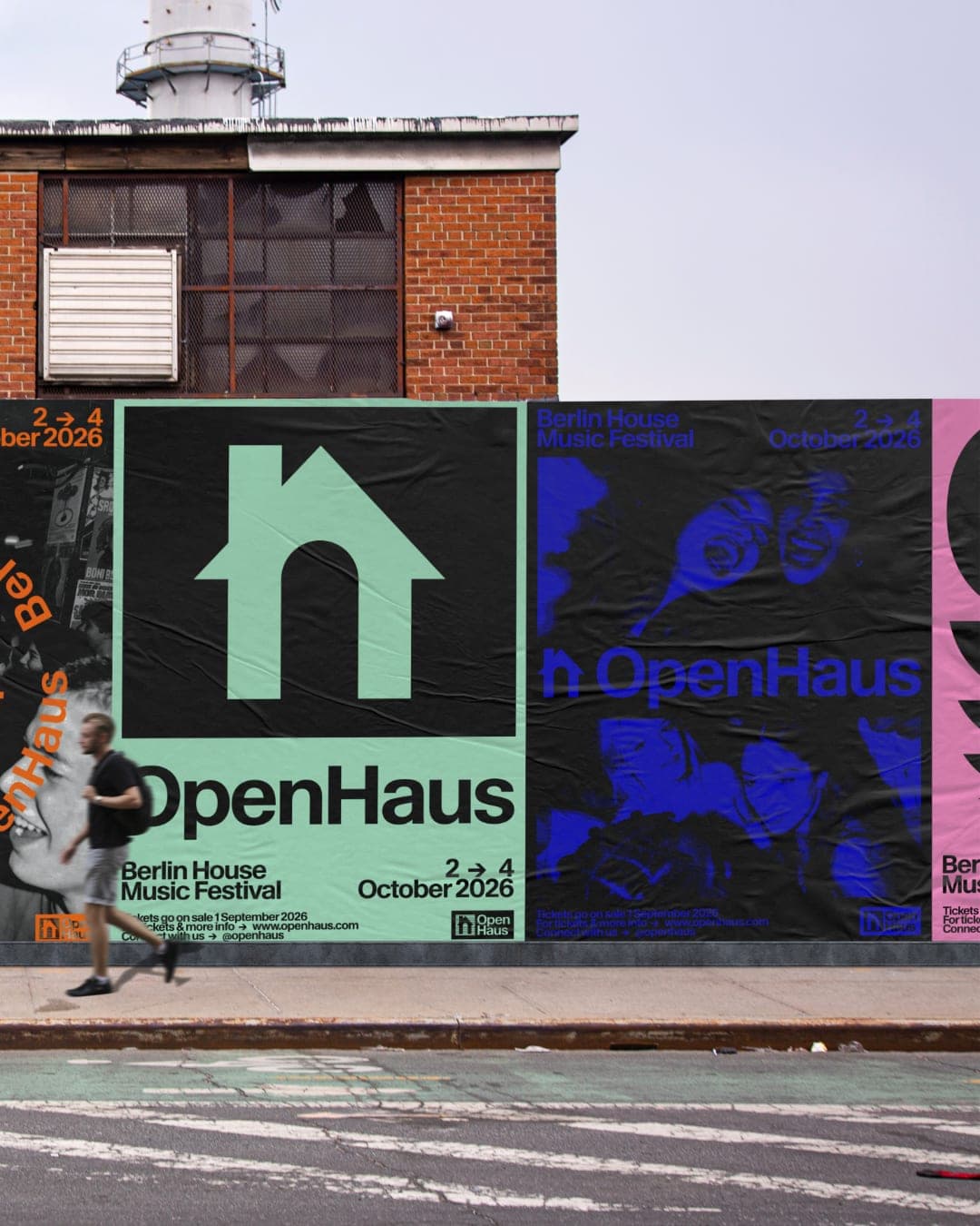
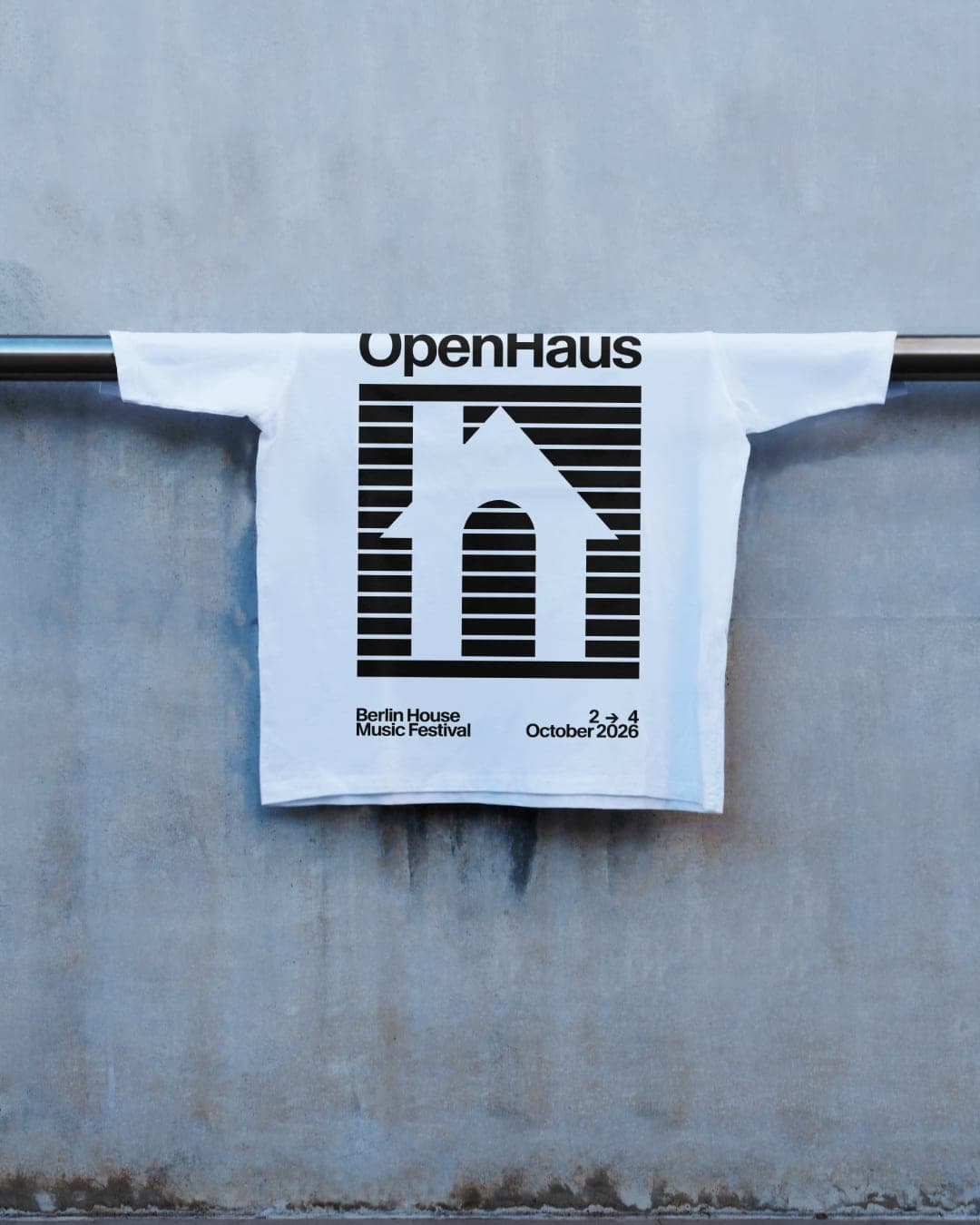
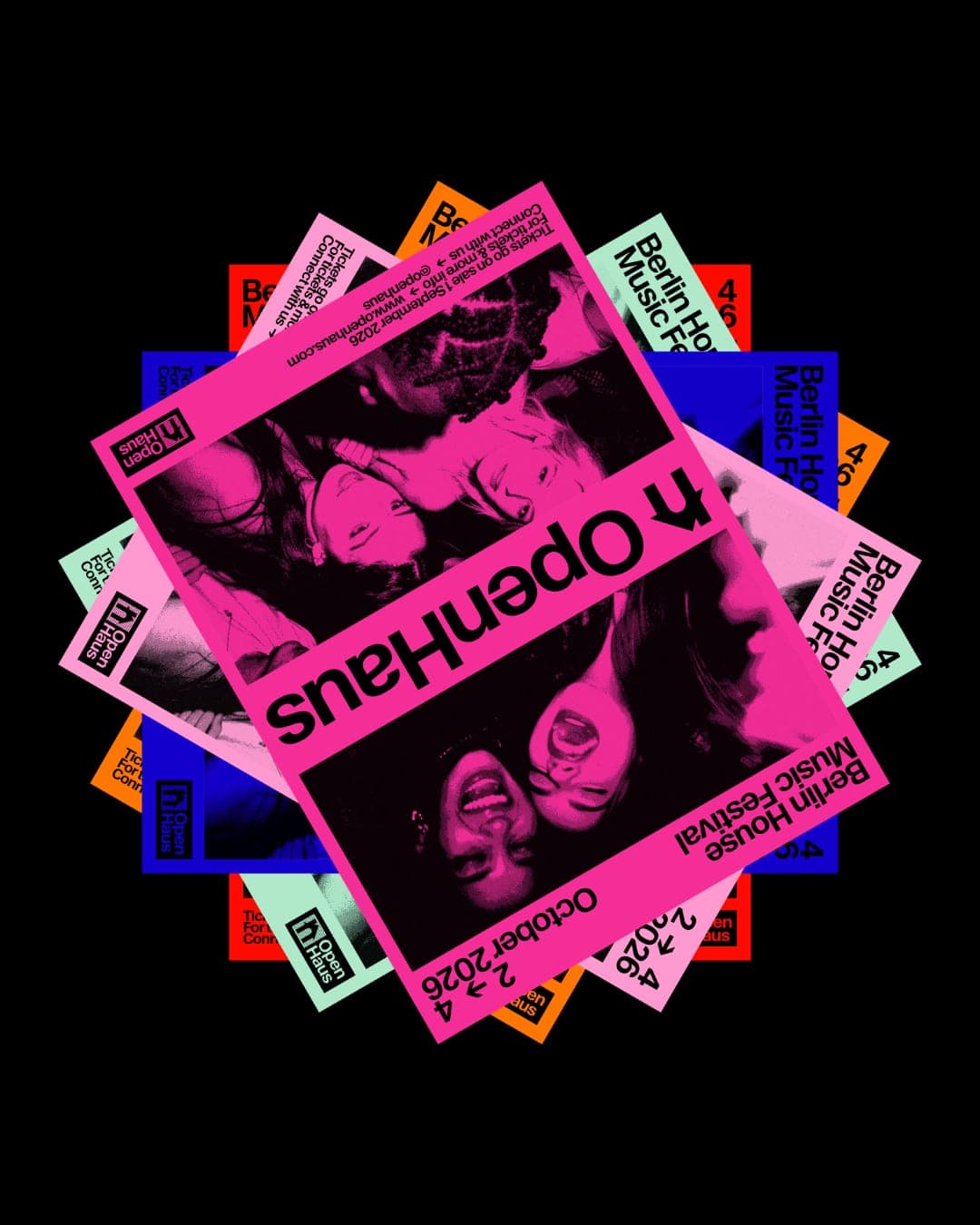
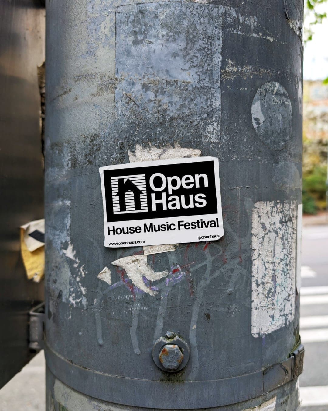
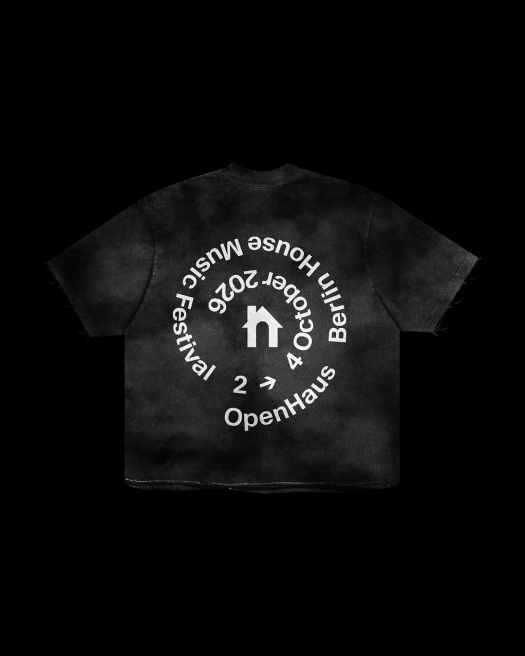
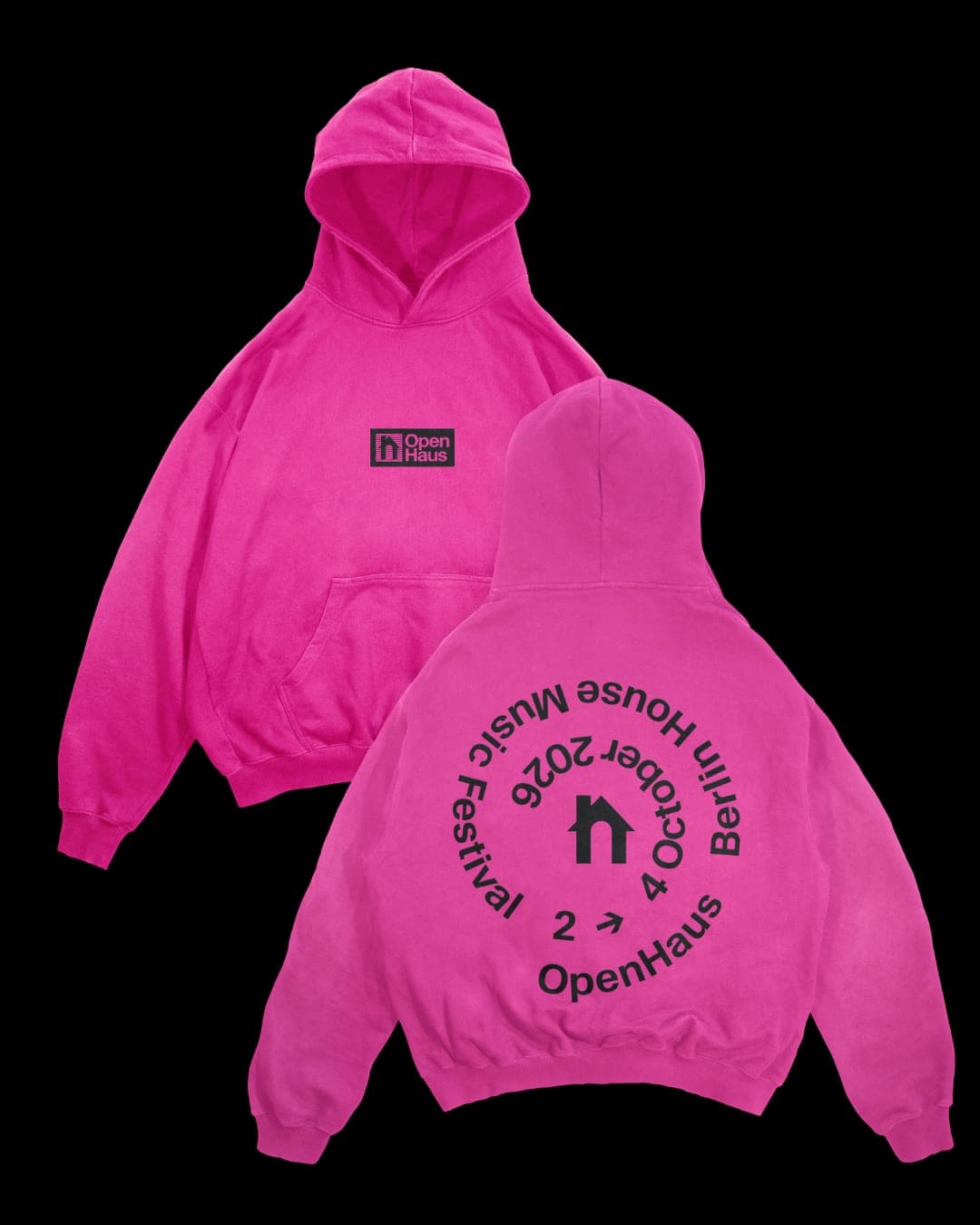
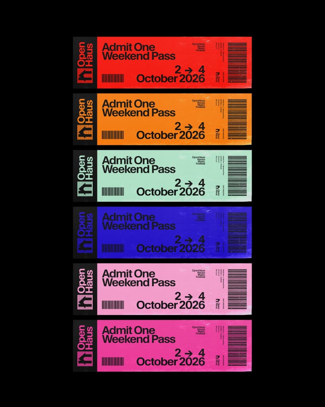
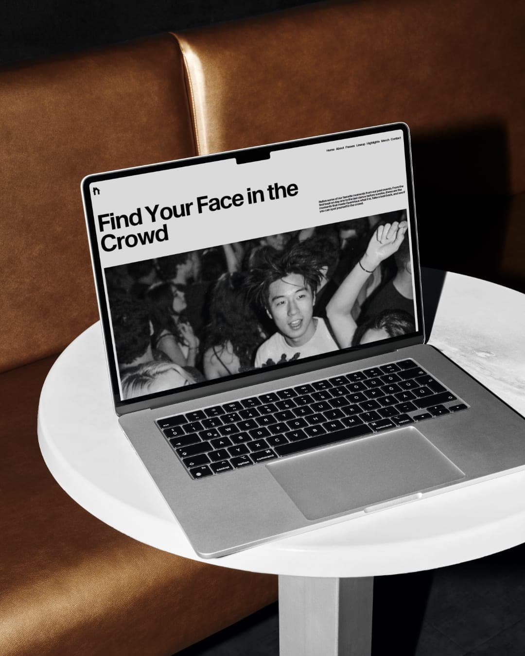
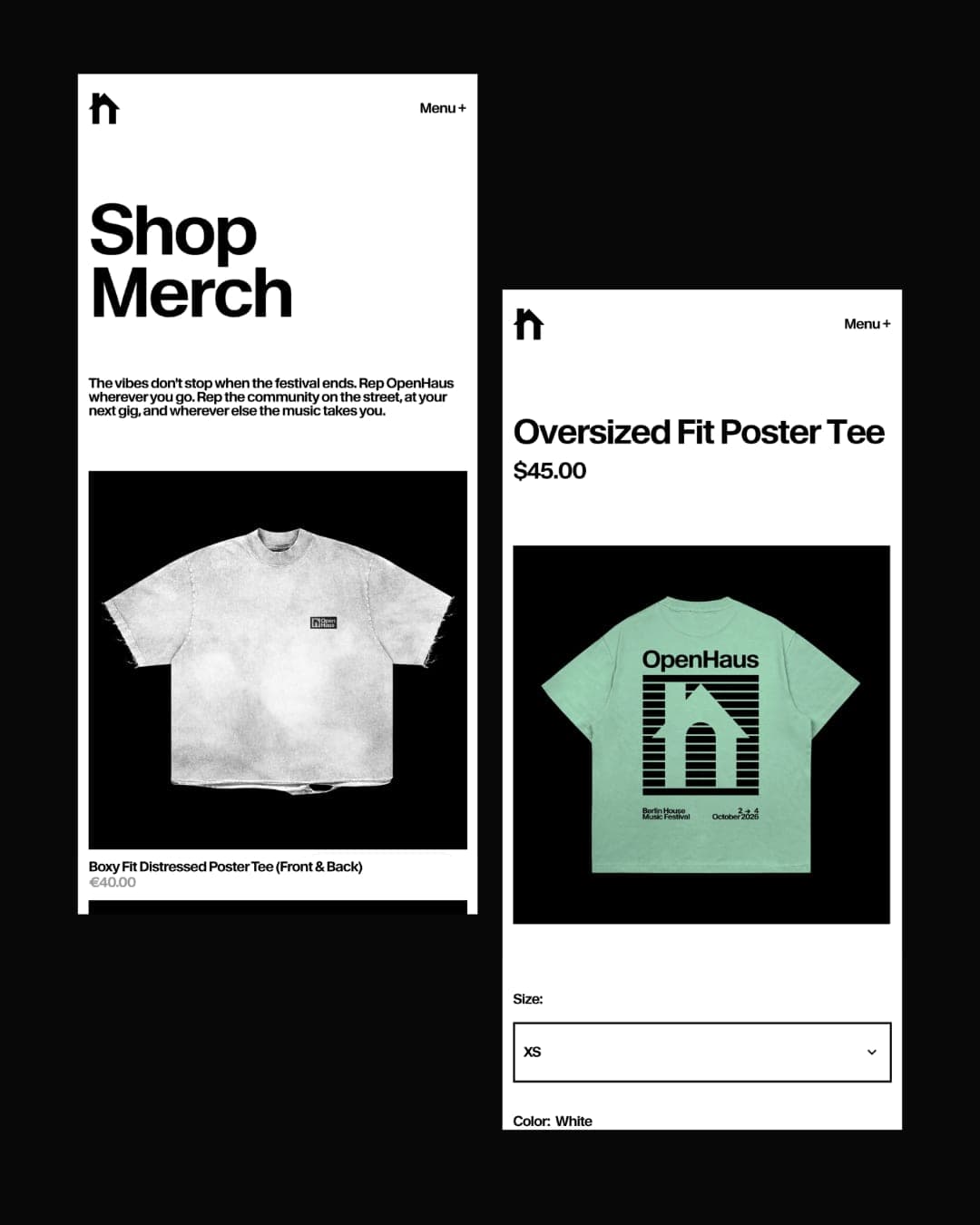
OpenHaus is a vibrant house music festival, made for anyone and everyone. The visual identity leans into bold, saturated color paired with bold typography and structured, grid-based layouts. It feels colorful and inviting on the surface, but stays grounded by a level of restraint that gives it a more considered feel. The logomark combines a lowercase "h" with a triangle, forming the silhouette of a house, a small, playful nod to the genre and the name itself. The website extends the OpenHaus identity into a digital space that feels just as lively and structured as the brand itself. Pops of bold color carry the brand's vibrant palette throughout. The color is grounded by a black and white base and gritty black and white film concert photography.
Color Palette
This brand uses a color palette of 2 colors
Click a color to find brands with similar colors.
Tags
Live score
Scores stay hidden while voting is open, so early votes can't anchor the ones that follow. Check back once the countdown ends.
Votes (0)
No votes yet — be the first.