Food & Beverage · by Nuvio Studio
Wild Chai
 Nuvio Studio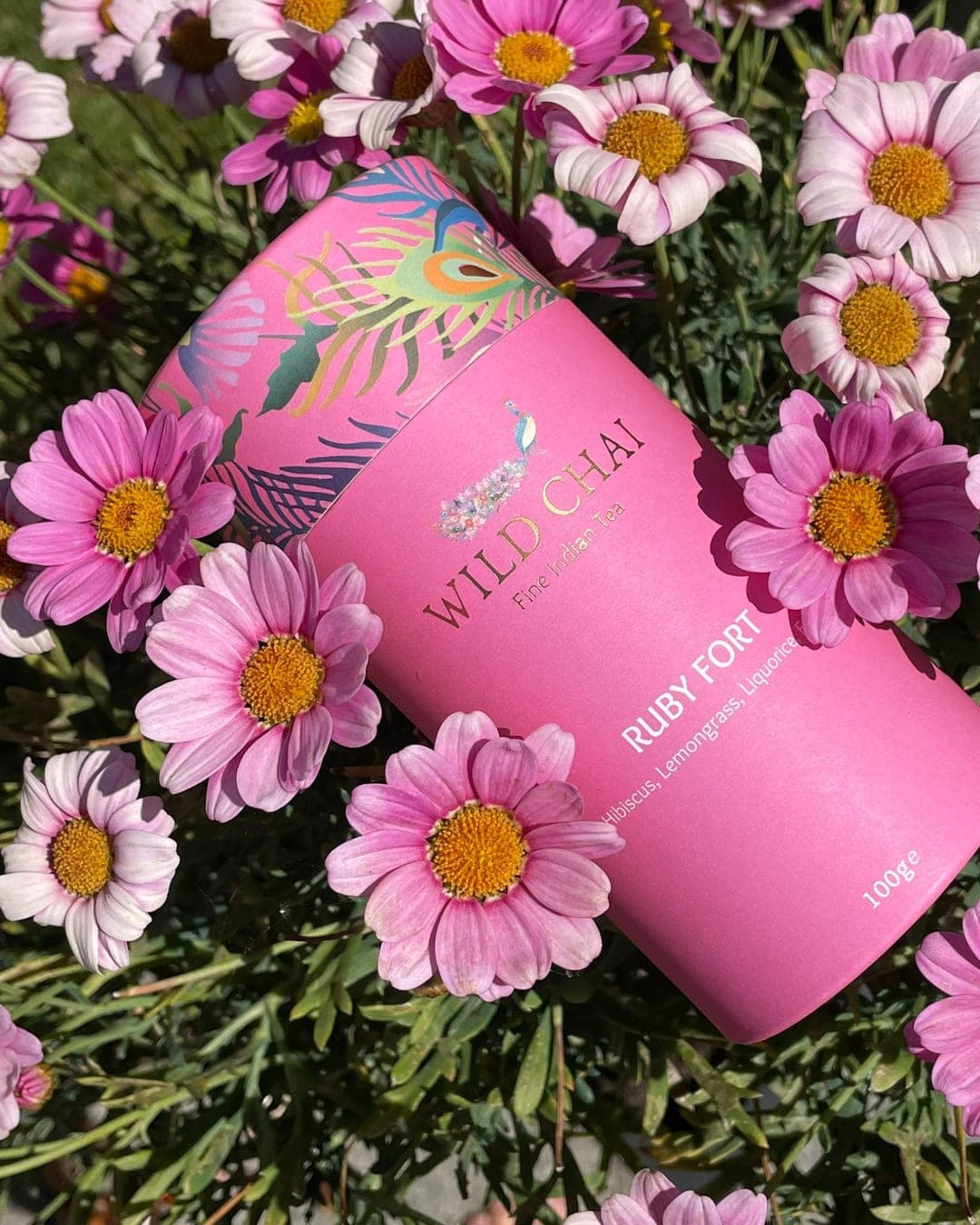
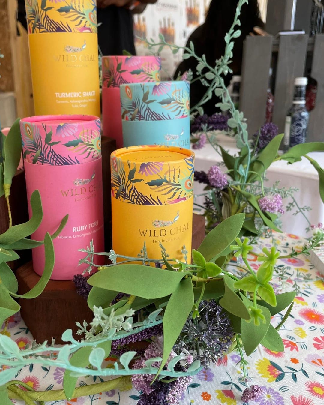
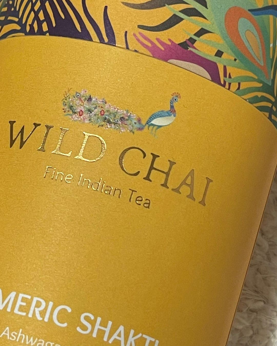
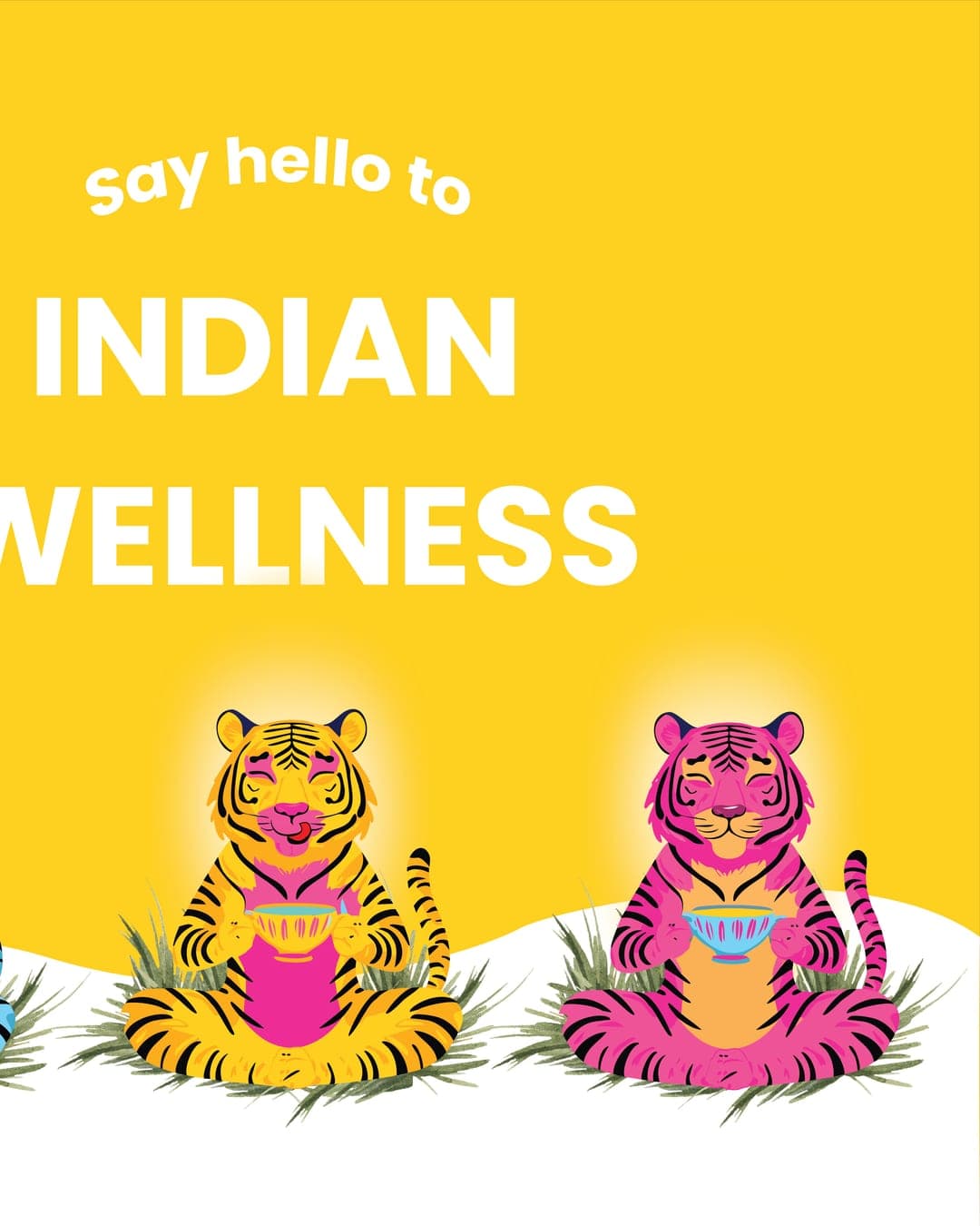
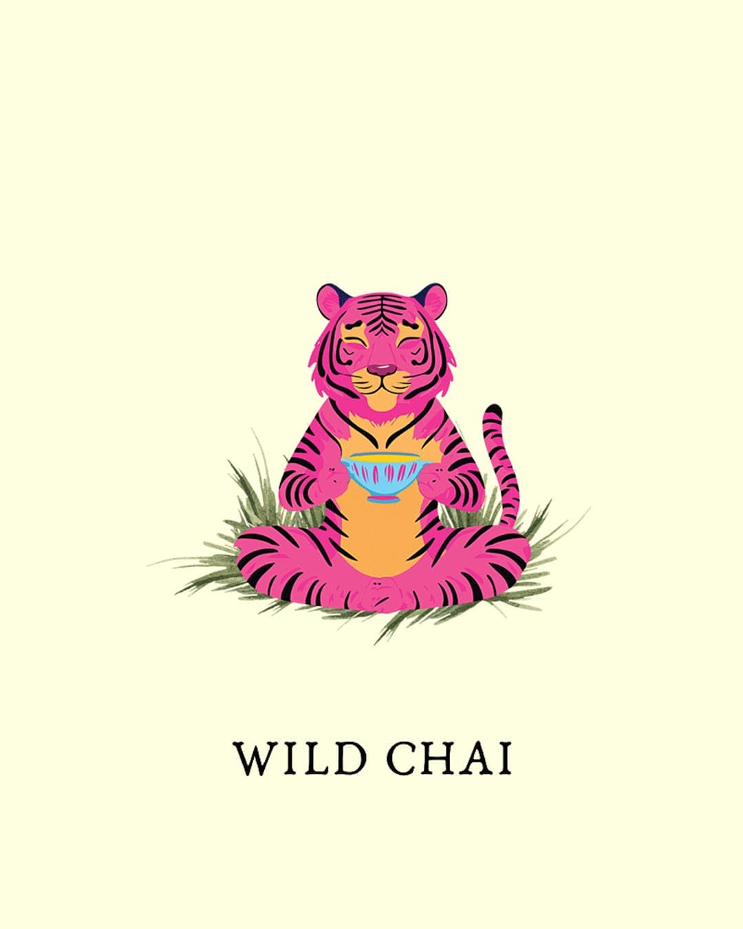
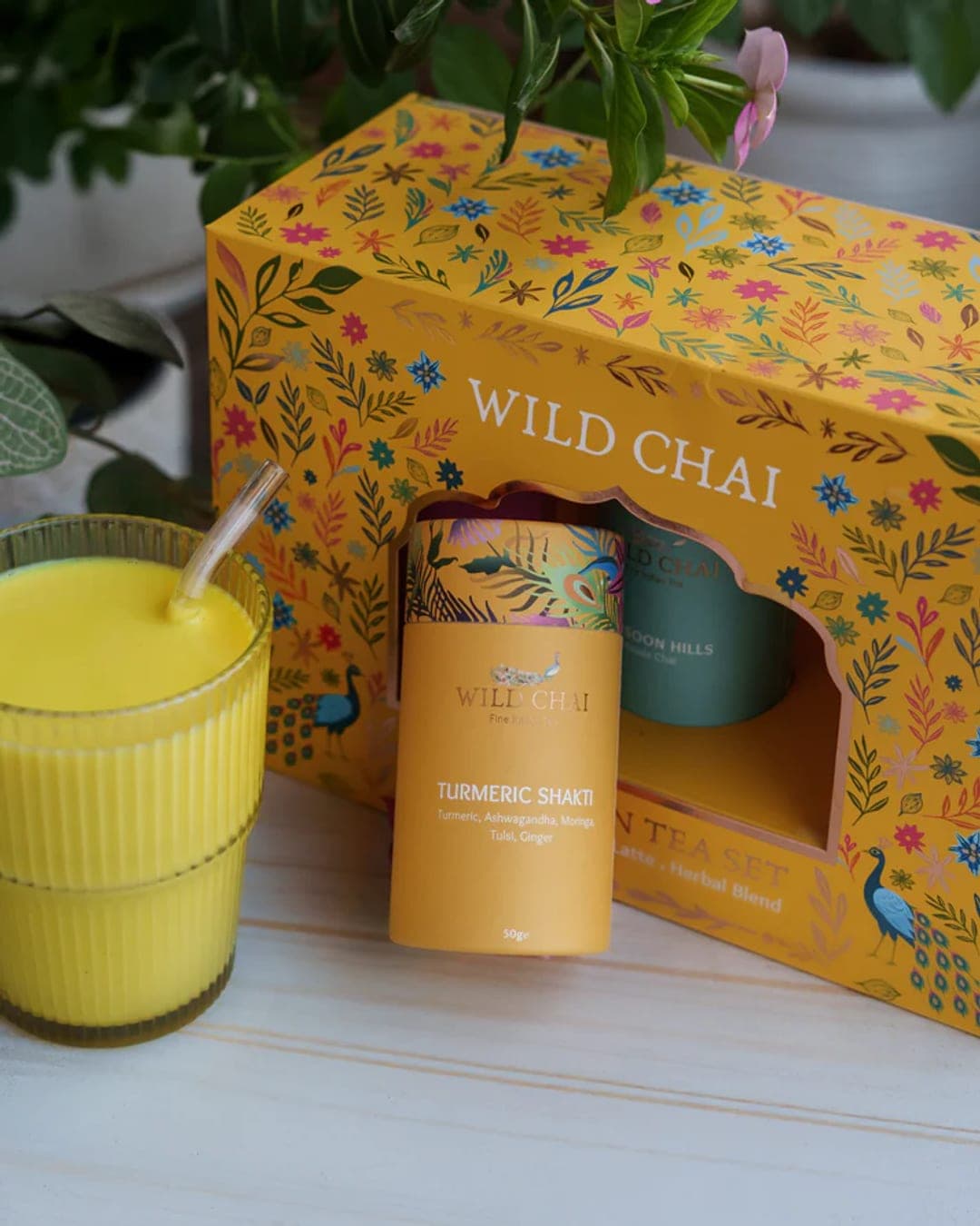
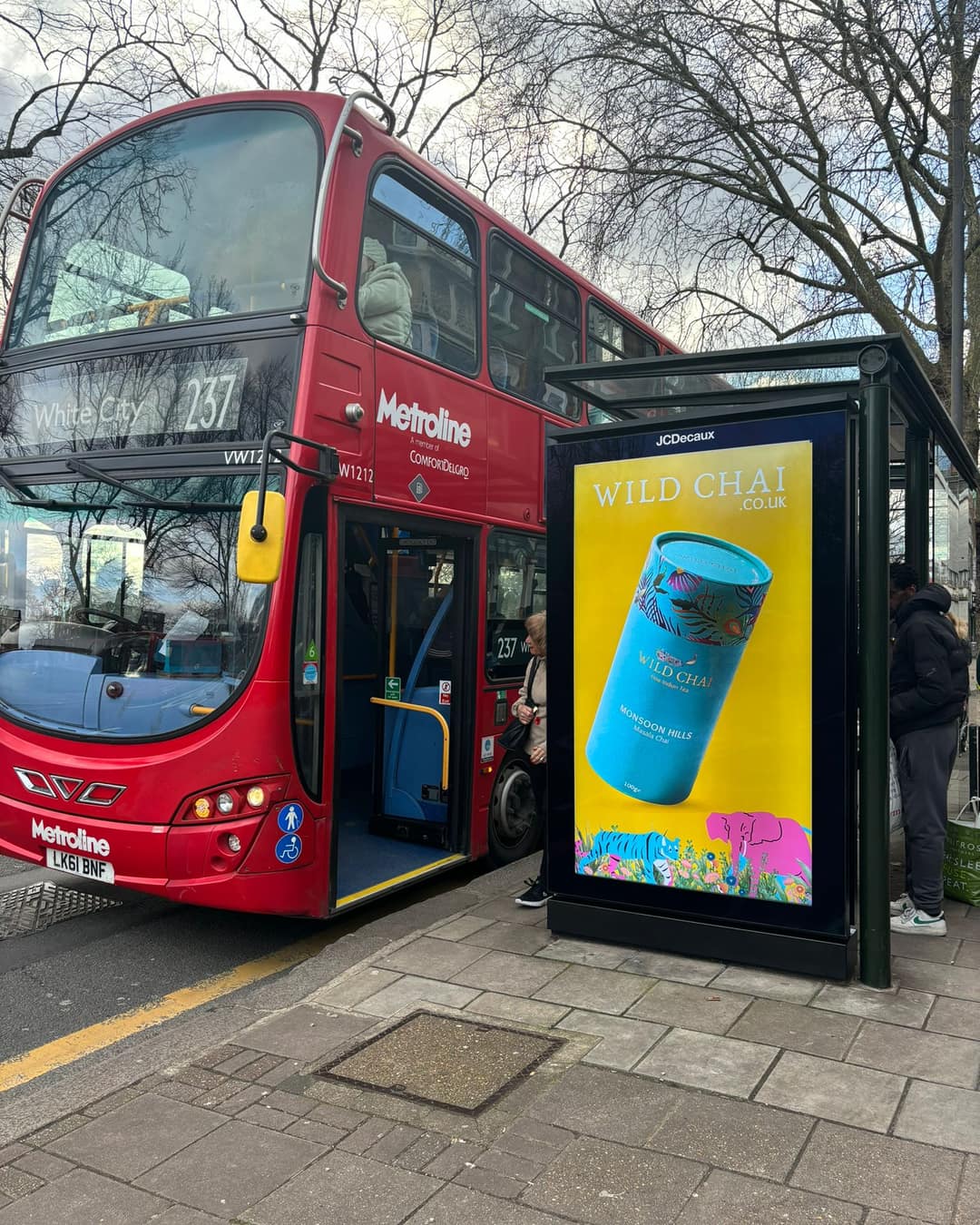
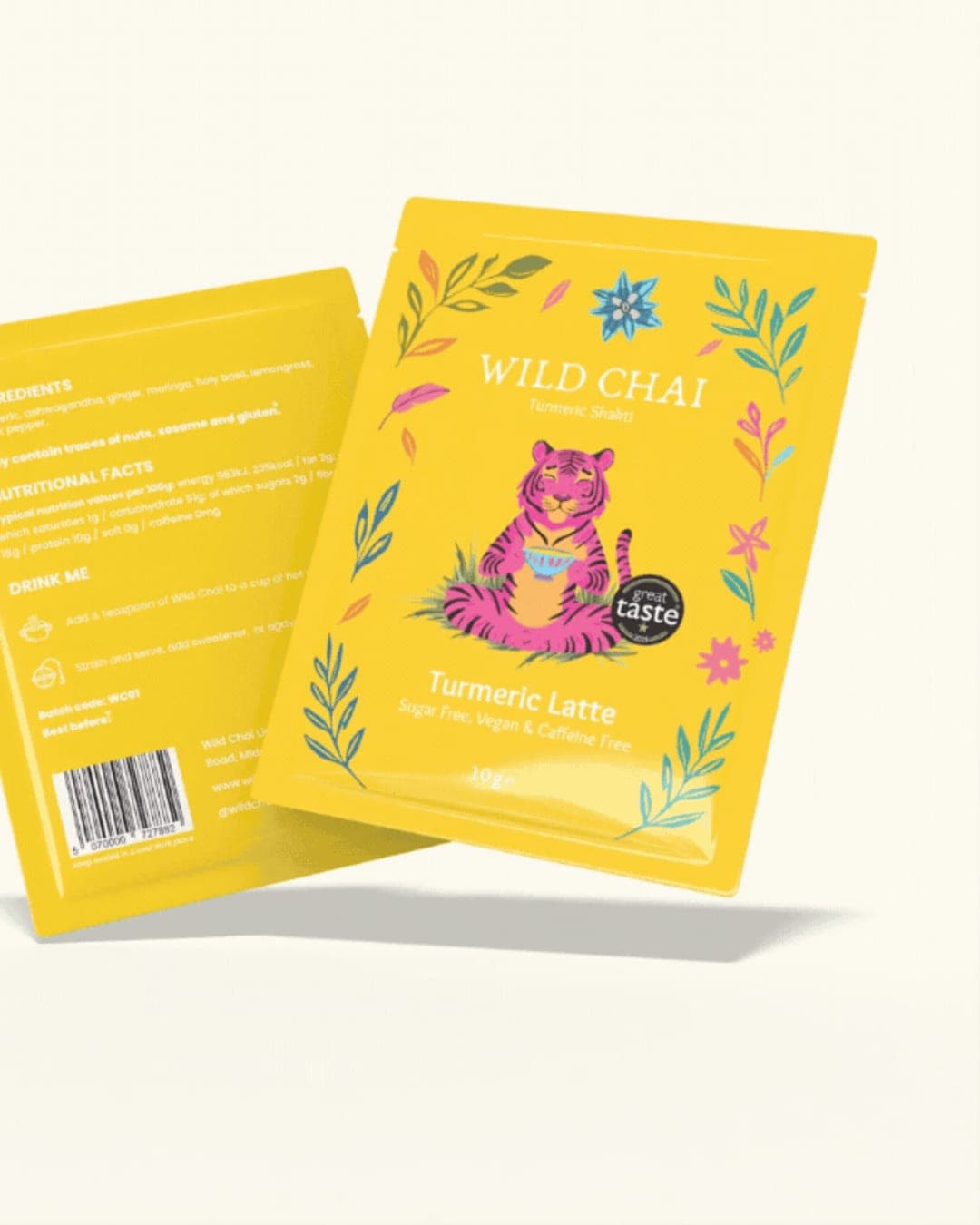
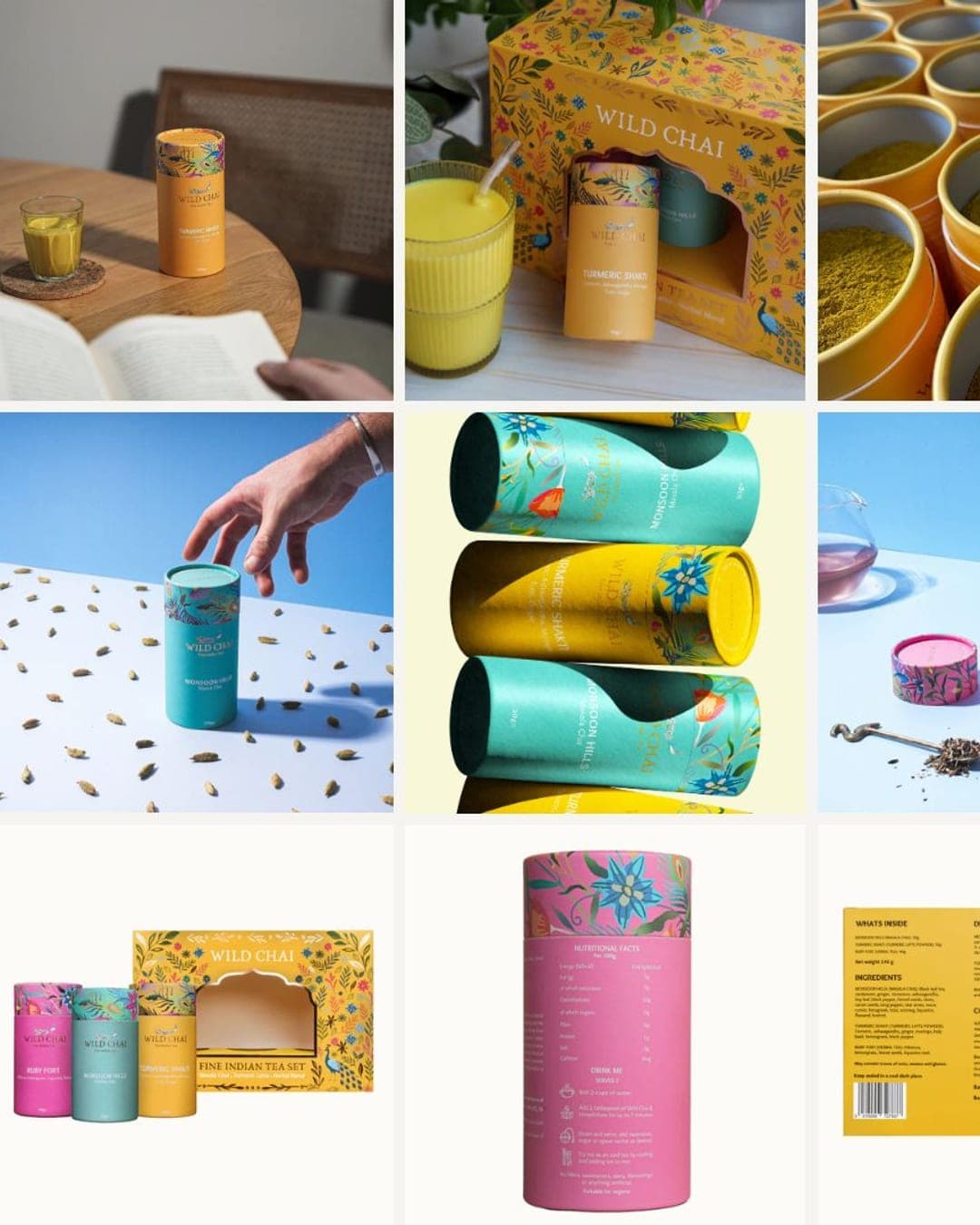
Wild Chai already had a strong point of view when the two sister founders and I started working together. They knew what they wanted the brand to feel like, rooted in Indian chai culture, energetic and a little untamed, but far removed from the predictable “traditional Indian” look. I was involved from the very beginning, building the brand identity, packaging and digital world alongside them. The process was highly collaborative, with their ideas, references and cultural perspective shaping the direction at every stage. The central challenge was finding a way to make Wild Chai feel unmistakably rooted without leaning on obvious cultural clichés. I explored this through custom illustration, bold colour and refined typography, letting the illustrations bring the energy and storytelling, while the type created enough structure and clarity. Packaging was designed with real production constraints in mind too. As a bootstrapped brand, the design couldn't depend on expensive finishes to create impact. Colour, composition and illustration had to do the heavy lifting, both on shelf and at pop-ups. And the identity didn't stop at the pack. I extended the visual system across cups, banners, billboards and other digital and physical touchpoints, building a brand world that could grow with Wild Chai rather than a collection of one-off designs. For me, the most interesting part was the collaboration, taking a vision the founders already felt strongly about and working together to keep refining it until it had a visual language of its own. Wild Chai is a live brand. Explore the brand at

Color Palette
This brand uses a color palette of 3 colors
Click a color to find brands with similar colors.
Tags
Live score
Scores stay hidden while voting is open, so early votes can't anchor the ones that follow. Check back once the countdown ends.
Votes (1)
| Voter | Design | Strategy | Originality | Story | Overall | |
|---|---|---|---|---|---|---|
 | Design By Sukaina from Pakistan | 8 | 8 | 8 | 8 | 8.00 |