Hospitality & Travel · by pixelarte-studio
Churros Churros
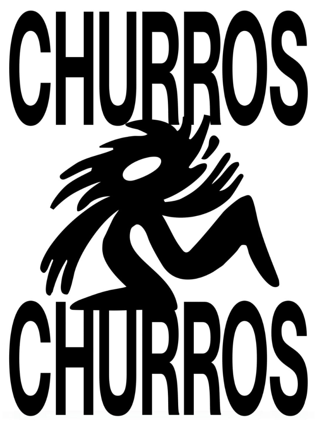
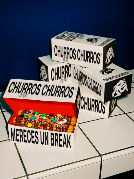
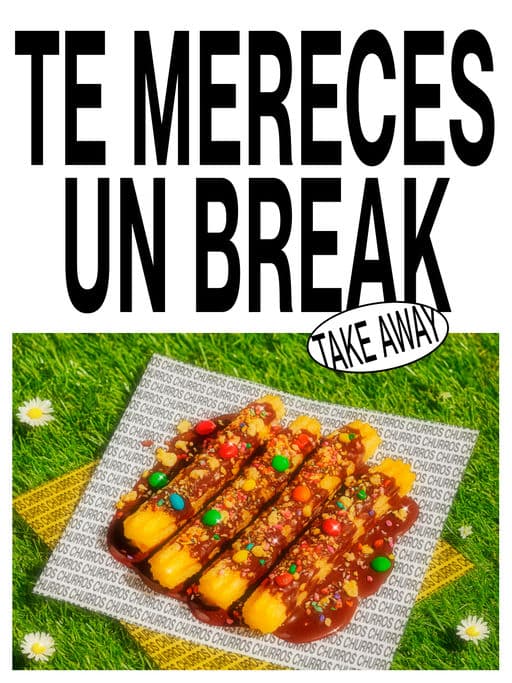
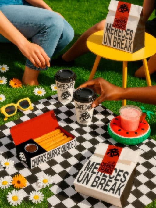
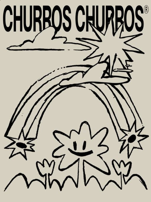
CHURROS CHURROS shows how bold hospitality branding can transform a traditional churro shop into a stand-out, character-driven brand 💥 Two young founders from Talavera de la Reina wanted to push the classic idea of a churrería further. From that starting point, we created a fresh, contemporary visual identity for a young, urban audience: powerful type choices, a chocolate-splashed mascot, spontaneous illustrations, super-colorful art direction, and take-away–ready churro packaging designed to shine both in real life and on social media. More than just a nice look, it’s a brand that’s recognizable, direct, and memorable — a modern churrería that reimagines tradition to connect with how we experience food today. Typography: Neue Montreal Ultra Squeezed by off-type.com Branding & Art Direction: pixelarte.com




Color Palette
Tags
Voting is closed for this nominee.