Food & Beverage · by Opime Studio
Elsie's
 Opime Studio
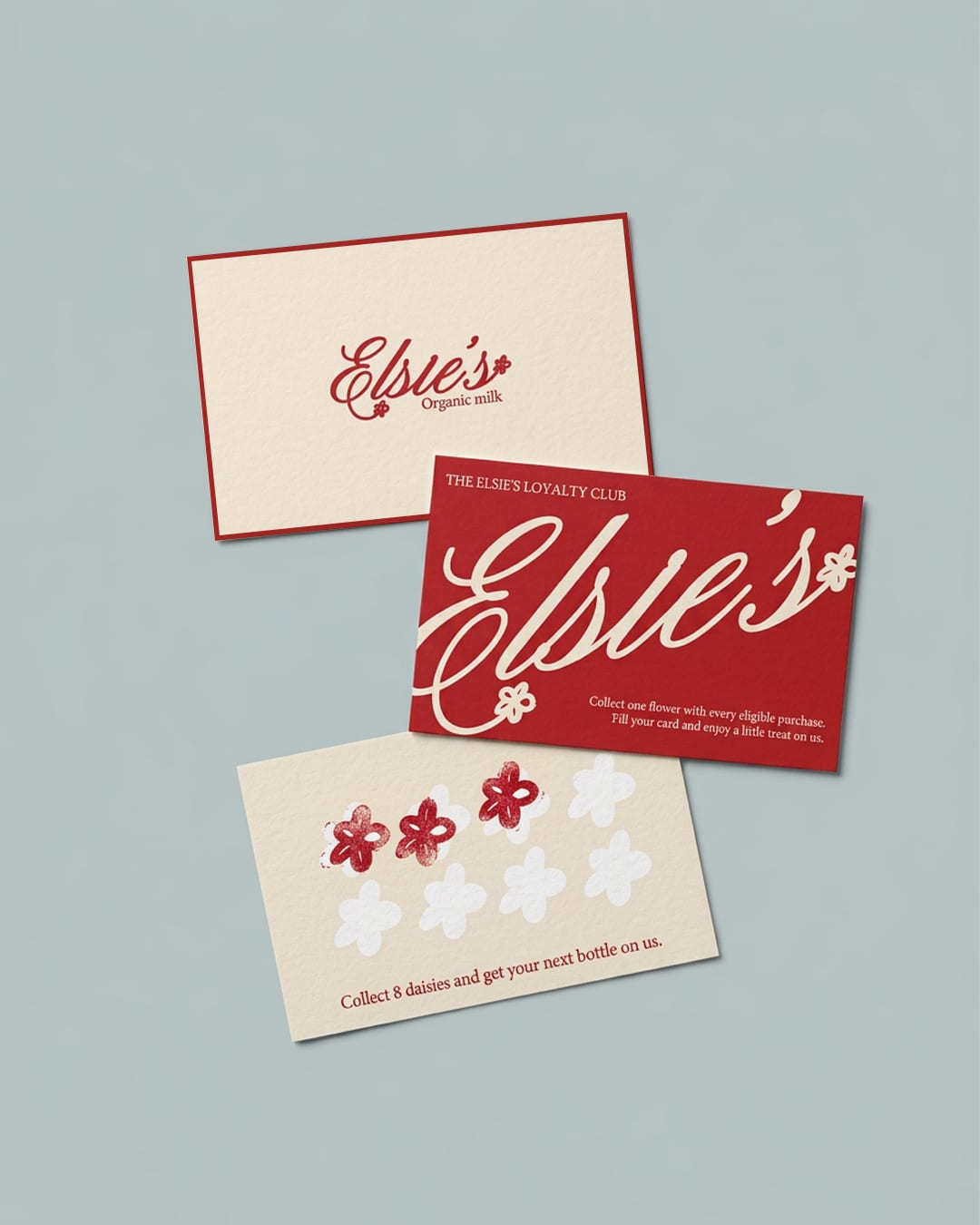
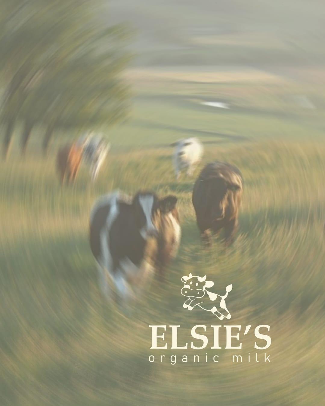
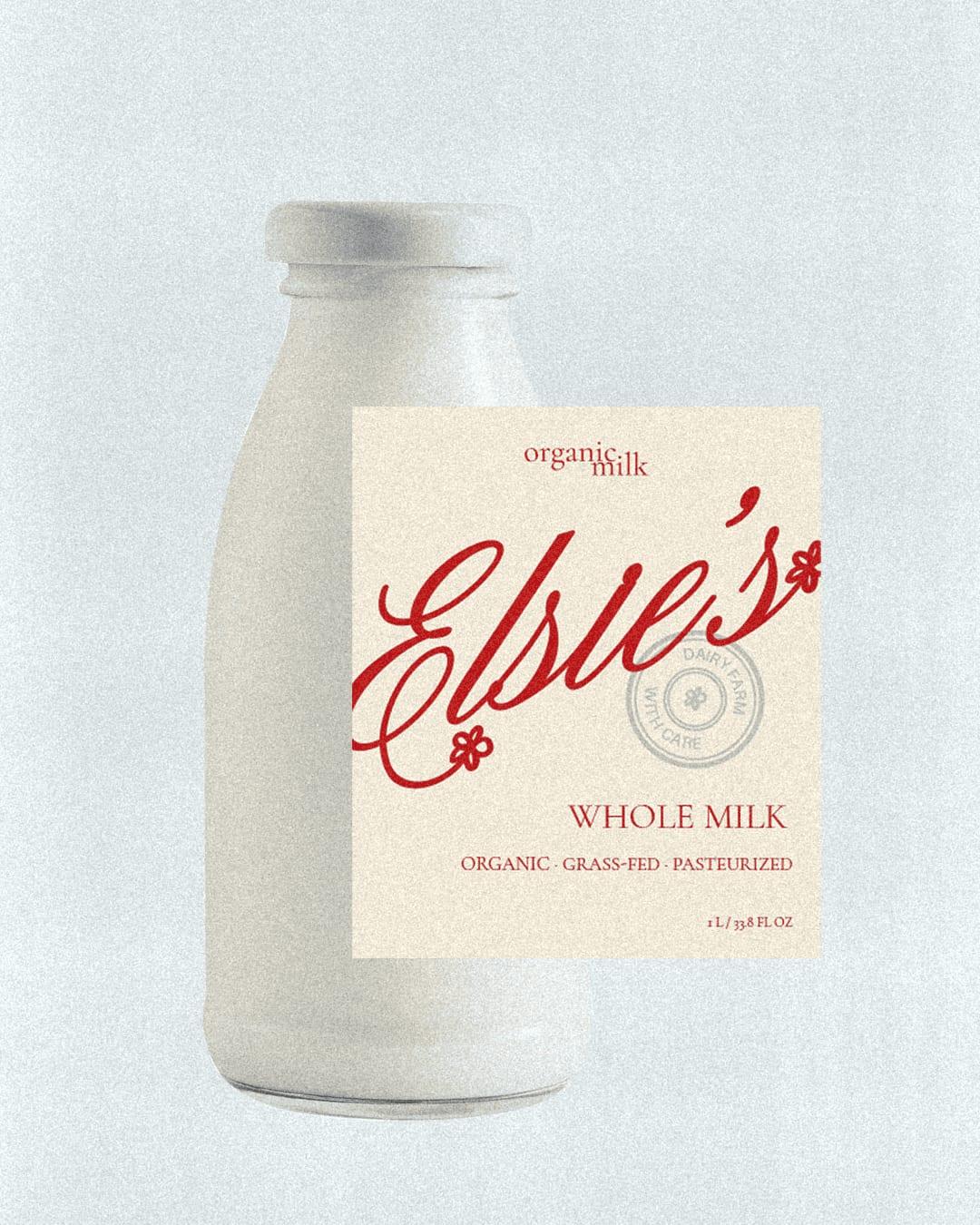
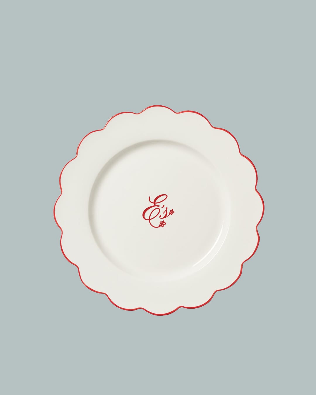
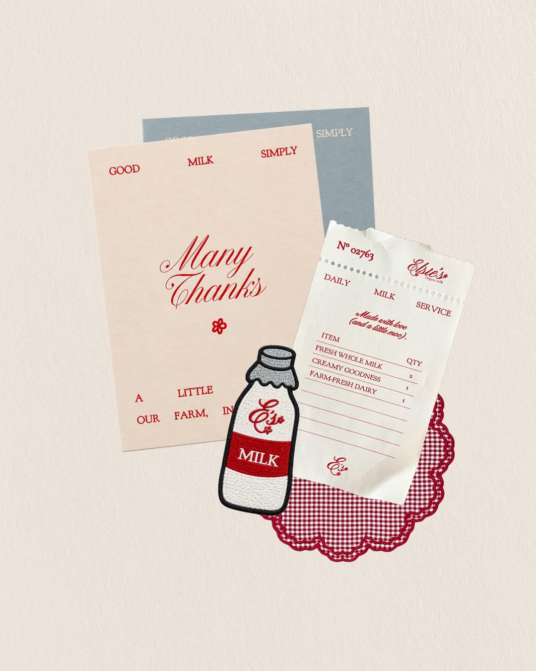
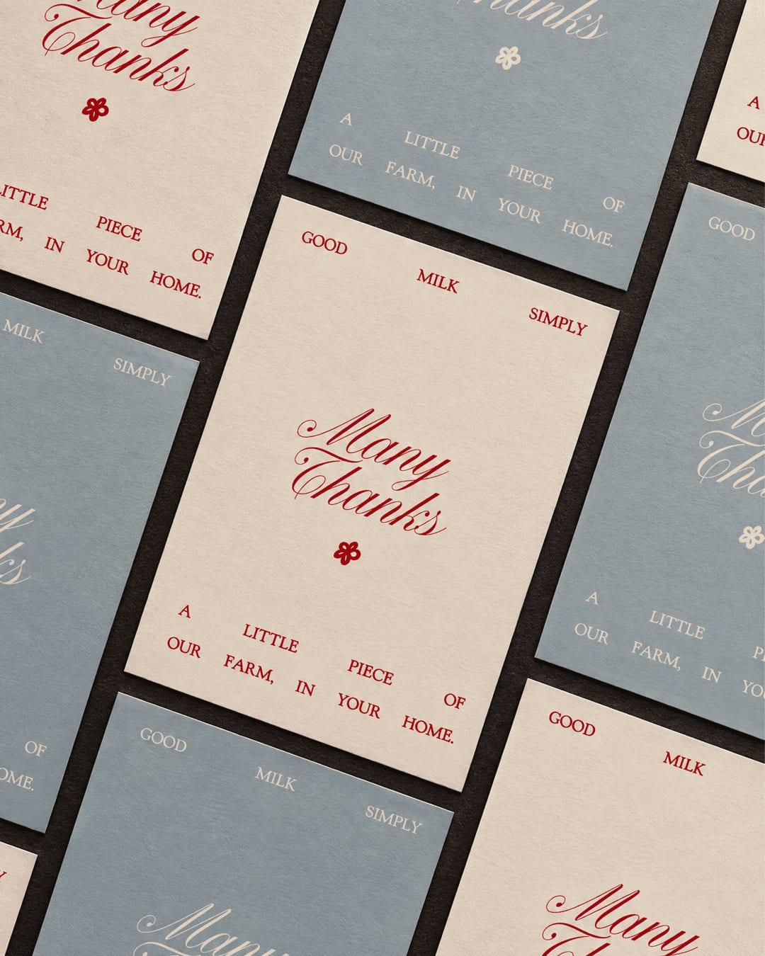
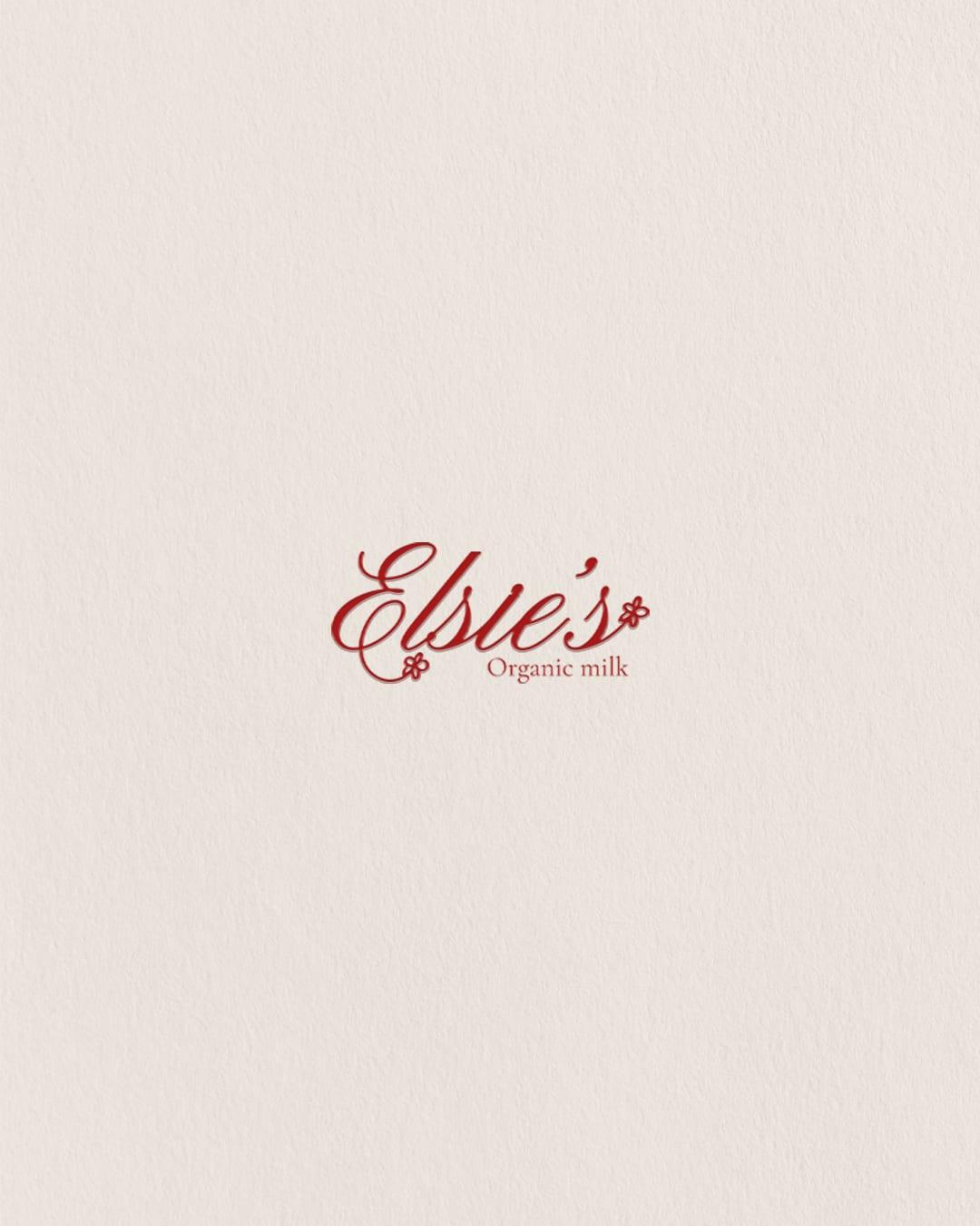
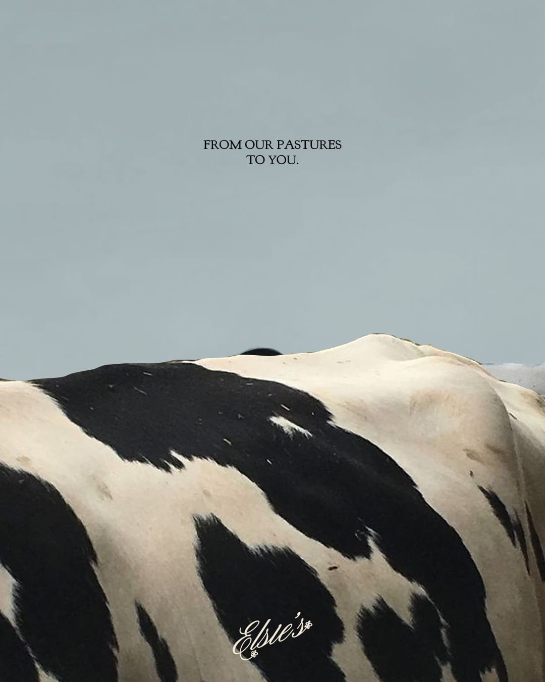
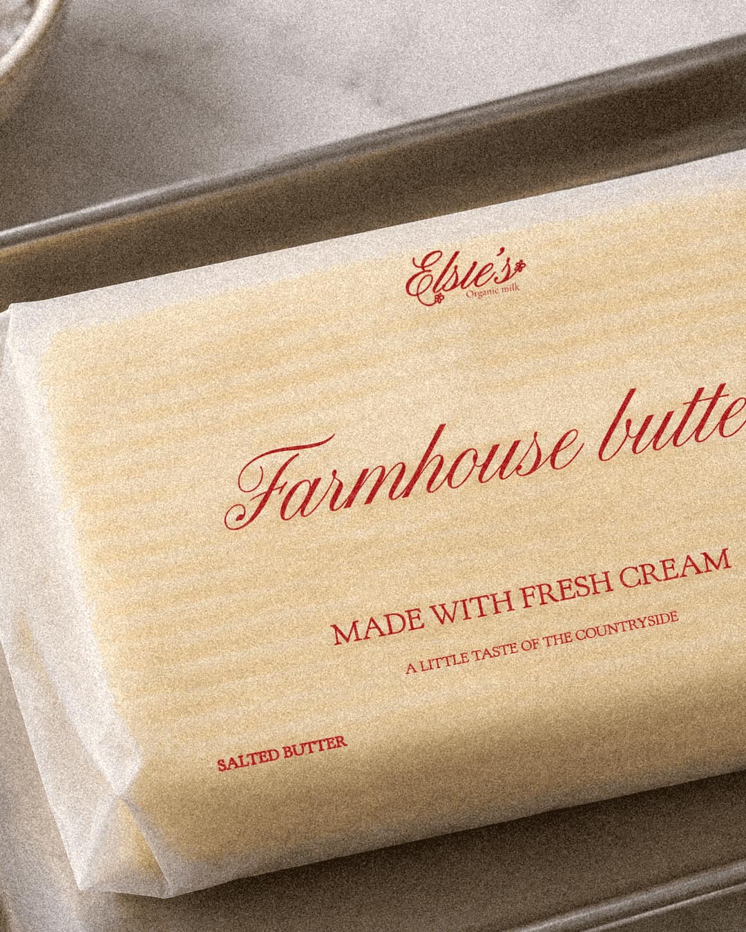
Elsie’s is an organic milk brand inspired by the simplicity of traditional farming and the beauty of everyday rituals. The visual identity combines a warm, delicate aesthetic with a distinctive sense of character, bringing a fresh perspective to a familiar product. The logotype features expressive calligraphic typography, adding a handcrafted feel and a sense of authenticity to the brand. Rather than relying on predictable visual references such as milk bottles, cows or green leaves, the identity takes inspiration from a simple wildflower: the daisy. A familiar sight in grazing pastures, it brings softness to the logo while connecting the brand to its natural surroundings. The colour palette brings together creamy white, deep burgundy and misty blue. Moving away from the expected green codes of organic branding, burgundy adds warmth, depth and a subtle vintage feel, while misty blue introduces a sense of freshness and lightness. Together, these elements create a distinctive visual world that balances rustic heritage with a contemporary approach to organic dairy branding.
Color Palette
This brand uses a color palette of 3 colors
Click a color to find brands with similar colors.
Tags
Live score
Scores stay hidden while voting is open, so early votes can't anchor the ones that follow. Check back once the countdown ends.
Votes (2)
| Voter | Design | Strategy | Originality | Story | Overall | |
|---|---|---|---|---|---|---|
 | croire.bureau from Paris | 10 | 10 | 10 | 10 | 10.00 |
 | Libra Studio from France www.libra-studio.fr | 10 | 10 | 10 | 10 | 10.00 |