Other · by Opime Studio
MATIZ
 Opime Studio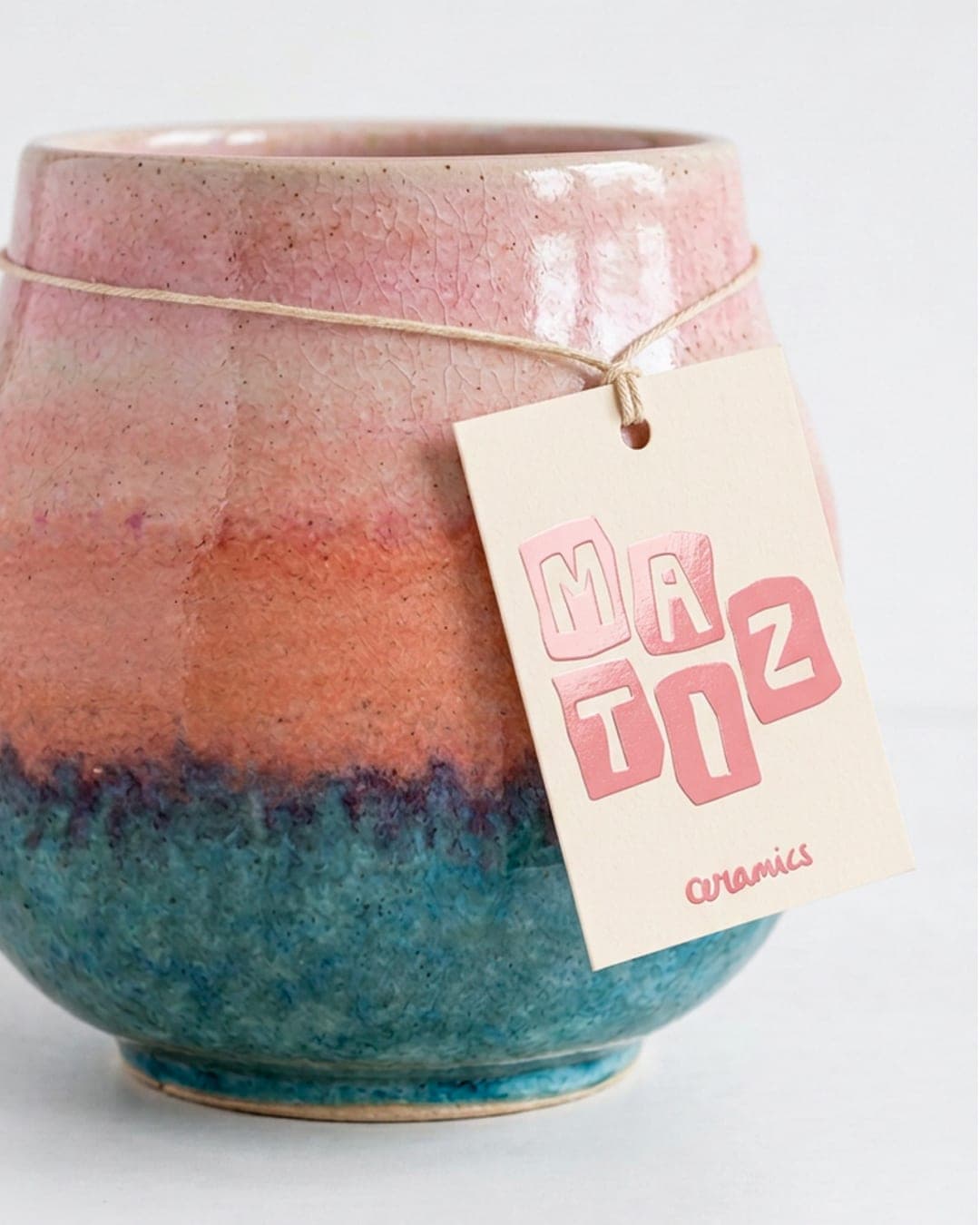
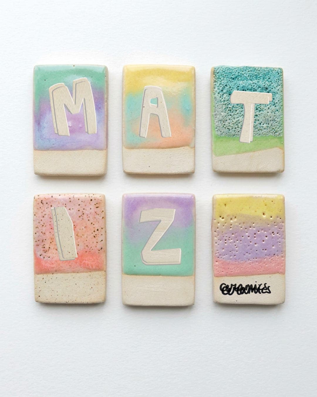
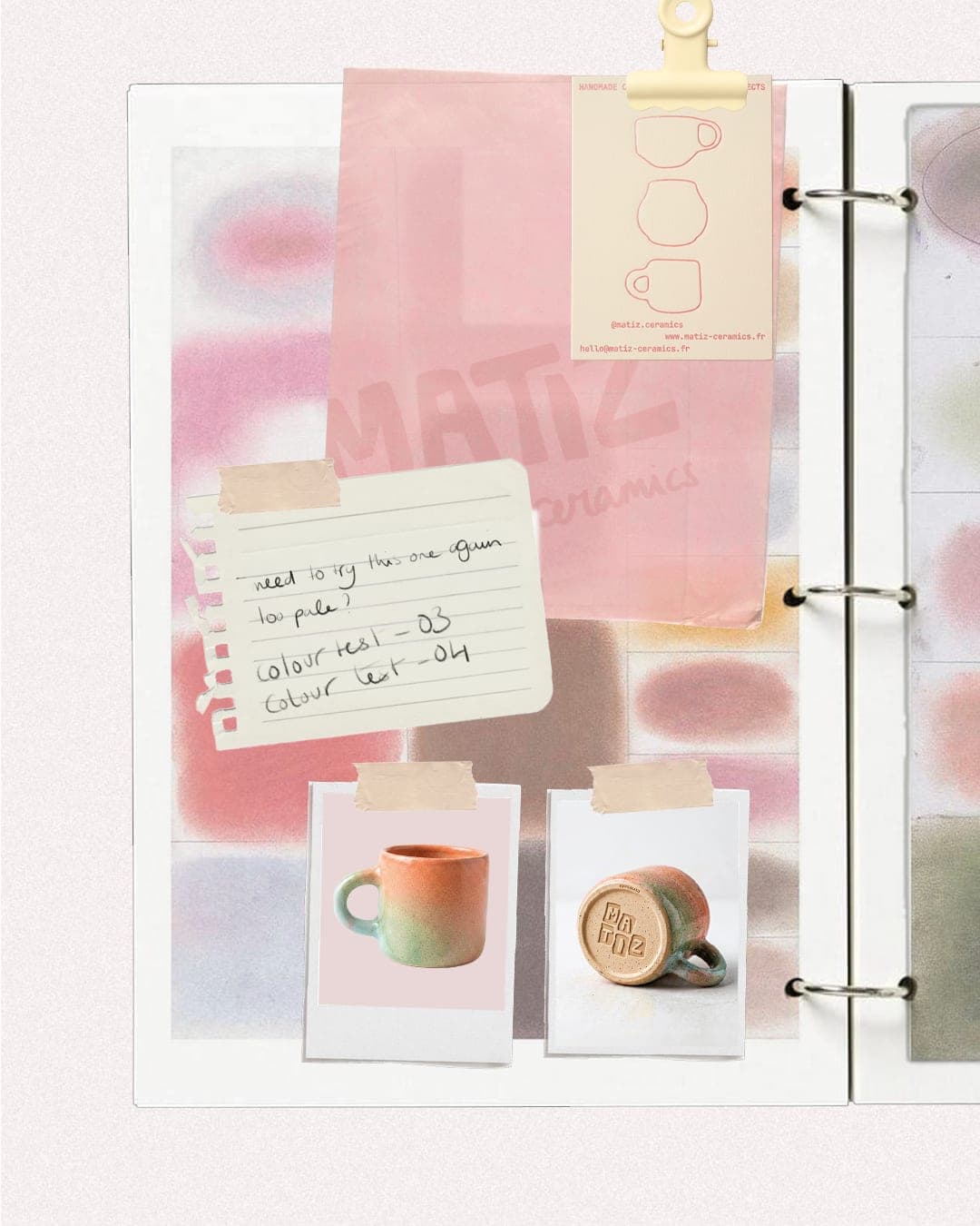
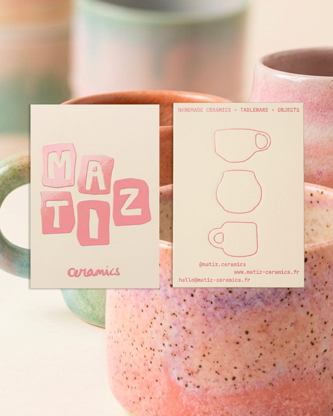
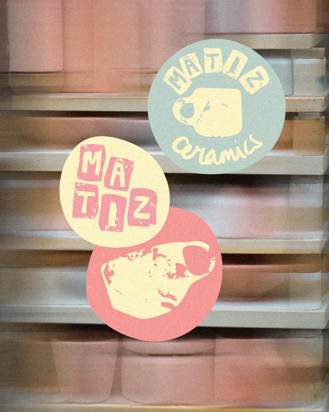
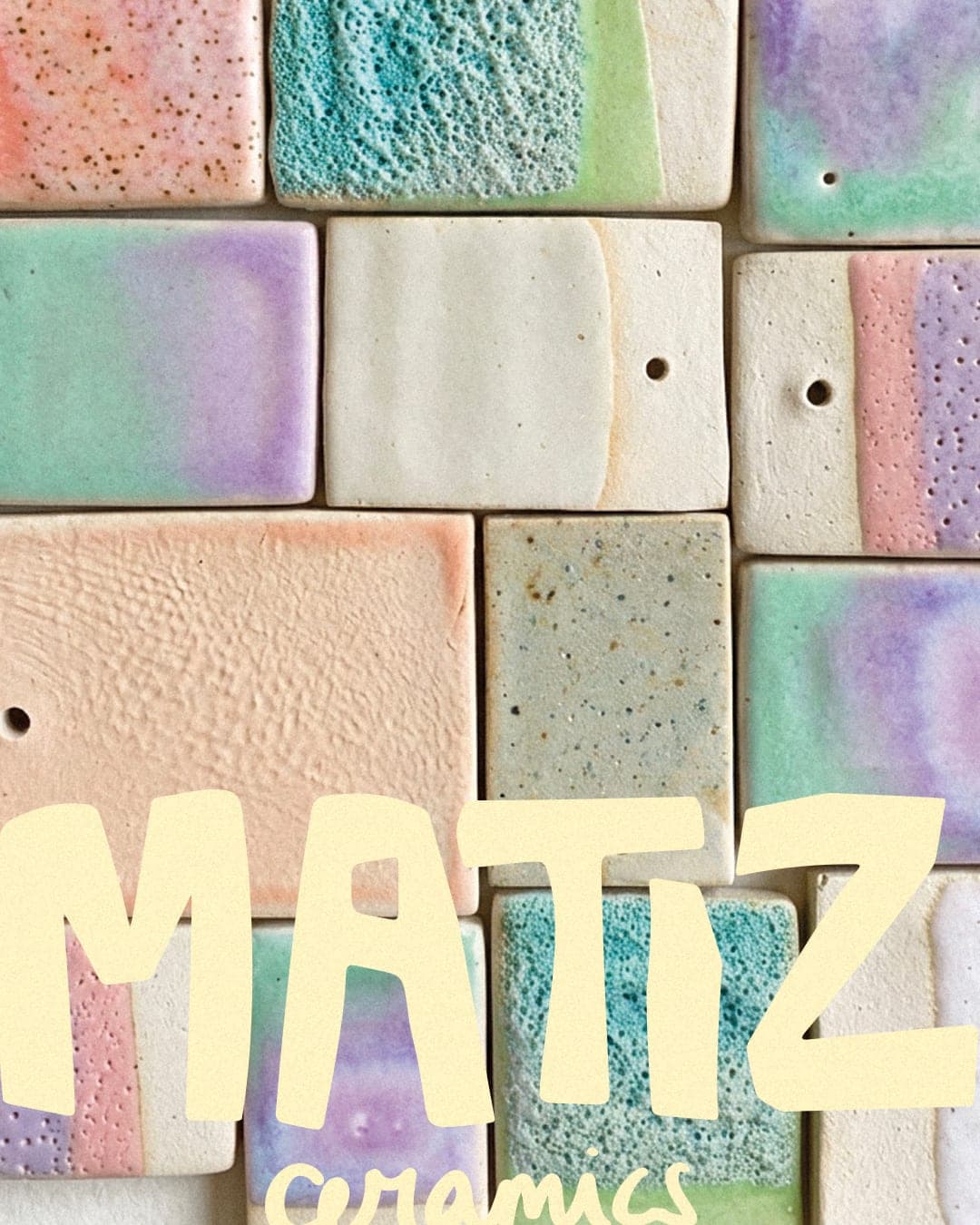
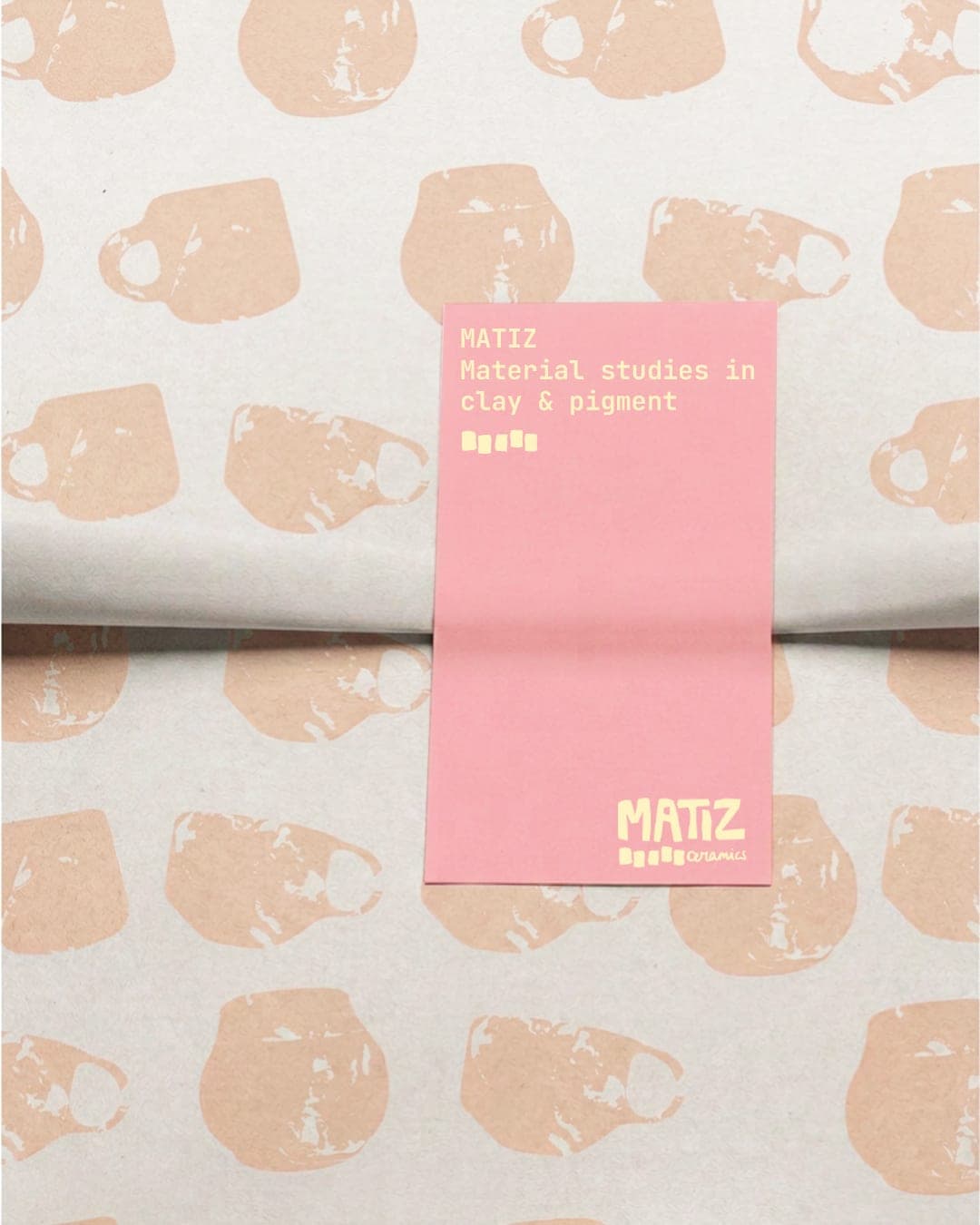
MATIZ is a visual identity concept for a contemporary ceramic studio, built around the studio’s creative process and material experimentation. The identity takes inspiration from elements found in ceramic workshops: pigment samples, color tests, raw textures and rectangular sample slabs used to test different finishes. These references were translated into the visual system through a bold, geometric logo inspired by the proportions and shapes of ceramic mugs and pots. The rectangular sample format is also used as a recurring graphic element across the identity and packaging. The color palette is based on pigment experiments, combining pink, butter yellow, light blue, green and violet. The packaging system includes branded tissue paper and applications designed to extend the identity to the ceramic pieces and studio materials.
Live score
Scores stay hidden while voting is open, so early votes can't anchor the ones that follow. Check back once the countdown ends.
Votes (1)
No votes yet — be the first.