Health & Wellness · by Vasundhara
Equilibria Pilates Studio
 Vasundhara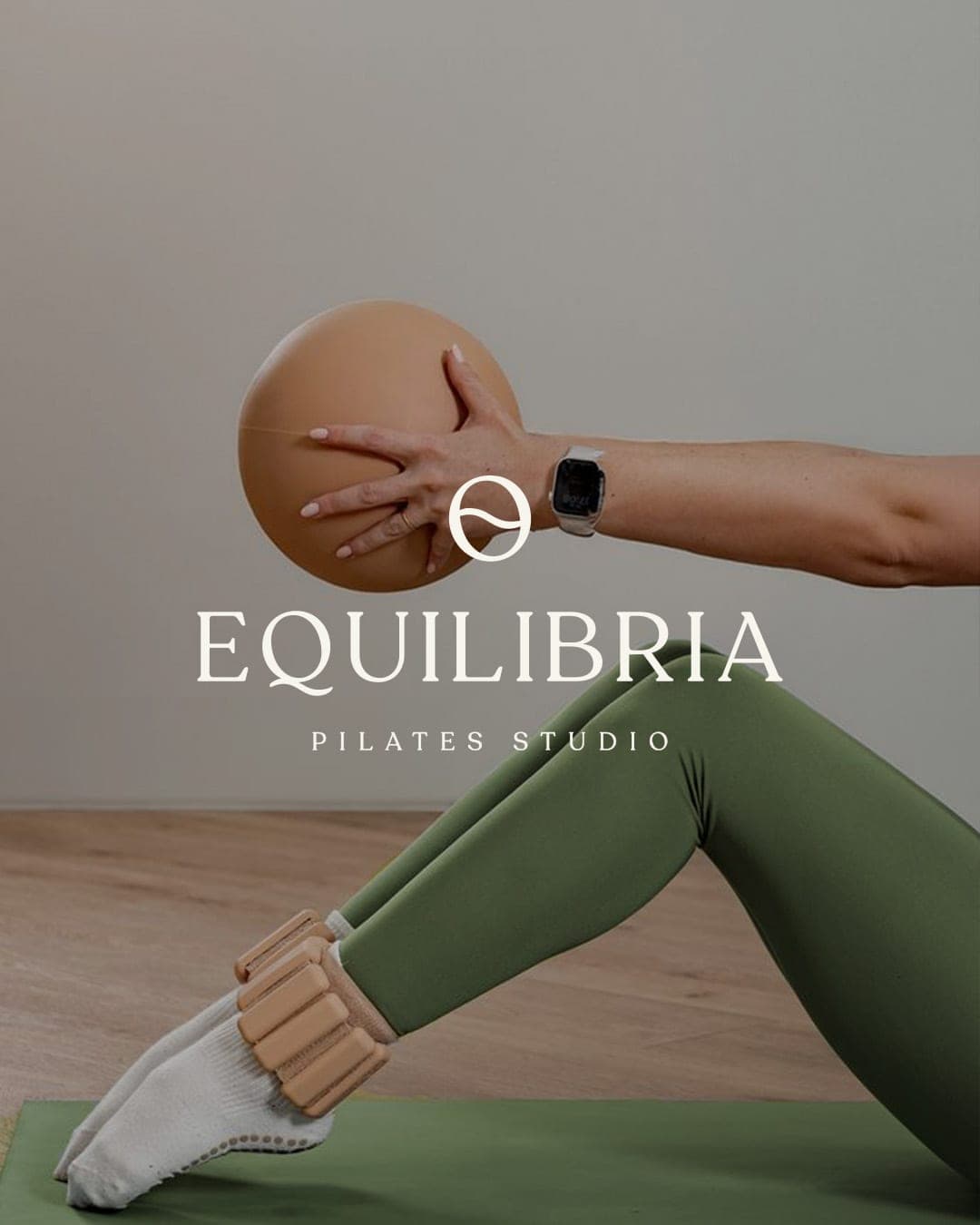
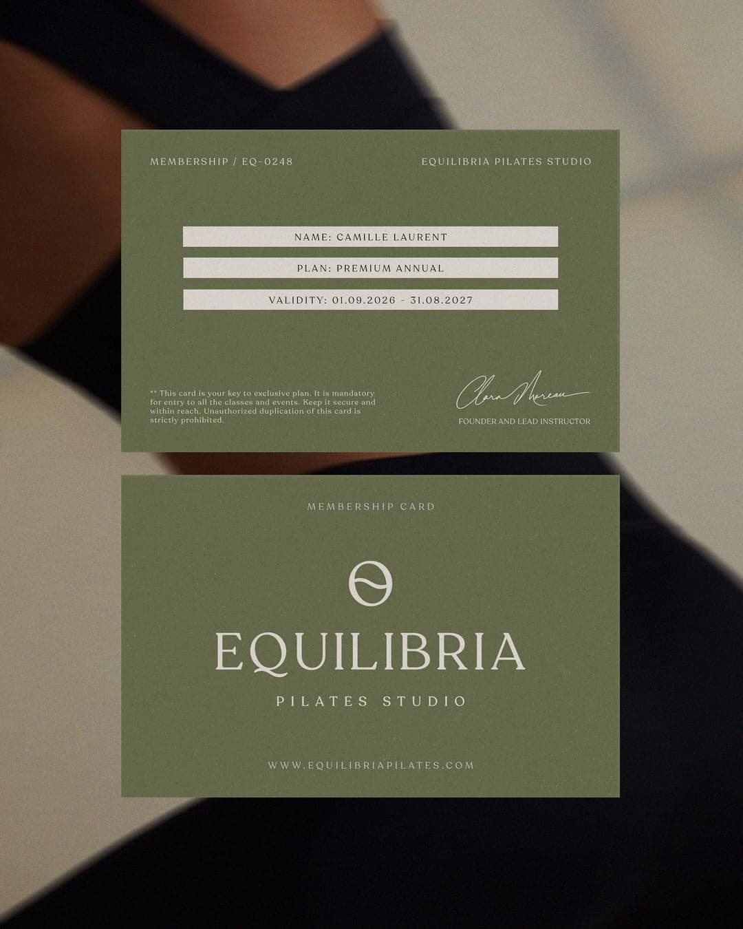
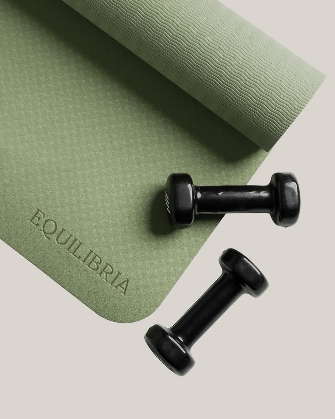
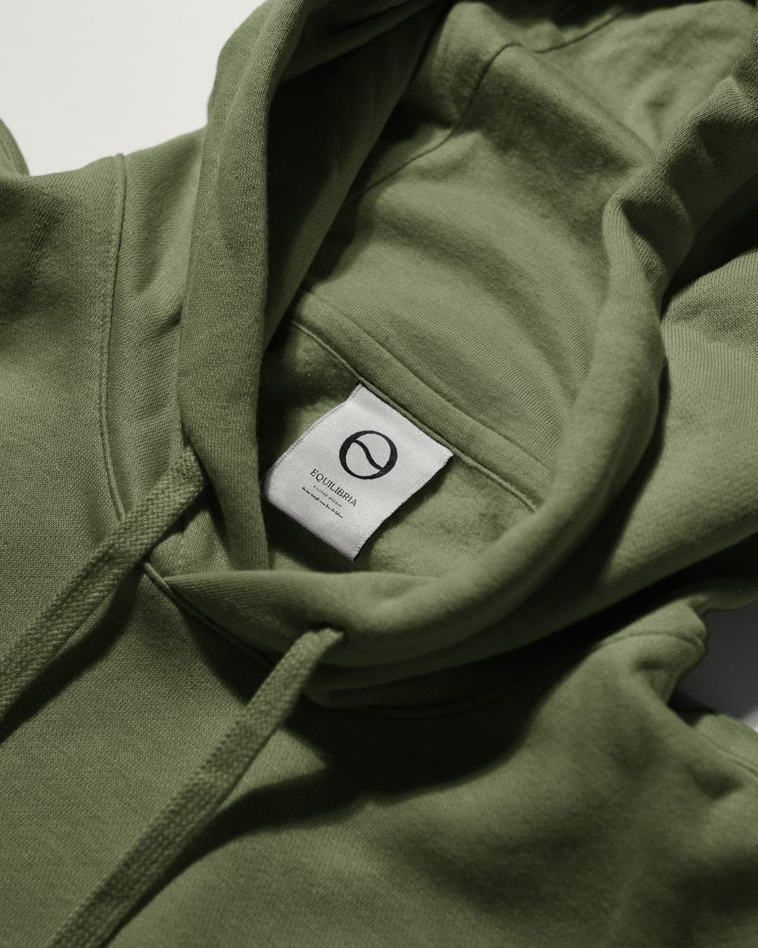
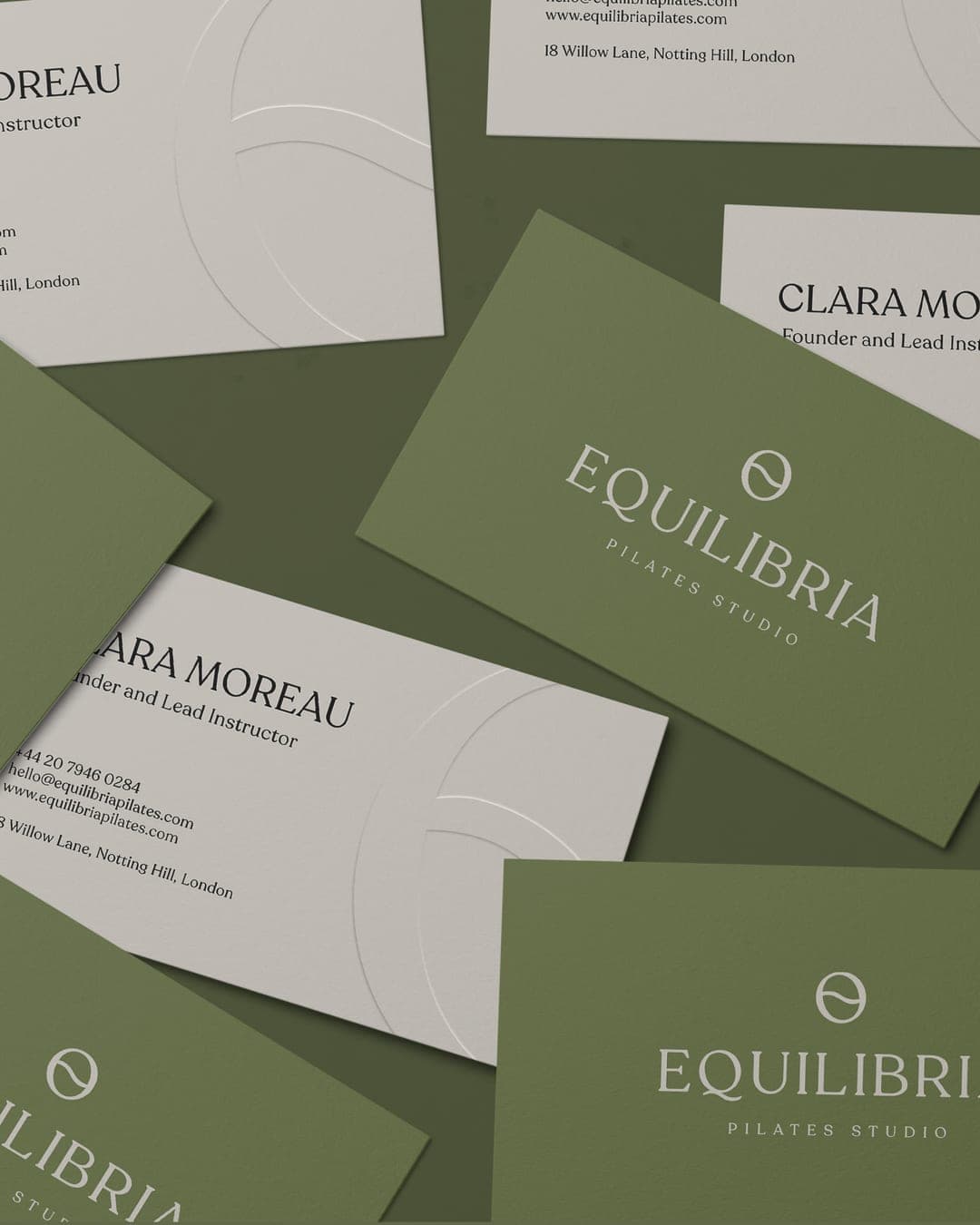
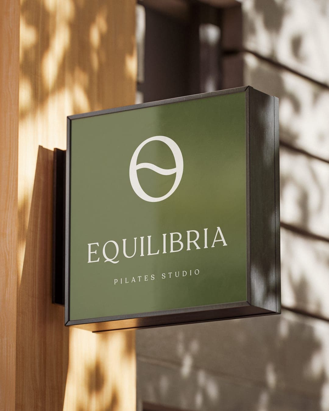
Equilibria is a Pilates studio built around one idea: true strength comes from balance - physical, mental, and intentional. The visual identity translates this philosophy through a clean, balanced system of typography, color, and form. The icon represents the circle of life, symbolizing continuous movement, change, and growth. A flowing line divides it into two equal parts, representing the opposing forces of positive and negative - coexisting to create wholeness. Together, the identity reflects Equilibria’s belief that true strength comes not from eliminating one side, but from finding balance between both.


Color Palette
This brand uses a color palette of 1 color
Click a color to find brands with similar colors.
Tags
Voting is closed for this nominee.
Score→ 8.3 / 10
Design & Craft
8.40 / 10
Strategy
8.40 / 10
Originality
6.80 / 10
Brand Story
8.80 / 10
Simple average of the counting votes, per criterion — the Score above also weights the four criteria, counts Jury and PRO/Agency votes more heavily, gives less weight to voters who rate everything at the very top or bottom of the scale, trims outliers once a tier has enough votes, and nudges scores built on few votes toward the site-wide average. Votes that don't count toward the score aren't included.
Votes (5)
| Voter | Design | Strategy | Originality | Story | Overall | |
|---|---|---|---|---|---|---|
 | Leyma Design from Spain www.leyma.design | 7 | 9 | 6 | 8 | 7.50 |
 | madstudio.ny from New York madimccreesh.com | 7 | 9 | 7 | 9 | 7.80 |
 | Laamari Designs from Tunisia | 8 | 7 | 6 | 8 | 7.30 |
 | digitalsbyavrish from India digitalsbyavrish.framer.website | 10 | 8 | 8 | 10 | 9.00 |
 | Erandy Elias from United States starhillstudio.com | 10 | 9 | 7 | 9 | 9.00 |