Sport & Outdoor · by Vasundhara
Maneridge Equestrian Club
 Vasundhara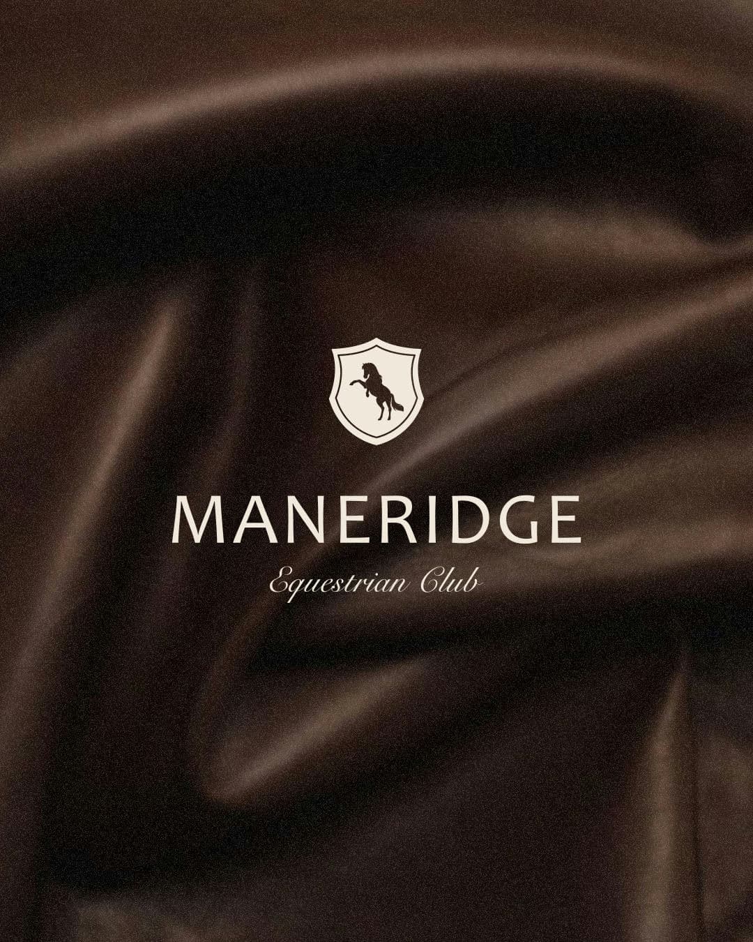
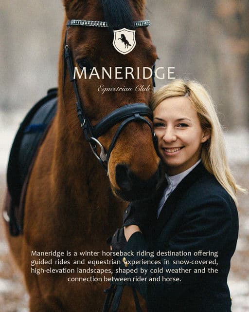
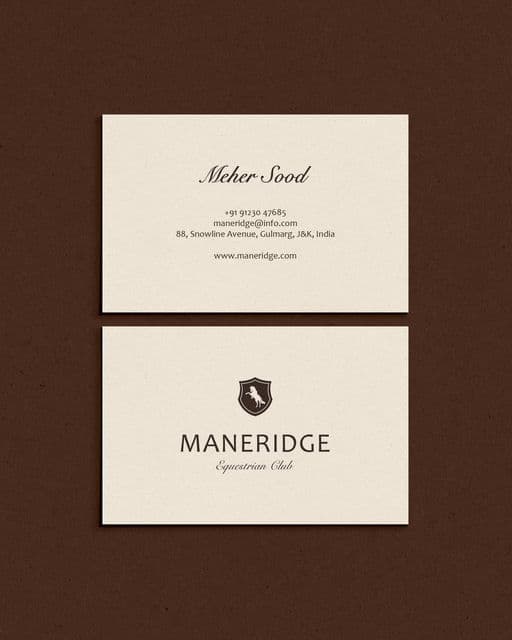
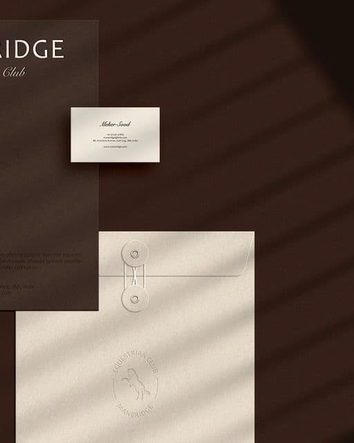
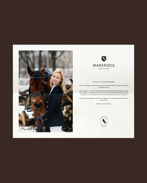
Maneridge is a winter horseback riding destination offering guided rides and equestrian experiences in snow-covered, high-elevation landscapes, shaped by cold weather and the connection between rider and horse. The branding for Maneridge is designed to feel modern, clean, premium, and professional, while still remaining warm and welcoming. The visual direction leans women-centric, reflected through the overall aesthetic and imagery choices. The typography and color palette were carefully selected to communicate the club’s refined professionalism and approachable spirit. The icon combines a shield and horseshoe silhouette, featuring an illustration of a joyful jumping horse to represent confidence, movement, and the thrill of riding.




Color Palette
Tags
Voting is closed for this nominee.