Voting closed
Link copied
Pet · by kurka
Nutrivida
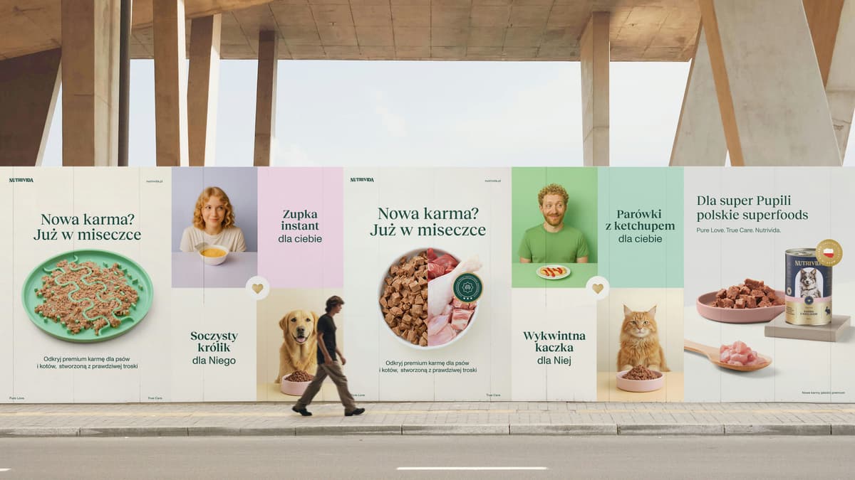
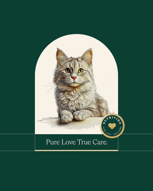
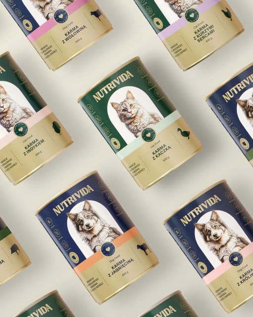
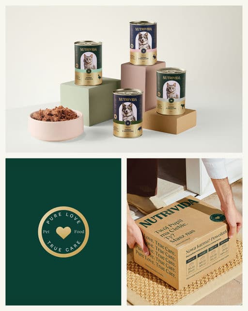
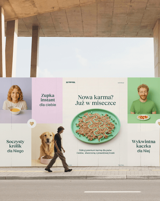
The branding was inspired by classic typographic forms. Serif typefaces, a golden Pantone accent, and a hand-drawn pen illustration gave the design an elegant, timeless character. The pet’s portrait was emphasized with a semi-circular color field, while the label layout followed a traditional, centered composition. To evoke warmth and a sense of closeness, the color palette was softened - warm ecru backgrounds and emotional photography showcasing the bond between humans and their pets. Combined with the tagline “Pure Love, True Care,” it all formed a coherent and harmonious brand identity.




Color Palette
Tags
Voting is closed for this nominee.