October 12, 2026 · 8 min read
Bakery Logo and Branding Ideas: 6 Approaches With 23 Real Examples
Six approaches to bakery branding and bakery logos, from a daily ritual to a mascot or French craft, with 23 real examples and the mistakes to avoid.
By Roman from Braaands™
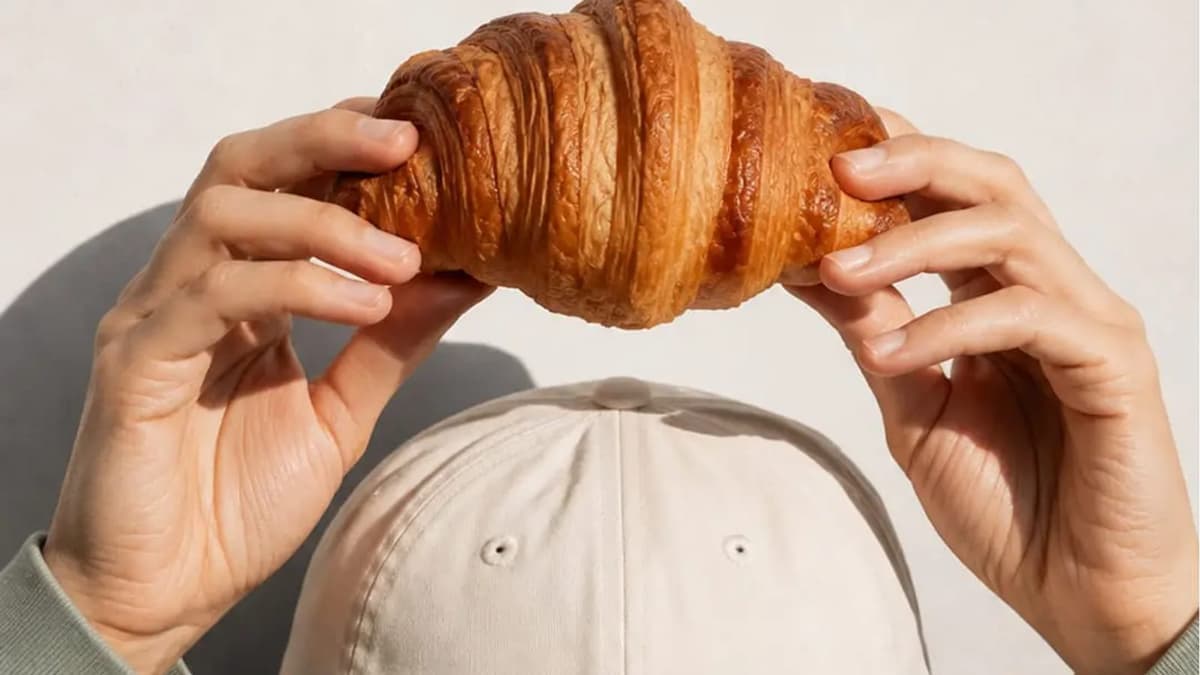
A bakery sells something people can smell before they see it. That makes branding harder, not easier: the brand has to carry the warmth, the freshness and the reason to walk in through a logo, a box and a window.
We went through the bakery identities on Braaands™ (71 brands, the third-biggest industry on the platform, as of October 2026) to see what the good ones do differently. Below you'll find six approaches to bakery branding with real examples, seven bakery logo ideas, what packaging has to do, the most common mistakes, six questions for your brief and a short FAQ.
6 approaches to bakery branding
1. The daily ritual
Many bakeries sell a pause more than a loaf: the morning coffee, the small break, the thing you pick up on the way.
Maru – Coffee and Bread by dirtyline is a Japanese-inspired café and bakery where "simplicity, warmth, and bold character" come together "to shape a meaningful everyday ritual". It was Brand of the Day. Momento by byjamilaahmad is built around "the simple pleasure of slowing down and enjoying the moment" and "small breaks, quiet mornings". It won an honorable mention. Coucou by studio-bainne is a patisserie of fresh French pastries whose mission is to create treats that feel "warm and sweet", "perfect for a coffee break or a gift".
Test: which moment of the day does your bakery own?
2. A character
A character gives a bakery a face that works on bags, stickers and the window.
Twisted Bites by pixelprincess is a pretzel bakery with a black-and-white checkered pattern on the package and in the window display, plus "a friendly cartoon character holding pretzels". My Cake by wooo-designs is a rebrand with a custom font and "a playful cake mascot" that brings the motto "We Give Emotions" to life. Melt & Munch by wooo-designs is a gluten-free cookie brand with "three illustrated cookie mascots, drawn in a childlike style". Uncle Dough by skojie is a conceptual bakery that "doesn't take itself too seriously. Just like Uncle Dough himself."
Test: could the character appear alone, in one color, on a sticker?
3. Loud and colorful
Some bakeries want to be seen from the other side of the street.
Stella by designs is a fun, bold bakery brand with bright colors, a bold modern typeface and a fun illustration, made to "grab attention". Gula Donuts by studiorevv is "whimsical, bold, and too pretty to throw away", with donut boxes designed to make jaws drop "before the first bite". Go Banana! by shams turns everyday comfort into "a bold, colorful experience" for a banana bread brand, from packaging to posters. Batter Up! by danieladesignstudio is a trio of breakfast products ("Stacks, squares, or circles?") designed to make breakfast feel like a game. Krumble Bakehouse by manars-graphix is "a fun, vibrant bakery" that "embraces the joy of baking with a playful twist".
Test: does the brand still look good at a quarter of the size, on a single paper bag?
4. Craft and heritage
When the product is classic, the brand can lean on where it comes from.
Krossa by wesley-jpg is an artisanal bakery in St. Rémy crafting classic French pastries "with time-honored techniques". Il Panetto by wolfflowwolf is an Italian bakery offering "authentic Italian baking, from bread to pastries". Dolce by atheria-studio is a vegan Italian baked goods brand inspired by the Luperca sculpture of Romulus and Remus, which "blends heritage with edge". Flourist by mrkttnr is an artisan bakery that treats baking "as an art form".
Test: what is the oldest thing about your bakery, and does the brand show it?
5. Minimal and calm
A quiet identity can make a bakery feel like a destination.
BAEK Bakery & Coffee by madewithathaa is a modern Korean bakery concept "focused on minimal aesthetics, soft baked goods, and a calm contemporary café experience". It was Brand of the Day. Bori by moara is a Korean-inspired café whose identity is "modern, approachable, and stylish", with a mascot that adds personality. It won an honorable mention. Nayma by laamari-designs is "a warm and friendly cake brand" with soft colors, clean shapes and a gentle look.
Test: what could you remove from the brand without losing it?
6. Premium sweets
For gifts, celebrations and boxes, the brand has to feel like the occasion.
Sweet Cake Co. by lilyzdesigns is a confectionery artist with a "touch of Parisian style", with a premium, exquisite look matched to "the incredible craft and heart put into every single bake". It won an honorable mention. YUMM by syeda-maham takes "a colorful approach to premium branding", moving away from the muted, minimal look often seen in the category. It was Brand of the Day. Cinnapop by clemarastudio is a gingerbread brand with "a festive visual identity" built around bold typography, warm colors and narrative illustrations. The Waffle Spot by brandsbycolorful captures "the warmth, indulgence, and joy of the perfect waffle experience" in its logo, colors, typography and textures.
Test: would you give this box as a gift?
Bakery logo ideas: seven ways to draw a bakery
The logo of a bakery goes on a window, a paper bag, a sticker, a box lid and a small social picture. These seven ideas come from the brands above:
- A wordmark in a distinctive style. Twisted Bites uses "stylish italics" for a personal look.
- A custom font. My Cake has a custom-designed font that makes the name feel handcrafted.
- A mascot. The cookie trio of Melt & Munch or the pretzel character of Twisted Bites are easy to put on a sticker.
- A pattern that does the work. The checkered pattern of Twisted Bites works on the package and in the window.
- A symbol with a story. Dolce draws on the Luperca sculpture of Romulus and Remus.
- Narrative illustration. Cinnapop tells a festive story through illustration instead of a single mark.
- A calm, minimal wordmark. BAEK relies on minimal aesthetics and lets the baked goods speak.
Packaging is the brand
For many bakeries, the box and the bag are the only part of the brand a customer takes home. Look at how the brands above use them:
- Gula Donuts designed its boxes to be "too pretty to throw away".
- Batter Up! made a trio of products with playful vibes that "pop off the shelf".
- Twisted Bites carries one pattern from the package to the window display.
- YUMM extends its identity across packaging and cookie boxes.
- Go Banana! takes the same system from packaging to posters.
Three checks for any bakery pack: it should be readable at a glance in a cluttered counter, work in a one-color print for stamps and bags, and show the product name before the brand name.
6 bakery branding mistakes
- The usual symbols. Wheat stalks, rolling pins and chef hats are on many bakery logos. If yours looks like them, the brand disappears next to them.
- A logo that only works on the sign. Test it small and on paper.
- Branding the shop, not the box. Customers carry the packaging far beyond the shop.
- A character without rules. Decide the poses, the one-color version and where it may appear.
- Copying the "calm minimal café" look. It works for BAEK because the concept is built around it. Without a concept it looks generic.
- Forgetting the range. If a bakery sells ten products, the system has to tell them apart.
How to brief a bakery branding project
- What is the one thing a customer should say about the bakery?
- Who buys here, and when: morning commuters, gift buyers, families at the weekend?
- What does the box or bag have to do?
- What do the bakeries within walking distance look like?
- How many products need to be told apart?
- What can't change: the name, the location, an existing sign?
Bakery branding FAQ
What makes a good bakery logo?
A good bakery logo is readable on a paper bag, a window and a small sticker, and it has one distinctive element: a custom wordmark, a character, a pattern or a symbol with a story.
Should a bakery logo include a symbol?
Not necessarily. Many of the brands above work with a distinctive wordmark. A symbol helps when it tells you something about the bakery, like Dolce's Luperca sculpture, rather than using a generic wheat stalk.
How is bakery branding different from restaurant branding?
A bakery sells a product people carry away, so packaging, labels and the window matter more than the dining room. Many bakeries also sell coffee and run as cafés, like Maru, Momento and BAEK.
Do I need a mascot for my bakery?
No. A mascot helps when the product is playful and repeatable, like cookies or pretzels, and when you plan stickers, boxes and merchandise. It needs a system behind it.
Where can I see more bakery brand identities?
Browse bakery brands, chocolate and sweets, coffee shops and cafés and ice cream and gelato on Braaands™.
Related reading
- Branding Inspiration: 46 Real Brand Identities by Industry
- Coffee Branding: 6 Principles and 19 Real Examples, for bakeries that are also cafés
See more bakery branding
Designed a bakery brand yourself? Submit it to Braaands™. Approved work is voted on by our community and jury and appears on your public designer profile.
See it in real brands
Browse hundreds of brand identities from independent designers, voted on by our community and jury.
Explore brand identities