October 9, 2026 · 10 min read
Coffee Branding: 6 Principles and 19 Real Examples
What 74 coffee and coffee shop brands have in common, six branding principles with 19 real examples, a touchpoint checklist for coffee shops and the mistakes to avoid.
By Roman from Braaands™
Coffee is one of the most crowded categories in branding. Every neighborhood has a café, every supermarket shelf has a wall of bags, and many of them lean on the same familiar cues: a bean, some steam, a warm brown. The brands that stand out choose a position and hold it across a cup, a bag and a menu board.
We went through every coffee and coffee shop identity on Braaands™ (74 approved projects from independent designers, as of September 2026) to see what the good ones do differently. This guide covers what those 74 brands have in common, six principles with real examples, a touchpoint checklist for coffee shops, the mistakes to avoid and a short brief you can reuse.
What 74 coffee brands have in common
Designers tag every project on Braaands™ with the general colors it uses. Here is how coffee brands compare with the average project on the platform:
| Color | Coffee brands (74) | All brands (918) |
|---|---|---|
| White | 42% | 38% |
| Black | 41% | 32% |
| Beige | 30% | 27% |
| Blue | 22% | 18% |
| Yellow | 18% | 13% |
| Brown | 11% | 9% |
| Green | 9% | 22% |
Three things stand out.
Black and white lead. Two thirds of the coffee brands (48 of 74) use black or white, and 20 of the 74 use only neutrals: white, black, beige and gray. Ten use nothing but black and white. Contrast, more than color, is the common ground.
Brown is rare. Only 8 of the 74 are tagged brown, hardly more than the average brand. The obvious coffee color is not the default choice. If you want to see the exceptions, browse coffee brands that use brown.
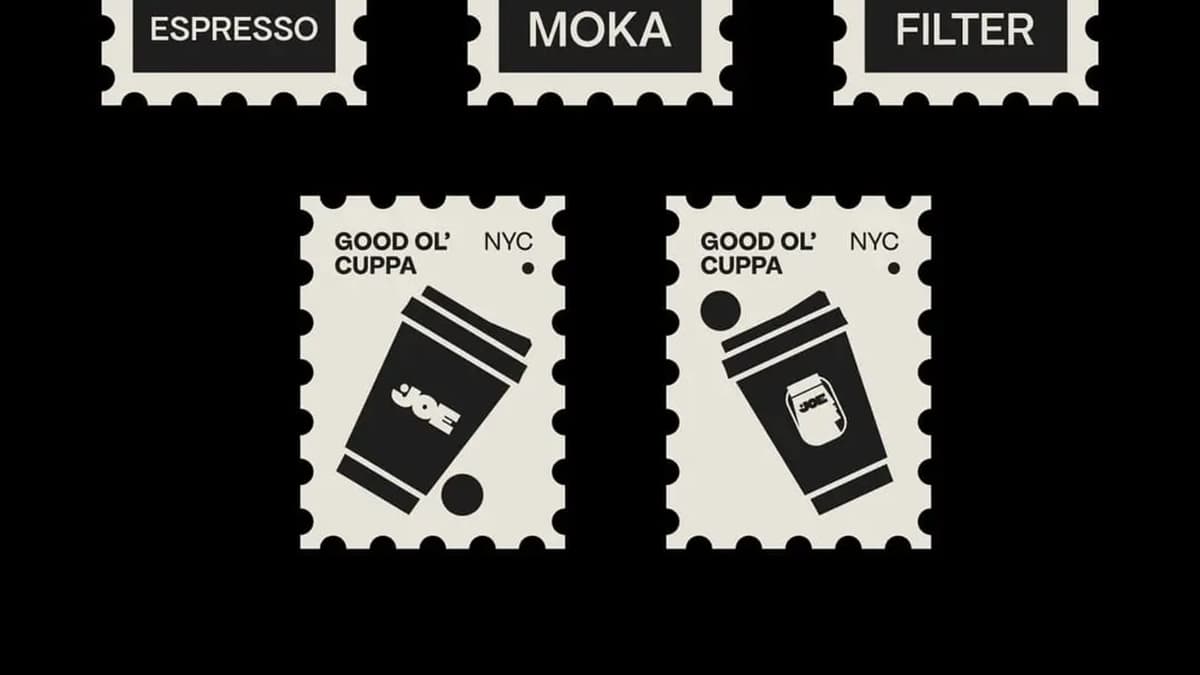
Half carry a warm accent. 36 of the 74 (49%) use yellow, orange, red or pink. Yellow is the standout: it appears in 18% of coffee brands against 13% overall. JOE Coffee NYC pairs a bright yellow (#f8c012) with a near-black (#0d0d0d) and a soft off-white (#e5e3d9). You can find brands with a similar yellow or filter coffee brands that use blue, the most common non-neutral color at 22%.
Green, a familiar café color, appears in only 9% of coffee brands, well below its 22% share across all brands.
6 principles of coffee branding, with real examples
1. Choose a position, not a mood
"Warm, cozy, artisan" describes almost any coffee shop. A position is a sentence a competitor could not say.
JOE Coffee NYC by patrykhanik says it outright: "No fancy shmancy coffee talk, sniffing bags or waxed mustaches. You grab it, drink it, toss the rest and go about your day." The brand is inspired by "the everyday Joe". PALMER coffee roasters by differentspecies takes a different route: a roaster that wants to stay "simple, organized" with "a strong look" and one bold statement, "Quality over quantity!" Pico by juliasabdesign is a Costa Rican roaster that "combines modern vibes with a hint of retro allure".
Test: if you removed the logo, could another café use the same words? Then it isn't a position yet.
2. Build for the counter, not only the bag
A coffee shop is a set of small surfaces used all day: cup, sleeve, menu, window, loyalty card. An identity has to hold up on all of them.
KROME by libra-studio, an honorable mention on Braaands™, is "an independent coffee shop with a concise menu, simple products, and an evolving identity". The system is "built around typography, raw materials, and contrast, designed to adapt across a range of applications". That last part is the point: it is a kit, not a logo.
Crumb & Brew by velloso went a different way and made the layout itself the brand: modern, minimal, "based on grid layouts", with a brand that "isn't afraid to expose its product". The palette is black and white.
Test: draw the identity on a cup, a menu and a door sticker. If it only works on one of them, it is a logo, not an identity.
3. Have a point of view on the moment
Coffee is rarely about coffee. It is about the morning, the break, the study session, the 9 pm cup.
Morning by miranchukova is a coffee shop whose illustrations "show the awakening of modern people through suffering and attachment to their phones". The drawings are "sloppily done, showing that everything is imperfect in the morning". The rough edge is the brand.
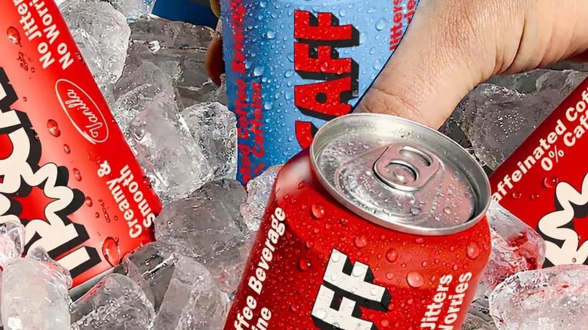
Two designers reworked decaf into a positive idea. Nocaff by yaphehdesign starts from the observation that "decaf is the only coffee defined by what's missing" and answers with "coffee you're allowed to have at 9pm". Nocaff by thetalesofj gives decaf "a clearer point of view: calm can still have presence", with a sloth character and the line "One can. Zero caffeine. Zero rush."
Test: what is the customer doing when they pick up the cup, and what does the brand say about it?
4. Use a character, and give it rules
Mascots make a coffee brand easy to remember and easy to put on merchandise. They also fail without discipline.
COMPANI by davka-design is "Coffee for humans. Snacks for pets." and uses Comic Sans, "intentionally". The typeface is announced as a joke, which fits the playful concept. Kokoro by wooo-designs is "minimalist yet playful", with "three children and a dog" drawn in a simple, modern style. Street Quack! by wooo-designs builds a café with "a skateshop vibe" around a "laid-back duck mascot". Meow Manor by twomoonsstudio pairs a cat-inspired logo with "a minimal color palette".
Test: can the character be drawn in three poses, one color and at cup size? If not, keep it simple.
5. Borrow a culture only with a reason
Japanese coffee culture is a recurring reference on Braaands™, and it shows how a borrowed look can be made specific.
Kōhī by wesley-jpg is "a calm, modern coffee space blending Japanese aesthetics with slow coffee culture and mindful design", inviting customers to "pause, breathe, and savor time". Kohi by maniu balances "Japanese simplicity with modern coffee culture": clean typography, minimal labels and "subtle Japanese characters" that "nod to its inspiration". In both, the reference serves an idea (slowness, order, craft) instead of decorating it.
Test: could you explain, in one sentence, why the reference belongs to this brand?
6. Tell one story: origin, place or attitude
Specialty coffee sells provenance and cafés sell a place, but either way the story has to be short.
LUWAKA by khushbu-parikh turns "one of the world's most unique coffee experiences" into a "playful, soulful, and modern identity" with character illustration, texture and storytelling: "From the jungle to your cup". Boil & Brew by super-ellipse goes the other way and brands a place: a café in the financial district designed as "a vibrant escape amidst the corporate rush". Llama cafe by sumit.branding is "a space that feels alive but never loud", with playful colors and minimal design.
Test: can the story fit in a single line on the bag, the cup or the menu?
One name, three answers: Crumb & Brew
The name Crumb & Brew appears four times on Braaands™. Three of them show how far one name can go:
- Crumb & Brew by velloso: black and white, a grid-based system for a brand that "isn't afraid to expose its product".
- Crumb & Brew by wesley-jpg: yellow, teal and brown. It "draws inspiration from old roasteries" and is "about craft over trend, leaning into industrial materials and heritage cues".
- Crumb and Brew by valdesignstudio: white, black and purple, "a modern coffee spot centered on warm drinks, soft cookies, and the joy of slowing down", with a "bold, flowing logomark" that "reflects community and rising steam".
Same name, same category, three different directions. It is a good reminder that the name doesn't make the brand. The decision about who it is for does.
Coffee shop branding: the touchpoint checklist
Of the 74 coffee projects on Braaands™, 78% include packaging, 73% include posters or print, 69% include merchandise and 43% include labels. Only 30% include business cards and just one includes a website. Designers show what customers hold and see, not what they click.
Use this list when you scope a coffee shop identity:
- Cup, lid and sleeve. Your most visible object, seen on the street. Check the logo at cup size before anything else.
- Menu and menu board. Prices, sizes and milk options need a clear hierarchy in the brand's typeface.
- Signage and window. The name has to be readable from across the street and in the dark.
- Bags and boxes. Pastry bags, takeaway boxes and bean bags for retail.
- Loyalty card and stamp. A small surface that people keep in their wallet.
- Merchandise. Tote, mug, apron. The character or logo has to work as a one-color print.
- Uniforms. Staff wear the brand all day.
- Social templates. Even a simple set keeps posts consistent without a designer on call.
6 coffee branding mistakes
- The bean and the steam. Generic coffee symbols make a brand interchangeable. Start from your position, not the product category.
- Brown by default. It is not wrong, but only 8 of 74 designers chose it. Ask what color your brand would be if it were not coffee.
- Designing the bag and forgetting the cup. A logo that reads on a large bag can disappear at cup size. Test small.
- Trend over craft. Type and textures that look current today date fast. The Crumb & Brew version by wesley-jpg above bets on "craft over trend".
- A mascot without a system. One nice drawing is not a character. Define poses, colors and where it may appear.
- A brand that ends at the logo. Menus, signage and staff clothing are where customers spend their time. Design them as part of the identity.
How to brief a coffee branding project
Answer these questions before you contact a designer or start a practice project:
- Is this a shop, a roaster or both? Shops sell an experience, roasters sell a product on a shelf.
- Who is the customer, and what are they doing when they buy?
- What is the one sentence no competitor could say?
- Which touchpoints are needed on day one, and which can wait?
- What must never change: the name, a color, the location?
- Which three brands do you admire, and what exactly do you like about each?
Coffee branding FAQ
What colors are best for a coffee brand?
There is no single best color, but the data helps you choose. On Braaands™, black, white and beige lead, brown is rare and yellow is used more often than average. If every competitor in your street is brown and cream, a blue or yellow accent is an easy way to be noticed.
What is the difference between coffee shop branding and coffee brand branding?
A coffee shop sells a place and a routine, so signage, cups, menus and staff matter most. A coffee brand or roaster sells a product, so the bag or can and the shelf presence matter most. Many projects, like KROME, cover both.
What should a coffee shop branding package include?
At minimum: logo and name, colors and typography, cup and sleeve, menu and signage templates, and a social media starter set. Add packaging and merchandise once the identity is settled. The checklist above covers the rest.
Should a coffee brand have a mascot?
Only if it can carry the brand alone, in one color and at small size. Compani, Kokoro and Street Quack! all build their whole concept around a character or a theme. When in doubt, a strong wordmark is safer.
Can I use the same ideas for matcha or tea?
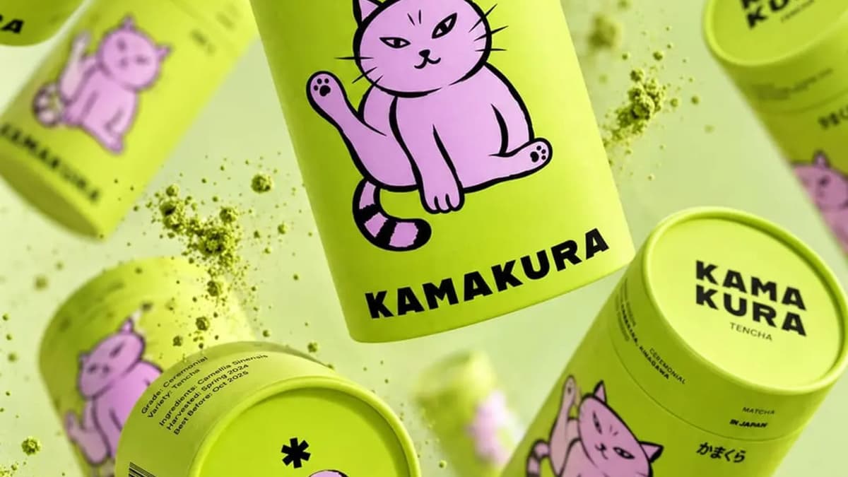
Many of them carry over: positioning, touchpoints and origin stories. Matcha has its own patterns, which we cover in our guide to matcha branding.
See more coffee branding
Browse all coffee brands or the coffee shop identities on Braaands™, or look at the tea brands for a neighboring category. Designed a coffee brand yourself? Submit it to Braaands™. Approved work is voted on by our community and jury, and it appears on your public designer profile.
See it in real brands
Browse hundreds of brand identities from independent designers, voted on by our community and jury.
Explore brand identities