September 26, 2026 · 9 min read
Matcha Branding: 5 Approaches, With 17 Real Examples
What 19 matcha brands have in common, five ways to brand matcha with 17 real examples, what matcha packaging has to do and the mistakes to avoid.
By Roman from Braaands™
Matcha went from a specialty-shop tin to a menu staple in a few years, and the branding had to keep up. The result is a category with one very visible problem: a lot of matcha brands look alike. Green, white, a leaf, a bowl, some Japanese-looking type.
To see what actually separates the memorable ones from the rest, we went through every matcha identity on Braaands™ (19 approved projects from independent designers, as of September 2026). Below you'll find what they have in common, five different ways to brand matcha with real examples, what matcha packaging has to do, and the mistakes worth avoiding.
What 19 matcha brands have in common
Designers tag every project on Braaands™ with the general colors it uses. For matcha, the pattern is clear:
| Color | Matcha brands (19) | All brands on Braaands™ (918) |
|---|---|---|
| Green | 63% | 22% |
| White | 63% | 38% |
| Black | 21% | 32% |
| Beige | 16% | 27% |
Twelve of the 19 use green, and twelve use white. Green is almost three times as common in matcha as in the average brand, which is no surprise. The more useful number is the other side of it: seven of the 19 do not use green at all. Those seven are built on beige, white, red, black, purple or pink instead, and we'll look at some of them below. You can explore the whole set yourself in the matcha brand directory, or filter it by color, for example matcha brands that use green or matcha brands that use pink.
5 ways to brand matcha
Every matcha brand answers the same question: what is this product for? The answer decides the look. Here are the five answers we see most often.
1. Heritage and origin
The brand sells where the tea comes from and who grew it. This is the most credible route for a single-origin or ceremonial-grade product.
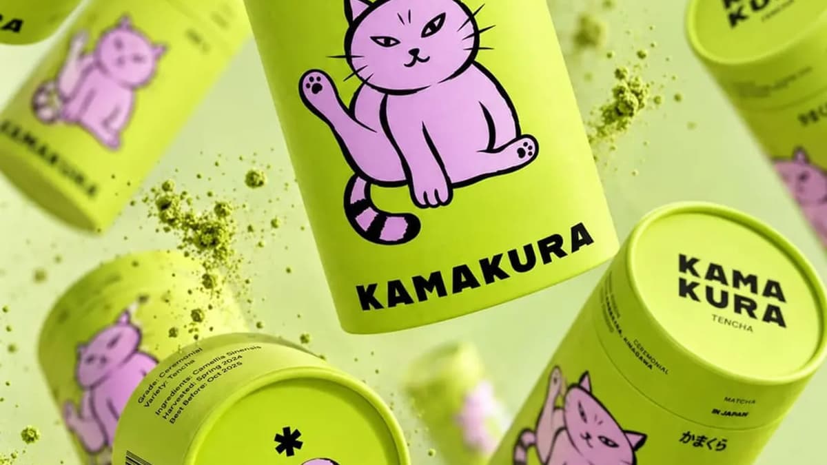
Kamakura by madstudiony is "a single origin Japanese matcha house founded by H. Nakamura", with the line "From her grandmother's tea room to yours." The palette is deliberately quiet: a warm gray (#aca5a5), an olive green (#5c5f3f) and a near-black (#171815). Nothing here is the bright green people expect from a matcha latte, which suits a single-origin story.
Mika Matcha by khushbu-parikh is a packaging concept for "authentic Japanese matcha, sourced straight from the farms of Japan", described as a "fresh, traditional, and playful take on matcha powder packaging". It is filed under beige only, no green. Midori by brands-by-disha takes its name from the Japanese word for "green" and positions itself as "a curated bridge between traditional Japanese heritage and modern culinary craft".
What to take from it: if the product has a real origin story, put it first and let the color palette stay restrained.
2. The pause
The brand sells a moment, not a powder. Matcha as the anti-coffee: slower, calmer, on your terms.
YOKO by breadfordesign is built on one line, "A matcha needed break", and calls itself "a pause button in the middle of a fast paced world". It mixes torii-gate symbolism, sakura pinks and matcha greens, and carries the idea from the menu to the merchandise. Its tagged palette is white and red, not green.
Dailycha by amrithsdesign came from a public practice brief that asked to "move beyond the traditional 'tea house' aesthetic". The concept is "Balanced Energy": raw, organic textures against a bold, high-contrast visual language, and a serif that carries the heritage of tea. The project includes a custom takeaway cup.
What to take from it: a single sentence the whole brand can repeat ("A matcha needed break") is worth more than a perfect logo.
3. Playful and pop
Matcha for people who drink it iced, with oat milk, at 3 pm. The brand is friendly, colorful and easy to share.
Hana Matcha Bar by brands-by-chavi is "premium and playful" and sells "the finest Japanese matcha in fun, modern ways". KIYO MATCHA by ezgi is a "premium Japanese ceremonial-grade matcha brand with a bold and modern identity", and its packaging pairs pink with green, "combining traditional Japanese aesthetics with a contemporary twist". Orocha Matcha by khushbu-parikh blends "minimalism with the vibrant energy of matcha" in a "character-filled" identity.
What to take from it: playful only works if the product still looks premium. Kiyo is still positioned as ceremonial-grade, and the pink is what makes it feel playful.
4. Art and attitude
The brand refuses to look like a wellness product.
Juno Matcha by aleena-sultana starts from the line "The world doesn't need another matcha brand, it needs one that feels like art." Its tagged colors are black, purple and pink, with no green at all. It is one of the seven brands in the set that drop the category color entirely.
What to take from it: if every competitor is green, the palette itself can be the positioning.
5. Wellness with personality
The brand talks like a person, not a health label.
Whisk by mkkab-psd-mukkab is "wellness with personality. Calm but not boring. Energising but not intense." Yiru by ultramarinedesignstudio is an e-commerce premium matcha brand "built around authenticity, quality, and emotional connection". Both are filed under white.
What to take from it: say who the brand is in the first sentence. Whisk does it in four short phrases.
Same brief, four answers: YOKŌ and Daily Cha
Designers often pick up the same practice brief, so the same brand name shows up more than once. Two matcha names appear four times each on Braaands™, and comparing them shows how much room there is inside one idea.
YOKŌ, a matcha café about slowing down in a fast city:
- YOKO by breadfordesign: white and red.
- Yokõ Matcha Cafe by studiorevv: green, black and white, a Tokyo café "for people who want a moment of calm, without losing the energy".
- YOKŌ Matcha Cafe by thetalesofj: white and green, set in Tokyo's Harajuku district.
- Yokō Matcha Café by giulialeccadesign: black and white, "a Japanese matcha bar that invites slowness and quiet reflection".
Daily Cha, a modern matcha café:
- Daily Cha by ezgi: white and green, authentic Japanese green tea made with ceremonial-grade matcha.
- Daily Cha by diisshaakdesigns: beige and green, "calm energy and daily ritual".
- Daily Cha by designs: green and white with "a touch of purple".
- Dailycha by amrithsdesign: green and white with the "Balanced Energy" idea from above.
Two things stand out. First, all four YOKŌ designers landed on the same idea, the pause, but none of them with the same tagged palette. The concept was shared; the execution was not. Second, that is also the risk: when several designers reach the same idea, so will your competitors. A concept like "slow down" is only a starting point.
Matcha packaging: what the tin, pouch or cup has to do
Of the 19 matcha projects, 18 include packaging design, 16 include posters or print, 15 include merchandise and 11 include labels. Matcha is a packaged product first, so most of the work happens on a small surface. A few rules that hold up:
- Say the grade. Ceremonial, premium daily or culinary grade decides what the customer does with it and what they pay. It belongs on the front, not on the back.
- Show the origin. Where the tea was grown is a trust signal, and Kamakura and Mika Matcha both lead with it.
- Explain the ritual. New customers don't know whether to whisk or blend. A one-line "how to make it" on the pack turns it into a guide.
- Design the cup too. Many matcha brands are cafés, so the takeaway cup, the sleeve and the stamp card carry as much of the brand as the tin does. Dailycha, for example, includes a custom takeaway cup.
- Check the fine print early. Net weight, ingredients, origin and allergen information are required, and the rules depend on the country you sell in. Leave space for them in the layout instead of squeezing them in at the end.
For more, browse matcha packaging projects.
5 matcha branding mistakes
- Green as the only idea. If the concept ends at "matcha is green", the brand looks like the other twelve green ones.
- Japanese symbols with no story. Cherry blossoms, torii gates and kanji are easy to add and easy to get wrong. YOKO ties its symbols to one clear idea, "A matcha needed break". Without an idea behind them, they read as decoration.
- Pale green on white in small sizes. Matcha green is light. On a cup, a stamp or a small label, low contrast makes the name unreadable. Test the logo at cup size before you approve it.
- Forgetting how it is drunk. Iced lattes, whisked bowls and smoothies are different moments. A brand that only shows a traditional bowl misses the iced-latte drinkers.
- Premium without proof. A luxury look with no origin, no grade and no story feels empty. The heritage brands above work because the claim is specific.
How to brief a matcha branding project
If you are hiring a designer or writing a practice brief for yourself, answer these six questions first:
- What is the product: ceremonial powder, culinary powder, ready-to-drink or a café?
- Who buys it and when do they drink it?
- Which of the five answers above is closest to your brand, and which do you refuse to be?
- What is the one sentence the brand should be able to repeat?
- Which formats are needed: tin, pouch, sachet, cup, menu, merchandise?
- What legal text has to fit on the pack, and in which language?
Matcha branding FAQ
What colors work for matcha branding?
Green and white dominate: on Braaands™, twelve of 19 matcha brands use each. But seven brands avoid green completely and work with beige, red, pink, black or purple. Green signals the category; another color signals your position within it.
Do I need Japanese design elements?
No. Several of the projects above lead with something else entirely: Juno Matcha with attitude, Whisk with tone of voice, Dailycha with "Balanced Energy". If you do use them, connect them to the brand's story, as Kamakura does with its origin and YOKO does with its idea.
How is matcha branding different from tea branding?
Matcha is closer to a lifestyle drink than loose-leaf tea: it is sold as powder and drunk in a café format. That leans the branding toward cups, color and tone of voice. For a wider look at the category, see the tea brands.
What makes matcha packaging feel premium?
Restraint and specifics: a clear grade, a named origin, a quiet palette and one confident piece of type. Kamakura's olive and near-black palette is a good example.
See more matcha branding
Browse all matcha brands on Braaands™, from ceremonial-grade tins to café identities. Designed a matcha brand yourself? Submit it to Braaands™. Approved work is voted on by our community and jury, and it appears on your public designer profile.
See it in real brands
Browse hundreds of brand identities from independent designers, voted on by our community and jury.
Explore brand identities