October 9, 2026 · 9 min read
Coffee Packaging Design: 6 Principles and 20 Real Examples
What a coffee pack has to say, six packaging principles with 20 real examples, ten answers to the name Dorado, five to Nocaff, and the mistakes to avoid.
By Roman from Braaands™
On a shelf, a coffee bag has a few seconds to say what it is, where it comes from and why it is worth the price. Coffee packaging design is the part of coffee branding where the identity meets a customer who has never heard of you.
We looked at the packaging work on Braaands™: 74 approved coffee and coffee shop projects, of which 58 (78%) include packaging design and 32 (43%) include label design (as of September 2026). One name, Dorado, appears ten times, and another, Nocaff, appears five times, which makes them a good side-by-side study of how far one brief can stretch. Below you'll find what a coffee pack must say, six packaging principles with real examples, those two comparisons, common mistakes and a brief you can reuse.
What a coffee pack has to say, in order
A bag, can or box is read in a fixed order, whether the designer plans it or not. Plan it.
- The brand name. Readable from a meter away and in poor light.
- What it is. Whole bean or ground, roast level, single origin or blend, decaf or not.
- The story in one line. Origin, farm, region or attitude. Not a paragraph.
- Flavor notes. BRAVURA - The Brew Club by himaja-dzynzs is described as "a medium roast with bright citrus, honey, and floral notes": the kind of detail that belongs on the pack.
- The required text. Net weight, ingredients and origin information are required in most markets, and the rules vary by country and by format. Reserve space for them in the layout from the first sketch.
- How to brew it. Usually on the back or the side.
If everything is the same size, nothing is first. Decide the hierarchy before you decide the illustration.
6 coffee packaging principles, with real examples
1. Design the range, not the single bag
A single hero pack is easy. The hard part is several versions that a customer can tell apart in a second and still recognize as one brand.
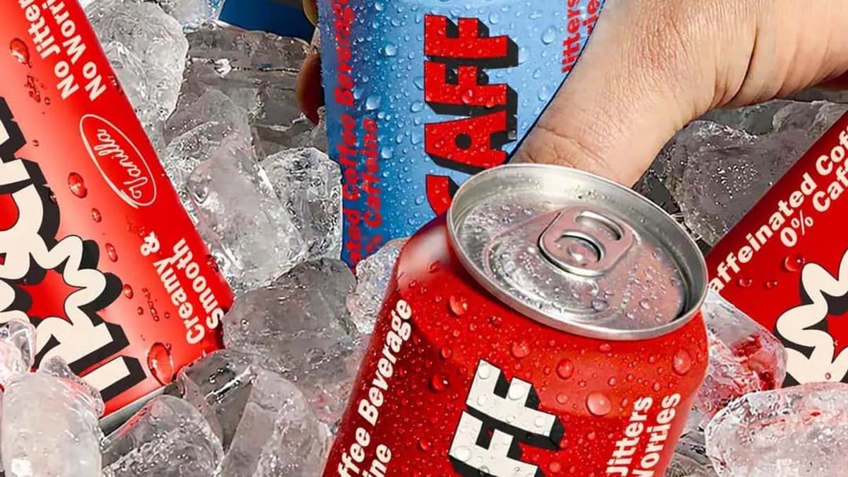
NOCAFF by wooo-designs, which received an honorable mention on Braaands™, gives "each product in the range" its "own distinct colour palette and illustration", and explores "slower routines, softer energy and calm everyday moments through bold typography, muted tones and minimal illustrations". nocaff by yaphehdesign has "three flavours and a complete system", with a label that "wraps with no start and no end: turn the can far enough and you're back where you began."
Test: line up all versions in a row, squint and see if you can still tell which is which.
2. Choose the format on purpose
The bag is the default, and every other format is a decision.
Cans and bottles read as drinks, not as ingredients. Kohi by maniu uses square bottles and a bold wordmark that "give Kohi a distinctive shelf presence", with "clean typography, minimal labels, and structured packaging". NOCAFF by syeda-maham builds "a flexible visual system built to move across packaging, cans" and the rest of the brand.
For bags, the format has physical constraints. Many coffee bags have a valve, a fold, a tin-tie or a seal, and the flat artwork has to work around them. Check the artwork on a mockup, not only on the flat file.
Test: where do the folds, seams and valve fall, and what is under them?
3. Borrow from outside coffee
Category conventions (brown paper, hand-drawn beans) make every pack look like the one next to it.
NOCAFF by syeda-maham "reimagines decaf coffee through a nostalgic, expressive lens, drawing from retro beverage graphics, convenience-store packaging, and vintage editorial typography", to make caffeine-free coffee "feel familiar, energetic, and culturally relevant". nocaff by thetalesofj puts an "expressive wordmark and sloth character" on the shelf while keeping the product "easy to recognise and understand".
Test: name one category outside coffee that your pack could borrow from.
4. Let the name do some of the work
When the name has a meaning, use it.
Dorado means "golden". Dorado Coffee by alliron-studio puts a stork in the logotype, "a nod to Colombia's diverse fauna", and adds "elegant gold finishes" that "embody the brand's name". DORADO by capy-studios takes "inspiration from the legend of El Dorado" and works in "deep blue and gold", with "coffee bags, mugs, and shipping boxes" in "a cohesive aesthetic".
Test: if your name means something, does your pack show it?
5. Say the origin with a real detail
"Premium" is a claim. A specific place is proof.
DORADO - Whole Coffee Beans by wylliamlach draws on "the textures of export sacks, the warmth of the morning sun, and the depth of Andean peaks". DORADO by creativeedge is "born in the hills of Salento". Pico by juliasabdesign is a "modern Costa Rican coffee roaster". Even a single named region beats a generic promise.
Test: could a competitor put the same sentence on their bag?
6. Keep type confident and simple
Small packs punish complicated type. PALMER coffee roasters by differentspecies is built on "a strong look with a bold statement: Quality over quantity!", and Dorado by maniu uses "clean layout and confident type" that "reflect the quality and strength of the coffee itself". differentspecies' Brewsmith has "a clean modern vibe with hints of retro features".
Test: shrink the front of the pack to the size of a thumbnail. Is the name still readable?
One name, ten answers: Dorado
Ten designers on Braaands™ have branded a Colombian coffee called Dorado, and it shows how many ways one product can look.
- Dorado by unnfold-design: orange and brown.
- Dorado by f-correia: teal and orange, built on "the warmth of its people, the richness of its land, and the golden heritage behind every bean".
- Dorado by studio-bainne: pink, beige and black.
- DORADO by capy-studios: blue and yellow, from the El Dorado legend.
- Dorado by maniu: yellow and black.
- Dorado by gingers-design: beige and black, for "Dorado Beans, straight from the sun-kissed hills".
- DORADO by creativeedge: white, blue and red.
- DORADO by waanrong: white, with the line "RICH BY NATURE. BOLD BY ORIGIN."
- Dorado - Whole Coffee Beans by wylliamlach: beige, yellow and black.
- Dorado Coffee by alliron-studio: beige and orange, with gold finishes.
Six of the ten use yellow or orange, the obvious reading of "golden". Four went another way: pink, beige and black; beige and black; white, blue and red; and plain white. Every one of them is built on the same facts, the same name, the same country and the same product, and the ten tagged palettes are all different. The lesson: the facts don't create a brand, the point of view does.
One name, five answers: Nocaff
Decaf is a tricky brief: the category is defined by what it lacks. Five designers answered it with five different palettes:
- nocaff by thetalesofj: blue, white and brown, with a sloth.
- nocaff by yaphehdesign: yellow, orange and purple, with a cat, "because no animal rests with less guilt".
- NOCAFF by wooo-designs: black and teal, one palette per product.
- NOCAFF | A Zero-Caffeine Coffee Brand by syeda-maham: red and blue, retro convenience-store energy.
- NoCaff Brand Identity Design by bloomlinestudio: black, with a "sad little fellow" and "a tragedy in one logo".
yaphehdesign points out that the decaf category "talks about itself in the negative" and that "the packaging follows with soft browns, gentle type, everything apologising". Four of the five palettes above contain no brown at all.
6 coffee packaging mistakes
- A crowded front. Name, origin, flavor, roast, badge, seal and slogan at the same volume. Choose one hero and let the rest step back.
- No system for the range. If two flavors need a close look to tell apart, the customer will not look twice.
- Legal text as an afterthought. Squeezing weight and ingredients in at the end changes the layout. Reserve the space early and check the requirements for each market you sell in.
- Ignoring the shelf next to you. Photograph the competing packs and place your design in the picture before you approve it.
- Designing the flat file only. Valves, folds and seams sit where your logo might be. Check a mockup or a printed sample.
- Starting with the illustration. Decide the hierarchy and the range logic first, then draw.
How to brief a coffee packaging project
- What format: bag, can, bottle, box, capsule or a mix, and in what sizes?
- How many versions in the range, and how will customers tell them apart?
- What is the first thing that should be read from a meter away?
- What is the origin or story, in one line?
- Who else is on the shelf, online or offline, and how should this one differ?
- What text has to go on the pack in which language, and what is the print method and minimum order?
Coffee packaging FAQ
What should be on a coffee bag?
The brand name, what the coffee is (bean or ground, roast, origin or blend), one line of story, flavor notes and the legally required text such as net weight. Brewing tips can go on the back. Requirements differ by country, so check them for your market.
How do you show roast level on packaging?
Give it a fixed place and a consistent device, such as a scale, a color step or an icon, on every version in the range. Customers should find it without reading.
Bag or can for coffee?
Bags are the default for beans and ground coffee. Several projects here use cans (the Nocaff versions) or square bottles (Kohi) instead. Pick the format for how the coffee is used, and choose it before the artwork, because the format changes the shelf.
What makes coffee packaging look premium?
Restraint and specifics: one strong element, a confident wordmark, a named origin and careful finishes. The Dorado versions with gold finishes and a named region show how far that goes.
Where can I see more coffee and matcha packaging?
Browse coffee packaging projects, coffee label designs and matcha packaging. We also wrote a guide to matcha branding.
See more coffee packaging
All the projects above, and many more, are in the coffee brand directory. Designed a coffee pack yourself? Submit it to Braaands™. Approved work is voted on by our community and jury, and it appears on your public designer profile.
See it in real brands
Browse hundreds of brand identities from independent designers, voted on by our community and jury.
Explore brand identities