November 16, 2026 · 8 min read
Fitness and Gym Branding: 5 Approaches With 20 Real Examples
Five approaches to fitness, gym and sports club branding, from community to calm and club culture, with 20 real examples and logo ideas.
By Roman from Braaands™
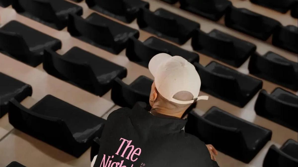
Fitness branding has long leaned on the same look: a bold sans-serif, a lightning bolt, a dark photo of someone mid-rep. Many brands on Braaands™ go another way. Running clubs, Pilates studios, paddle courts and pickleball brands often build on belonging rather than intensity, and the identity has to say who is welcome before anyone signs up.
We went through the sport, fitness and wellness identities on Braaands™ (37 sport and fitness brands and 17 wellness brands, as of October 2026) to see how the good ones do it. Below you'll find five approaches to fitness branding with real examples, what a gym or studio logo has to do, a touchpoint list, the most common mistakes, six questions for your brief and a short FAQ.
5 approaches to fitness branding
1. Community over performance
For many clubs the product is the group, not the workout.
Nocturn by madstudiony is a late-night running collective: "No races, no medals. Every run starts after 10pm. Miles after Midnight." It won an honorable mention. Step-by-Step Running Club by nadia-ariefdien is built on the idea that "progress happens gradually through pace, rhythm, and consistency", with a pixelated running figure made of block-like shapes that resemble steps. It was Brand of the Day. FLOW & GO by skojie is a running club for women and gender-expansive people, "less about performance, more about connection", with simple, abstract characters, "each one different, all equally part of the story". Hoop Union by breadfordesign is "an urban collective built around respect, culture, and the game they grew up on", with a visual language pulled from the streets.
Test: could a stranger tell, from the identity alone, whether they would be welcome?
2. Calm and balance
Studio brands for Pilates, yoga and mindful movement sell the opposite of the gym floor.
BALNCE by madstudiony is a Pilates and movement practice in London built on the idea that "balance is not stillness, it's a thousand small adjustments", with a crane that "represents poise that looks effortless". It was Brand of the Day. Equilibria Pilates Studio by vasundhara is built around "true strength comes from balance", with an icon of the circle of life divided by a flowing line into two equal parts. It was Brand of the Day. Nalu by shumenaz is a modern yoga and Pilates brand that uses "a signature orb gradient to represent core strength, flow, and balance" across apparel, packaging and digital. ASANA YOGA STUDIO by designsbyaleena is all about "mindfulness, balance, and feeling good in your body and mind". Inner Matter by ellith-design is a premium spa focused on deep rest and inner balance, inspired by Japanese onsen culture. INNER MATTER by brands-by-disha is "a sanctuary designed to bridge the gap between physical recovery and emotional stillness".
Test: does the brand look like the first breath of a class, not the last rep?
3. Club culture
Racket and court sports have turned into lifestyle brands with their own aesthetic.
The Grid by arshmah-designs is "where vintage tennis culture meets modern, high-fashion sports branding", described as "bold, editorial, and effortlessly cool". BLNK by thetalesofj is an urban paddle club "born from Berlin's raw energy", where "concrete, sound, and light shape the experience". Rally Club by sasha-talover is a pickleball brand selling paddles, apparel and accessories, built to capture "the energy of community, playfulness, and modern lifestyle".
Test: would people wear the logo outside the club?
4. Honest products and platforms
In sports nutrition and gear, the opposite of loud can be a position.
Kinetic by artamrit is a sports-nutrition brand that rejected an industry crowded with "exaggerated claims, aggressive aesthetics, and scientific complexity" in favor of "something more enduring. Honest products backed by purpose." It won an honorable mention. Wilde by benistudio brands a backpack line that sells "functional and sustainable bags made for the adventurers". Bettors by pata-png is a sports analytics platform that needed "a memorable and minimalist visual identity" for detailed statistics on sports competitions.
Test: what does your category exaggerate, and what could you say plainly instead?
5. The outdoors
Outdoor and adventure brands sell a way of being outside.
WILD TRAIL by notblankdesigns is shaped by "the quiet charm of slow hiking and soft adventure", leaning into analogue nostalgia: grainy textures, flash-burnt photography and handwritten journal entries, with a matchbox and a trail journal as collateral. Roam & Return by glowhubcreative is a purpose-driven outdoor gear and apparel brand for eco-conscious explorers, honoring U.S. national parks.
Test: does the brand feel like it was found on the trail, not designed for a store?
Same name, three answers: The Grid
Three tennis clubs on Braaands™ share the name The Grid:
- The Grid by arshmah-designs pairs vintage tennis culture with high-fashion sports branding.
- The Grid tennis court by notblankdesigns is "a modern tennis club for players who love the game and the energy that comes with it".
- THE GRID Tennis Club by creativeedge is rooted in the legacy of classic tennis and reimagined "for the modern player", with a refined aesthetic and a tech-driven experience.
Same name, same sport, three levels of seriousness: fashion, energy and tradition. A sports club's brand starts with how it wants players to feel, not with the sport.
Gym and studio logo ideas
A fitness logo lives on apparel, bags, floors, walls, a membership card and an app icon. Check it in these places:
- On clothing, in one color, at chest size and on a sleeve.
- On a wall or floor, large and from a distance.
- On a membership card or app icon, very small.
- On a social profile picture, square and low-res.
Five logo ideas from the brands above:
- A figure made of shapes. Step-by-Step's pixelated runner reinforces the name and the idea.
- A single symbol with a meaning. BALNCE's crane and Equilibria's divided circle stand for poise and balance.
- A gradient as a signature. Nalu's orb gradient carries across apparel, packaging and digital.
- A name that is the rule. Nocturn's name already says "after dark".
- Collateral that fits the story. WILD TRAIL's matchbox and trail journal belong in a backpack.
Touchpoints for a fitness brand
- Apparel and merchandise. The logo is worn, so test it on fabric.
- Class schedules and membership. Cards, passes and welcome materials.
- Signage and space. Walls, floors and the entrance.
- The app or booking page. Nalu extends its system "across apparel, packaging, and digital".
- Social media. Templates for events, runs and classes.
- Equipment and packaging. Rally Club sells paddles, apparel and accessories.
- Community material. Stickers, flyers and posters for meet-ups.
6 fitness branding mistakes
- Lightning bolts and flames. They signal "fitness" and nothing else. Start from the idea of your club.
- Looking like a gym when you're a community. If the brand says intensity and the club says belonging, people feel the mismatch.
- A logo that only works on a dark background. Check it on white, on fabric and in one color.
- Forgetting apparel. For many clubs, the T-shirt is the best advertisement.
- Using stock fitness imagery. If the photos could belong to any gym, the brand isn't specific yet.
- Promising results. Health and performance claims can be regulated in your market, so keep the brand about who it's for and how it feels.
How to brief a fitness branding project
- Who is this for, and who is it explicitly not for?
- What does a member do in the first ten minutes?
- What is the club's one rule, ritual or promise?
- Which surfaces matter most: apparel, signage, an app, social?
- What do other studios or clubs nearby look like?
- What can't change: the name, the location, an existing logo?
Fitness and gym branding FAQ
What makes a good fitness logo?
It's readable on fabric, in one color and at small sizes, and it carries one idea: a symbol with meaning, a rule, a shape built from the name. The best ones don't look like fitness logos.
How is gym branding different from studio branding?
A gym sells access and equipment, so the identity needs to stay clear at scale across a big space. A studio sells a practice and an atmosphere, so the identity can be quieter and more specific.
Do running clubs and sports clubs need a full brand?
They need enough to feel like one group: a name, a mark that works on apparel, a few templates for events and a tone of voice. Nocturn and Step-by-Step show how a single rule or shape can carry a lot.
Where can I see more sport and fitness brand identities?
Browse sport and fitness brands, wellness and supplements on Braaands™.
Related reading
- Branding Inspiration: 46 Real Brand Identities by Industry
- Fashion Branding and Logo Design, for apparel and activewear
See more fitness branding
Designed a sport or wellness brand yourself? Submit it to Braaands™. Approved work is voted on by our community and jury and appears on your public designer profile.
See it in real brands
Browse hundreds of brand identities from independent designers, voted on by our community and jury.
Explore brand identities