October 26, 2026 · 8 min read
Hotel Branding: 6 Approaches With 22 Real Examples
Six approaches to hotel branding, from a sense of place to a decade, a keepsake or a mission, with 22 real examples and a guest-journey checklist.
By Roman from Braaands™
A hotel brand is judged in the order a guest meets it: a name in a search result, a photo online, a sign at the door, a key card, a menu, a pillow note, a bill. The identity has to feel the same at every step, and it has to promise a feeling before the guest has slept a single night.
We went through the hotel, stay and travel identities on Braaands™ (24 hotel and stay brands and 7 travel and experience brands, as of October 2026) to see how the good ones do it. Below you'll find six approaches to hotel branding with real examples, what a hotel logo has to do, a touchpoint list along the guest journey, the most common mistakes, six questions for your brief and a short FAQ.
6 approaches to hotel branding
1. A sense of place
The strongest hotel brands sound like the place they are in.
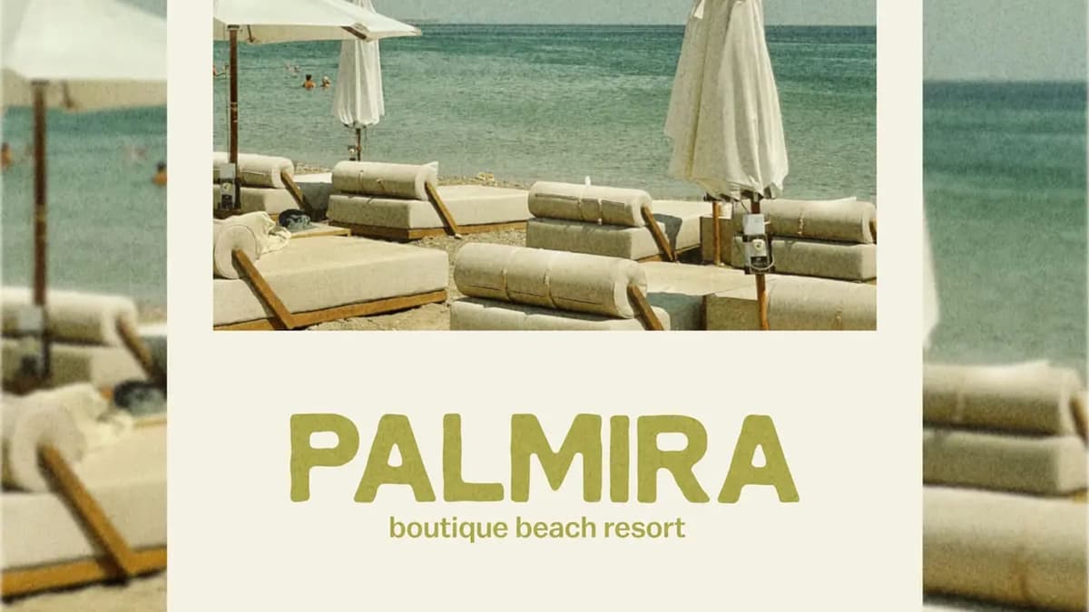
Paloma Holiday Residence by zso.designs is a Mediterranean hospitality brand "inspired by olive groves, sun-ripened lemons, and the azure coastline". A dove and a key stand for peace, freedom and "the feeling of arriving somewhere you instantly want to stay". It won an honorable mention. Azuroscape by mariyam is a boutique hotel inspired by Fort Kochi's coastal charm and Portuguese heritage, with azulejo-inspired patterns, a custom script logo and hand-drawn details. Palmira by ezgi is a boutique beach resort "made for slow days and salty air". Isla Mare by brandsbycolorful is a beach resort inspired by "calm tides, sun-drenched days, and barefoot luxury". AURUM by giulialeccadesign is a luxury hotel in Provence where a hand-drawn horse becomes the symbol, "a tribute to the region's equestrian heritage". NORDIQ by notblankdesigns blends "Scandinavian simplicity with cozy warmth", pairing a bold wordmark with a cabin stamp.
Test: could this identity be used for a hotel in another country? Then it isn't about the place yet.
2. A decade
A time period gives guests a mood immediately.
The pink roadside motel is a favorite. No Vacancy by studiolaficha imagines the 1970s: "Summer is in full swing" and No Vacancy is "the perfect pink motel to stop at on the road". No Vacancy by studio-bainne is "a modern and chic roadside motel for design-conscious travelers", mixing mid-century charm with a touch of luxury. No Vacancy by glowhubcreative is a fictional motel and café in Albuquerque shaped by desert landscapes, soft pastels, retro typography and classic American motel culture. RESERVED by libra-studio is a conceptual motel inspired by retro Californian motels and fashion editorial aesthetics.
Test: which details make the decade real: a typeface, an object, a sign?
3. The stay as a keepsake
A hotel is something guests take home in their pockets.
PALOMA by libra-studio is a summer residence "conceived as a memento of a holiday on the French Riviera", built around cyanotypes, textured paper, hotel ephemera and seaside archives. The project includes "a postcard, menu, keycard, beach pass, welcome letter, and keepsake folder". No Vacancy by glowhubcreative extends its retro motel idea into "key tags, postcards, apparel, signage, and room details".
Test: what would a guest keep, and is it good enough to keep?
4. A service concept
Some hospitality brands aren't hotels, but borrow the idea.
Le Concierge by blue-theory-design-studio is a lifestyle service brand imagined as a timeless hotel, with "handwritten notes, vintage room keys, and quiet luxury". Roamin' by unnfold-design offers flexible living and workspace solutions for modern professionals and digital nomads, with "tech-infused accommodations in diverse locations". Maison Laurent by ultramarinedesignstudio is a boutique countryside retreat in Provence, "crafted to evoke timeless elegance, warmth, and intention" with values of slow living and refined simplicity.
Test: what service does a guest get that they wouldn't expect from a normal hotel?
5. A mission
Some stays exist for a reason beyond the room.
Echo Canyon Ranch by bysarastudio is an eco-friendly retreat focused on regenerative farming, wildlife conservation and animal rehabilitation. Echo Canyon Ranch by designbyrebeca gives the same ranch a "charming, nostalgic, warm, rustic, and emotional" proposal. Vermont Valley Express by vasundhara is a heritage-style scenic train that celebrates "slow travel, shared memories, and the romance of the rails".
Test: can a guest understand what the place stands for before they arrive?
6. Travel and experiences
The same thinking applies to agencies and journeys.
AirAlbania by devaapx is a travel agency with a logo that is "a minimalistic, geometric version of the Albanian eagle", representing freedom, strength and the spirit of adventure. ÉCHAPPÉE BELLE by libra-studio is a travel agency conceived as "a series of immersive stopovers", where each destination becomes a chapter. Cloud Nine Escape by anni-studio-graphique is "a travel agency devoted to the art of exception", shaped by escape and understated luxury.
Test: does the brand make a journey feel like a story?
Same name, many answers: Paloma and No Vacancy
Two hotel names appear several times on Braaands™, and comparing them shows how much room there is inside one idea.
Paloma, a Mediterranean holiday residence:
- Paloma Holiday Residence by zso.designs uses a dove and a key as its symbol.
- PALOMA by sehrish-design is "a calm retreat between sea, sun, and slow living".
- PALOMA by opimestudio translates "the gentle movement of the waves into the logo".
- PALOMA by libra-studio builds a keepsake world from cyanotypes and hotel ephemera.
No Vacancy, a roadside motel: the three versions above go from 1970s pink to mid-century chic to desert Americana.
Four designers, one name, four ideas: a dove and a key, a calm retreat, a wave and a memento. The name doesn't make the brand. The symbol and the story do.
What a hotel logo has to do
A hotel logo lives on a sign, a key card, stationery, a bathrobe, an amenity bottle and a booking page. Check it in these places before approving it:
- The sign and facade, from a distance and at night.
- A key card or key tag, where it is tiny.
- Stationery and menus, in one color.
- A booking page, next to the property photos.
- A social profile picture, where it becomes a thumbnail.
Four logo ideas from the brands above:
- Two objects that say the promise. Paloma's dove and key.
- A wordmark plus a stamp. NORDIQ pairs a bold wordmark with a cabin stamp for versatility.
- A custom script with a pattern. Azuroscape combines a script logo with azulejo-inspired patterns.
- A symbol from local heritage. AURUM's horse and AirAlbania's eagle both come from the place.
Touchpoints along the guest journey
- Before the stay: the website, booking page, confirmation emails and social profiles.
- Arrival: the sign, the door, the welcome letter and the key card or key tag.
- In the room: stationery, room details and amenities. Paloma's keepsake folder and No Vacancy's key tags and postcards show how far this can go.
- Food and drink: menus, coasters and napkins.
- The pool or beach: passes, towels and signage.
- Staff: uniforms and name tags.
- After the stay: a thank-you note and the follow-up message.
6 hotel branding mistakes
- Generic travel imagery. Palm trees and sunsets could belong to any hotel. Find what is specific to this one.
- A brand that lives in the logo and nowhere else. The key card and the menu are where guests spend time with it.
- Copying a decade without a concept. A retro look needs a story, as the No Vacancy versions show.
- Luxury without a point of view. "Quiet luxury" is a feeling, not an idea. Say what makes it quiet.
- Ignoring the small surfaces. A key card, a coaster or a pillow note carries the brand into the room.
- Forgetting the booking page. Many guests will see the brand there first.
How to brief a hotel branding project
- What is the one feeling a guest should have on arrival?
- Who stays here, and why: a weekend away, a business trip, a slow week?
- What is specific to the place: the landscape, the building, the history?
- Which touchpoints are needed on opening day?
- What do the other options in the area look like, and how should yours differ?
- What can't change: the name, the building, existing signage?
Hotel branding FAQ
What makes a good hotel logo?
A good hotel logo is readable on a sign, a key card and a small profile picture, and it carries one idea from the place: an object, a symbol or a local detail. It should come in a one-color version.
What is the difference between hotel branding and hospitality branding?
Hotel branding focuses on the property and the stay. Hospitality branding is wider: it includes restaurants, bars, retreats, serviced apartments and travel services that follow the same guest-centered thinking.
Does a small boutique hotel need a full brand system?
It needs enough to stay consistent across the sign, the website, the stationery and the room details. A small system done well works better than a big one done unevenly.
How long does hotel branding take?
For a logo and a basic system it typically takes several weeks. A full identity with signage, stationery and a website takes longer. The timeline depends on the scope and on how quickly decisions get made.
Where can I see more hotel brand identities?
Browse hotel and stay brands, travel and experience brands and wellness on Braaands™.
Related reading
- Branding Inspiration: 46 Real Brand Identities by Industry
- Restaurant Branding, for hotel restaurants and bars
See more hotel branding
Designed a hotel or hospitality brand yourself? Submit it to Braaands™. Approved work is voted on by our community and jury and appears on your public designer profile.
See it in real brands
Browse hundreds of brand identities from independent designers, voted on by our community and jury.
Explore brand identities