October 19, 2026 · 9 min read
Restaurant Branding: 6 Approaches With 21 Real Examples
Six approaches to restaurant branding, from a sense of place to a single object, a character or a voice, with 21 real examples and logo ideas.
By Roman from Braaands™
A restaurant brand has more to do than almost any other kind. The same identity has to work on a sign you read from across the street, a menu you hold in your hand, a takeaway bag, a delivery app and a phone-sized profile picture, and it has to make a stranger hungry in about two seconds.
We went through the restaurant and fast food identities on Braaands™ (65 restaurant brands and 37 in fast food and street food, as of October 2026) to see how the good ones solve it. Below you'll find six approaches with real examples, six restaurant logo ideas, a touchpoint checklist, the most common mistakes, six questions for your brief and a short FAQ.
6 approaches to restaurant branding
1. A place on the map
When the cuisine comes from somewhere, the brand can too, as long as it avoids the postcard.
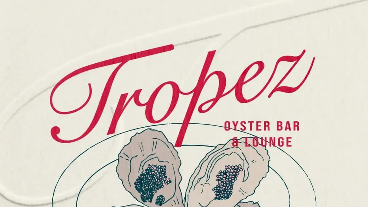
Tropez Oyster Bar & Lounge by zso.designs draws on "sun-faded coastal interiors, vintage menus, Mediterranean summers and elegant seaside dining". It was Brand of the Day. NÔM Vietnamese Restaurant by studiorevv "distills the essence of Vietnam into a modern design system", with a dragon woven into the type. Gogiya by estudio-marciano is a Korean barbecue restaurant where friends and family gather around sizzling grills; the name means "Hey meat!", and the bold, rounded wordmark plays with the space around it. Cantina by emmacalvosa combines Italian tradition with modernity, and its only rule is "No flag colors. No Vespas. No clichés."
Test: swap the country for another one. If the identity still works, it's a cliché, not an idea.
2. One object
A single object gives a restaurant something to draw, print and remember.
Ciao! by artworkbysofia is a takeaway pasta brand built around "an iconic red box", from packaging to signage. Picnica by nadeeneldelaa turns outdoor dining into a picnic-inspired restaurant with a playful, modern identity for Gen Z and a "social-first personality". It won an honorable mention. The Breakfast Club by mrkttnr is a weekly breakfast delivery, so the logo and packaging had to "delight everyone upon delivery".
Test: if a guest forgot the name, what object would they remember?
3. A character
A character puts a face on the food and is easy to put on bags, stickers and walls.
BONSTER by tenvr is a burger brand built around a "playful chef mascot" and a "chunky visual language", with the line "Big Bites. Bigger Attitude." It won an honorable mention. Mama's by wooo-designs is a restaurant where "comfort is always on the menu", brought to life by "the bold and caring character of Mama". Boccia by outfit-of-the-brand is a concept for an Italian sandwich place with a cheerful mascot inspired by Italian food culture and strong, rounded typography.
Test: can the character be drawn in one color at sticker size?
4. Stripped back
Some restaurant brands get their strength from taking things away.
Midday by helocrene is a modern sandwich bar that strips "the visual language of a classic deli down to its essentials": utilitarian typography, straightforward layouts, and details like a circular badge, printed napkins and food labeling. Honorable mention. MNCH by designs-by-yusra is a plant-based sandwich brand with a clean black-and-white design and "playful pops of color", where script fonts mimic ketchup and mustard drips. midday by wooo-designs is an artisanal sandwich bar with a bold custom logotype and "intentionally imperfect linework" that shows the craft.
Test: remove everything that isn't needed. Does the idea survive?
5. A voice
When the product is simple, the way the brand talks can be the difference.
Midday Sandwich House by mariahussain starts from "Lunch deserved better" and wants to feel "loud, messy, and full of personality". MAD MAYO by varioustyle000 says that eating is "a celebration, not a checklist. No calorie counts. No regrets."
Test: could the tagline sit on the menu without sounding forced?
6. Heritage with a twist
Tradition gives a restaurant credibility. The twist gives it a reason to be noticed.
Friteur by harpie-studio is a one-week concept for a Belgian takeaway fries shop, with a logo inspired by Belgian craft and "the retro visuals of traditional fry shops". CANTINA by wolfflowwolf brands an Italian restaurant for "food lovers, social butterflies" and anyone looking for a fun and inviting dining experience. El Toro by ezgi is a Mexican restaurant with "authentic flavors with a modern twist", inspired by recipes passed down through generations.
Test: what is the twist, in three words?
Same name, different answers: Daily Yolk and Midday
Some names appear several times on Braaands™, and comparing them shows how much room there is inside one idea.
Daily Yolk, an all-day breakfast spot:
- Daily Yolk by leyma-design is "a brunch spot we wish existed", with "marching egg illustrations", for lazy mornings and eating breakfast "way past breakfast time".
- Daily Yolk by tanjeena-design turns brunch into "a mood" with an "egg parade" of characters.
- Daily Yolk by wooo-designs has a yolk mascot that is "using its egg white as a blanket and just chilling on toast", drawn with playful, hand-drawn lines.
Midday, a sandwich bar:
- Midday by helocrene goes utilitarian, like a stripped-back deli.
- Midday Sandwich House by mariahussain is loud and messy.
- midday by wooo-designs is artisanal and hand-drawn.
Same name, same category, different tone every time. The name doesn't make the brand. The decision about how the place should feel does.
Restaurant logo ideas: what the logo has to do
A restaurant logo is used smaller and more often than most logos. Check it in five places before you approve it:
- The sign, read from across the street and in the dark.
- The menu header, printed in one color on paper.
- A takeaway sticker or lid, a few centimeters wide.
- A square social profile picture, where it shrinks to a thumbnail.
- An apron or a sleeve, often embroidered or printed in a single color.
Six ways to draw a restaurant logo, taken from the brands above:
- Type with a trick. NÔM weaves a dragon into the letters.
- A rounded, confident wordmark. Gogiya uses a bold, "puffed up" type that fills its space.
- A badge or stamp. Midday's circular badge is one of the details, next to printed napkins and food labeling, that make a plain system recognisable.
- A mascot. BONSTER's chef and Boccia's character carry the personality for the brand.
- Type that behaves like the food. MNCH's script mimics ketchup and mustard drips.
- Hand-drawn imperfection. midday's linework says "made by hand" before anyone reads the menu.
Touchpoint checklist for a restaurant brand
- Sign and window. The first thing a guest sees, and the only one you can't print again cheaply.
- Menu and menu board. Prices, sizes and dietary notes need a clear hierarchy in the brand's typeface.
- Packaging. Bags, boxes, cups and stickers. For takeaway brands like Ciao! the box is the brand.
- Table details. Midday shows how far a printed napkin can go.
- Food labeling. Labels for sandwiches, sauces and sides, as Midday does.
- Staff clothing. Aprons and caps are worn all day.
- Delivery. A bag, a sticker and a card. The Breakfast Club is built around the moment the box arrives.
- Digital. A square profile picture, a header image and templates for specials.
6 restaurant branding mistakes
- Cuisine clichés. Flags, chef hats, checkered tablecloths and the colors of the national flag. Cantina's rule of no flag colors, no Vespas and no clichés is a good place to start.
- A logo that only works on the sign. Test it small and in one color.
- Designing the menu last. The menu is the most-read thing the restaurant has. Design the hierarchy early.
- Forgetting takeaway and delivery. For many restaurants, the box is the first impression.
- A mascot without a system. One nice drawing isn't a character. Decide the poses, the one-color version and where it may appear.
- A concept that needs an explanation. If a guest has to ask what the brand means, the idea isn't visible enough.
How to brief a restaurant branding project
Answer these six questions before you contact a designer:
- What is the one thing a guest should remember?
- Who eats here, and when?
- Which matters most: dine-in, takeaway or delivery?
- What do the restaurants within a few blocks look like, and how should yours differ?
- Which surfaces are needed on opening day, and which can wait?
- What can't change: the name, the location, an existing sign?
Restaurant branding FAQ
What is restaurant branding?
Restaurant branding is the identity of a restaurant as a whole: the name, the logo, the colors and type, the menu design, the packaging, the signage, the tone of voice and how all of it feels together.
What should a restaurant logo include?
The name, readable at a distance and at small sizes, and one distinctive element such as a mascot, a badge or a custom letter. It should come in a one-color version, a square version for social profiles and a horizontal version for menus and signs.
Does a restaurant need a mascot?
No. Gogiya relies on a wordmark and Midday on typography and a badge. A mascot helps when the restaurant sells a casual, repeatable product like burgers or sandwiches, and it needs a system behind it.
How long does restaurant branding take?
For a logo and a basic system it typically takes several weeks. It takes longer if the project includes naming, interiors or a full set of packaging. The timeline depends on the scope and on how quickly decisions get made.
Where can I see more restaurant brand identities?
Browse restaurant brands, fast food and street food, pizza and pasta, bars and pubs and Japanese and Asian food on Braaands™.
Related reading
- Branding Inspiration: 46 Real Brand Identities by Industry
- Coffee Branding: 6 Principles and 19 Real Examples, for cafés and coffee shops
- Bakery Logo and Branding Ideas, for bakeries and cafés
See more restaurant branding
Designed a restaurant brand yourself? Submit it to Braaands™. Approved work is voted on by our community and jury and appears on your public designer profile.
See it in real brands
Browse hundreds of brand identities from independent designers, voted on by our community and jury.
Explore brand identities