October 16, 2026 · 12 min read
Brand Identity Design: A 7-Step Guide With Real Examples
How to design a brand identity in seven steps, from strategy and naming to logo, type, color and guidelines, with real examples from 972 brands.
By Roman from Braaands™
Brand identity design is the work of turning what a business is and wants to be into something people can see and hear: a name, a logo, type, color, imagery, a voice and the rules that hold them together. Done well, a customer recognizes the brand on a shelf, in a feed or in a single sentence, without reading the name.
This guide explains what a brand identity is, how it differs from a brand and from branding, and walks through seven steps with real examples from Braaands™, where independent designers have shared 972 brand identities (as of October 2026). Each step ends with a test you can run on your own work. After the steps you'll find the most common mistakes, a checklist, six questions for your brief and a short FAQ.
Brand, branding and brand identity: what's the difference?
The three terms are often used as if they meant the same thing. They don't:
- A brand is what people think and feel about a business: its reputation. You can influence it, but you don't control it.
- Branding is the ongoing work of shaping that reputation: what a business says, does and shows over time.
- A brand identity is the designed part of it, everything a person can see and hear: the name, the logo, the colors, the type, the imagery, the voice and how they're applied.
So a brand identity is one tool of branding, and a logo is one part of a brand identity. If you only need a mark, ask for a logo. If you need a name, a look and a voice that work together across products, you're asking for a brand identity.
A visual identity is a close neighbor. It covers only what you see (logo, color, type, imagery), while a brand identity adds the verbal side: the name, the tone of voice and the messaging.
What a brand identity is made of
Most identities combine the parts below. Not every project needs all of them, but each one answers a question someone will ask sooner or later.
| Part | The question it answers |
|---|---|
| Strategy | Who is this for, why does it exist and how is it different? |
| Name | What do we call it, and what does the name say? |
| Logo or wordmark | What is the one mark people will recognize? |
| Color | Which colors does the brand own? |
| Typography | How does the brand look when it's written? |
| Imagery and illustration | Which pictures, shapes and characters belong to it? |
| Voice | How does it talk? |
| Applications | Where does it show up: packaging, signage, web, social? |
| Guidelines | What are the rules, so other people can use it correctly? |
How to design a brand identity in 7 steps
1. Start with strategy
An identity without a strategy is decoration. Before drawing anything, write down who the brand is for, what it promises, who it competes with and what it can say that they can't.
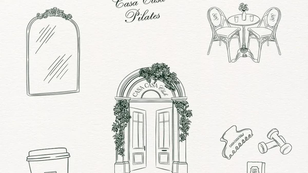
East Village Coffee (rebranding) by whatbrij is a good example of the order of work: the rebrand "came with brand strategy as we discovered the core value of EVC". The visuals followed from it, a playful, sophisticated logo with hand-drawn illustrations "to show authenticity". It was Brand of the Day. For Citadel Cybersecurity by sampetrillo, "a strategic and visual repositioning was essential to convey its true essence", so the designer built "a solid and coherent identity, aligned with the brand's purpose". Casa Casa Club by ultramarinedesigns aimed at "positioning Casa Casa not as another fitness studio, but as a lifestyle destination with a founding story worth belonging to".
Test: can you finish this sentence in one line? "We help [who] do [what], unlike [the alternative], because [reason]."
2. Find one idea
The strongest identities are built around a single idea that every later choice can be checked against.
Rude Olive by arshmah-designs is "built around one simple idea: good olives, bad manners", and the concept "moves away from the traditional, rustic world of olive brands". It was Brand of the Day with a score of 9.4. Hummey by husain-studio found its idea by turning the category around: "Most honey brands tell the story of the bees. I wanted to tell the story of the one animal that simply couldn't resist their honey." Brand of the Day, 9.3. Skeltch by work-sp-ce puts the idea before the result: instead of finished work, it celebrates "the first mark - the moment an idea begins". Brand of the Day, 8.8. Equilibria Pilates Studio by vasundhara is "built around one idea: true strength comes from balance".
Test: can you explain the idea to a stranger in ten words, and does every element of the identity serve it?
3. Choose the name and the voice
The name is the first piece of the identity people meet. The voice is how the brand sounds in every sentence after it.
Good names often carry a small story. The name Chocol by sof-design "echoes xocolatl, the original cacao drink of the Mayans and Aztecs". For the toothpaste brand migaké by penguin, the name means "Just brush!", "a gentle nudge with a spark of fun". For the Korean BBQ spot Gogiya by creavora, the name itself, "Hey Meat!", "sets the fun and welcoming tone". A voice can also be a rule. For Cantina by emmacalvosa, "Their only rule? No flag colors. No Vespas. No clichés." And Nommies by ayanna-peniston uses "a playful verbal identity" next to its mascot and typography, so the cookie boxes talk as much as they look.
Before you fall in love with a name, check the domain, the trademark register for your market and the social handles.
Test: say the name out loud, then read three sentences of the brand's copy. Do they sound like the same company?
4. Design the logo
The logo is the smallest and most-used part of the identity. It has to work as a favicon, on a stamp, in one color and on a sign.
On HappyJoy by aesthedish, "the letter 'J' curves into a joyful smile, complete with subtle eyes tucked in", a single idea inside a single letter. Street Blends by wooo-designs has a custom typographic logo that "blends the 'S' and 'B'", and the same mark "also serves as the submark", a smaller version for tight spaces. For Brushed by unnfold-design, the designer chose "a typeface with lots of angles since brushing means reaching all the corners of the mouth". It was Brand of the Day. AirAlbania by devaapx draws its logo as "a minimalistic, geometric version of the Albanian eagle".
Test: print the logo at 16 pixels and in one color. Is it still recognizable?
5. Pick color and type
Color and type do most of the work people call "the look". Choose them for a reason you can explain, not because they're fashionable.
Eight Hour by designedinsleep pairs two typefaces that argue with each other on purpose: "A handwritten primary typeface keeps it human and unbothered, while a stiff secondary sans serif holds the structure down." Brand of the Day, 8.6. YUMM by syeda-maham chose color against the category, "moving away from the expected muted and minimal aesthetic often seen in the category". The designer of Brushed picked a chrome scheme because it is "unusual for a toothpaste brand". KOKU by afinaiskandar uses variations in charcoal and lavender, "each variation is designed to stand out at the coffee bar while staying cohesive with the brand universe".
Check contrast before you fall for a palette: the Web Content Accessibility Guidelines recommend at least 4.5:1 between body text and its background.
Test: can you say in one sentence why each color and each typeface is there?
6. Build a system and apply it
A logo is not an identity. An identity is a system that works on a bag, a sign, a screen and a sticker, built from a few parts that repeat.
Boccia by outfit-of-the-brand, a "fictional Italian sandwich concept", shows the idea: "the system extends across packaging, posters, signage and environmental applications". Pixelity Branding by raphicx is "a flexible brand system designed to work seamlessly across digital products, interfaces, social media, presentations, and brand communications". In Nitham by tariqshehsani, the principle that "interlocking parts create one coherent structure" shapes "the logo, visual system, motion and applications through repetition, overlap, scale and structured composition". And NOCAFF by wooo-designs shows how to extend a system without breaking it: "each product in the range has its own distinct colour palette and illustration, the system remains visually consistent across the full lineup." It won an honorable mention.
Test: mock the identity up on four different things: a bag, a sign, a social post and a one-color stamp. Do they look like one brand?
7. Write the guidelines and hand it over
An identity only survives if other people can use it correctly. Guidelines are how you hand it over. They don't have to be long, but they have to be complete enough that someone who has never met you can build with them. A good set contains:
- The logo: all versions, the clear space around it, the smallest size and what not to do.
- Color: every color with its values for screen and print.
- Type: the typefaces, where they're used and a few example sizes.
- Imagery and illustration: what belongs to the brand and what doesn't.
- Voice: a few real sentences, good and bad.
- Templates and files: where to download the working files.
Test: could a freelancer who has never met you build a flyer from the guidelines alone?
How identities are judged on Braaands™
Every approved submission on Braaands™ is voted on by the community and a jury on four criteria: Design & Craft (40%), Strategy (30%), Originality (20%) and Brand Story (10%). They map onto the steps above. Strategy is step 1, originality is the idea of step 2, the story lives in the name and voice of step 3, and craft is everything from the logo to the system in steps 4 to 6. It's a useful way to review your own work: give your identity a score from 1 to 10 on each and see which part is weakest.
7 brand identity mistakes
- Starting with the logo. Without strategy and an idea, the logo is a guess.
- Following the trend instead of the idea. Trends date, ideas can be built on.
- Too many colors and typefaces. A system needs a few parts that repeat.
- No small or one-color version. The logo has to work on a stamp and on a favicon.
- A system that only exists in the mockups. Test it on things you'll actually produce.
- Skipping the name check. A beautiful name you can't register or use online is a cost.
- No guidelines. Everyone who touches the brand afterwards will improvise.
Brand identity checklist
- Positioning written down in one sentence
- One idea that guides every decision
- A name that's available as a domain, a trademark and a handle
- A logo with a primary, a small and a one-color version
- A color palette with screen and print values and checked contrast
- Typefaces with clear roles
- Imagery, illustration or pattern rules
- A voice with real example sentences
- The identity tested on at least four applications
- Guidelines and working files handed over
How to brief a brand identity project
If you're hiring a designer, these six answers make the first conversation much shorter:
- What does the business do, and for whom, in two sentences?
- What should people say about it after meeting it for the first time?
- Who are the competitors, and how should the brand look different?
- Which brands do you like, and what exactly do you like about them?
- Where will the identity be used first: packaging, a shop, a website?
- What can't change: the name, an existing sign, a deadline?
Brand identity design FAQ
What is brand identity design?
Brand identity design is the process of creating the visible and verbal parts of a brand: the name, logo, colors, typography, imagery, voice and the guidelines that keep them consistent.
What's the difference between a brand identity and branding?
A brand identity is the designed set of assets a brand uses. Branding is the wider, ongoing work of shaping how people see the business, of which the identity is one part.
What does a brand identity include?
Usually a strategy or positioning, a logo and its variations, a color palette, typefaces, imagery or illustration rules, a voice and brand guidelines. Many projects also include applications such as packaging, stationery, signage or social templates.
Do I need a logo before I start a brand identity?
No. The logo is part of the identity and works better once you know the strategy and the idea behind it.
How long does brand identity design take?
It depends on the scope and on how quickly you give feedback. A focused identity can be done in weeks, while a full system with applications and guidelines takes longer. Ask for a schedule with milestones before you start.
Can I design my own brand identity?
You can, if you can answer the strategy questions and have a clear idea. Hire a designer when you need the craft: a distinctive logo, a system that holds up across products and guidelines others can follow.
Where can I see more brand identity examples?
Browse every identity on Braaands™, or the archive of Brand of the Day winners. For examples by industry, see the articles below.
Related reading
- Branding Inspiration: 46 Real Brand Identities by Industry
- Coffee Branding: 6 Principles and 19 Real Examples
- Matcha Branding: 5 Approaches, With 17 Real Examples
- Coffee Packaging Design: 6 Principles and 20 Real Examples
- Bakery Logo and Branding Ideas: 6 Approaches With 23 Real Examples
See more brand identities
Designed a brand identity yourself? Submit it to Braaands™. Approved work is voted on by our community and jury and appears on your public designer profile.
See it in real brands
Browse hundreds of brand identities from independent designers, voted on by our community and jury.
Explore brand identities