Best Brand Designs and winner of the Brand of the Day Awards
Brand of the day
Thank you! Your submission has been received!
Oops! Something went wrong while submitting the form.
Showing 0 results out of 0 Brands of the Day.
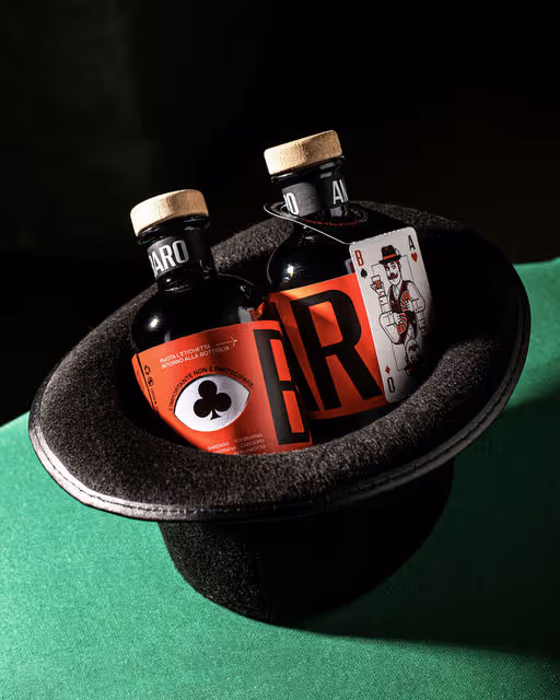

Art direction and brand identity design for Amaro Baro by @diegoserpico
Mr. Baro (“baro” means cardsharp in Italian) is a gentleman from another era, with a sly, knowing gaze – always ready to play the right card to win.
The project features a double label. The top label, with the cardsharp’s eye, wraps around the bottle and “reveals” the card suits as it turns, creating interaction. Each bottle also includes a neck tag with “the cardsharp’s card,” illustrated in the classic poker-card style with a contemporary twist; it detaches and becomes a keepsake gift.
The primary typography is based on @fontpopulista, a project that pays homage to the vinyl adhesive lettering typical of Italian hardware stores, commonly seen on shop windows and signs in the ’80s and ’90s – often slightly misaligned, with a highly recognizable, popular aesthetic.
The packaging is screen-printed, and the boxes – when aligned – can recompose the cardsharp’s face.
Illustration & motion design: @dariogenuardi_illustrations
Photography: @aury.scotto
Motion design: @russovittorio98
Italian amaro Branding
February 6, 2026
Food & Beverage
Retail
Packaging Design
Label Design
Merchandise
Poster & Print

A modern teahouse offering an exceptional range of teas and pastries.
Tea House Branding
February 5, 2026
Food & Beverage
Hospitality
Packaging Design
Poster & Print
Label Design
Business Cards
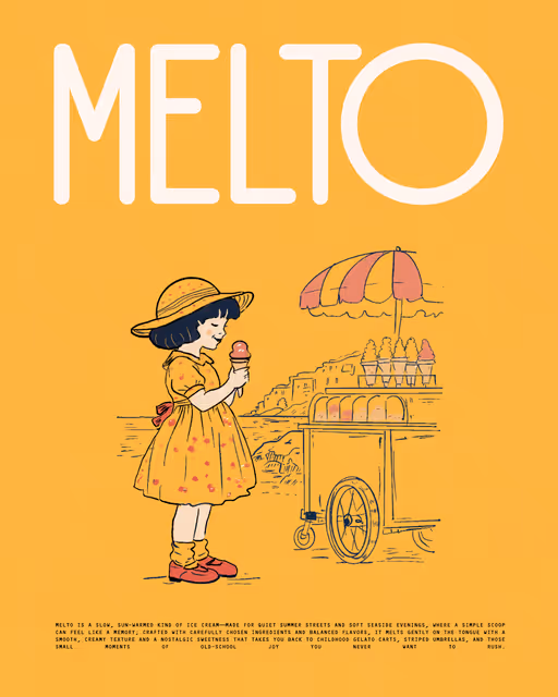
MELTO is a slow, sun-warmed kind of ice cream—made for quiet summer streets and soft seaside evenings, where a simple scoop can feel like a memory; crafted with carefully chosen ingredients and balanced flavors, it melts gently on the tongue with a smooth, creamy texture and a nostalgic sweetness that takes you back to childhood gelato carts, striped umbrellas, and those small moments of old-school joy you never want to rush.
Ice Cream Branding
February 4, 2026
Food & Beverage
Retail
Packaging Design
Merchandise
Poster & Print
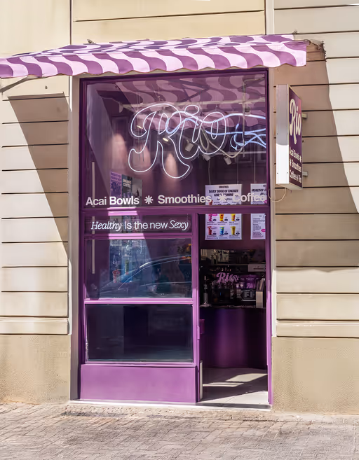
RIO Açaí opened its first location in Prague in October 2024. The launch on Kaprova Street was followed by a major opening event on Národní, marking the beginning of expansion to Ostrava, Brno, London and Dubai.
A wave pattern, loosely inspired by Rio’s iconic Copacabana sidewalks, became one of the key visual elements of the brand. The countertop is shaped as a continuous wave, reflecting the same curves used across packaging, printed materials and small interior details. The main color is açaí purple, expanded into bold gradients that add contrast and movement to the space.
Posters are the highlight of the in-store experience. Each location features large-format prints showcasing key products through a mix of AI-generated backgrounds, editorial-style lighting and polished retouching. They add energy to the space and help tie the brand’s visual world together.
Healthy is the new Sexy
Açaí Bowl Branding
February 3, 2026
Food & Beverage
Retail
Packaging Design
Poster & Print
Merchandise
Label Design

Bare Glow is a makeup brand that behaves like skincare. Thoughtfully made to hydrate, protect, and enhance your natural features, for a glow that feels calm, comfortable, and easy to wear - everyday.
The identity is built around a palette of blue, green, and brown to communicate nature, balance, and health. A combination of clean, modern sans-serif and serif typefaces keeps the brand minimal and contemporary, with glow set in bold to visually reflect the radiance the product delivers. The packaging is intentionally minimal, allowing the product to - and the skin it enhances - to speak for itself.
Make-up Branding
February 2, 2026
Beauty & Skincare
Packaging Design
Label Design
Poster & Print
Business Cards
Brand identity for a fancy American Motel
Motel Branding
February 1, 2026
Hospitality
Home & Lifestyle
Business Cards
Label Design
Merchandise
Poster & Print
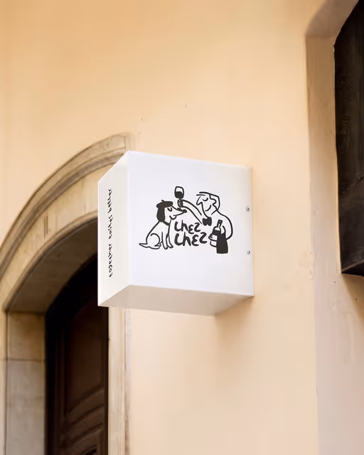

Chez chez is a neighbourhood bistro where the food is unfussy, the wine flows freely, and the dog might just be wearing a beret. Warm, playful and just the right amount of chaotic — a local spot that feels like a second living room, only with better wine. The energy lives somewhere between a Parisian sidewalk and a doodle drawn on a napkin.
Bistro Branding
January 31, 2026
Food & Beverage
Hospitality
Label Design
Packaging Design
Poster & Print
Merchandise

Framed is a photography studio dedicated to the idea that every moment and every story can fit in a frame, letting photography become more than just an image and represent a timeless expression of emotion and perspective.
The goal for this project was to create a modern, but timeless, visual identity that could translate the essence of capturing life's fleeting moments into a strong visual language.
The resulting design blends minimalism and structure, evoking both the precision of capturing a shot and the emotional depth behind each image. The non-existent kerning, as well as the subtle photographic details create a refined sense of geometric balance and harmony that evoques the feeling of "fitting every moment in a frame".
Photography Branding
January 30, 2026
Home & Lifestyle
Retail
Business Cards
Stationery
Poster & Print
Label Design

A sourdough bakery with heart, crust, and character. It’s all about honest bread and long ferments. Baked with passion, served with love.
Keywords : Warm, bold, rustic, playful
Bakery Branding
January 29, 2026
Food & Beverage
Packaging Design
Label Design
Merchandise
Business Cards


Mora is an artisanal jam and jelly brand that celebrates fruit at its peak ripeness. Named after the Spanish and Italian word for berry, MORA is rooted in heritage yet styled for the modern pantry. Design brief by @readysetbrief
Jam Branding
January 28, 2026
Food & Beverage
Retail
Packaging Design
Label Design
Poster & Print
Business Cards
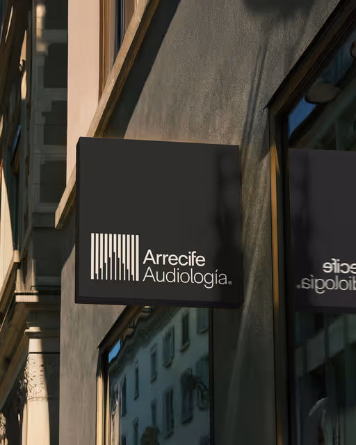
For Arrecife Audiología, we designed a visual identity that celebrates sound as connection and emotion, not loss. Through authentic imagery, messaging, and a cohesive brand universe, we created a warm, human-centered identity that builds trust and enriches life.
Design by pixelarte.com
Typography by cotypefoundry.com
Healthcare Branding
January 27, 2026
No items found.
No items found.


“Pietro Strizzi” is an Italian-style ice cream shop, defined by witty signature creations and genuine Viennese charm. The name refers to the colloquial Viennese term “Strizzi”—a character known for being a little roguish yet always likeable.
The parlor presents itself as an exceptional ice cream shop with an extravagant graphic identity. On mild summer evenings in 1140 Vienna, ice cream with distinctive character is served here.
Type in use: EK Roumald / @erkin_karamemet
Business Blooming: @pizzatypefaces
Ice Cream Branding
January 26, 2026
Food & Beverage
Retail
Label Design
Packaging Design
Poster & Print
Merchandise
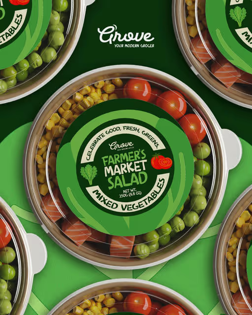
rove is a modern grocer for the design-minded. Think small-batch sauces, seasonal fruit, handmade pasta, and local favourites gathered under one thoughtfully curated roof. This isn't your average corner shop. Grove celebrates good food, good people, and good design. Design brief by @brief.mebaby
Grocer Branding
January 25, 2026
Food & Beverage
Retail
Packaging Design
Label Design
Poster & Print
Merchandise

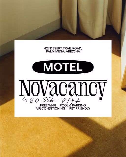
A fictional motel and café located in Albuquerque, New Mexico, created as a full brand identity exploration. This project imagines a warm, nostalgic roadside stay shaped by desert landscapes, soft pastels, retro typography, and classic American motel culture.
The visual direction leans into familiar Southwestern textures, analog ephemera, and vintage-inspired objects: key tags, postcards, apparel, signage, and room details.
The concept also nods to the cultural footprint of Breaking Bad, Better Call Saul, and Pluribus, drawing from their atmosphere, tone, and Albuquerque setting. Certain elements (like Howard’s Jaguar from Better Call Saul) appear as direct Easter eggs for fans.
Motel Branding
January 24, 2026
No items found.
No items found.


CLER is a modern dermatological brand built on the principles of inclusivity, transparency, and scientific simplicity. The visual identity centers around the core mission: providing high-performance "Care for All Skin" types, including combination, oily, and dry profiles.
Skincare Branding
January 23, 2026
No items found.
No items found.

Branding and packaging concept for a gingerbread brand.
A festive visual identity built around bold typography, warm colors and narrative illustrations, designed to create a cohesive and memorable brand experience.
Gingerbread Branding
January 22, 2026
No items found.
No items found.
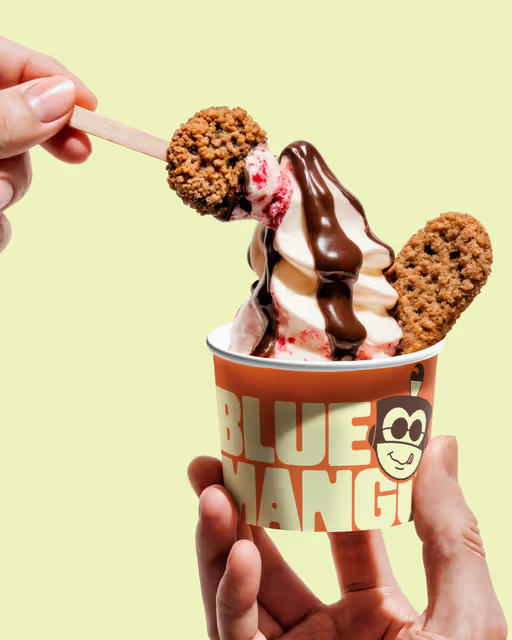
What began as a small froyo concept became a full visual universe. Driven by a mischievous monkey, a legendary blue mango, and a brand attitude that refuses to take dessert too seriously.
Blue Mango blends storytelling with strong graphic structure, resulting in a cheerful, memorable identity made for a new generation of customers in Tyre.
Ice Cream Branding
January 21, 2026
Food & Beverage
Retail
Packaging Design
Merchandise
Poster & Print
Label Design
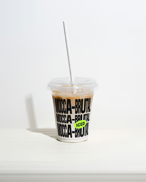
„Mocca Brutal“ is a Viennese coffee with a touch of extravagance. Unlike traditional coffeehouses, „Mocca Brutal“ is located in the heart of Favoriten, in Vienna’s 10th district. It’s not the typical corner you would expect for a coffeehouse of this kind – but that’s what makes it special. Here, traditions are slightly broken, and coffee is celebrated through a fusion of old and new cultures. ☕️
——
Type: -Bandit VF- & –Visual– by @allcapstype
Coffee Shop Branding
January 20, 2026
Food & Beverage
Home & Lifestyle
Merchandise
Packaging Design
Poster & Print
Label Design
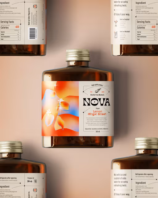
Nova is a bold and modern mocktail brand that transforms the non-alcoholic beverage experience into something exciting and sophisticated. With a focus on delivering refreshing flavors, Nova is perfect for any occasion—whether it’s a lively celebration, a casual hangout, or a quiet night in. The brand combines a sense of fun and elegance, offering an elevated alternative to traditional alcoholic drinks, allowing everyone to enjoy the perfect balance of flavor and style.
Mocktail Branding
January 19, 2026
Food & Beverage
Hospitality
Packaging Design
Label Design
Merchandise
Poster & Print

Amaro brings the Italian cocktail spirit wherever you are. Vibrant, refreshing, and made for sunny days.
Cocktail Branding
January 18, 2026
Food & Beverage
Hospitality
Packaging Design
Label Design
Merchandise
Poster & Print

Crybaby is a bold hot sauce brand with dramatic color pops, spicy attitude and playful emotional twist. The branding mixes heat, humor and clean design to make every bottle feel fierce, modern and instantly recognizable at a glance.
Sauce Branding
January 17, 2026
No items found.
No items found.
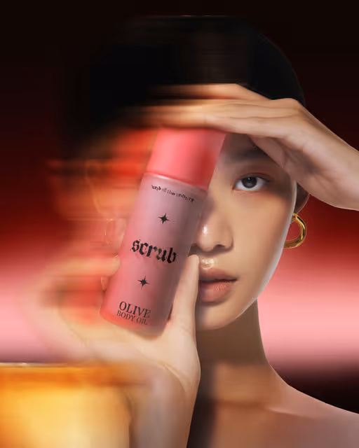

Scrub is a startup selling amazing sugar scrubs containing simple ingredients that are dermatologically tested and hypoallergenic.
Beauty & Wellness Branding
January 16, 2026
Beauty & Skincare
Retail
Packaging Design
Poster & Print
Label Design
Merchandise
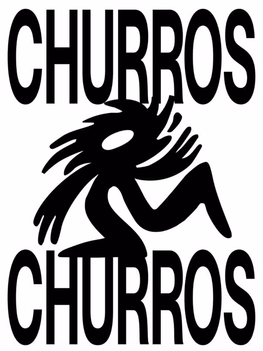
CHURROS CHURROS shows how bold hospitality branding can transform a traditional churro shop into a stand-out, character-driven brand 💥
Two young founders from Talavera de la Reina wanted to push the classic idea of a churrería further. From that starting point, we created a fresh, contemporary visual identity for a young, urban audience: powerful type choices, a chocolate-splashed mascot, spontaneous illustrations, super-colorful art direction, and take-away–ready churro packaging designed to shine both in real life and on social media.
More than just a nice look, it’s a brand that’s recognizable, direct, and memorable — a modern churrería that reimagines tradition to connect with how we experience food today.
Typography: Neue Montreal Ultra Squeezed by off-type.com
Branding & Art Direction: pixelarte.com
Hospitality Branding
January 15, 2026
No items found.
No items found.


CHOCOL was born wild, far from clichés. But who said a fierce jaguar can’t become elegant for a special occasion? CHOCOL Deluxe transforms the iconic dark chocolate brand with dark chocolate truffles, orange filling and premium orange crystals.
Chocolate Branding
January 14, 2026
Food & Beverage
Packaging Design
Label Design
Poster & Print
Merchandise

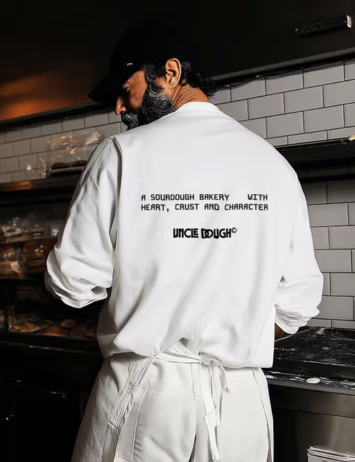
Uncle Dough is a sourdough bakery with heart, crust, and character. It's all about honest bread and long ferments. Design brief by @designerbriefs @brief.mebaby @dirtyline.std
Bakery Branding
January 13, 2026
Food & Beverage
Packaging Design
Label Design
Merchandise
Business Cards

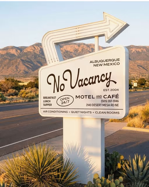
No Vacancy is a modern and chic roadside motel for design-conscious travelers. Inspired by classic Americana and desert stays, it mixes mid-century charm with a touch of luxury. It's the perfect spot for spontaneous road trips.
Motel Branding
January 12, 2026
No items found.
No items found.
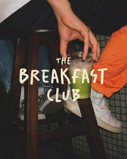
The Breakfast Club delivers everything you want for your breakfast every Sunday. From your own jam to fresh croissants to soft eggs. The company needs a logo and packaging for delivery, something playful, cheerful, that will delight everyone upon delivery.
Breakfast Club Branding
January 11, 2026
Food & Beverage
Retail
Poster & Print
Packaging Design
Merchandise
Label Design
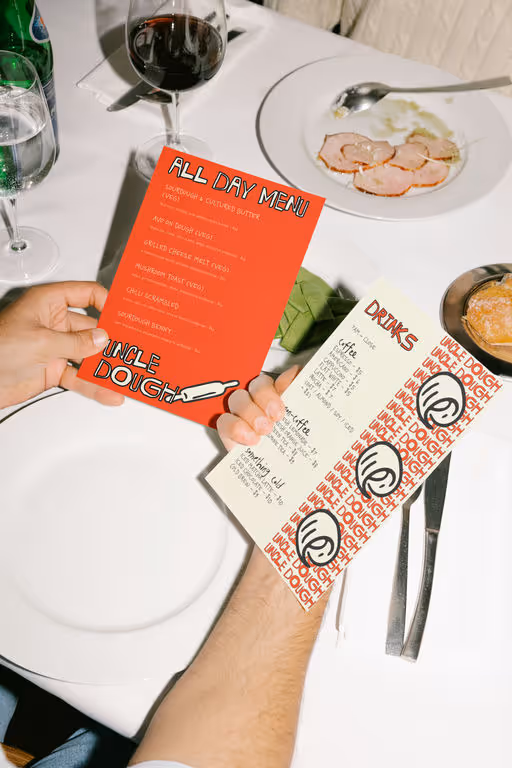

Uncle Dough, “what if a sourdough bakery didn’t look like every other earth-tone, muted, “farm-to-table” spot on the planet?”
Yeah… I asked myself the same thing.
so I made Uncle Dough loud.
Uncle Dough is a bakery built on honesty and neighborhood warmth, so I pushed the identity toward something that feels handmade, bold, and full of character: reds inspired by oven heat, soft blues from morning light, and scribbly handwritten textures that mimic the way bakers track notes.
sourdough is loud. It crackles, hisses, pops, grows, deflates, fights back!! I wanted the identity to feel alive , bold lines, messy charm, that handwritten energy that mirrors the unpredictability of a ferment.
It’s sourdough with personality, not perfection🥖🍞🥯
the goal? A sourdough brand that doesn’t whisper “organic,” but shouts “I’ve got crust and character.”
Bakery Branding
January 10, 2026
Food & Beverage
Poster & Print
Packaging Design
Merchandise
Label Design