Food & Beverage · by Studio Moara
KMCH
 Studio MoaraPRO
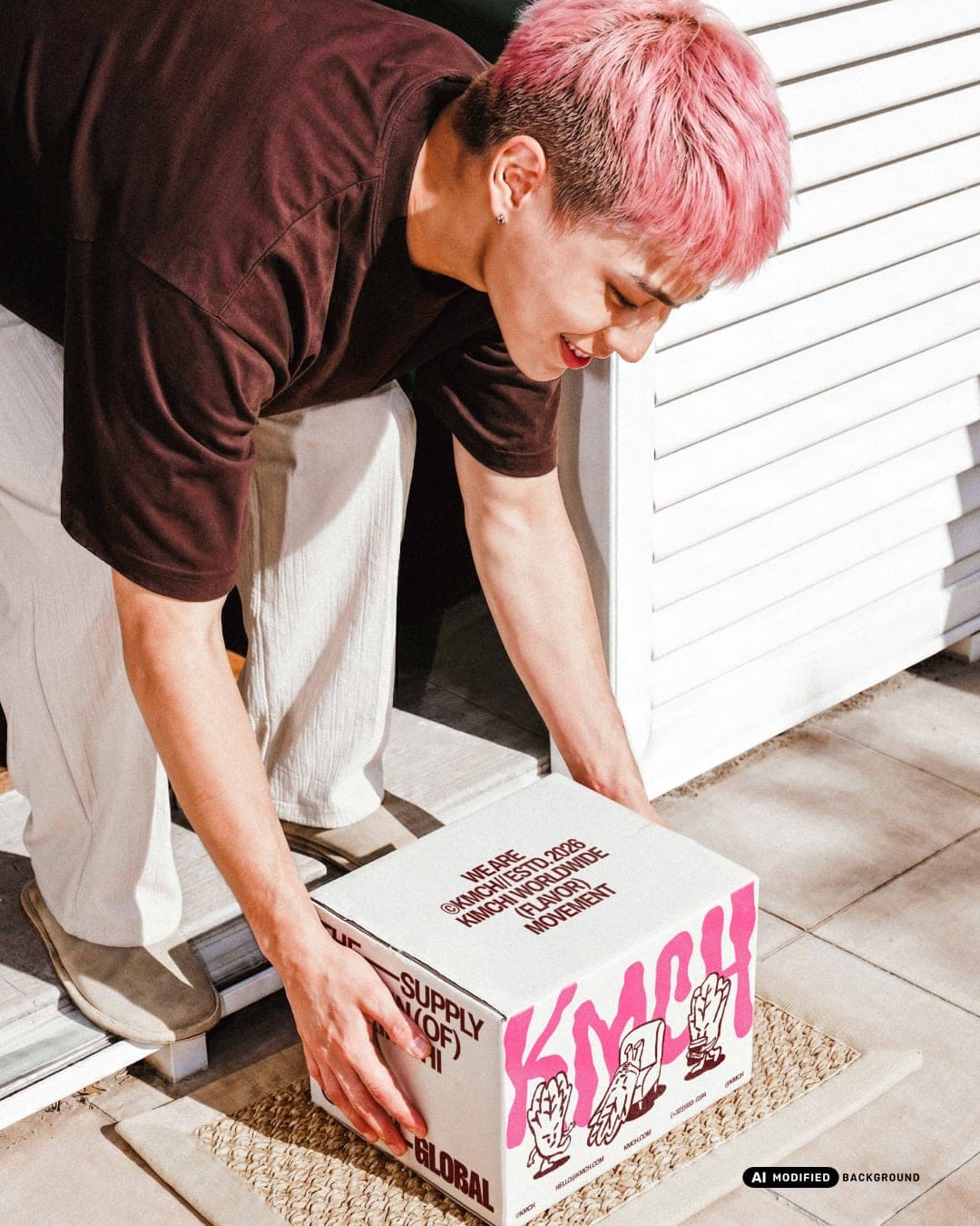
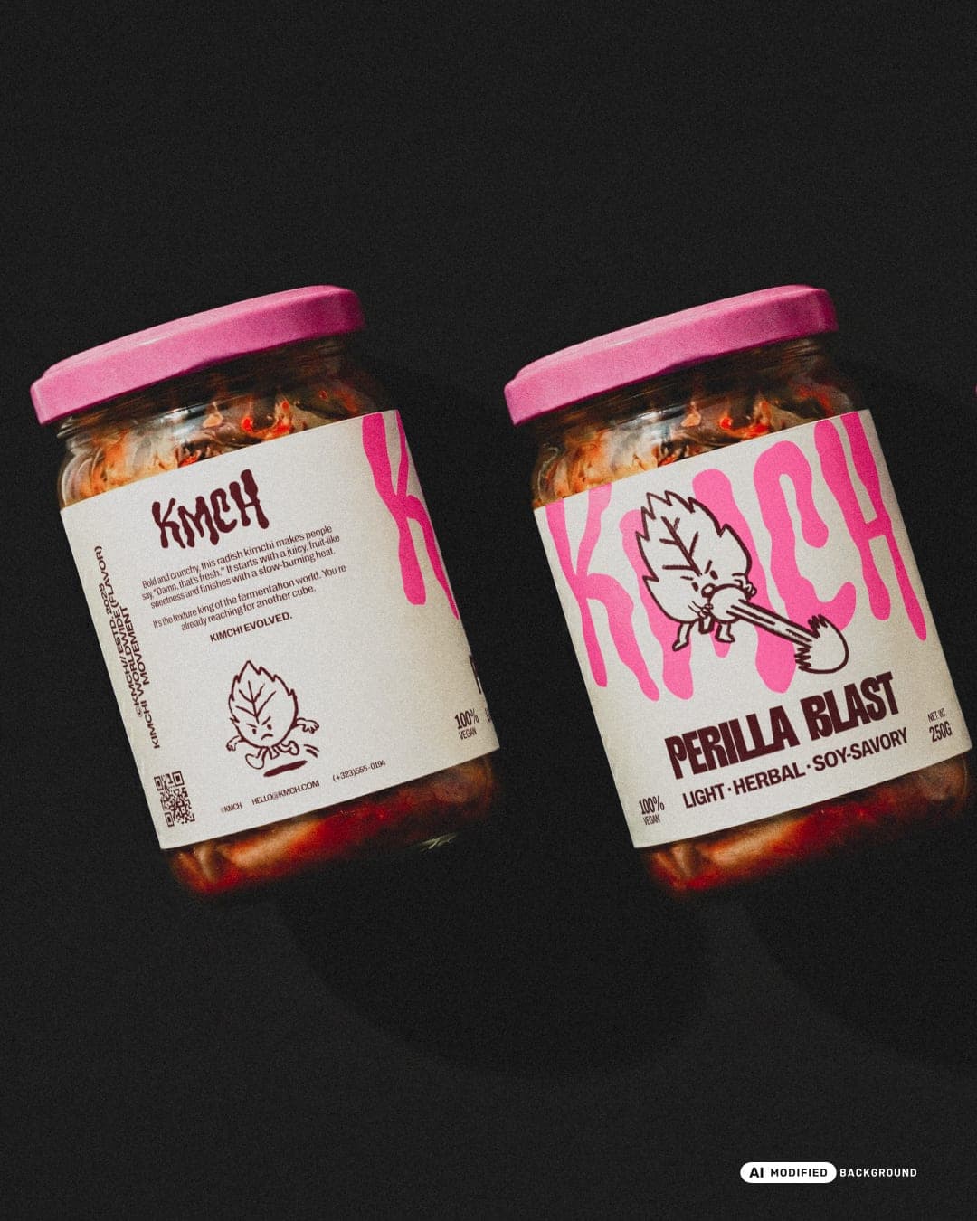
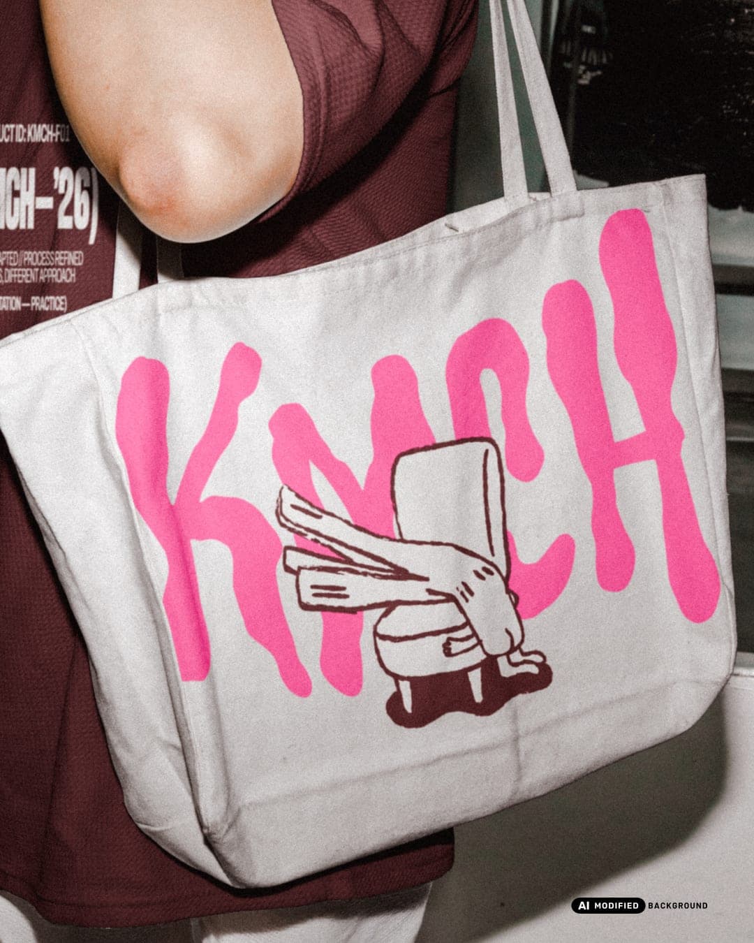
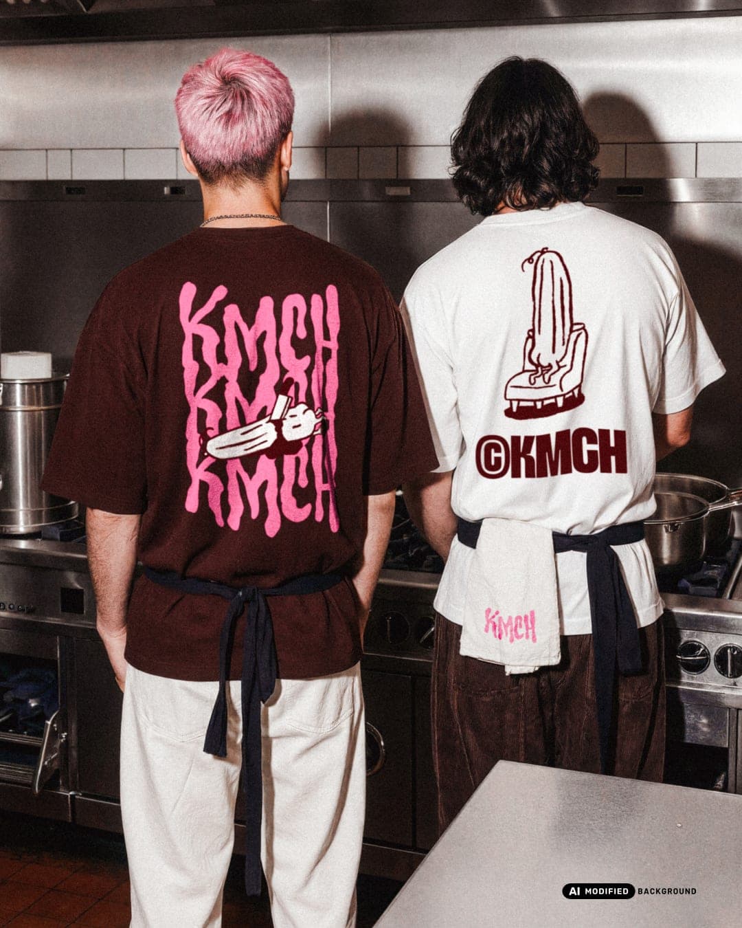
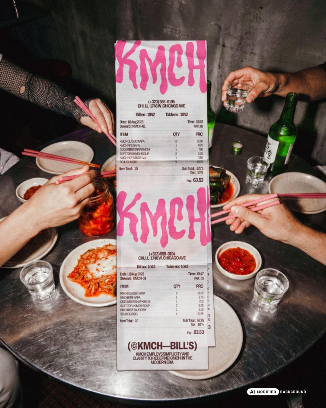
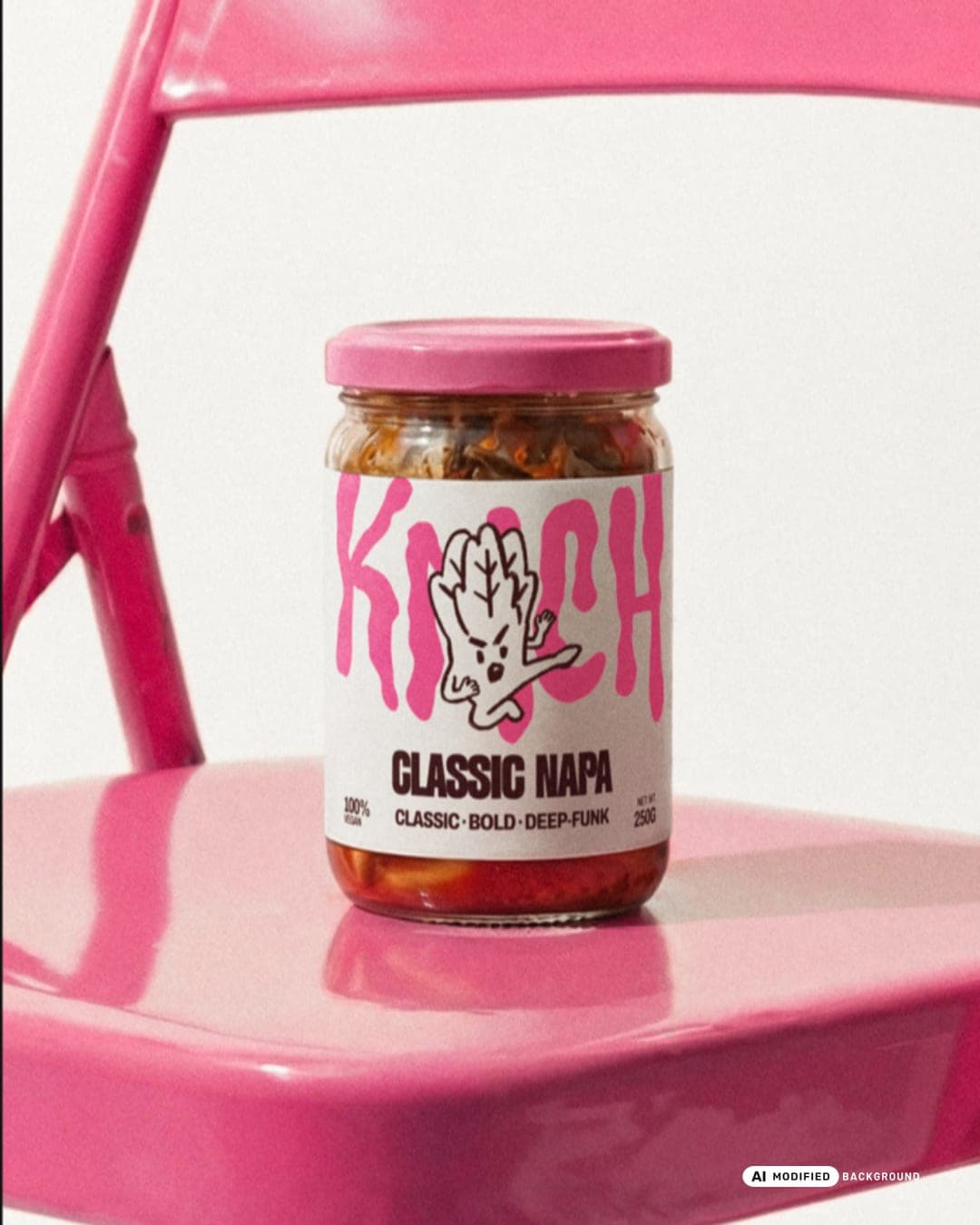
KMCH tries to see kimchi from a more everyday point of view. In this branding and brand identity project, we stepped away from stiff conventions and built a visual language rooted in raw hand-drawn touch and gentle quirkiness. The mascot, logo, and packaging were designed to feel relaxed and imperfect, balanced with a mature urban tone. Every element, from the logo mark to the packaging system, speaks the same calm attitude. KMCH doesn’t aim to be the loudest, just more real. Modern kimchi culture with character.

Color Palette
This brand uses a color palette of 3 colors
Click a color to find brands with similar colors.
Tags
Live score
Scores stay hidden while voting is open, so early votes can't anchor the ones that follow. Check back once the countdown ends.
Votes (0)
No votes yet — be the first.