Brand Identity Showcase
Nominees
Thank you! Your submission has been received!
Oops! Something went wrong while submitting the form.
Showing you 0 of 0 Nominees

Brand for Sale
Brand Design for toothfolk - a conceptual all-natural toothpaste company that prides itself on clean ingredients, healthy living, and sustainability – without compromising on quality results. This one’s more muted than my usual colour-happy work, but still holds a bold feel. I wanted to explore a slightly different direction, and landed on this modern witchy style. Really enjoyed the process! mockups made with @pacdora ( you can use my code SKOJIE for 20% off! 🧙♀️ )
copy by Haley R. Farmer
brief by @readysetbrief
Beauty & Health
Minimal / Monochrome, Earthy Tones
Packaging Design
Business Cards
Poster & Print
Label Design
Beauty & Skincare
Wellness & Health


Brand for Sale
Snap is a new Swiss chocolate brand that offers delicious and playful chocolate treats for kids. Their goal is to create positive associations for chocolate with children, making it an adventure for the senses. They also want to build strong brand loyalty. For my design of the brand, I decided to create an identity tied around the word 'adventure' from the brief. I avoided using lots of chocolate brown colors and instead used more forest orange and green colors, linking towards the ideas of kids having fun adventures in the forest, kinda like when we used to go camping as kids. I created a logomark with a lightning shape formed in the logotype to symbolise the idea of 'creating a spark for adventure with chocolate. Finally, with areas such as the brand touchpoints, I not only focused on exploring consistency of the visual identity, but I also explored unique ways to build brand loyalty. Two ways I achieved this were through packaging and app design. For the packaging, I created a section that included a special offer for amusement parks like Chessington (like how Kellogg cereal boxes do it), as a fun way for kids to 'unlock their next adventure'. and finally for the app design, I create a playfully-styled rewards program where kids could scan every time they buy the product, and once they buy enough, they can win rewards such as free chocolate, special discounts and more!
Sweets
Bold Colors, Warm Tones
Merchandise
Packaging Design
Poster & Print
Label Design
Food & Beverage
Retail


Brand for Sale
Asana ~ a yoga studio that’s all about mindfulness, balance, and feeling good in your body and mind✨
Sport
Earthy Tones, Minimal / Monochrome
Business Cards
Label Design
Merchandise
Poster & Print
Wellness & Health


Brand for Sale
The visual ID for Upper St. Beer Bros limited edition APA beer, Hangover draws its inspiration from the famous Upper Street art deco cinema “The Screen“ in Islington, London.
Beverage
Bold Colors, Warm Tones
Packaging Design
Food & Beverage


Brand for Sale
Elios Olive Co. is a gourmet olive oil brand rooted in the sun-soaked Palestinian lands. It is crafted to deliver purity, tradition, and soulful flavor in every drop. The challenge was to create a brand identity that communicates authenticity and heritage while positioning the product as a premium choice in the health-conscious artisanal food market. The visual identity embraces warmth and tradition with a refined color palette inspired by the sun and the earth. A modern serif wordmark paired with natural textures and custom icons tells the story of harvesting, pressing, and purity. Elegant bottle packaging, branded stationery, and a cohesive social presence bring the brand to life, ensuring Elios Olive Co. feels timeless and trustworthy, honoring the land it comes from and the people it’s made for.
Food & Beverage
Earthy Tones, Minimal / Monochrome
Label Design
Packaging Design
Business Cards
Poster & Print
Food & Beverage
Retail


Brand for Sale
We are excited to craft the bold and vibrant branding for Gogiya, a Korean BBQ spot where friends and family gather around sizzling grills! 🇰🇷✨ With a modern urban aesthetic, we infused the identity with fiery red and dynamic blue, reflecting the energy, authenticity, and social spirit of Gogiya. The name itself—“Hey Meat!”—sets the fun and welcoming tone, making every meal an experience to remember!
Restaurant
Bold Colors, Cool Tones
Poster & Print
Packaging Design
Label Design
Merchandise
Food & Beverage


Brand for Sale
Revair's inspiration from Botticelli’s Venus, an eternal symbol of natural beauty and rebirth to reflect Revair’s mission of restoring strength, shine, and feminine confidence from the roots up. The Renaissance aesthetic communicates sophistication, heritage, and timeless care. This is not just packaging. It’s presence. A ritual, bottled
Beauty & Health
Earthy Tones, Dark Mode
Packaging Design
Label Design
Poster & Print
Social Media Kit
Beauty & Skincare


Brand for Sale
Daily Yolk is a brunch spot we wish existed. Built for lazy mornings, golden eggs, and eating breakfast way past breakfast time. It’s not just about food, it’s about a vibe: slow, sunny, and a little cheeky. A place for waking up late and eating like it’s 8am, because eggs don’t check the clock, and neither do we. With cozy corners, playful taglines, and marching egg illustrations, Daily Yolk mixes warm colors, bold type, and soft shapes to make brunch feel fun again.
Restaurant
Bold Colors, Minimal / Monochrome
Poster & Print
Business Cards
Label Design
Merchandise
Food & Beverage

Brand for Sale
bather is all about everyday rituals that feel good—bare skin, slow mornings, and scents that stick with you. The vibe is raw, soft, and a little rebellious. Think sun-warmed skin, not perfection. The logo is crossed out with a bold black line—like a quiet refusal. A rejection of expectations, beauty standards, and doing things “right.” It reflects the heart of bather: finding presence in the undone, the messy, the real. Not chasing moments—just being in them. No rules. Just ritual.
Beauty & Health
Earthy Tones, Minimal / Monochrome
Poster & Print
Packaging Design
Merchandise
Label Design
Beauty & Skincare


Brand for Sale
DNM GEN is a sustainable denim brand that reinvents this iconic material through upcycling and innovation. Each piece reflects a responsible and contemporary vision of fashion, blending style with ethics. For this project, I designed a bold and cohesive visual identity. A modern, impactful typeface conveys the strength of denim while highlighting its timelessness. The minimalist color palette showcases the recycled fabric. Lastly, the clean, dynamic lookbook enhances each piece by telling its story and highlighting its unique character.
Fashion
Minimal / Monochrome, Dark Mode
Label Design
Merchandise
Packaging Design
Poster & Print
Fashion & Apparel

Brand for Sale
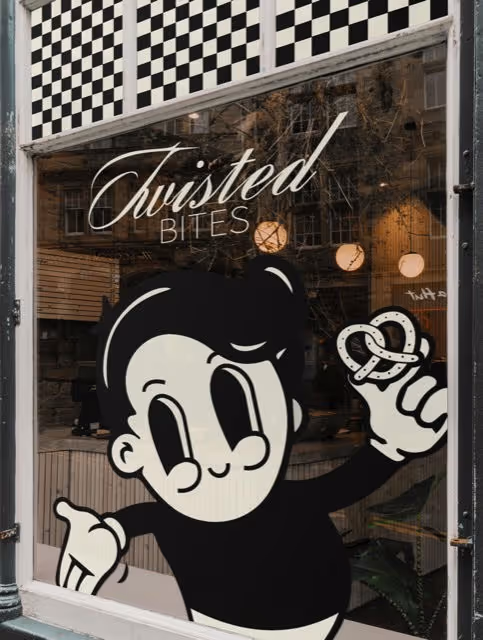
I developed a memorable and striking visual style for a pretzel bakery. The main design element is a black and white checkered pattern, which I applied on the package and envisioned for the window display. This pattern creates a strong visual identity for the brand. I also created a friendly cartoon character holding pretzels. This mascot is placed on the package and in the window display design, making the brand more appealing and memorable. The Twisted Bites logo is in stylish italics, giving it a personalized look. The packaging also features the founding year, "EST. 2025".
Bakery
Dark Mode, Minimal / Monochrome
Merchandise
Packaging Design
Label Design
Poster & Print
Food & Beverage
Retail


Brand for Sale
Oryn is a modern skincare brand that aims for simplicity, being gentle on your skin and in environment too.
Beauty & Health
Minimal / Monochrome, Pastel
Packaging Design
Label Design
Poster & Print
Social Media Kit
Beauty & Skincare


Brand for Sale
The Grid, is a modern tennis club for players who love the game and the energy that comes with it. It’s the perfect place to train, compete and connect.
Sport
Bold Colors, Earthy Tones
Business Cards
Poster & Print
Website Design
Stationery
Sports


Brand for Sale
At Mad Mayo, eating is a celebration, not a checklist. No calorie counts. No regrets. Just endless bites, messy hands, and for people who eats like it's their last day on Earth.
Restaurant
Bold Colors, Warm Tones
Packaging Design
Poster & Print
Stationery
Food & Beverage

Brand for Sale
Go Bananas! Handmade banana bread, baked to golden perfection. Brand design by: @johnfer.design
Food & Beverage
Bold Colors, Warm Tones
Packaging Design
Poster & Print
Social Media Kit
Merchandise
Food & Beverage

Brand for Sale
Ciao! is a pasta to-go spot made for cravings. It’s fast, hot, a little messy, and always good, perfect for those on the move or not in the mood to cook.
Restaurant
Bold Colors, Warm Tones
Packaging Design
Label Design
Merchandise
Business Cards
Food & Beverage

Brand for Sale
Silvra is a branding concept for a premium Icelandic vodka born from ice and stone. The identity blends a modular grid, minimalist typography, and 3D packaging to express purity, elegance, and the quiet strength of nature through minimal forms.
Beverage
Cool Tones, Minimal / Monochrome
Packaging Design
Poster & Print
Merchandise
Website Design
Food & Beverage


Brand for Sale
Aam & Co is a luxury mango brand blending Bengali heritage with bold design. With rich visuals, refined packaging, and artisanal flair, it redefines fruit as a premium experience. Ripe for gifting, indulgence, and sun-soaked sophistication.
Food & Beverage
Bold Colors, Warm Tones
Packaging Design
Label Design
Poster & Print
Merchandise
Food & Beverage


Brand for Sale
(✯ᴗ✯) A retro-inspired laundromat offering a nostalgic twist on modern convenience.
Business
Bold Colors, Neon / Vibrant
Packaging Design
Poster & Print
Merchandise
Home & Lifestyle


Brand for Sale
Branding isn’t just a logo — it’s a mood, a memory, a connection. This is OVARA — Where scent becomes ritual, and every detail whispers calm. ⟡ Candles, oils & diffusers crafted for modern stillness. Create a vibe your clients will never forget. → DM me.
Candles
Warm Tones, Earthy Tones
Label Design
Packaging Design
Merchandise
Business Cards
Beauty & Skincare
Brand for Sale
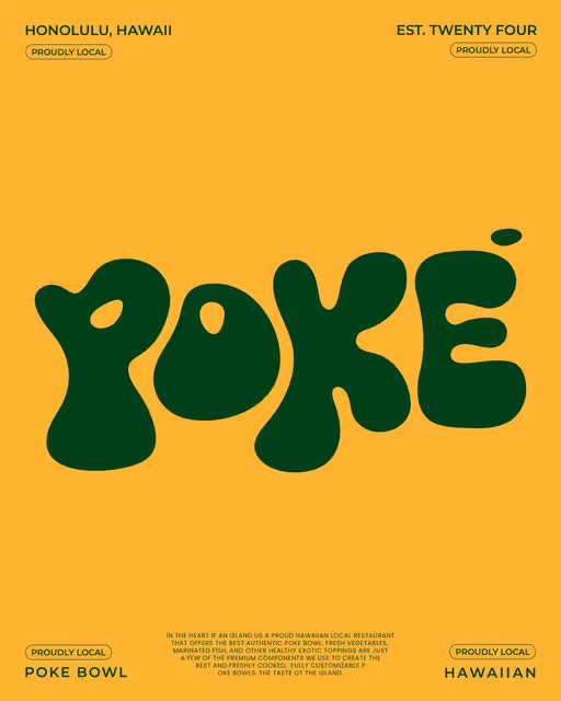
POKÉ by @johnfer.design - Introducing POKÉ: Hawaiian Restaurant that offers the best authentic poké bowl. It embodies the true definition of the ‘Taste of the Island’!
Restaurant
Earthy Tones, Bold Colors
Packaging Design
Label Design
Poster & Print
Business Cards
Food & Beverage


Brand for Sale
Revair is a hair oil brand focused on restoring strength, shine, and growth from the root up. The name blends 'revive' and 'hair', reflecting its mission: to nourish the scalp, support hair growth and bring tired strands back to life.
Beauty & Health
Earthy Tones, Minimal / Monochrome
Packaging Design
Poster & Print
Merchandise
Business Cards
Beauty & Skincare


Brand for Sale
The design for “DORADO” coffee branding takes inspiration from the legend of El Dorado, using a rich color palette of deep blue and gold. The visuals incorporate elegant typography and symbolic elements, such as a stylized golden artifact, evoking Colombian heritage and premium quality. The packaging and merchandise, including coffee bags, mugs, and shipping boxes, maintain a cohesive aesthetic with decorative patterns and sunburst motifs, reinforcing the luxurious and artisanal appeal of the brand.
Coffee
Bold Colors, Dark Mode
Merchandise
Packaging Design
Poster & Print
Business Cards
Food & Beverage
Retail

Brand for Sale
We’re excited to finally share one of our latest creations: LOST SOCIETY. A bold streetwear project we crafted with vibrant energy and a unique vision.Proudly made by Creavora Studio and this is just the beginning.
Fashion
Earthy Tones, Warm Tones
Merchandise
Poster & Print
Fashion & Apparel


Brand for Sale
Bearable is a low-sugar gummy bear brand made with real fruit juice and natural ingredients. It's all about vibrant fruit flavor, joy, and fun. A playful treat that feels just right.
Sweets
Bold Colors, Pastel
Packaging Design
Food & Beverage


Brand for Sale
🍋Citrus Brand Identity - Citrus is a plant-based bowl restaurant concept born from the founders’ mission to make healthy eating simple, satisfying, and accessible for busy urban lifestyles. The brand was designed to reflect their core philosophy: food isn’t just fuel—it’s an act of self-care.
The branding draws inspiration from nature’s vibrant palette, with earthy greens and warm citrus tones representing freshness and vitality. The typography is modern yet approachable, reinforcing the brand's mission to create a sense of trust and community. From logo design to visual storytelling, the identity focuses on making the brand feel fresh, wholesome, and grounded.
Citrus is not just about eating; it’s about celebrating wellness through food. This branding project captures the founders’ vision of creating a community around nourishment, care, and quality.
Restaurant
Bold Colors, Warm Tones
Poster & Print
Packaging Design
Merchandise
Label Design
Food & Beverage
Wellness & Health


Brand for Sale
Whether with or without alcohol, beer is synonymous with conviviality and can be enjoyed on any occasion. Zero embodies the very essence of beer: festive and joyful. Its identity and communication convey a clear message: an explosion of flavors without a drop of alcohol.
Zero, a simple and universal word, allowed us to play with the letters to create a logo with random, rounded shapes that reflect the brand's playful and relaxed spirit. With a visual identity that doesn't take itself too seriously, Zero offers fun and festive products. We chose a flashy pink as the brand color to stand out distinctly from the competition. Whether on tap in bars or in supermarkets, this beer is designed to be instantly recognizable.
Beverage
Bold Colors, Dark Mode
Packaging Design
Poster & Print
Merchandise
Stationery
Food & Beverage


Brand for Sale
OPTICORP (Optimize Corporation) is a team of digital reputation management experts specializing in assisting individuals and businesses in the management and enhancement of their online reputation. They provide services related to cyber intelligence, design and branding, as well as website development.
My goal was to develop an identity that highlights a comprehensive analytical approach for clients looking to optimize their brand's online presence. From development strategy to the look of the website and social media of the business.
Technology
Cool Tones, Dark Mode
Poster & Print
Business Cards
Merchandise
Social Media Kit
Tech & AI

Brand for Sale
A creative direction balancing minimalist elegance and organic softness — raw textures, soft light, bold type. Like couture, the frosted glass bottle is made to be kept and displayed.
Product
Earthy Tones, Minimal / Monochrome
Packaging Design
Label Design
Merchandise
Poster & Print
Beauty & Skincare

Branding for a matcha brand
Beverage
Earthy Tones, Minimal / Monochrome
Packaging Design
Poster & Print
Label Design
Merchandise
Food & Beverage


Brand for Sale
Stamina, a restaurant that offers dishes adapted to athletes' diets. It's aimed at those who don't have time to cook before or after their sports session. It's all about maintaining their quality of life. So a physical location, a delivery service, adapted, local recipes using seasonal produce, a business plan and an entire financing plan have been put in place.
Restaurant
Bold Colors, Pastel
Packaging Design
Merchandise
Poster & Print
Label Design
Food & Beverage
Wellness & Health

Brand for Sale
(✯ᴗ✯)My proposal for this special and beautiful brand. Charming, nostalgic, warm, rustic, and emotional.
Brief: Echo Canyon Ranch is an eco-friendly retreat that fosters a deep connection between people, animals, and nature – with commitment to regenerative farming, conservation, and animal
Health
Bold Colors, Warm Tones
Label Design
Merchandise
Poster & Print
Packaging Design
Home & Lifestyle


Brand for Sale
Ciao! is a bold takeaway pasta brand built around an iconic red box. Fast, fresh, and full of flavor, it combines playful visuals with punchy design — from packaging to signage — for a crave-worthy, on-the-go experience.
Restaurant
Bold Colors, Warm Tones
Packaging Design
Poster & Print
Merchandise
Food & Beverage

Brand for Sale
A brand design concept focused on elevating mixology culture. Unfolds through a fresh and subtle vintage aesthetic that energizes both digital and physical experiences, including a carefully crafted webdesign concept.
Beverage
Earthy Tones, Cool Tones
Packaging Design
Poster & Print
Label Design
Business Cards
Food & Beverage


Brand for Sale
Rooted in the power of herbs, Botanica Drinks uses only organic, sustainably sourced ingredients to create unique, aromatic spirits that are pure and natural. Free from artificial additives, each sip is a celebration of nature’s goodness and the art of distillation.
Whether you’re enjoying a simple sip or crafting the perfect cocktail, Botanica Drinks offers an experience that is naturally delicious.
Food & Beverage
Earthy Tones, Minimal / Monochrome
Label Design
Business Cards
Food & Beverage


Brand for Sale
Brunch Out is a fictional brand identity capturing the cozy freedom of outdoor brunching. Two illustrated characters in the sun — scarf blowing, sunglasses on — set the vibe: fresh bites, good vibes, open skies.
Food & Beverage
Earthy Tones, Minimal / Monochrome
Business Cards
Poster & Print
Stationery
Food & Beverage