Brand Identity Showcase
Nominees
Thank you! Your submission has been received!
Oops! Something went wrong while submitting the form.
Showing you 0 of 0 Nominees


Brand for Sale
Sunday Script is a UK-based copywriting studio that champions clarity with charisma. Built around the phrase “Ink. Pause. Repeat.”, this brand identity treats punctuation like poetry and ideas like rituals.
The design system pays homage to the desk drawer—from notepads and filing folders to typewriter ribbons and rubber-stamp marks—capturing the slow, deliberate rhythm of great writing. The typographic treatment contrasts the sharpness of editorial serifs with the blunt honesty of bold sans, while the symbol (an expressive eight-point burst) stands for a thought that’s just hit the page.
Every brand touchpoint—from business cards to letterheads to merchandise—is designed with reverence for the pause: the breath before the next sentence, the space between draft and delivery.
Project Credits
Designer & Art Director: Harsh Vardhan
Concept developed for Brief Club’s Challenge 208: Sunday Script
Business
Bold Colors, Warm Tones
Business Cards
Packaging Design
Poster & Print
Stationery
Home & Lifestyle
Retail


Brand for Sale
Brine blends the raw essence of the ocean with urban edge. Think fresh catches, smoky grills, and a moody, salt-air aesthetic. This isn’t your classic seafood joint — Brine is sleek, minimal, and just a little wild. Every plate tells a story of flavor, freshness, and fire.
The word “BRINE” uses a bold, condensed sans-serif typeface with strong vertical strokes. This gives the logo impact, modernity, and a bold urban edge. The tight letter spacing and condensed form create tension and visual strength, perfect for a brand that wants to stand out.
In contrast, the curved “seafood restaurant” in a thin, delicate type softens the composition with a sense of movement — reminiscent of waves or sea currents. This adds an organic, artisanal feel to the design.
The color palette is minimal but meaningful:
Deep blue (background): represents the ocean, depth, and freshness.
White (text): provides strong contrast, clarity, and cleanliness.
Burnt orange (illustrations): evokes heat, grilling, and bold flavors — visually striking and symbolically rich. The orange against blue creates an eye-catching focal point that draws immediate attention.
The illustrations use a vintage engraving style, full of texture and detail. This raw, handmade aesthetic aligns perfectly with the brand keywords — especially “elemental,” “authentic,” and “non-traditional.”
The way the illustrations interact with the word “BRINE” is a bold visual decision — they merge illustration and typography, reinforcing the concept of blending the raw ocean essence with an urban aesthetic.
Restaurant
Bold Colors, Cool Tones
Business Cards
Merchandise
Packaging Design
Poster & Print
Food & Beverage

Brand for Sale
Baya Baya: Dive into the vibrant taste of the tropics! It's not just a bowl, it's a whole mood.
Food & Beverage
Bold Colors, Earthy Tones
Label Design
Packaging Design
Poster & Print
Merchandise
Food & Beverage

Brand for Sale
Solaris is a Solar energy company which switched from petroleum to Solar energy industry and they needed a new Visual Identity
Technology
Cool Tones, Minimal / Monochrome
Business Cards
Poster & Print
Packaging Design
Stationery
Tech & AI


Brand for Sale
Based in London and Essex, Rhyme Room is a live music event company dedicated to empowering emerging artists by sharing their work on stage and build their performance credentials. They host regular events that showcase across hip-hop, soul and acoustic styles, allowing performers to refine their craft and explore new creative directions.
To reflect their vision of guiding artists toward G.O.A.T. status, Rhyme Room required a bold, energetic identity. The vibrant red evokes passion, confidence and excitement, while the stylised goat head symbolises strength, ambition and ultimate achievement. Finally, the enclosing oval frame conveys unity and focus, keeping artists at the heart of a supportive community. For maximum flexibility, the mark also works comfortably in night black or off white, ensuring it stands out wherever it appears.
Event
Bold Colors, Cool Tones
Packaging Design
Poster & Print
Merchandise
Stationery
Entertainment
Events & Festivals


Brand for Sale
JAM Hip Hop Festival surge de la transformación de un festival previo, creado en 2015 en las afueras de Valencia. El evento celebra la unión de arte urbano, danza, música y calistenia, defendiendo los valores clave del movimiento hip hop: creatividad, expresión, respeto y unidad.
Con la intención de consolidarse internacionalmente, el primer paso fue renombrar el festival, simplificando “Godejam” a “JAM”. Este cambio unifica la marca a lo largo de las distintas ediciones, donde la ubicación se añade como una etiqueta personalizada creada por uno de los artistas, reflejando la esencia creativa y expresiva del festival.
El diseño del logo se inspira en técnicas clásicas del graffiti de los años 70 y 80, como sprays, plantillas y tags, capturando la autenticidad del hip hop. La tipografía Rainer Bold aporta fuerza y presencia, creando contraste con los elementos gráficos orgánicos que representan la expresión.
La paleta cromática neutra de la marca permite resaltar los colores vivos que cambian en cada edición, definiendo la identidad visual única de cada festival y sus murales colectivos. Además, se desarrollaron plantillas para redes sociales y materiales promocionales offline, asegurando coherencia visual en todas las plataformas y soportes.
El lema del festival, inspirado en un rap creado en la última edición, resume sus valores esenciales: comunidad, unidad, expresión y respeto — “We are Hip, We are Hop, We are Rap, We are JAM.”
Festival
Cool Tones, Earthy Tones
Merchandise
Poster & Print
Label Design
Social Media Kit
Events & Festivals
Entertainment


Brand for Sale
Visual identity for Daily Yolk, a modern all-day breakfast spot. The yolk mascot brings a calm, playful tone, using its egg white as a blanket and just chilling on toast. Bold black, white, and yellow tones meet playful, hand-drawn lines for a light and relaxed vibe.
Food & Beverage
Bold Colors, Warm Tones
Poster & Print
Stationery
Packaging Design
Food & Beverage

Brand for Sale
Passion project for Street Quack, a playful café concept with a skateshop vibe. Built around a laid-back duck mascot that inspired the brand direction. A fun and bold identity for a spot that feels both cool and welcoming.
Coffee
Cool Tones, Minimal / Monochrome
Merchandise
Packaging Design
Poster & Print
Food & Beverage
Retail


Brand for Sale
Asana ~ a yoga studio that’s all about mindfulness, balance, and feeling good in your body and mind✨🧘♀️
Sport
Earthy Tones, Minimal / Monochrome
Business Cards
Merchandise
Poster & Print
Stationery
Wellness & Health

Brand for Sale
TIDE is a sustainable swimwear brand inspired by the sun, sea, and laid-back beach culture. It’s looking for a breezy visual identity, modern packaging, and bold social content that captures its carefree, conscious, and coastal spirit.
Fashion
Earthy Tones, Dark Mode
Business Cards
Packaging Design
Poster & Print
Fashion & Apparel


Brand for Sale
Dolce is a vegan Italian baked goods brand with a bold, effortless vibe. Inspired by the Luperca sculpture of Romulus and Remus, the identity blends heritage with edge. Quietly confident, unapologetic, and rooted in authentic Italian tradition.
Bakery
Earthy Tones, Minimal / Monochrome
Packaging Design
Poster & Print
Label Design
Merchandise
Food & Beverage

Brand for Sale
La fundadora de Serendipia llegó con una idea clara, pero sin una identidad visual que reflejara su esencia. Juntas, trabajamos en construir los cimientos de la marca: definimos su propósito, valores y personalidad, y creamos una narrativa coherente que guiara todo el desarrollo visual.
A partir de este enfoque estratégico, diseñé un sistema gráfico basado en formas orgánicas inspiradas en lo artesanal y en su contexto geográfico. La identidad transmite calma, conexión y bienestar, alineándose con la misión de Serendipia: ser un espacio creativo que invita al autocuidado y la expresión personal.
El universo visual se apoya en una paleta cálida y en ilustraciones espontáneas y simples, reforzando el tono reconfortante y cercano de la marca.
Manufacturer
Earthy Tones, Minimal / Monochrome
Packaging Design
Poster & Print
Merchandise
Stationery
Home & Lifestyle
Wellness & Health


Brand for Sale
CA-WOW offers real dairy milk that’s 100% lactose-free, making it ideal for those who are lactose intolerant. Enjoy the rich taste of milk without the discomfort. Their product line includes a 330ml and a 1L option. Your dairy cravings sorted!
Food & Beverage
Earthy Tones, Minimal / Monochrome
Label Design
Merchandise
Packaging Design
Poster & Print
Food & Beverage


Brand for Sale
PLATELY is a satirical-meets-functional meal kit brand designed for those everyday emergencies — when life gets chaotic and cooking feels like a crisis. With a bold visual identity, tongue-in-cheek copywriting, and editorial-style presentation, PLATELY reinvents convenience food through the lens of fashion, humor, and design.
Food & Beverage
Bold Colors, Dark Mode
Business Cards
Poster & Print
Packaging Design
Merchandise
Food & Beverage
Fashion & Apparel

Brand for Sale
Plately is a meal kit subscription service for people who want to eat well without the stress. It brings fresh ingredients and easy recipes straight to your door, so you can throw together something good any day of the week.
Food & Beverage
Bold Colors, Neon / Vibrant
Packaging Design
Food & Beverage


Brand for Sale
GO BANANAS! Banana bread 🍌 🍞
A shop that only sells delicious banana bread, run by its owner Frankie✨(☆▽☆)
This is my somewhat unconventional design proposal for a bread brand. I hope you enjoy this as much as I did ( ꈍᴗꈍ)
Food & Beverage
Bold Colors, Warm Tones
Packaging Design
Merchandise
Poster & Print
Food & Beverage


Brand for Sale
This is PITH, a fruit delivery service. PITH is redefining the fruit industry with its quirky branding and relatability. That’s reFRESHing!
Delivery Service
Bold Colors, Warm Tones
Label Design
Merchandise
Packaging Design
Poster & Print
Food & Beverage

Brand for Sale
Branding project for a coffee shop / bookstore designed for Monday-haters and slow starters.
A cozy spot where caffeine meets procrastination — with a twist of humor.
We created a bold, fun, and minimal visual identity that captures the spirit of lazy mornings and the joy of doing things at your own pace.
Modern illustration, playful details, and a laid-back vibe all around.
Because not every Monday has to suck.
Coffee, Books
Minimal / Monochrome, Earthy Tones
Poster & Print
Packaging Design
Merchandise
Label Design
Food & Beverage
Brand for Sale
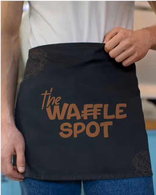
Bringing The Waffle Spot to Life
From logo to colors, typography to textures – every detail in this brand identity reflects the warmth, indulgence, and joy of the perfect waffle experience. A blend of crispy edges, fluffy centers, and cozy brunch vibes 🧇☕💛
This project was all about crafting a brand that feels as good as it tastes! 🍓
Food & Beverage
Dark Mode, Earthy Tones
Merchandise
Packaging Design
Poster & Print
Label Design
Food & Beverage


Brand for Sale
Sliced is a Quick Service Restaurant (QSR) created to serve bold flavors and fast solutions for today's busy lifestyles. The brand brings a unique twist to traditional pizza by offering customers the freedom to enjoy just a single slice or indulge in a full pie – all freshly made and bursting with Indian and Italian-inspired flavors.
Whether you're on a short break, rushing between meetings, or just not in the mood for an entire pizza, Sliced makes it easy to grab what you need, when you need it. The menu celebrates the best of two rich culinary cultures Italy's classic cheesy goodness meets India's bold, spicy zest.
-
With speed, taste, and flexibility at its core, Sliced is all about serving convenient cravings without compromise - because good pizza shouldn't make you wait.
Restaurant
Bold Colors, Warm Tones
Poster & Print
Packaging Design
Merchandise
Label Design
Food & Beverage

Brand for Sale
CIAO! is a bold new take on fast-casual pasta—an identity built to disrupt tradition and resonate with a young, urban, no-filter generation. This is pasta for the TikTok age: messy, loud, and shareable. My goal was to create a visual and verbal identity that matched the energy of the product: fast, craveable comfort food that doesn't take itself too seriously.
Most pasta brands lean into heritage, rustic charm, and family tradition.
CIAO! needed the opposite. How to make pasta relevant for a youthful audience constantly bombarded with content and craving authenticity—with no patience for cliché or polish?
Hospitality
Bold Colors, Dark Mode
Packaging Design
Poster & Print
Merchandise
Business Cards
Food & Beverage


Brand for Sale
Plately. We bring the chef. You bring the appetite.
Branding, merch, advertising, packaging and app design.
If you want your brand to stand out like this little chef, I’m here for you 🙌🏼
Hospitality
Bold Colors, Warm Tones
Merchandise
Packaging Design
Poster & Print
Label Design
Food & Beverage

Brand for Sale
Hello! (◠‿◕)A brewery brand that focuses on camaraderie, friendship, and the enjoyment of beer among friends.
Beverage
Bold Colors, Warm Tones
Packaging Design
Label Design
Merchandise
Food & Beverage

Brand for Sale
'Goodness packed in a kit'---Introducing PLATELY, a healthy meal kit subscription service!
This brand conveys the experience of a seamless, hassle-free meal kit subscription service. The logo features a bold, modern design with a slight tilt in the typeface, reflecting speed and efficiency in its service.
Brand design by: @johnfer.design
Hospitality
Cool Tones, Earthy Tones
Packaging Design
Poster & Print
Merchandise
Label Design
Food & Beverage

Branding for a breakfast club
Restaurant
Bold Colors, Warm Tones
Poster & Print
Packaging Design
Merchandise
Business Cards
Food & Beverage

Brand for Sale
I had the absolute joy of creating the logo for SUGAR BUTT, a brand-new sweet pie project coming out of West Yorkshire.
The brief was all about playful confidence: something fun, bold, and memorable! I had so much fun working on this one, especially creating the mascot. Hope everyone loves that little bear as much as I do! 🐻
mockups by @scenenumber.mockup
typeface: Roger
Sweets
Warm Tones, Bold Colors
Merchandise
Packaging Design
Poster & Print
Label Design
Food & Beverage

Brand for Sale
Daily Yolk: 'Serving slow mornings Right!'
The core theme of this brand revolves around the concept of "serving", which is visually represented in the logomark. by @johnfer.design
Restaurant
Bold Colors, Cool Tones
Poster & Print
Social Media Kit
Website Design
Merchandise
Food & Beverage


Brand for Sale
Clara Aurora is a contemporary jewelry brand that brings elegance and innovation together in every piece. Specializing in modern designs, Clara Aurora offers a wide selection of handcrafted jewelry that reflects both timeless sophistication and follows the current trends. Each creation is made with high-quality materials, ensuring lasting beauty and exceptional craftsmanship.
Jewelry
Earthy Tones, Minimal / Monochrome
Business Cards
Packaging Design
Poster & Print
Stationery
Fashion & Apparel


Brand for Sale
El Toro is and authentic Mexican restaurant, where the funny and funky vibes meets the traditional cuisine. El Toro has a spicy, unapologetic and fun personality, just like it's dishes and is designed to be funny, vibrant and to always keep you coming back for more.
Restaurant
Bold Colors, Warm Tones
Packaging Design
Poster & Print
Label Design
Merchandise
Food & Beverage

Brand for Sale
Daily Yolk is a modern and trendy breakfast club designed to deliver good vibes and that unforgettable first bite feeling. The branding captures a balance of cozy warmth and playful energy, creating a visual identity that feels both inviting and contemporary. With its vibrant style and welcoming tone, Daily Yolk stands out as the perfect morning escape for breakfast lovers.
Restaurant
Warm Tones, Dark Mode
Packaging Design
Merchandise
Poster & Print
Business Cards
Food & Beverage


Brand for Sale
"Celium provides affordable access to high-performance GPUs through a platform that empowers and inspires action. Its evolving visual identity reflects a decentralized ecosystem that inspires creativity and progress." I would love for you guys to see & use the videos for this brand as it really brings it to life!
Technology
Dark Mode, Cool Tones
Interface Design
Website Design
Poster & Print
Social Media Kit
Tech & AI


Brand for Sale
Introducing Meadow, an alcohol-free digestif made with organic herbs and absolutely zero nasties! I wanted the design to feel bold yet refined, clean, minimal, and elegant. The simplicity of the ingredient list inspired a stripped-back visual identity. The result is a look that reflects the purity of the product while still feeling confident and contemporary.
Beverage
Bold Colors, Earthy Tones
Poster & Print
Packaging Design
Label Design
Merchandise
Food & Beverage


Brand for Sale
In the misty hills of Uji in Japan, Haruki, a third-generation tea artisan, sought to preserve the purity of true Japanese matcha. As mass production diluted its authenticity, he founded Kiyo Matcha. Using time-honored methods, Kiyo Matcha’s leaves are hand-picked, stone-ground, and free from additives, ensuring vibrant color and rich umami. More than a brand, Kiyo Matcha is a tribute to tradition and a promise of authenticity, inviting you to slow down and savor matcha as it was meant to be.
Tea
Earthy Tones, Dark Mode
Packaging Design
Poster & Print
Label Design
Merchandise
Food & Beverage


Brand for Sale
Go Bananas! is a banana bread brand built on joy, warmth, and simplicity. It turns everyday comfort into a bold, colorful experience with fresh loaves baked daily and a visual identity that’s playful yet modern. The design features vibrant colors, and confident type. Every detail, from packaging to posters, is made to spark smiles and invite feel-good moments. This project covers the full identity: logo, tone of voice, packaging, and digital — all baked with love
Bakery
Bold Colors, Dark Mode
Label Design
Merchandise
Packaging Design
Poster & Print
Food & Beverage

Brand for Sale
Daily Yolk is a brunch brand built around the joy of slow mornings, golden eggs, and cozy corners. It’s a place where brunch isn’t just a meal - it’s a mood. From sunny-side eggs to playful taglines, the brand marches to the beat of brunch with warmth, charm, and an all-day invitation to linger a little longer. The identity blends bold type with soft edges, a warm color palette, and playful line illustrations like the signature "egg parade" characters. I wanted the visuals to feel sunny, nostalgic, and a little cheeky. Just like a perfect brunch with friends.
Restaurant
Earthy Tones, Warm Tones
Packaging Design
Merchandise
Poster & Print
Business Cards
Food & Beverage


Brand for Sale
Mamasala is an Indian fast good restaurant that breaks the rules. Recipes validated by the street including crispy samosas and spicy naans and the boss's signature Tikka Masala !
Restaurant
Bold Colors, Warm Tones
Packaging Design
Poster & Print
Label Design
Merchandise
Food & Beverage