Best Brand Designs and winner of the Brand of the Day Awards
Brand of the day
Thank you! Your submission has been received!
Oops! Something went wrong while submitting the form.
Showing 0 results out of 0 Brands of the Day.


Bold Colors, Warm Tones
Sunday Script is a UK-based copywriting studio that champions clarity with charisma. Built around the phrase “Ink. Pause. Repeat.”, this brand identity treats punctuation like poetry and ideas like rituals.
The design system pays homage to the desk drawer—from notepads and filing folders to typewriter ribbons and rubber-stamp marks—capturing the slow, deliberate rhythm of great writing. The typographic treatment contrasts the sharpness of editorial serifs with the blunt honesty of bold sans, while the symbol (an expressive eight-point burst) stands for a thought that’s just hit the page.
Every brand touchpoint—from business cards to letterheads to merchandise—is designed with reverence for the pause: the breath before the next sentence, the space between draft and delivery.
Project Credits
Designer & Art Director: Harsh Vardhan
Concept developed for Brief Club’s Challenge 208: Sunday Script
Business
July 25, 2025
Home & Lifestyle
Retail
Business Cards
Packaging Design
Poster & Print
Stationery


Earthy Tones, Cool Tones
WILD TRAIL is a visual identity shaped by the quiet charm of slow hiking and soft adventure. The design process leaned into analogue nostalgia—grainy textures, flash-burnt photography, handwritten journal entries, and lo-fi layouts—to echo the unfiltered, offline feel of being on the trail. Every element—from the matchbox to the trail journal—was crafted to feel like something you’d find stuffed at the bottom of a backpack. This isn’t high-performance gear culture—it’s thoughtful, slightly muddy, and full of soul.
Lifestyle & Outdoor
July 24, 2025
Home & Lifestyle
Poster & Print
Merchandise
Stationery
Packaging Design


Minimal / Monochrome, Earthy Tones
Gaze is a premium sunglasses brand tailored for the modern corporate lifestyle. Merging fashion with function, the brand offers sleek, sophisticated eyewear that complements business attire. For their identity, the goal was to show the balance between professional and trendy, which is why the logotype uses customized lowercase ‘a’ and ‘e’ to add a modern, stylish touch while keeping a clean and refined look.
Fashion Brand Identity
July 23, 2025
Fashion & Apparel
Poster & Print
Social Media Kit
Packaging Design
Merchandise

Bold Colors, Cool Tones
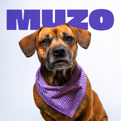
Muzo is a personal project born from the desire to combine design, craftsmanship, and upcycling. My goal was to create dog bandanas with modern, vibrant patterns, hand-printed using the screen-printing technique. Each piece is made from repurposed fabrics, giving a second life to existing materials.
Pet
July 22, 2025
Fashion & Apparel
Merchandise
Label Design
Packaging Design
Poster & Print

Dark Mode, Minimal / Monochrome
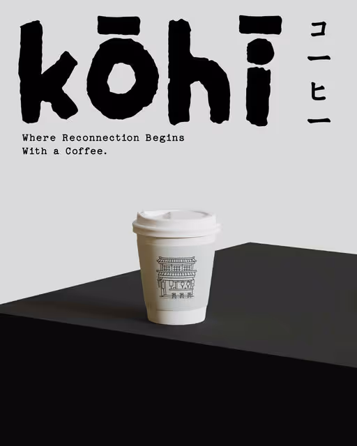
Kōhī: Slow Coffee Bar- Where Reconnection Begins With a Coffee.☕
Coffee
July 21, 2025
Food & Beverage
Hospitality
Packaging Design
Merchandise
Poster & Print
Business Cards

Pastel, Minimal / Monochrome
Branding for Milk Lab coffee shop
Coffee Brand Identity
July 20, 2025
Food & Beverage
Retail
Packaging Design
Poster & Print
Merchandise
Label Design

Cool Tones, Minimal / Monochrome
As part of the Design Brief Challenge, I developed a fictional branding project for Friteur, a Belgian takeaway fries shop. The goal was to create a full visual identity within one week, blending tradition with a modern twist to reflect the essence of a local, authentic food spot. The aim was to design a full brand identity, including a logo inspired by Belgian craft and heritage, a clean, well-structured menu, and a graphic universe rooted in the retro visuals of traditional fry shops.
Take Away
July 19, 2025
Food & Beverage
Packaging Design
Poster & Print
Merchandise
Label Design


Cool Tones, Minimal / Monochrome
Passion project for Street Quack, a playful café concept with a skateshop vibe. Built around a laid-back duck mascot that inspired the brand direction. A fun and bold identity for a spot that feels both cool and welcoming.
Coffee
July 18, 2025
Food & Beverage
Retail
Merchandise
Packaging Design
Poster & Print

Earthy Tones, Cool Tones
Palmira is a boutique beach resort made for slow days and salty air. It's a place for laid-back travelers hidden between palm trees and the sea to reset and feel the warmth of the coast, with open-air cabanas, relaxed rooms, and more.
Resort
July 17, 2025
Hospitality
Business Cards
Poster & Print
Social Media Kit
Stationery

Bold Colors, Cool Tones
Brine blends the raw essence of the ocean with urban edge. Think fresh catches, smoky grills, and a moody, salt-air aesthetic. This isn’t your classic seafood joint — Brine is sleek, minimal, and just a little wild. Every plate tells a story of flavor, freshness, and fire.
The word “BRINE” uses a bold, condensed sans-serif typeface with strong vertical strokes. This gives the logo impact, modernity, and a bold urban edge. The tight letter spacing and condensed form create tension and visual strength, perfect for a brand that wants to stand out.
In contrast, the curved “seafood restaurant” in a thin, delicate type softens the composition with a sense of movement — reminiscent of waves or sea currents. This adds an organic, artisanal feel to the design.
The color palette is minimal but meaningful:
Deep blue (background): represents the ocean, depth, and freshness.
White (text): provides strong contrast, clarity, and cleanliness.
Burnt orange (illustrations): evokes heat, grilling, and bold flavors — visually striking and symbolically rich. The orange against blue creates an eye-catching focal point that draws immediate attention.
The illustrations use a vintage engraving style, full of texture and detail. This raw, handmade aesthetic aligns perfectly with the brand keywords — especially “elemental,” “authentic,” and “non-traditional.”
The way the illustrations interact with the word “BRINE” is a bold visual decision — they merge illustration and typography, reinforcing the concept of blending the raw ocean essence with an urban aesthetic.
Restaurant
July 16, 2025
Food & Beverage
Business Cards
Merchandise
Packaging Design
Poster & Print


Earthy Tones, Minimal / Monochrome
CA-WOW offers real dairy milk that’s 100% lactose-free, making it ideal for those who are lactose intolerant. Enjoy the rich taste of milk without the discomfort. Their product line includes a 330ml and a 1L option. Your dairy cravings sorted!
Food & Beverage
July 15, 2025
Food & Beverage
Label Design
Merchandise
Packaging Design
Poster & Print


Earthy Tones, Minimal / Monochrome
Dolce is a vegan Italian baked goods brand with a bold, effortless vibe. Inspired by the Luperca sculpture of Romulus and Remus, the identity blends heritage with edge. Quietly confident, unapologetic, and rooted in authentic Italian tradition.
Bakery
July 14, 2025
Food & Beverage
Packaging Design
Poster & Print
Label Design
Merchandise

Bold Colors, Dark Mode
CIAO! is a bold new take on fast-casual pasta—an identity built to disrupt tradition and resonate with a young, urban, no-filter generation. This is pasta for the TikTok age: messy, loud, and shareable. My goal was to create a visual and verbal identity that matched the energy of the product: fast, craveable comfort food that doesn't take itself too seriously.
Most pasta brands lean into heritage, rustic charm, and family tradition.
CIAO! needed the opposite. How to make pasta relevant for a youthful audience constantly bombarded with content and craving authenticity—with no patience for cliché or polish?
Hospitality
July 13, 2025
Food & Beverage
Packaging Design
Poster & Print
Merchandise
Business Cards

Bold Colors, Warm Tones
Branding for a breakfast club
Restaurant
July 12, 2025
Food & Beverage
Poster & Print
Packaging Design
Merchandise
Business Cards


Earthy Tones, Dark Mode
In the misty hills of Uji in Japan, Haruki, a third-generation tea artisan, sought to preserve the purity of true Japanese matcha. As mass production diluted its authenticity, he founded Kiyo Matcha. Using time-honored methods, Kiyo Matcha’s leaves are hand-picked, stone-ground, and free from additives, ensuring vibrant color and rich umami. More than a brand, Kiyo Matcha is a tribute to tradition and a promise of authenticity, inviting you to slow down and savor matcha as it was meant to be.
Tea
July 11, 2025
Food & Beverage
Packaging Design
Poster & Print
Label Design
Merchandise
Dark Mode, Minimal / Monochrome
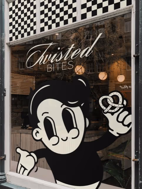
I developed a memorable and striking visual style for a pretzel bakery. The main design element is a black and white checkered pattern, which I applied on the package and envisioned for the window display. This pattern creates a strong visual identity for the brand. I also created a friendly cartoon character holding pretzels. This mascot is placed on the package and in the window display design, making the brand more appealing and memorable. The Twisted Bites logo is in stylish italics, giving it a personalized look. The packaging also features the founding year, "EST. 2025".
Bakery
July 10, 2025
Food & Beverage
Retail
Merchandise
Packaging Design
Label Design
Poster & Print


Dark Mode
Bruno’s Bakery – born out of sheer passion for home-baked bread and pastries. The visual identity of Bruno’s Bakery is all about this tangible, authentic look and feel. Inspired by the simple joy of good bread, this identity captures the charm of a neighborhood bakery that’s run by people who love what they do and want to share it with their local community.
Bakery
July 9, 2025
Food & Beverage
Business Cards
Social Media Kit


Bold Colors, Warm Tones
Nôm, a Vietnamese restaurant where tradition meets modern flavor, whether you’re stopping by for a quick bite or a laid-back meal.
Restaurant
July 8, 2025
Food & Beverage
Poster & Print
Merchandise
Packaging Design
Business Cards
Dark Mode, Earthy Tones
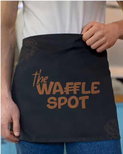
Bringing The Waffle Spot to Life
From logo to colors, typography to textures – every detail in this brand identity reflects the warmth, indulgence, and joy of the perfect waffle experience. A blend of crispy edges, fluffy centers, and cozy brunch vibes 🧇☕💛
This project was all about crafting a brand that feels as good as it tastes! 🍓
Food & Beverage
July 7, 2025
Food & Beverage
Merchandise
Packaging Design
Poster & Print
Label Design

Minimal / Monochrome, Earthy Tones
Branding project for a coffee shop / bookstore designed for Monday-haters and slow starters.
A cozy spot where caffeine meets procrastination — with a twist of humor.
We created a bold, fun, and minimal visual identity that captures the spirit of lazy mornings and the joy of doing things at your own pace.
Modern illustration, playful details, and a laid-back vibe all around.
Because not every Monday has to suck.
Coffee, Books
July 6, 2025
Food & Beverage
Poster & Print
Packaging Design
Merchandise
Label Design

Earthy Tones, Dark Mode
TIDE is a sustainable swimwear brand inspired by the sun, sea, and laid-back beach culture. It’s looking for a breezy visual identity, modern packaging, and bold social content that captures its carefree, conscious, and coastal spirit.
Fashion
July 5, 2025
Fashion & Apparel
Business Cards
Packaging Design
Poster & Print


Bold Colors, Warm Tones
Plately. We bring the chef. You bring the appetite.
Branding, merch, advertising, packaging and app design.
If you want your brand to stand out like this little chef, I’m here for you 🙌🏼
Hospitality
July 4, 2025
Food & Beverage
Merchandise
Packaging Design
Poster & Print
Label Design


Bold Colors, Warm Tones
Hello! (◠‿◕)A brewery brand that focuses on camaraderie, friendship, and the enjoyment of beer among friends.
Beverage
July 3, 2025
Food & Beverage
Packaging Design
Label Design
Merchandise


Bold Colors, Warm Tones
Sliced is a Quick Service Restaurant (QSR) created to serve bold flavors and fast solutions for today's busy lifestyles. The brand brings a unique twist to traditional pizza by offering customers the freedom to enjoy just a single slice or indulge in a full pie – all freshly made and bursting with Indian and Italian-inspired flavors.
Whether you're on a short break, rushing between meetings, or just not in the mood for an entire pizza, Sliced makes it easy to grab what you need, when you need it. The menu celebrates the best of two rich culinary cultures Italy's classic cheesy goodness meets India's bold, spicy zest.
-
With speed, taste, and flexibility at its core, Sliced is all about serving convenient cravings without compromise - because good pizza shouldn't make you wait.
Restaurant
July 2, 2025
Food & Beverage
Poster & Print
Packaging Design
Merchandise
Label Design

Warm Tones, Bold Colors
I had the absolute joy of creating the logo for SUGAR BUTT, a brand-new sweet pie project coming out of West Yorkshire.
The brief was all about playful confidence: something fun, bold, and memorable! I had so much fun working on this one, especially creating the mascot. Hope everyone loves that little bear as much as I do! 🐻
mockups by @scenenumber.mockup
typeface: Roger
Sweets
July 1, 2025
Food & Beverage
Merchandise
Packaging Design
Poster & Print
Label Design


Bold Colors, Warm Tones
Mamasala is an Indian fast good restaurant that breaks the rules. Recipes validated by the street including crispy samosas and spicy naans and the boss's signature Tikka Masala !
Restaurant
June 30, 2025
Food & Beverage
Packaging Design
Poster & Print
Label Design
Merchandise

Earthy Tones, Warm Tones
Daily Yolk is a brunch brand built around the joy of slow mornings, golden eggs, and cozy corners. It’s a place where brunch isn’t just a meal - it’s a mood. From sunny-side eggs to playful taglines, the brand marches to the beat of brunch with warmth, charm, and an all-day invitation to linger a little longer. The identity blends bold type with soft edges, a warm color palette, and playful line illustrations like the signature "egg parade" characters. I wanted the visuals to feel sunny, nostalgic, and a little cheeky. Just like a perfect brunch with friends.
Restaurant
June 29, 2025
Food & Beverage
Packaging Design
Merchandise
Poster & Print
Business Cards

Bold Colors, Warm Tones
Pico, this modern Costa Rican coffee roaster, combines modern vibes with a hint of retro allure. From the first sip to the last drop, Pico promises a symphony of rich flavours and a vibe that resonates with the trendsetter in you.
Coffee
June 28, 2025
Food & Beverage
Business Cards
Poster & Print
Packaging Design